Fixing the Most Common Problem With Plotly Histograms


Data exploration is a critical step in every Data Science project here at statworx. In order to discover every insight, we prefer interactive charts to static charts, because we have the ability to dig deeper into the data. This helps us to reveal every insight.
In today’s blog post, we show you how to improve the interactivity of Plotly histograms in Python like you can see in the graphics below. You can find the code in our GitHub repo.
TL;DR: Quick Summary
- We show you the default Plotly histogram and its unexpected behaviour
- We improve the interactive histogram to match our human intuition and show you the code
- We explain the code line by line and give you some more context on the implementation
The problem of the default Plotly histogram

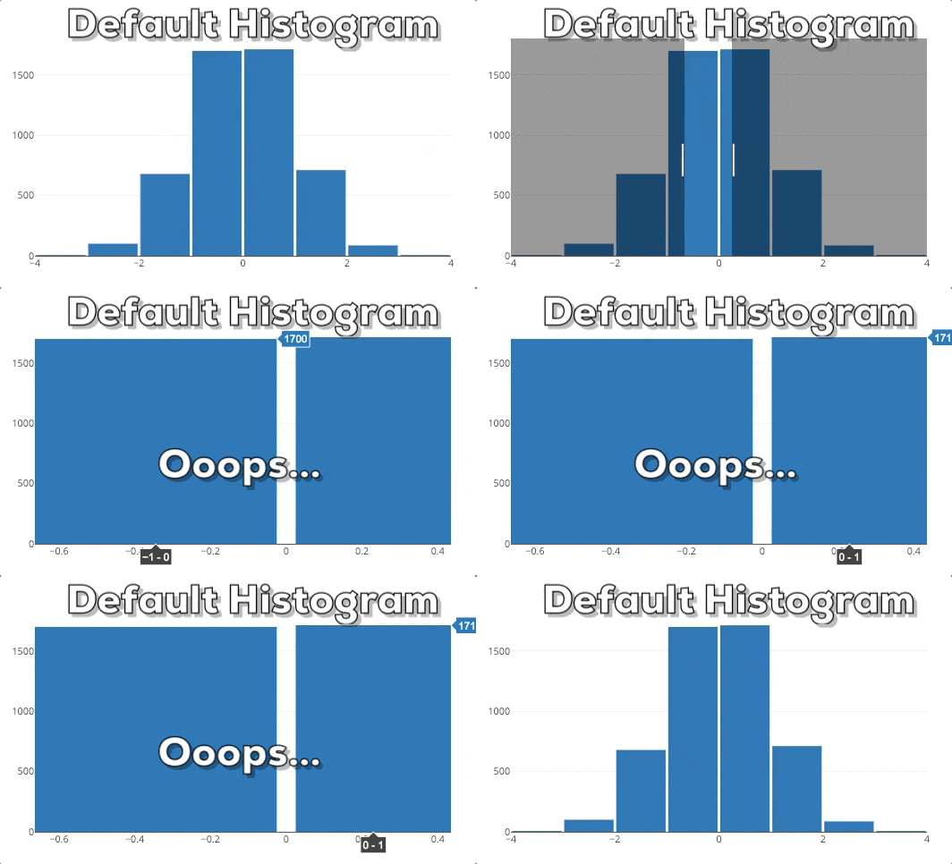
This graphic shows you the behavior of a Plotly histogram if you zoom into a specific region. What you can see is that the bars just get bigger/wider. This is not what we expect! If we zoom into a plot, we want to dig deeper and see more fine-grained information for a special area. Therefore, we expect that the histogram shows more fine-grained information. In this specific case, this means that we expect that the histogram shows bins for the selected region. So, the histogram needs to be rebinned.
Improving the interactive histogram

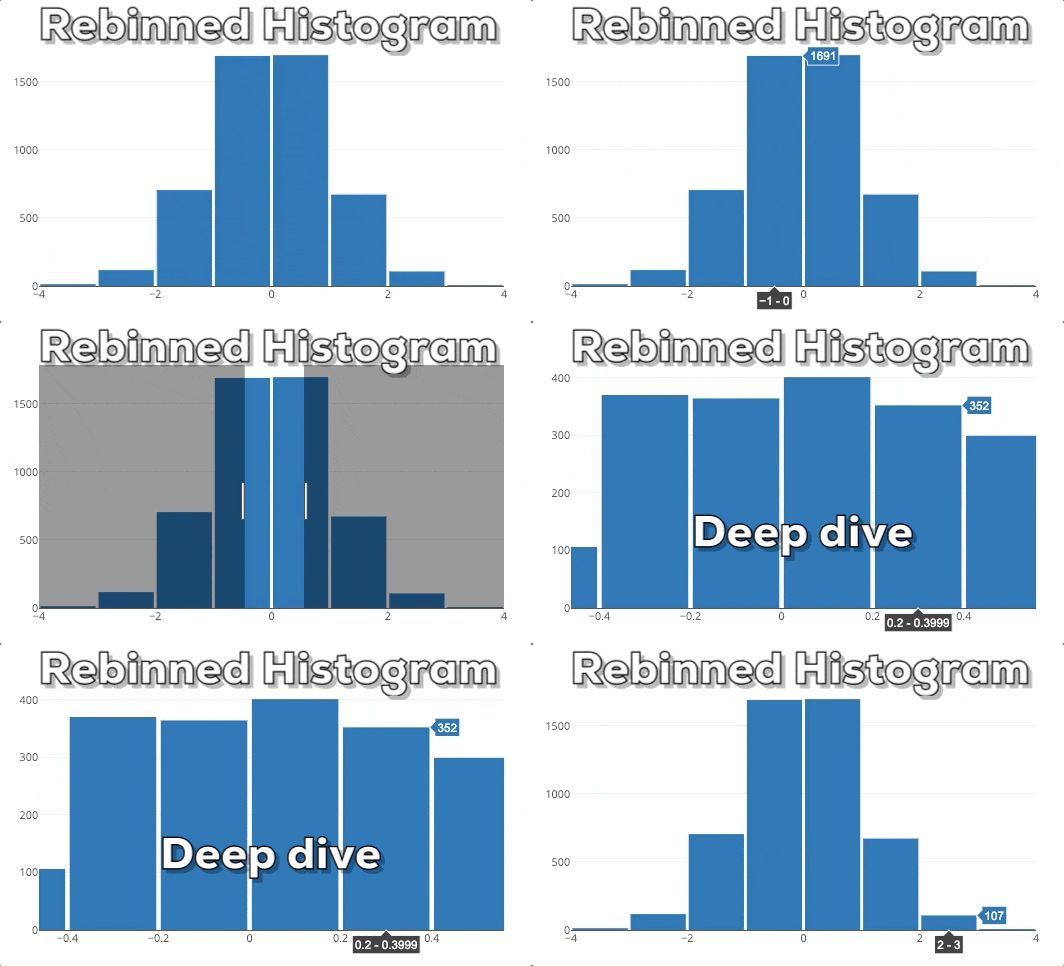
In this graphic you can see our expected end result. If the user selects a new x-region we want to rebin the histogram based on the new x-range.
In order to implement this behavior, we need to change the graphic, when the selected x-range changes. This is a new feature of plotly.py 3.0.0 which was brought to the community by the great Jon Mease. You can read more about the new Plotly.py 3.0.0 features in this announcement.
Disclaimer: The implementation only works inside a Jupyter Notebook or JupyterLab because it needs an active Python kernel for the callback. It does not work in a standalone Python script and it does not work in a standalone HTML file. The implementation idea is the following: We create an interactive figure and every time the x-axis changes, we will update the underlying data of the histogram. Whoops, why didn’t we change the binning? Plotly histograms automatically handle the binning for the underlying data. Therefore, we can let the histogram do the work and just change the underlying data. This is a little bit counterintuitive but saves a lot of work.
Glimpse of the full code
So, finally here comes the relevant code without unnecessary imports etc. If you want to see the full code, please check this GitHub file.
x_values = np.random.randn(5000)
figure = go.FigureWidget(data=[go.Histogram(x=x_values,
                                            nbinsx=10)],
                         layout=go.Layout(xaxis={'range': [-4, 4]},
                                          bargap=0.05))
histogram = figure.data[0]

def adjust_histogram_data(xaxis, xrange):
    x_values_subset = x_values[np.logical_and(xrange[0] <= x_values,
                                              x_values <= xrange[1])]
    histogram.x = x_values_subset
figure.layout.xaxis.on_change(adjust_histogram_data, 'range')
Detailed explanations for each line of code
In the following, we will provide some detailed insights and explanations for each line of code.
1) Initializing the x_values
x_values = np.random.randn(5000)
We get 5000 new random x_values which are distributed according to a normal distribution. The values are created by the great numpy library which is abbreviated as np.
2) Creating the figure
figure = go.FigureWidget(data=[go.Histogram(x=x_values,
                                            nbinsx=10)],
                         layout=go.Layout(xaxis={'range': [-4, 4]},
                                          bargap=0.05))
We generate a new FigureWidget instance. The FigureWidget object is the new “magic object” which was introduced by Jon Mease. You can display it within Jupyter Notebook or JupyterLab like a normal Plotly figure but there are some advantages. You can manipulate the FigureWidgetin various ways from Python and you can also listen for some events and execute some more Python code which gives you a lot of options. This flexibility is the great benefit which Jon Mease envisioned. The FigureWidget receives the attributes data and layout.
As data, we specify a list of all the traces (read: visualizations) that we want to show. In our case, we only want to show a single histogram. The x values for the histogram are our x_values. Also, we set the maximum number of bins with nbinsx to 10. Plotly will use this as a guideline but will not enforce the plot to exactly contain nbinsx bins. As layout, we specify a new layout object and set the range of the xaxis to [-4, 4]. With the bargap argument, we can enable the layout to show a gap between individual bars. This helps us to see where a bar stops and the next one begins. In our case, this value is set to 0.05.
3) Saving a reference to the histogram
histogram = figure.data[0]
We get the reference to the histogram because we want to manipulate the histogram in the last step. We don’t actually get the data but a reference to the Plotly trace object. This Plotly syntax might be a little bit misleading but it is consistent with the definition of the figure where we also specified the “traces” as “data”.
4) Overview of the callback
def adjust_histogram_data(xaxis, xrange):
    x_values_subset = x_values[np.logical_and(xrange[0] <= x_values,
                                              x_values <= xrange[1])]
    hist.x = x_values_subset
figure.layout.xaxis.on_change(adjust_histogram_data, 'range')
In this chunk, we first define what we want to do at the event when the xaxis changes. Afterwards, we register the callback function adjust_histogram_data. We will break this down further but we will start with the last line because Python will execute this line first at runtime. Therefore, it makes more sense to read the code based on this reverse execution order. A little bit more background on the callback: The code within the callback method adjust_histogram_data will be called when the xaxis.on_change event actually happens because the user interacted with the chart. But first, Python needs to register the adjust_histogram_data callback method. Way later, when the callback event xaxis.on_change occurs, Python will execute the callback method adjust_histogram_data and its contents. Go back and read this section 3-4 times until you fully understand it.
4a) Registering the callback
figure.layout.xaxis.on_change(adjust_histogram_data, 'range')
In this line, we tell the figure object to always call the callback function adjust_histogram_data whenever the xaxis changes. Please note, that we only specify the name of the function adjust_histogram_data without the round brackets (). This is because we only need to pass the reference to the function and do not want to call the function. This is a common error and source of confusion. Also we specify, that we are only interested in the range attribute. Therefore, the figure object will only send this information to the callback function.
But how does the callback function look like and what is the task of the callback function? Those questions are explained in the next steps:
4b) Defining the callback signature
def adjust_histogram_data(xaxis, xrange):
In this line, we start to define our callback function. The first argument which is passed to the function is the xaxis object which initiated the callback. This is a Plotly convention and we just need to put this placeholder here although we don’t use it. The second argument is the xrange which contains the lower and upper limit of the new xrange configuration. You might wonder: “where do the arguments xaxis and xrange come from?” Those arguments are automatically provided by the figure when the callback gets called. When you use callbacks for the first time, this might seem like intransparent magic. But you will get used to it…
4c) Updating the x_values
x_values_subset = x_values[np.logical_and(xrange[0] <= x_values,
                                          x_values <= xrange[1])]
In this line, we define our new x_values which in most cases are a subset of the original x_values. However, if the lower and upper limit are very far away from each other, we might end up selecting all the original x_values. So the subset is not always a strict subset. The lower limit of the xrange is defined by xrange[0] and the upper limit via xrange[1]. In order to select the subset of the x_values which is within the lower and upper limit of the xrange we use the logical_and function from numpy. There are multiple ways how we can select data subsets in Python. For example, you can also do this via pandas selectors if you use pandas dataframes/series.
4d) Updating the histogram data
histogram.x = x_values_subset
In this line, we update the underlying data of the histogram and set it to the new x_values_subset. This line will trigger the update of the Histogram and the automatic rebinning. The histogram is the reference which we created in step 3 of the code because we need it here.
Wrapping up
In this blog post, we showed you how to improve the default Plotly histogram via interactive binning. We gave you the code and explained every line of the implementation. We hope that you were able to follow along and gained some good understanding of the new possibilities thanks to plotly.py 3.0.0.
Maybe you sometimes have the feeling that you cannot understand the code that you find on the internet or Stackoverflow. If you want intuitive explanations for everything you need to know in the world of Data Science, consider some of our open courses which are taught by our Data Science experts here at statworx.
References
- Official plotly.py GitHub repository https://github.com/plotly/plotly.py
- Official overview of all new plotly.py 3.0.0 features https://medium.com/@plotlygraphs/introducing-plotly-py-3-0-0-7bb1333f69c6


