Data Science in Python – Matplotlib – Part 4

After providing an introduction to Pandas in the previous article, enabling us to select and manipulate data, this article will focus on data visualization. It is well-known that with appropriate graphics, data can often be understood even better and allow for a different type of interpretation, independent of averages and other metrics.
Which library for data visualization in Python?
In the library jungle of Python, there are countless libraries suitable for visualization. The range extends from a simple scatter plot to the representation of a neural network's structure and even 3D visualizations. The oldest and most mature data visualization library in the Python ecosystem is Matplotlib. With the development starting in 2003, it has continuously evolved and also forms the basis for the seaborn library. It offers a wide range of customization options and is oriented towards MATLAB. The name connection is obvious ;-).
Starting with Matplotlib
Creating graphics with Matplotlib can be done in two ways:
- via
pyplot - Object-oriented approach
It should be noted at this point that pyplot is a sub-library of matplotlib. The first approach is the most widespread, as it provides an easy entry into Matplotlib. In contrast, the second is suitable for very detailed graphics that require many adjustments. In this blog post, the graphics will be created exclusively with pyplot. The creation is oriented towards the following procedure:
- Creation of a figure object including axes objects
- Editing the axes objects
- Output of the object
Consequently, we directly edit an object in Python, rather than layering graphics as with the "Grammar of Graphics."
Initializing a Graphic
Importing matplotlib is typically as follows:
# Import Matplotlib
import matplotlib.pyplot as plt
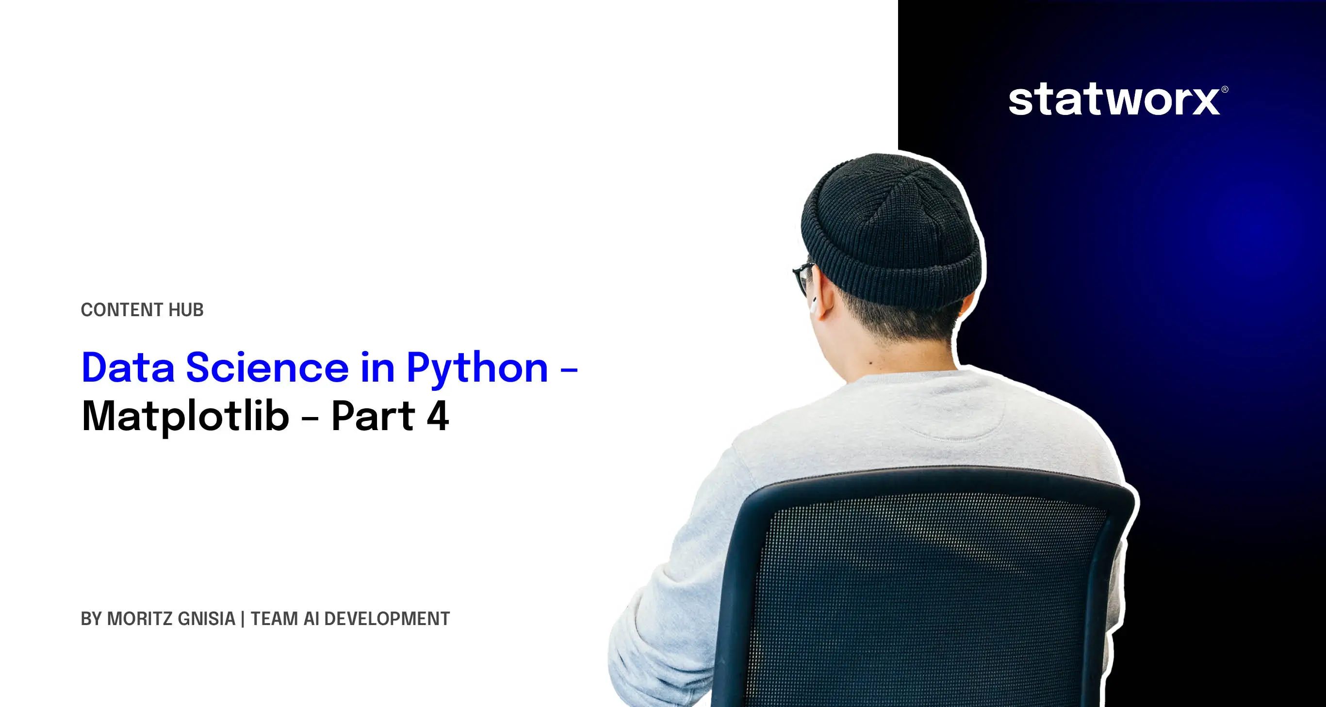
Now, we need to create a figure object. At this point, one should also consider how many representations to integrate into the object, as this facilitates the workflow later on. In the following code example, a figure with one column and one row is created.
# Initialization of a Figure
fig, ax = plt.subplots(nrows = 1, ncols = 1)
# Ausgabe der Figure
fig
The figure method returns two arguments: the actual figure and an Axes object. This is related to Matplotlib's object-oriented approach. If a figure includes multiple sub-representations, such as histograms of different data, the sub-representations can be individually edited via the Axes object, and the figure object combines all sub-representations. Thus, the figure includes the graphical representation, and the Axes object includes the individual sub-representations. Displaying the created variable fig gives the following representation:
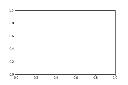
Our graphic currently only contains a coordinate system. To further clarify the object-oriented approach, we will create a figure with a total of two rows and two columns.
# Creating a Figure with 4 separate graphics
fig, ax = plt.subplots(nrows = 2, ncols = 2)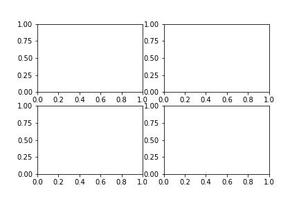
Using index selection, one can now select individual sub-representations from the grid. The object-oriented approach should now be clear.
# Selecting the individual sub-representations
ax[0,0]
ax[0,1]
ax[1,0]
ax[1,1]
When initializing a graphic, adjustments regarding the size of the graphic are certainly conceivable, which can be implemented as follows:
# Setting the figure size
fig, ax = plt.subplots(nrows = 2, ncols = 2, figsize = (10, 12))
The graphic size is specified as a tuple (width, height) in inches.
Representation of Data
After demonstrating how to initialize a graphic in Matplotlib, we will now focus on populating it with data. For the entry, we will take the first figure from the blog post. To represent data, we access the Axes object and initially choose the plot function. A variety of other functions can be found at this link.
# Creating the graphic
fig, ax = plt.subplots(nrows = 1, ncols = 1)
# Creating sample data
sample_data = np.random.randint(low = 0, high = 10, size = 10)
# Displaying the sample data
ax.plot(sample_data)
# Output of the Figure
fig
It should be briefly noted here that Matplotlib has performed two operations in the background:
- The scale was automatically adjusted to the data.
- The data representation was done via the index, i.e., the actual value is on the y-axis.
If one believes, for example, that a scatter plot would be more suitable, the graphic can easily be changed. Instead of plot, one writes scatter. The code shows that, in this case, the data was not automatically represented via the index, but x and y had to be explicitly passed as arguments.
# Creating the graphic
fig, ax = plt.subplots(nrows = 1, ncols = 1)
# Creating sample data
sample_data = np.random.randint(low = 0, high = 10, size = 10)
# Displaying the sample data
ax.scatter(x = range(0, len(sample_data)), y=sample_data)
# Output of the Figure
fig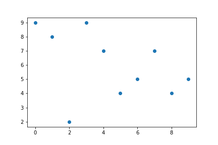
All typical data visualizations can be implemented with Matplotlib.
Labeling and Saving Graphics
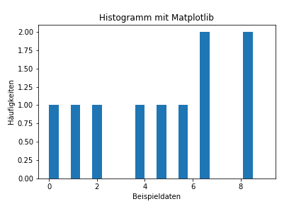
Representing the data is one thing; with an appropriate title, they become more understandable.
As an example, we want to label a histogram with the sample data. Using the set_ functions, labeling can be easily done.
fig, ax = plt.subplots(nrows=1, ncols=1)
sample_data = np.random.randint(low = 0, high = 10, size = 10)
ax.hist(sample_data,width = 0.4)
# Adding labels
ax.set_xlabel('Sample data')
ax.set_ylabel('Frequencies')
ax.set_title('Histogram with Matplotlib')
# Output of the Figure
fig
We get the following graphic:
If one wishes to save their graphic, this can be done using the fig.savefig ('Path of the graphic') function.
Summary and Outlook
This blog post should provide an initial introduction to the Python visualization library Matplotlib and convey basic concepts. The adaptability of the graphics goes far beyond the functions we have presented:
- Customization of colors, gradients,...
- individual axis labeling/scaling
- Annotating graphics with text boxes
- Changing the font
- ...
To consider selecting the appropriate data for the graphics, how to implement it with Pandas can be read here. In the next post in this series, we will then focus on Scikit-Learn, the beginner machine learning library in Python.


