Back to all Blog Posts

How To Build A Dashboard In Python – Plotly Dash Step-by-Step Tutorial

  • Frontend
  • Python
  • Tutorial
26. March 2020
·

Alexander Blaufuss
Team AI Academy

From my experience here at statworx, the best way to learn something is by trying it out yourself – with a little help from a friend! In this article, I will focus on giving you a hands-on guide on how to build a dashboard in Python. As a framework, we will be using Dash, and the goal is to create a basic dashboard with a dropdown and two reactive graphs:

Developed as an open-source library by Plotly, the Python framework Dash is built on top of Flask, Plotly.js, and React.js. Dash allows the building of interactive web applications in pure Python and is particularly suited for sharing insights gained from data.

In case you’re interested in interactive charting with Python, I highly recommend my colleague Markus’ blog post Plotly – An Interactive Charting Library

For our purposes, a basic understanding of HTML and CSS can be helpful. Nevertheless, I will provide you with external resources and explain every step thoroughly, so you’ll be able to follow the guide.

The source code can be found on GitHub.

Prerequisites

The project comprises a style sheet called style.css, sample stock data stockdata2.csv and the actual Dash application app.py

Load the Stylesheet

If you want your dashboard to look like the one above, please download the file style.css from our statworx GitHub. That is completely optional and won’t affect the functionalities of your app. Our stylesheet is a customized version of the stylesheet used by the Dash Uber Rides Demo. Dash will automatically load any .css-file placed in a folder named assets.

dashapp
    |--assets
        |-- style.css
    |--data
        |-- stockdata2.csv
    |-- app.py

The documentation on external resources in dash can be found here.

Load the Data

Feel free to use the same data we did (stockdata2.csv), or any pick any data with the following structure:

datestockvaluechange2007-01-03MSFT23.95070-0.16672007-01-03IBM80.517961.06912007-01-03SBUX16.149670.1134

import pandas as pd

# Load data
df = pd.read_csv('data/stockdata2.csv', index_col=0, parse_dates=True)
df.index = pd.to_datetime(df['Date'])

Getting Started – How to start a Dash app

Back to Guide Structure

After installing Dash (instructions can be found here), we are ready to start with the application. The following statements will load the necessary packages dash and dash_html_components. Without any layout defined, the app won’t start. An empty html.Div will suffice to get the app up and running.

import dash
import dash_html_components as html

If you have already worked with the WSGI web application framework Flask, the next step will be very familiar to you, as Dash uses Flask under the hood.

# Initialise the app
app = dash.Dash(__name__)

# Define the app
app.layout = html.Div()
# Run the app
if __name__ == '__main__':
    app.run_server(debug=True)

How a .css-files changes the layout of an app

The module dash_html_components provides you with several html components, also check out the documentation.

Worth to mention is that the nesting of components is done via the children attribute.

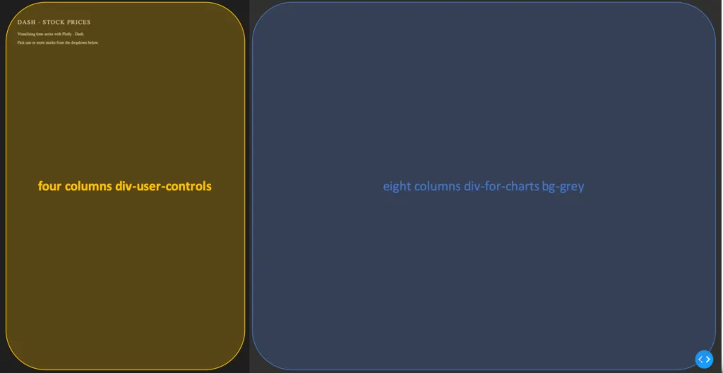
app.layout = html.Div(children=[
                      html.Div(className='row',  # Define the row element
                               children=[
                                  html.Div(className='four columns div-user-controls'),  # Define the left element
                                  html.Div(className='eight columns div-for-charts bg-grey')  # Define the right element
                                  ])
                                ])

The first html.Div() has one child. Another html.Div named row, which will contain all our content. The children of row are four columns div-user-controls and eight columns div-for-charts bg-grey.

The style for these div components come from our style.css.

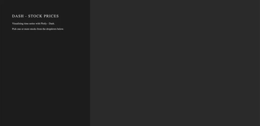
Now let’s first add some more information to our app, such as a title and a description. For that, we use the Dash Components H2 to render a headline and P to generate html paragraphs.

children = [
    html.H2('Dash - STOCK PRICES'),
    html.P('''Visualising time series with Plotly - Dash'''),
    html.P('''Pick one or more stocks from the dropdown below.''')
]

Switch to your terminal and run the app with python app.py.

The basics of an app’s layout

Another nice feature of Flask (and hence Dash) is hot-reloading. It makes it possible to update our app on the fly without having to restart the app every time we make a change to our code.

Running our app with debug=True also adds a button to the bottom right of our app, which lets us take a look at error messages, as well a Callback Graph. We will come back to the Callback Graph in the last section of the article when we’re done implementing the functionalities of the app.

Charting in Dash – How to display a Plotly-Figure

Back to Guide Structure

With the building blocks for our web app in place, we can now define a plotly-graph. The function dcc.Graph() from dash_core_components uses the same figure argument as the plotly package. Dash translates every aspect of a plotly chart to a corresponding key-value pair, which will be used by the underlying JavaScript library Plotly.js.

In the following section, we will need the express version of plotly.py, as well as the Package Dash Core Components. Both packages are available with the installation of Dash.

import dash_core_components as dcc
import plotly.express as px

Dash Core Components has a collection of useful and easy-to-use components, which add interactivity and functionalities to your dashboard.

Plotly Express is the express-version of plotly.py, which simplifies the creation of a plotly-graph, with the drawback of having fewer functionalities.

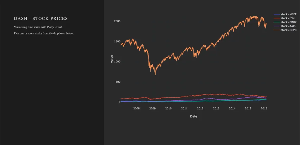
To draw a plot on the right side of our app, add a dcc.Graph() as a child to the html.Div() named eight columns div-for-charts bg-grey. The component dcc.Graph() is used to render any plotly-powered visualization. In this case, it’s figure will be created by px.line() from the Python package plotly.express. As the express version of Plotly has limited native configurations, we are going to change the layout of our figure with the method update_layout(). Here, we use rgba(0, 0, 0, 0) to set the background transparent. Without updating the default background- and paper color, we would have a big white box in the middle of our app. As dcc.Graph() only renders the figure in the app; we can’t change its appearance once it’s created.

dcc.Graph(id='timeseries',
          config={'displayModeBar': False},
          animate=True,
          figure=px.line(df,
                         x='Date',
                         y='value',
                         color='stock',
                         template='plotly_dark').update_layout(
                                   {'plot_bgcolor': 'rgba(0, 0, 0, 0)',
                                    'paper_bgcolor': 'rgba(0, 0, 0, 0)'})
                                    )

After Dash reload the application, you will end up in something like that: A dashboard with a plotted graph:

Creating a Dropdown Menu

Back to Guide Structure

Another core component is dcc.dropdown(), which is used – you’ve guessed it – to create a dropdown menu. The available options in the dropdown menu are either given as arguments or supplied by a function. For our dropdown menu, we need a function that returns a list of dictionaries. The list contains dictionaries with two keys, label and value. These dictionaries provide the available options to the dropdown menu. The value of label is displayed in our app. The value of value will be exposed for other functions to use, and should not be changed. If you prefer the full name of a company to be displayed instead of the short name, you can do so by changing the value of the key label to Microsoft. For the sake of simplicity, we will use the same value for the keys label and value.

Add the following function to your script, before defining the app’s layout.

# Creates a list of dictionaries, which have the keys 'label' and 'value'.
def get_options(list_stocks):
    dict_list = []
    for i in list_stocks:
        dict_list.append({'label': i, 'value': i})

    return dict_list

With a function that returns the names of stocks in our data in key-value pairs, we can now add dcc.Dropdown() from the Dash Core Components to our app. Add a html.Div() as child to the list of children of four columns div-user-controls, with the argument className=div-for-dropdown. This html.Div() has one child, dcc.Dropdown().

We want to be able to select multiple stocks at the same time and a selected default value, so our figure is not empty on startup. Set the argument multi=True and chose a default stock for value.

 html.Div(className='div-for-dropdown',
          children=[
              dcc.Dropdown(id='stockselector',
                           options=get_options(df['stock'].unique()),
                           multi=True,
                           value=[df['stock'].sort_values()[0]],
                           style={'backgroundColor': '#1E1E1E'},
                           className='stockselector')
                    ],
          style={'color': '#1E1E1E'})

The id and options arguments in dcc.Dropdown() will be important in the next section. Every other argument can be changed. If you want to try out different styles for the dropdown menu, follow the link for a list of different dropdown menus.

Working with Callbacks

Back to Guide Structure

How to add interactive functionalities to your app

Callbacks add interactivity to your app. They can take inputs, for example, certain stocks selected via a dropdown menu, pass these inputs to a function and pass the return value of the function to another component. We will write a function that returns a figure based on provided stock names. A callback will pass the selected values from the dropdown to the function and return the figure to a dcc.Grapph() in our app.

At this point, the selected values in the dropdown menu do not change the stocks displayed in our graph. For that to happen, we need to implement a callback. The callback will handle the communication between our dropdown menu 'stockselector' and our graph 'timeseries'. We can delete the figure we have previously created, as we won’t need it anymore.

We want two graphs in our app, so we will add another dcc.Graph() with a different id.

  • Remove the figure argument from dcc.Graph(id='timeseries')
  • Add another dcc.Graph() with className='change' as child to the html.Div() named eight columns div-for-charts bg-grey.
dcc.Graph(id='timeseries', config={'displayModeBar': False})
dcc.Graph(id='change', config={'displayModeBar': False})

Callbacks add interactivity to your app. They can take Inputs from components, for example certain stocks selected via a dropdown menu, pass these inputs to a function and pass the returned values from the function back to components.

In our implementation, a callback will be triggered when a user selects a stock. The callback uses the value of the selected items in the dropdown menu (Input) and passes these values to our functions update_timeseries() and update_change(). The functions will filter the data based on the passed inputs and return a plotly figure from the filtered data. The callback then passes the figure returned from our functions back to the component specified in the output.

A callback is implemented as a decorator for a function. Multiple inputs and outputs are possible, but for now, we will start with a single input and a single output. We need the class dash.dependencies.Input and dash.dependencies.Output.

Add the following line to your import statements.

from dash.dependencies import Input, Output

Input() and Output() take the id of a component (e.g. in dcc.Graph(id='timeseries') the components id is 'timeseries') and the property of a component as arguments.

Example Callback:

# Update Time Series
@app.callback(Output('id of output component', 'property of output component'),
              [Input('id of input component', 'property of input component')])
def arbitrary_function(value_of_first_input):
    '''
    The property of the input component is passed to the function as value_of_first_input.
    The functions return value is passed to the property of the output component.
    '''
    return arbitrary_output

If we want our stockselector to display a time series for one or more specific stocks, we need a function. The value of our input is a list of stocks selected from the dropdown menu stockselector.

Implementing Callbacks

The function draws the traces of a plotly-figure based on the stocks which were passed as arguments and returns a figure that can be used by dcc.Graph(). The inputs for our function are given in the order in which they were set in the callback. Names chosen for the function’s arguments do not impact the way values are assigned.

Update the figure time series:

@app.callback(Output('timeseries', 'figure'),
              [Input('stockselector', 'value')])
def update_timeseries(selected_dropdown_value):
    ''' Draw traces of the feature 'value' based one the currently selected stocks '''
    # STEP 1
    trace = []  
    df_sub = df
    # STEP 2
    # Draw and append traces for each stock
    for stock in selected_dropdown_value:   
        trace.append(go.Scatter(x=df_sub[df_sub['stock'] == stock].index,
                                 y=df_sub[df_sub['stock'] == stock]['value'],
                                 mode='lines',
                                 opacity=0.7,
                                 name=stock,
                                 textposition='bottom center'))  
    # STEP 3
    traces = [trace]
    data = [val for sublist in traces for val in sublist]
    # Define Figure
    # STEP 4
    figure = {'data': data,
              'layout': go.Layout(
                  colorway=["#5E0DAC", '#FF4F00', '#375CB1', '#FF7400', '#FFF400', '#FF0056'],
                  template='plotly_dark',
                  paper_bgcolor='rgba(0, 0, 0, 0)',
                  plot_bgcolor='rgba(0, 0, 0, 0)',
                  margin={'b': 15},
                  hovermode='x',
                  autosize=True,
                  title={'text': 'Stock Prices', 'font': {'color': 'white'}, 'x': 0.5},
                  xaxis={'range': [df_sub.index.min(), df_sub.index.max()]},
              ),

              }

    return figure

STEP 1

  • A trace will be drawn for each stock. Create an empty list for each trace from the plotly figure.

STEP 2

Within the for-loop, a trace for a plotly figure will be drawn with the function go.Scatter().

  • Iterate over the stocks currently selected in our dropdown menu, draw a trace, and append that trace to our list from step 1.

STEP 3

  • Flatten the traces

STEP 4

Plotly figures are dictionaries with the keys data and layout. The value of data is our flattened list with the traces we have drawn. The layout is defined with the plotly class go.Layout().

  • Add the trace to our figure
  • Define the layout of our figure

Now we simply repeat the steps above for our second graph. Just change the data for our y-Axis to change and slightly adjust the layout.

Update the figure change:

@app.callback(Output('change', 'figure'),
              [Input('stockselector', 'value')])
def update_change(selected_dropdown_value):
    ''' Draw traces of the feature 'change' based one the currently selected stocks '''
    trace = []
    df_sub = df
    # Draw and append traces for each stock
    for stock in selected_dropdown_value:
        trace.append(go.Scatter(x=df_sub[df_sub['stock'] == stock].index,
                                 y=df_sub[df_sub['stock'] == stock]['change'],
                                 mode='lines',
                                 opacity=0.7,
                                 name=stock,
                                 textposition='bottom center'))
    traces = [trace]
    data = [val for sublist in traces for val in sublist]
    # Define Figure
    figure = {'data': data,
              'layout': go.Layout(
                  colorway=["#5E0DAC", '#FF4F00', '#375CB1', '#FF7400', '#FFF400', '#FF0056'],
                  template='plotly_dark',
                  paper_bgcolor='rgba(0, 0, 0, 0)',
                  plot_bgcolor='rgba(0, 0, 0, 0)',
                  margin={'t': 50},
                  height=250,
                  hovermode='x',
                  autosize=True,
                  title={'text': 'Daily Change', 'font': {'color': 'white'}, 'x': 0.5},
                  xaxis={'showticklabels': False, 'range': [df_sub.index.min(), df_sub.index.max()]},
              ),
              }

    return figure

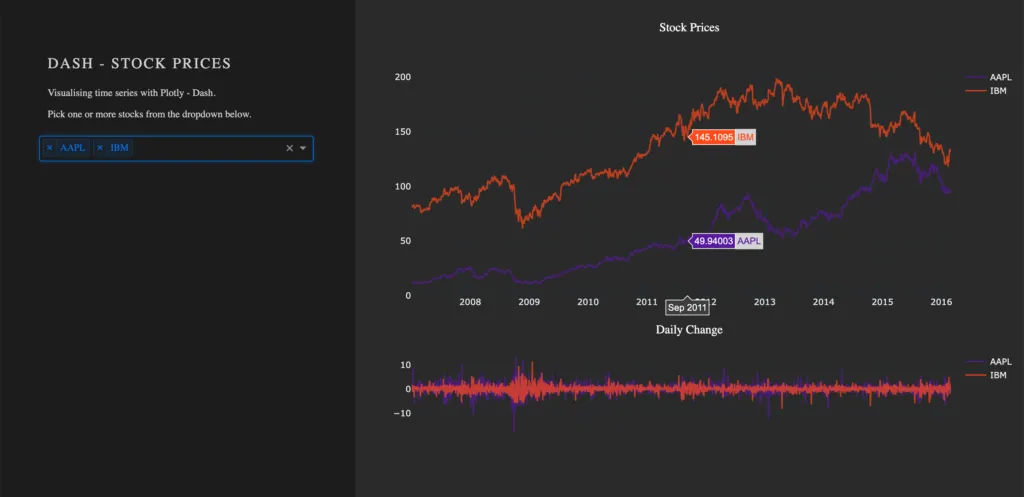
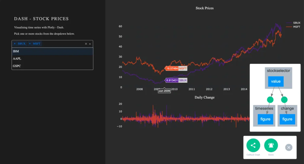
Run your app again. You are now able to select one or more stocks from the dropdown. For each selected item, a line plot will be generated in the graph. By default, the dropdown menu has search functionalities, which makes the selection out of many available options an easy task.

Visualize Callbacks – Callback Graph

With the callbacks in place and our app completed, let’s take a quick look at our callback graph. If you are running your app with debug=True, a button will appear in the bottom right corner of the app. Here we have access to a callback graph, which is a visual representation of the callbacks which we have implemented in our code. The graph shows that our components timeseries and change display a figure based on the value of the component stockselector. If your callbacks don’t work how you expect them to, especially when working on larger and more complex apps, this tool will come in handy.

Conclusion

Let’s recap the most important building blocks of Dash. Getting the App up and running requires just a couple lines of code. A basic understanding of HTML and CSS is enough to create a simple Dash dashboard. You don’t have to worry about creating interactive charts, Plotly already does that for you. Making your dashboard reactive is done via Callbacks, which are functions with the users’ interaction as the input.

If you liked this blog, feel free to contact me via LinkedIn or Email. I am curious to know what you think and always happy to answer any questions about data, my journey to data science, or the exciting things we do here at statworx.

Thank you for reading!

Linkedin Logo
Marcel Plaschke
Head of Strategy, Sales & Marketing
schedule a consultation
Zugehörige Leistungen
No items found.

More Blog Posts

  • Artificial Intelligence
AI Trends Report 2025: All 16 Trends at a Glance
Tarik Ashry
05. February 2025
Read more
  • Artificial Intelligence
  • Data Science
  • Human-centered AI
Explainable AI in practice: Finding the right method to open the Black Box
Jonas Wacker
15. November 2024
Read more
  • Artificial Intelligence
  • Data Science
  • GenAI
How a CustomGPT Enhances Efficiency and Creativity at hagebau
Tarik Ashry
06. November 2024
Read more
  • Artificial Intelligence
  • Data Culture
  • Data Science
  • Deep Learning
  • GenAI
  • Machine Learning
AI Trends Report 2024: statworx COO Fabian Müller Takes Stock
Tarik Ashry
05. September 2024
Read more
  • Artificial Intelligence
  • Human-centered AI
  • Strategy
The AI Act is here – These are the risk classes you should know
Fabian Müller
05. August 2024
Read more
  • Artificial Intelligence
  • GenAI
  • statworx
Back to the Future: The Story of Generative AI (Episode 4)
Tarik Ashry
31. July 2024
Read more
  • Artificial Intelligence
  • GenAI
  • statworx
Back to the Future: The Story of Generative AI (Episode 3)
Tarik Ashry
24. July 2024
Read more
  • Artificial Intelligence
  • GenAI
  • statworx
Back to the Future: The Story of Generative AI (Episode 2)
Tarik Ashry
04. July 2024
Read more
  • Artificial Intelligence
  • GenAI
  • statworx
Back to the Future: The Story of Generative AI (Episode 1)
Tarik Ashry
10. July 2024
Read more
  • Artificial Intelligence
  • GenAI
  • statworx
Generative AI as a Thinking Machine? A Media Theory Perspective
Tarik Ashry
13. June 2024
Read more
  • Artificial Intelligence
  • GenAI
  • statworx
Custom AI Chatbots: Combining Strong Performance and Rapid Integration
Tarik Ashry
10. April 2024
Read more
  • Artificial Intelligence
  • Data Culture
  • Human-centered AI
How managers can strengthen the data culture in the company
Tarik Ashry
21. February 2024
Read more
  • Artificial Intelligence
  • Data Culture
  • Human-centered AI
AI in the Workplace: How We Turn Skepticism into Confidence
Tarik Ashry
08. February 2024
Read more
  • Artificial Intelligence
  • Data Science
  • GenAI
The Future of Customer Service: Generative AI as a Success Factor
Tarik Ashry
25. October 2023
Read more
  • Artificial Intelligence
  • Data Science
How we developed a chatbot with real knowledge for Microsoft
Isabel Hermes
27. September 2023
Read more
  • Data Science
  • Data Visualization
  • Frontend Solution
Why Frontend Development is Useful in Data Science Applications
Jakob Gepp
30. August 2023
Read more
  • Artificial Intelligence
  • Human-centered AI
  • statworx
the byte - How We Built an AI-Powered Pop-Up Restaurant
Sebastian Heinz
14. June 2023
Read more
  • Artificial Intelligence
  • Recap
  • statworx
Big Data & AI World 2023 Recap
Team statworx
24. May 2023
Read more
  • Data Science
  • Human-centered AI
  • Statistics & Methods
Unlocking the Black Box – 3 Explainable AI Methods to Prepare for the AI Act
Team statworx
17. May 2023
Read more
  • Artificial Intelligence
  • Human-centered AI
  • Strategy
How the AI Act will change the AI industry: Everything you need to know about it now
Team statworx
11. May 2023
Read more
  • Artificial Intelligence
  • Human-centered AI
  • Machine Learning
Gender Representation in AI – Part 2: Automating the Generation of Gender-Neutral Versions of Face Images
Team statworx
03. May 2023
Read more
  • Artificial Intelligence
  • Data Science
  • Statistics & Methods
A first look into our Forecasting Recommender Tool
Team statworx
26. April 2023
Read more
  • Artificial Intelligence
  • Data Science
On Can, Do, and Want – Why Data Culture and Death Metal have a lot in common
David Schlepps
19. April 2023
Read more
  • Artificial Intelligence
  • Human-centered AI
  • Machine Learning
GPT-4 - A categorisation of the most important innovations
Mareike Flögel
17. March 2023
Read more
  • Artificial Intelligence
  • Data Science
  • Strategy
Decoding the secret of Data Culture: These factors truly influence the culture and success of businesses
Team statworx
16. March 2023
Read more
  • Artificial Intelligence
  • Deep Learning
  • Machine Learning
How to create AI-generated avatars using Stable Diffusion and Textual Inversion
Team statworx
08. March 2023
Read more
  • Artificial Intelligence
  • Human-centered AI
  • Strategy
Knowledge Management with NLP: How to easily process emails with AI
Team statworx
02. March 2023
Read more
  • Artificial Intelligence
  • Deep Learning
  • Machine Learning
3 specific use cases of how ChatGPT will revolutionize communication in companies
Ingo Marquart
16. February 2023
Read more
  • Recap
  • statworx
Ho ho ho – Christmas Kitchen Party
Julius Heinz
22. December 2022
Read more
  • Artificial Intelligence
  • Deep Learning
  • Machine Learning
Real-Time Computer Vision: Face Recognition with a Robot
Sarah Sester
30. November 2022
Read more
  • Data Engineering
  • Tutorial
Data Engineering – From Zero to Hero
Thomas Alcock
23. November 2022
Read more
  • Recap
  • statworx
statworx @ UXDX Conf 2022
Markus Berroth
18. November 2022
Read more
  • Artificial Intelligence
  • Machine Learning
  • Tutorial
Paradigm Shift in NLP: 5 Approaches to Write Better Prompts
Team statworx
26. October 2022
Read more
  • Recap
  • statworx
statworx @ vuejs.de Conf 2022
Jakob Gepp
14. October 2022
Read more
  • Data Engineering
  • Data Science
Application and Infrastructure Monitoring and Logging: metrics and (event) logs
Team statworx
29. September 2022
Read more
  • Coding
  • Data Science
  • Machine Learning
Zero-Shot Text Classification
Fabian Müller
29. September 2022
Read more
  • Cloud Technology
  • Data Engineering
  • Data Science
How to Get Your Data Science Project Ready for the Cloud
Alexander Broska
14. September 2022
Read more
  • Artificial Intelligence
  • Human-centered AI
  • Machine Learning
Gender Repre­sentation in AI – Part 1: Utilizing StyleGAN to Explore Gender Directions in Face Image Editing
Isabel Hermes
18. August 2022
Read more
  • Artificial Intelligence
  • Human-centered AI
statworx AI Principles: Why We Started Developing Our Own AI Guidelines
Team statworx
04. August 2022
Read more
  • Data Engineering
  • Data Science
  • Python
How to Scan Your Code and Dependencies in Python
Thomas Alcock
21. July 2022
Read more
  • Data Engineering
  • Data Science
  • Machine Learning
Data-Centric AI: From Model-First to Data-First AI Processes
Team statworx
13. July 2022
Read more
  • Artificial Intelligence
  • Deep Learning
  • Human-centered AI
  • Machine Learning
DALL-E 2: Why Discrimination in AI Development Cannot Be Ignored
Team statworx
28. June 2022
Read more
  • R
The helfRlein package – A collection of useful functions
Jakob Gepp
23. June 2022
Read more
  • Recap
  • statworx
Unfold 2022 in Bern – by Cleverclip
Team statworx
11. May 2022
Read more
  • Artificial Intelligence
  • Data Science
  • Human-centered AI
  • Machine Learning
Break the Bias in AI
Team statworx
08. March 2022
Read more
  • Artificial Intelligence
  • Cloud Technology
  • Data Science
  • Sustainable AI
How to Reduce the AI Carbon Footprint as a Data Scientist
Team statworx
02. February 2022
Read more
  • Recap
  • statworx
2022 and the rise of statworx next
Sebastian Heinz
06. January 2022
Read more
  • Recap
  • statworx
5 highlights from the Zurich Digital Festival 2021
Team statworx
25. November 2021
Read more
  • Data Science
  • Human-centered AI
  • Machine Learning
  • Strategy
Why Data Science and AI Initiatives Fail – A Reflection on Non-Technical Factors
Team statworx
22. September 2021
Read more
  • Artificial Intelligence
  • Data Science
  • Human-centered AI
  • Machine Learning
  • statworx
Column: Human and machine side by side
Sebastian Heinz
03. September 2021
Read more
  • Coding
  • Data Science
  • Python
How to Automatically Create Project Graphs With Call Graph
Team statworx
25. August 2021
Read more
  • Coding
  • Python
  • Tutorial
statworx Cheatsheets – Python Basics Cheatsheet for Data Science
Team statworx
13. August 2021
Read more
  • Data Science
  • statworx
  • Strategy
STATWORX meets DHBW – Data Science Real-World Use Cases
Team statworx
04. August 2021
Read more
  • Data Engineering
  • Data Science
  • Machine Learning
Deploy and Scale Machine Learning Models with Kubernetes
Team statworx
29. July 2021
Read more
  • Cloud Technology
  • Data Engineering
  • Machine Learning
3 Scenarios for Deploying Machine Learning Workflows Using MLflow
Team statworx
30. June 2021
Read more
  • Artificial Intelligence
  • Deep Learning
  • Machine Learning
Car Model Classification III: Explainability of Deep Learning Models With Grad-CAM
Team statworx
19. May 2021
Read more
  • Artificial Intelligence
  • Coding
  • Deep Learning
Car Model Classification II: Deploying TensorFlow Models in Docker Using TensorFlow Serving
No items found.
12. May 2021
Read more
  • Coding
  • Deep Learning
Car Model Classification I: Transfer Learning with ResNet
Team statworx
05. May 2021
Read more
  • Artificial Intelligence
  • Deep Learning
  • Machine Learning
Car Model Classification IV: Integrating Deep Learning Models With Dash
Dominique Lade
05. May 2021
Read more
  • AI Act
Potential Not Yet Fully Tapped – A Commentary on the EU’s Proposed AI Regulation
Team statworx
28. April 2021
Read more
  • Artificial Intelligence
  • Deep Learning
  • statworx
Creaition – revolutionizing the design process with machine learning
Team statworx
31. March 2021
Read more
  • Artificial Intelligence
  • Data Science
  • Machine Learning
5 Types of Machine Learning Algorithms With Use Cases
Team statworx
24. March 2021
Read more
  • Recaps
  • statworx
2020 – A Year in Review for Me and GPT-3
Sebastian Heinz
23. Dezember 2020
Read more
  • Artificial Intelligence
  • Deep Learning
  • Machine Learning
5 Practical Examples of NLP Use Cases
Team statworx
12. November 2020
Read more
  • Data Science
  • Deep Learning
The 5 Most Important Use Cases for Computer Vision
Team statworx
11. November 2020
Read more
  • Data Science
  • Deep Learning
New Trends in Natural Language Processing – How NLP Becomes Suitable for the Mass-Market
Dominique Lade
29. October 2020
Read more
  • Data Engineering
5 Technologies That Every Data Engineer Should Know
Team statworx
22. October 2020
Read more
  • Artificial Intelligence
  • Data Science
  • Machine Learning

Generative Adversarial Networks: How Data Can Be Generated With Neural Networks
Team statworx
10. October 2020
Read more
  • Coding
  • Data Science
  • Deep Learning
Fine-tuning Tesseract OCR for German Invoices
Team statworx
08. October 2020
Read more
  • Artificial Intelligence
  • Machine Learning
Whitepaper: A Maturity Model for Artificial Intelligence
Team statworx
06. October 2020
Read more
  • Data Engineering
  • Data Science
  • Machine Learning
How to Provide Machine Learning Models With the Help Of Docker Containers
Thomas Alcock
01. October 2020
Read more
  • Recap
  • statworx
STATWORX 2.0 – Opening of the New Headquarters in Frankfurt
Julius Heinz
24. September 2020
Read more
  • Machine Learning
  • Python
  • Tutorial
How to Build a Machine Learning API with Python and Flask
Team statworx
29. July 2020
Read more
  • Data Science
  • Statistics & Methods
Model Regularization – The Bayesian Way
Thomas Alcock
15. July 2020
Read more
  • Recap
  • statworx
Off To New Adventures: STATWORX Office Soft Opening
Team statworx
14. July 2020
Read more
  • Data Engineering
  • R
  • Tutorial
How To Dockerize ShinyApps
Team statworx
15. May 2020
Read more
  • Coding
  • Python
Making Of: A Free API For COVID-19 Data
Sebastian Heinz
01. April 2020
Read more
  • Coding
  • R
Why Is It Called That Way?! – Origin and Meaning of R Package Names
Team statworx
19. March 2020
Read more
  • Data Visualization
  • R
Community Detection with Louvain and Infomap
Team statworx
04. March 2020
Read more
  • Coding
  • Data Engineering
  • Data Science
Testing REST APIs With Newman
Team statworx
26. February 2020
Read more
  • Coding
  • Frontend
  • R
Dynamic UI Elements in Shiny – Part 2
Team statworx
19. Febuary 2020
Read more
  • Coding
  • Data Visualization
  • R
Animated Plots using ggplot and gganimate
Team statworx
14. Febuary 2020
Read more
  • Machine Learning
Machine Learning Goes Causal II: Meet the Random Forest’s Causal Brother
Team statworx
05. February 2020
Read more
  • Artificial Intelligence
  • Machine Learning
  • Statistics & Methods
Machine Learning Goes Causal I: Why Causality Matters
Team statworx
29.01.2020
Read more
  • Data Engineering
  • R
  • Tutorial
How To Create REST APIs With R Plumber
Stephan Emmer
23. January 2020
Read more
  • Recaps
  • statworx
statworx 2019 – A Year in Review
Sebastian Heinz
20. Dezember 2019
Read more
  • Artificial Intelligence
  • Deep Learning
Deep Learning Overview and Getting Started
Team statworx
04. December 2019
Read more
  • Coding
  • Machine Learning
  • R
Tuning Random Forest on Time Series Data
Team statworx
21. November 2019
Read more
  • Data Science
  • R
Combining Price Elasticities and Sales Forecastings for Sales Improvement
Team statworx
06. November 2019
Read more
  • Data Engineering
  • Python
Access your Spark Cluster from Everywhere with Apache Livy
Team statworx
30. October 2019
Read more
  • Recap
  • statworx
STATWORX on Tour: Wine, Castles & Hiking!
Team statworx
18. October 2019
Read more
  • Data Science
  • R
  • Statistics & Methods
Evaluating Model Performance by Building Cross-Validation from Scratch
Team statworx
02. October 2019
Read more
  • Data Science
  • Machine Learning
  • R
Time Series Forecasting With Random Forest
Team statworx
25. September 2019
Read more
  • Coding
  • Frontend
  • R
Dynamic UI Elements in Shiny – Part 1
Team statworx
11. September 2019
Read more
  • Machine Learning
  • R
  • Statistics & Methods
What the Mape Is FALSELY Blamed For, Its TRUE Weaknesses and BETTER Alternatives!
Team statworx
16. August 2019
Read more
  • Coding
  • Python
Web Scraping 101 in Python with Requests & BeautifulSoup
Team statworx
31. July 2019
Read more
  • Coding
  • Frontend
  • R
Getting Started With Flexdashboards in R
Thomas Alcock
19. July 2019
Read more
  • Recap
  • statworx
statworx summer barbecue 2019
Team statworx
21. June 2019
Read more
  • Data Visualization
  • R
Interactive Network Visualization with R
Team statworx
12. June 2019
Read more
  • Deep Learning
  • Python
  • Tutorial
Using Reinforcement Learning to play Super Mario Bros on NES using TensorFlow
Sebastian Heinz
29. May 2019
Read more
This is some text inside of a div block.