Data science applications provide insights into large and complex data sets, oftentimes including powerful models that have been carefully crafted to fulfill customer needs. However, the insights generated are not useful unless they are presented to the end-users in an accessible and understandable way. This is where building a web app with a well-designed frontend comes into the picture: it helps to visualize customizable insights and provides a powerful interface that users can leverage to make informed decisions effectively.
In this article, we will discuss why a frontend is useful in the context of data science applications and which steps it takes to get there! We will also give a brief overview of popular frontend and backend frameworks and when these setups should be used.
Three reasons why a frontend is useful for data science
In recent years, the field of data science has witnessed a rapid expansion in the range and complexity of available data. While Data Scientists excel in extracting meaningful insights from raw data, effectively communicating these findings to stakeholders remains a unique challenge. This is where a frontend comes into play. A frontend, in the context of data science, refers to the graphical interface that allows users to interact with and visualize data-driven insights. We will explore three key reasons why incorporating a frontend into the data science workflow is essential for successful analysis and communication.
Visualize data insights
A frontend helps to present the insights generated by data science applications in an accessible and understandable way. By visualizing data insights with charts, graphs, and other visual aids, users can better understand patterns and trends in the data.
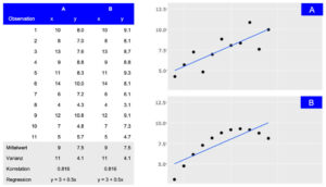
Depiction of two datasets (A and B) that share summary statistics even though the distribution differs. While the tabular view provides detailed information, the visual presentation makes the general association between observations easily accessible.
Customize user experiences
Dashboards and reports can be highly customized to meet the specific needs of different user groups. A well-designed frontend allows users to interact with the data in a way that is most relevant to their requirements, enabling them to gain insights more quickly and effectively.
Enable informed decision-making
By presenting results from Machine Learning models and outcomes of explainable AI methods via an easy-to-understand frontend, users receive a clear and understandable representation of data insights, facilitating informed decisions. This is especially important in industries like financial trading or smart cities, where real-time insights can drive optimization and competitive advantage.
Four stages from ideation to a first prototype
When dealing with data science models and results, the frontend is the part of the application with which users will interact. Therefore, it should be clear that building a useful and productive frontend will take time and effort. Before the actual development, it is crucial to define the purpose and goals of the application. To identify and prioritize these requirements, multiple iterations of brainstorming and feedback sessions are needed. During these sessions, the frontend will travers from a simple sketch over a wireframe and mockup to the first prototype.
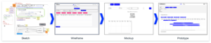
Sketch
The first stage involves creating a rough sketch of the frontend. It includes identifying the different components and how they might look. To create a sketch, it is helpful to have a planning session, where the functional requirements and visual ideas are clarified and shared. During this session, a first sketch is created with simple tools like an online whiteboard (e.g., Miro) or even pen and paper can be sufficient.
Wireframe
When the sketching is done, the individual parts of the application need to be connected to understand their interactions and how they will work together. This is an important stage as potential problems can be identified before the development process starts. Wireframes showcase the usage from a user’s point of view and incorporate the application’s requirements. They can also be created on a Miro board or with tools like Figma.
Mockup
After the sketching and wireframe stage, the next step is to create a mockup of the frontend. This involves creating a visually appealing design that is easy to use and understand. With tools like Figma, mockups can be quickly created, and they also provide an interactive demo that can showcase the interaction within the frontend. At this stage, it is important to ensure that the design is consistent with the company’s brand and style guidelines, because first impressions tend to stick.
Prototype
Once the mockup is complete, it is time to build a working prototype of the frontend and connect it to the backend infrastructure. To ensure scalability later, the used framework and the given infrastructure need to be evaluated. This decision will impact the tools used for this stage and will be discussed in the following sections.
There are many Options for Frontend Development
Most data scientists are familiar with R or Python. Therefore, the first go-to solutions to develop frontend applications like dashboards are often R Shiny, Dash, or streamlit. These tools have the advantage that data preparation and model calculation steps can be implemented within the same framework as the dashboard. Visualizations are closely linked to the used data and models and changes can often be integrated by the same developer. For some projects this might be enough, but as soon as a certain threshold of scalability is reached it becomes beneficial to separate backend model calculation and frontend user interactions.
Though it is possible to implement this kind of separation in R or Python frameworks, under the hood, these libraries translate their output into files that the browser can process, like HTML, CSS or JavaScript. By using JavaScript directly with the relevant libraries, the developers gain more flexibility and adjustability. Some good examples that offer a wide range of visualizations are D3.js, Sigma.js or Plotly.js with which richer user interface with modern and visually appealing designs can be created.
That being said, the range of JavaScript based frameworks is still vast and growing. The most popular used ones are React, Angular, Vue and Svelte. Comparing them in performance, community and learning curve shows some differences, that in the end depend on the specific use cases and preferences (more details can be found here or here).
Being “the programming language of the Web”, JavaScript has been around for a long time. It’s diverse and versatile ecosystem with the advantages mentioned above is proof of that. Not only do the directly used libraries play a part in this, but also the wide and powerful range of developer tools that exist, which make the lives of developers easier.
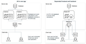
Considerations for the Backend Architecture
Next to the ideation the questions about the development framework and infrastructure need to be answered. Combining the visualizations (frontend) with the data logic (backend) in one application has both pros and cons.
One approach is to use highly opinionated technologies such as R Shiny or Python’s Dash, where both frontend and backend are developed together in the same application. This has the advantage of making it easier to integrate data analysis and visualization into a web application. It helps users to interact with data directly through a web browser and view visualizations in real-time. Especially R Shiny offers a wide range of packages for data science and visualization that can be easily integrated into a web application, making it a popular choice for developers working in data science.
On the other hand, separating the frontend and backend using different frameworks like Node.js and Python provides more flexibility and control over the application development process. Frontend frameworks like Vue and React offer a wide range of features and libraries for building intuitive user interfaces and interactions, while backend frameworks like Express.js, Flask and Django provide robust tools for building stable and scalable server-side code. This approach allows developers to choose the best tools for each aspect of the application, which can result in better performance, easier maintenance, and more customizability. However, it can also add complexity to the development process and requires more coordination between frontend and backend developers.
Hosting a JavaScript-based frontend offers several advantages over hosting an R Shiny or Python Dash application. JavaScript frameworks like React, Angular, or Vue.js provide high-performance rendering and scalability, allowing for complex UI components and large-scale applications. These frameworks also offer more flexibility and customization options for creating custom UI elements and implementing complex user interactions. Furthermore, JavaScript-based frontends are cross-platform compatible, running on web browsers, desktop applications, and mobile apps, making them more versatile. Lastly, JavaScript is the language of the web, enabling easier integration with existing technology stacks. Ultimately, the choice of technology depends on the specific use case, development team expertise, and application requirements.
Conclusion
Building a frontend for a data science application is crucial in effectively communicating insights to the end-users. It helps to present the data in an easily digestible manner and enables the users to make informed decisions. To ensure that the needs and requirements are utilized correctly and efficiently, the right framework and infrastructure must be evaluated. We suggest that solutions in R or Python are a good starting point, but applications in JavaScript might scale better in the long run.
If you are looking to build a frontend for your data science application, feel free to contact our team of experts who can guide you through the process and provide the necessary support to bring your visions to life.
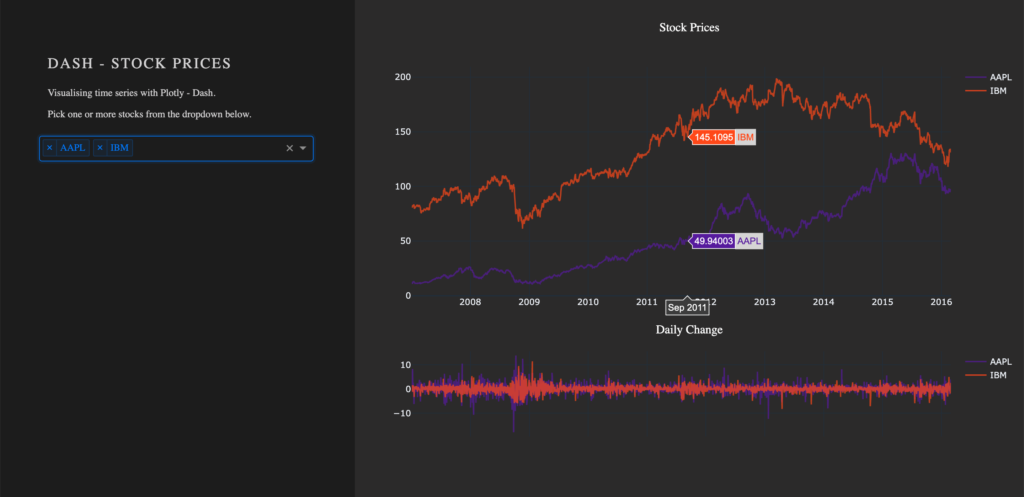
From my experience here at STATWORX, the best way to learn something is by trying it out yourself – with a little help from a friend! In this article, I will focus on giving you a hands-on guide on how to build a dashboard in Python. As a framework, we will be using Dash, and the goal is to create a basic dashboard with a dropdown and two reactive graphs:
Developed as an open-source library by Plotly, the Python framework Dash is built on top of Flask, Plotly.js, and React.js. Dash allows the building of interactive web applications in pure Python and is particularly suited for sharing insights gained from data.
In case you’re interested in interactive charting with Python, I highly recommend my colleague Markus’ blog post Plotly – An Interactive Charting Library
For our purposes, a basic understanding of HTML and CSS can be helpful. Nevertheless, I will provide you with external resources and explain every step thoroughly, so you’ll be able to follow the guide.
The source code can be found on GitHub.
Prerequisites
The project comprises a style sheet called style.css, sample stock data stockdata2.csv and the actual Dash application app.py
Load the Stylesheet
If you want your dashboard to look like the one above, please download the file style.css from our STATWORX GitHub. That is completely optional and won’t affect the functionalities of your app. Our stylesheet is a customized version of the stylesheet used by the Dash Uber Rides Demo. Dash will automatically load any .css-file placed in a folder named assets.
dashapp
    |--assets
        |-- style.css
    |--data
        |-- stockdata2.csv
    |-- app.py
The documentation on external resources in dash can be found here.
Load the Data
Feel free to use the same data we did (stockdata2.csv), or any pick any data with the following structure:
| date | stock | value | change |
|---|---|---|---|
| 2007-01-03 | MSFT | 23.95070 | -0.1667 |
| 2007-01-03 | IBM | 80.51796 | 1.0691 |
| 2007-01-03 | SBUX | 16.14967 | 0.1134 |
import pandas as pd

# Load data
df = pd.read_csv('data/stockdata2.csv', index_col=0, parse_dates=True)
df.index = pd.to_datetime(df['Date'])
Getting Started – How to start a Dash app
After installing Dash (instructions can be found here), we are ready to start with the application. The following statements will load the necessary packages dash and dash_html_components. Without any layout defined, the app won’t start. An empty html.Div will suffice to get the app up and running.
import dash
import dash_html_components as html
If you have already worked with the WSGI web application framework Flask, the next step will be very familiar to you, as Dash uses Flask under the hood.
# Initialise the app
app = dash.Dash(__name__)

# Define the app
app.layout = html.Div()
# Run the app
if __name__ == '__main__':
    app.run_server(debug=True)
How a .css-files changes the layout of an app
The module dash_html_components provides you with several html components, also check out the documentation.
Worth to mention is that the nesting of components is done via the children attribute.
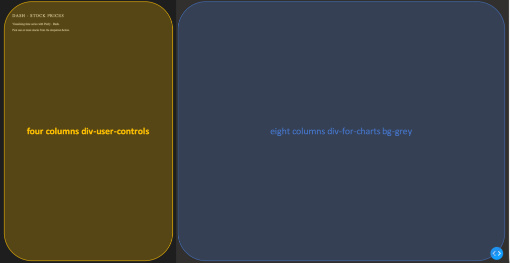
app.layout = html.Div(children=[
                      html.Div(className='row',  # Define the row element
                               children=[
                                  html.Div(className='four columns div-user-controls'),  # Define the left element
                                  html.Div(className='eight columns div-for-charts bg-grey')  # Define the right element
                                  ])
                                ])
The first html.Div() has one child. Another html.Div named row, which will contain all our content. The children of row are four columns div-user-controls and eight columns div-for-charts bg-grey.
The style for these div components come from our style.css.
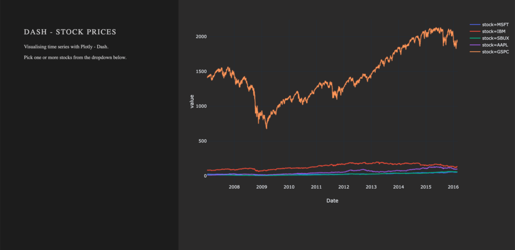
Now let’s first add some more information to our app, such as a title and a description. For that, we use the Dash Components H2 to render a headline and P to generate html paragraphs.
children = [
    html.H2('Dash - STOCK PRICES'),
    html.P('''Visualising time series with Plotly - Dash'''),
    html.P('''Pick one or more stocks from the dropdown below.''')
]
Switch to your terminal and run the app with python app.py.

The basics of an app’s layout
Another nice feature of Flask (and hence Dash) is hot-reloading. It makes it possible to update our app on the fly without having to restart the app every time we make a change to our code.
Running our app with debug=True also adds a button to the bottom right of our app, which lets us take a look at error messages, as well a Callback Graph. We will come back to the Callback Graph in the last section of the article when we’re done implementing the functionalities of the app.
Charting in Dash – How to display a Plotly-Figure
With the building blocks for our web app in place, we can now define a plotly-graph. The function dcc.Graph() from dash_core_components uses the same figure argument as the plotly package. Dash translates every aspect of a plotly chart to a corresponding key-value pair, which will be used by the underlying JavaScript library Plotly.js.
In the following section, we will need the express version of plotly.py, as well as the Package Dash Core Components. Both packages are available with the installation of Dash.
import dash_core_components as dcc
import plotly.express as px
Dash Core Components has a collection of useful and easy-to-use components, which add interactivity and functionalities to your dashboard.
Plotly Express is the express-version of plotly.py, which simplifies the creation of a plotly-graph, with the drawback of having fewer functionalities.
To draw a plot on the right side of our app, add a dcc.Graph() as a child to the html.Div() named eight columns div-for-charts bg-grey. The component dcc.Graph() is used to render any plotly-powered visualization. In this case, it’s figure will be created by px.line() from the Python package plotly.express. As the express version of Plotly has limited native configurations, we are going to change the layout of our figure with the method update_layout(). Here, we use rgba(0, 0, 0, 0) to set the background transparent. Without updating the default background- and paper color, we would have a big white box in the middle of our app. As dcc.Graph() only renders the figure in the app; we can’t change its appearance once it’s created.
dcc.Graph(id='timeseries',
          config={'displayModeBar': False},
          animate=True,
          figure=px.line(df,
                         x='Date',
                         y='value',
                         color='stock',
                         template='plotly_dark').update_layout(
                                   {'plot_bgcolor': 'rgba(0, 0, 0, 0)',
                                    'paper_bgcolor': 'rgba(0, 0, 0, 0)'})
                                    )
After Dash reload the application, you will end up in something like that: A dashboard with a plotted graph:
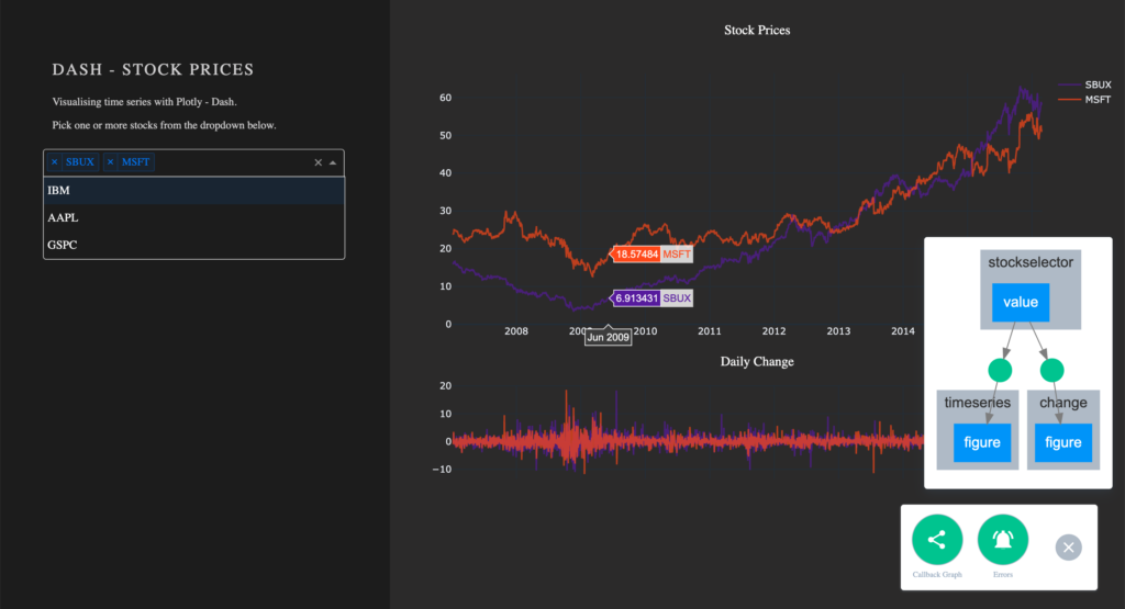
Creating a Dropdown Menu
Another core component is dcc.dropdown(), which is used – you’ve guessed it – to create a dropdown menu. The available options in the dropdown menu are either given as arguments or supplied by a function. For our dropdown menu, we need a function that returns a list of dictionaries. The list contains dictionaries with two keys, label and value. These dictionaries provide the available options to the dropdown menu. The value of label is displayed in our app. The value of value will be exposed for other functions to use, and should not be changed. If you prefer the full name of a company to be displayed instead of the short name, you can do so by changing the value of the key label to Microsoft. For the sake of simplicity, we will use the same value for the keys label and value.
Add the following function to your script, before defining the app’s layout.
# Creates a list of dictionaries, which have the keys 'label' and 'value'.
def get_options(list_stocks):
    dict_list = []
    for i in list_stocks:
        dict_list.append({'label': i, 'value': i})

    return dict_list
With a function that returns the names of stocks in our data in key-value pairs, we can now add dcc.Dropdown() from the Dash Core Components to our app. Add a html.Div() as child to the list of children of four columns div-user-controls, with the argument className=div-for-dropdown. This html.Div() has one child, dcc.Dropdown().
We want to be able to select multiple stocks at the same time and a selected default value, so our figure is not empty on startup. Set the argument multi=True and chose a default stock for value.
 html.Div(className='div-for-dropdown',
          children=[
              dcc.Dropdown(id='stockselector',
                           options=get_options(df['stock'].unique()),
                           multi=True,
                           value=[df['stock'].sort_values()[0]],
                           style={'backgroundColor': '#1E1E1E'},
                           className='stockselector')
                    ],
          style={'color': '#1E1E1E'})
The id and options arguments in dcc.Dropdown() will be important in the next section. Every other argument can be changed. If you want to try out different styles for the dropdown menu, follow the link for a list of different dropdown menus.
Working with Callbacks
How to add interactive functionalities to your app
Callbacks add interactivity to your app. They can take inputs, for example, certain stocks selected via a dropdown menu, pass these inputs to a function and pass the return value of the function to another component. We will write a function that returns a figure based on provided stock names. A callback will pass the selected values from the dropdown to the function and return the figure to a dcc.Grapph() in our app.
At this point, the selected values in the dropdown menu do not change the stocks displayed in our graph. For that to happen, we need to implement a callback. The callback will handle the communication between our dropdown menu 'stockselector' and our graph 'timeseries'. We can delete the figure we have previously created, as we won’t need it anymore.
We want two graphs in our app, so we will add another dcc.Graph() with a different id.
- Remove the
figureargument fromdcc.Graph(id='timeseries') - Add another
dcc.Graph()withclassName='change'as child to thehtml.Div()namedeight columns div-for-charts bg-grey.
dcc.Graph(id='timeseries', config={'displayModeBar': False})
dcc.Graph(id='change', config={'displayModeBar': False})
Callbacks add interactivity to your app. They can take Inputs from components, for example certain stocks selected via a dropdown menu, pass these inputs to a function and pass the returned values from the function back to components.
In our implementation, a callback will be triggered when a user selects a stock. The callback uses the value of the selected items in the dropdown menu (Input) and passes these values to our functions update_timeseries() and update_change(). The functions will filter the data based on the passed inputs and return a plotly figure from the filtered data. The callback then passes the figure returned from our functions back to the component specified in the output.
A callback is implemented as a decorator for a function. Multiple inputs and outputs are possible, but for now, we will start with a single input and a single output. We need the class dash.dependencies.Input and dash.dependencies.Output.
Add the following line to your import statements.
from dash.dependencies import Input, OutputInput() and Output() take the id of a component (e.g. in dcc.Graph(id='timeseries') the components id is 'timeseries') and the property of a component as arguments.
Example Callback:
# Update Time Series
@app.callback(Output('id of output component', 'property of output component'),
              [Input('id of input component', 'property of input component')])
def arbitrary_function(value_of_first_input):
    '''
    The property of the input component is passed to the function as value_of_first_input.
    The functions return value is passed to the property of the output component.
    '''
    return arbitrary_output
If we want our stockselector to display a time series for one or more specific stocks, we need a function. The value of our input is a list of stocks selected from the dropdown menu stockselector.
Implementing Callbacks
The function draws the traces of a plotly-figure based on the stocks which were passed as arguments and returns a figure that can be used by dcc.Graph(). The inputs for our function are given in the order in which they were set in the callback. Names chosen for the function’s arguments do not impact the way values are assigned.
Update the figure time series:
@app.callback(Output('timeseries', 'figure'),
              [Input('stockselector', 'value')])
def update_timeseries(selected_dropdown_value):
    ''' Draw traces of the feature 'value' based one the currently selected stocks '''
    # STEP 1
    trace = []
    df_sub = df
    # STEP 2
    # Draw and append traces for each stock
    for stock in selected_dropdown_value:
        trace.append(go.Scatter(x=df_sub[df_sub['stock'] == stock].index,
                                 y=df_sub[df_sub['stock'] == stock]['value'],
                                 mode='lines',
                                 opacity=0.7,
                                 name=stock,
                                 textposition='bottom center'))
    # STEP 3
    traces = [trace]
    data = [val for sublist in traces for val in sublist]
    # Define Figure
    # STEP 4
    figure = {'data': data,
              'layout': go.Layout(
                  colorway=["#5E0DAC", '#FF4F00', '#375CB1', '#FF7400', '#FFF400', '#FF0056'],
                  template='plotly_dark',
                  paper_bgcolor='rgba(0, 0, 0, 0)',
                  plot_bgcolor='rgba(0, 0, 0, 0)',
                  margin={'b': 15},
                  hovermode='x',
                  autosize=True,
                  title={'text': 'Stock Prices', 'font': {'color': 'white'}, 'x': 0.5},
                  xaxis={'range': [df_sub.index.min(), df_sub.index.max()]},
              ),

              }

    return figure
STEP 1
- A
tracewill be drawn for each stock. Create an emptylistfor each trace from the plotly figure.
STEP 2
Within the for-loop, a trace for a plotly figure will be drawn with the function go.Scatter().
- Iterate over the stocks currently selected in our dropdown menu, draw a trace, and append that trace to our list from step 1.
STEP 3
- Flatten the traces
STEP 4
Plotly figures are dictionaries with the keys data and layout. The value of data is our flattened list with the traces we have drawn. The layout is defined with the plotly class go.Layout().
- Add the trace to our figure
- Define the layout of our figure
Now we simply repeat the steps above for our second graph. Just change the data for our y-Axis to change and slightly adjust the layout.
Update the figure change:
@app.callback(Output('change', 'figure'),
              [Input('stockselector', 'value')])
def update_change(selected_dropdown_value):
    ''' Draw traces of the feature 'change' based one the currently selected stocks '''
    trace = []
    df_sub = df
    # Draw and append traces for each stock
    for stock in selected_dropdown_value:
        trace.append(go.Scatter(x=df_sub[df_sub['stock'] == stock].index,
                                 y=df_sub[df_sub['stock'] == stock]['change'],
                                 mode='lines',
                                 opacity=0.7,
                                 name=stock,
                                 textposition='bottom center'))
    traces = [trace]
    data = [val for sublist in traces for val in sublist]
    # Define Figure
    figure = {'data': data,
              'layout': go.Layout(
                  colorway=["#5E0DAC", '#FF4F00', '#375CB1', '#FF7400', '#FFF400', '#FF0056'],
                  template='plotly_dark',
                  paper_bgcolor='rgba(0, 0, 0, 0)',
                  plot_bgcolor='rgba(0, 0, 0, 0)',
                  margin={'t': 50},
                  height=250,
                  hovermode='x',
                  autosize=True,
                  title={'text': 'Daily Change', 'font': {'color': 'white'}, 'x': 0.5},
                  xaxis={'showticklabels': False, 'range': [df_sub.index.min(), df_sub.index.max()]},
              ),
              }

    return figure
Run your app again. You are now able to select one or more stocks from the dropdown. For each selected item, a line plot will be generated in the graph. By default, the dropdown menu has search functionalities, which makes the selection out of many available options an easy task.
Visualize Callbacks – Callback Graph
With the callbacks in place and our app completed, let’s take a quick look at our callback graph. If you are running your app with debug=True, a button will appear in the bottom right corner of the app. Here we have access to a callback graph, which is a visual representation of the callbacks which we have implemented in our code. The graph shows that our components timeseries and change display a figure based on the value of the component stockselector. If your callbacks don’t work how you expect them to, especially when working on larger and more complex apps, this tool will come in handy.
Conclusion
Let’s recap the most important building blocks of Dash. Getting the App up and running requires just a couple lines of code. A basic understanding of HTML and CSS is enough to create a simple Dash dashboard. You don’t have to worry about creating interactive charts, Plotly already does that for you. Making your dashboard reactive is done via Callbacks, which are functions with the users’ interaction as the input.
If you liked this blog, feel free to contact me via LinkedIn or Email. I am curious to know what you think and always happy to answer any questions about data, my journey to data science, or the exciting things we do here at STATWORX.
Thank you for reading!
At STATWORX, deploying our project results with the help of Shiny has become part of our daily business. Shiny is a great way of letting users interact with their own data and the data science products that we provide.
Applying the philosophy of reactivity to your app’s UI is an interesting way of bringing your apps closer in line with the spirit of the Shiny package. Shiny was designed to be reactive, so why limit this to only the server-side of your app? Introducing dynamic UI elements to your apps will help you reduce visual clutter, make for cleaner code and enhance the overall feel of your applications.
I have previously discussed the advantages of using renderUI in combination with lapply and do.call in the first part of this series on dynamic UI elements in Shiny. Building onto this I would like to expand our toolbox for reactive UI design with a few more options.
The objective
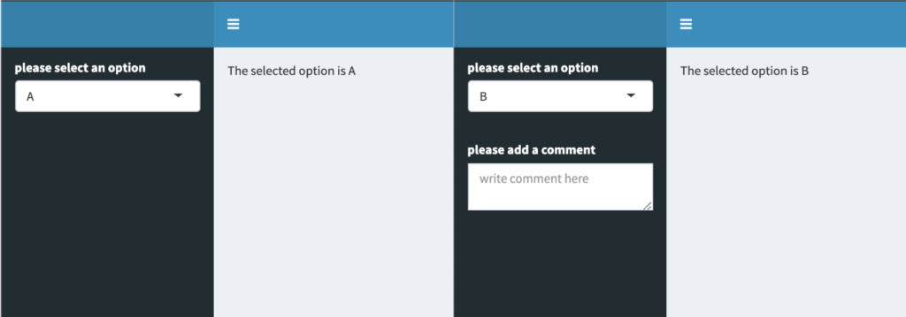
In this particular case, we’re trying to build an app where one of the inputs reacts to another input dynamically. Let’s assume we’d like to present the user with multiple options to choose from in the shape of a selectInput. Let’s also assume that one of the options may call for more input from the user, let’s say a comment, to explain more clearly the previous selection. One way to do this would be to add a static textInput or similar to the app. A much more elegant solution would be to conditionally render the second input to only appear if the proper option had been selected. The image below shows how this would look in practice.
There are multiple ways of going about this in Shiny. I’d like to introduce two of them to you, both of which lead to the same result but with a few key differences between them.
A possible solution: req
What req is usually used for
req is a function from the Shiny package whose purpose is to check whether certain requirements are met before proceeding with your calculations inside a reactive environment. Usually this is used to avoid red error messages popping up in your ShinyApp UI when an element of your app depends on an input that doesn’t have a set value yet. You may have seen one of these before:

These errors usually disappear once you have assigned a value to the needed inputs. req makes it so that your desired output is only calculated once its required inputs have been set, thus offering an elegant way to avoid the rather garish-looking error messages in your app’s UI.
How we can make use of req
In terms of reactive UI design, we can make use of req‘s functionality to introduce conditional statements to our uiOutputs. This is achieved by using renderUI and req in combination as shown in the following example:
output$conditional_comment <- renderUI({
    # specify condition
    req(input$select == "B")

    # execute only if condition is met
    textAreaInput(inputId = "comment",
                  label = "please add a comment",
                  placeholder = "write comment here")
  })
Within req the condition to be met is specified and the rest of the code inside the reactive environment created by renderUI is only executed if that condition is met. What is nice about this solution is that if the condition has not been met there will be no red error messages or other visual clutter popping up in your app, just like what we’ve seen at the beginning of this chapter.
A simple example app
Here’s the complete code for a small example app:
library(shiny)
library(shinydashboard)

ui <- dashboardPage(

  dashboardHeader(),
  dashboardSidebar(
    selectInput(inputId = "select",
                label = "please select an option",
                choices = LETTERS[1:3]),
    uiOutput("conditional_comment")
  ),
  dashboardBody(
    uiOutput("selection_text"),
    uiOutput("comment_text")
  )
)

server <- function(input, output) {

  output$selection_text <- renderUI({
    paste("The selected option is", input$select)
  })

  output$conditional_comment <- renderUI({
    req(input$select == "B")
    textAreaInput(inputId = "comment",
                  label = "please add a comment",
                  placeholder = "write comment here")
  })

  output$comment_text <- renderText({
    input$comment
  })
}

shinyApp(ui = ui, server = server)
If you try this out by yourself you will find that the comment box isn’t hidden or disabled when it isn’t being shown, it simply doesn’t exist unless the selectInput takes on the value of “B”. That is because the uiOutput object containing the desired textAreaInput isn’t being rendered unless the condition stated inside of req is satisfied.
The popular choice: conditionalPanel
Out of all the tools available for reactive UI design this is probably the most widely used. The results obtained with conditionalPanel are quite similar to what req allowed us to do in the example above, but there are a few key differences.
How does this differ from req?
conditionalPanel was designed to specifically enable Shiny-programmers to conditionally show or hide UI elements. Unlike the req-method, conditionalPanel is evaluated within the UI-part of the app, meaning that it doesn’t rely on renderUI to conditionally render the various inputs of the shinyverse. But wait, you might ask, how can Shiny evaluate any conditions in the UI-side of the app? Isn’t that sort of thing always done in the server-part? Well yes, that is true if the expression is written in R. To get around this, conditionalPanel relies on JavaScript to evaluate its conditions. After stating the condition in JS we can add any given UI-elements to our conditionalPanel as shown below:
conditionalPanel(
      # specify condition
      condition = "input.select == 'B'",

      # execute only if condition is met
      textAreaInput(inputId = "comment",
                    label = "please add a comment",
                    placeholder = "write comment here")
    )
This code chunk displays the same behavior as the example shown in the last chapter with one major difference: It is now part of our ShinyApp’s UI-function unlike the req-solution, which was a uiOutput calculated in the server part of the app and later passed to our UI-function as a list element.
A simple example app:
Rewriting the app to include conditionalPanel instead of req yields a script that looks something like this:
library(shiny)
library(shinydashboard)

ui <- dashboardPage(

  dashboardHeader(),
  dashboardSidebar(
    selectInput(inputId = "select",
                label = "please select an option",
                choices = LETTERS[1:3]),
    conditionalPanel(
      condition = "input.select == 'B'",
      textAreaInput(inputId = "comment",
                    label = "please add a comment",
                    placeholder = "write comment here")
    )
  ),
  dashboardBody(
    uiOutput("selection_text"),
    textOutput("comment_text")
    )
)

server <- function(input, output) {

  output$selection_text <- renderUI({
    paste("The selected option is", input$select)
  })

  output$comment_text <- renderText({
    input$comment
  })
}

shinyApp(ui = ui, server = server)
With these two simple examples, we have demonstrated multiple ways of letting your displayed UI elements react to how a user interacts with your app – both on the server, as well as the UI side of the application. In order to keep things simple, I have used a basic textAreaInput for this demonstration, but both renderUI and conditionalPanel can hold so much more than just a simple input element.
So get creative and utilize these tools, maybe even in combination with the functions from part 1 of this series, to make your apps even shinier!
At STATWORX, we regularly deploy our project results with the help of Shiny. It’s not only an easy way of letting potential users interact with your R-code, but it’s also fun to design a good-looking app.
One of Shiny’s biggest strengths is its inherent reactivity after all being reactive to user input is a web-applications prime purpose. Unfortunately, many apps seem to only make use of Shiny’s responsiveness on the server-side while keeping the UI completely static. This doesn’t have to be necessarily bad. Some apps wouldn’t profit from having dynamic UI elements. Adding them regardless could result in the app feeling gimmicky. But in many cases adding reactivity to the UI can not only result in less clutter on the screen but also cleaner code. And we all like that, don’t we?
A toolbox for reactivity: renderUI
Shiny natively provides convenient tools to turn the UI of any app reactive to input. In today’s blog entry, we are namely going to look at the renderUI function in conjunction with lapply and do.call.
renderUI is helpful because it frees us from the chains of having to define what kind of object we’d like to render in our render function. renderUI can render any UI element. We could, for example, let the type of the content of our uiOutput be reactive to input instead of being set in stone.
Introducing reactivity with lapply
Imagine a situation where you’re tasked with building a dashboard showing the user three different KPIs for three different countries. The most obvious approach would be to specify the position of each KPI-box on the UI side of the app and creating each element on the server-side with the help of shinydashboard::renderValueBox as seen in the example below.
The common way
library(shiny)
library(shinydashboard)
ui <- dashboardPage(
dashboardHeader(),
dashboardSidebar(),
dashboardBody(column(width = 4,
fluidRow(valueBoxOutput("ch_1", width = 12)),
fluidRow(valueBoxOutput("jp_1", width = 12)),
fluidRow(valueBoxOutput("ger_1", width = 12))),
column(width = 4,
fluidRow(valueBoxOutput("ch_2", width = 12)),
fluidRow(valueBoxOutput("jp_2", width = 12)),
fluidRow(valueBoxOutput("ger_2", width = 12))),
column(width = 4,
fluidRow(valueBoxOutput("ch_3", width = 12)),
fluidRow(valueBoxOutput("jp_3", width = 12)),
fluidRow(valueBoxOutput("ger_3", width = 12)))
)
)
server <- function(input, output) {
output$ch_1 <- renderValueBox({
valueBox(value = "CH",
subtitle = "Box 1")
})
output$ch_2 <- renderValueBox({
valueBox(value = "CH",
subtitle = "Box 2")
})
output$ch_3 <- renderValueBox({
valueBox(value = "CH",
subtitle = "Box 3",
width = 12)
})
output$jp_1 <- renderValueBox({
valueBox(value = "JP",
subtitle = "Box 1",
width = 12)
})
output$jp_2 <- renderValueBox({
valueBox(value = "JP",
subtitle = "Box 2",
width = 12)
})
output$jp_3 <- renderValueBox({
valueBox(value = "JP",
subtitle = "Box 3",
width = 12)
})
output$ger_1 <- renderValueBox({
valueBox(value = "GER",
subtitle = "Box 1",
width = 12)
})
output$ger_2 <- renderValueBox({
valueBox(value = "GER",
subtitle = "Box 2",
width = 12)
})
output$ger_3 <- renderValueBox({
valueBox(value = "GER",
subtitle = "Box 3",
width = 12)
})
}
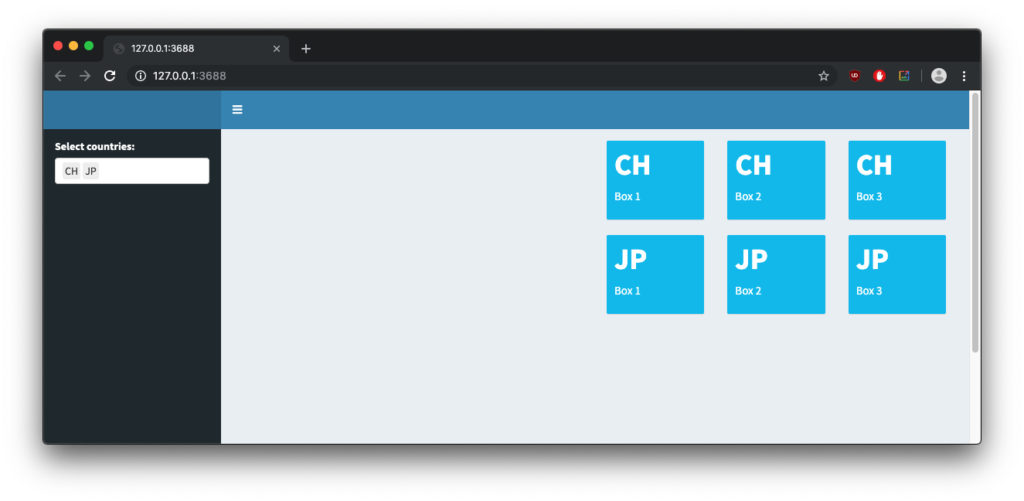
shinyApp(ui = ui, server = server)This might be a working solution to the task at hand, but it is hardly an elegant one. The valueboxes take up a large amount of space in our app and even though they can be resized or moved around, we always have to look at all the boxes, regardless of which ones are currently of interest. The code is also highly repetitive and largely consists of copy-pasted code chunks. A much more elegant solution would be to only show the boxes for each unit of interest (in our case countries) as chosen by the user. Here’s where renderUI comes in.
renderUI not only allows us to render UI objects of any type but also integrates well with the lapply function. This means that we don’t have to render every valuebox separately, but let lapply do this repetitive job for us.
The reactive way
Assuming we have any kind of input named “select” in our app, the following code chunk will generate a valuebox for each element selected with that input. The generated boxes will show the name of each individual element as value and have their subtitle set to “Box 1”.
lapply(seq_along(input$select), function(i) {
      fluidRow(
        valueBox(value = input$select[i],
               subtitle = "Box 1",
               width = 12)
      )
    })
How does this work exactly? The lapply function iterates over each element of our input “select” and executes whatever code we feed it once per element. In our case, that means lapply takes the elements of our input and creates a valuebox embedded in a fluidrow for each (technically it just spits out the corresponding HTML code that would create that).
This has multiple advantages:
- Only boxes for chosen elements are shown, reducing visual clutter and showing what really matters.
- We have effectively condensed 3
renderValueBoxcalls into a singlerenderUIcall, reducing copy-pasted sections in our code.
If we apply this to our app our code will look something like this:
library(shiny)
library(shinydashboard)

ui <- dashboardPage(
  dashboardHeader(),

  dashboardSidebar(
    selectizeInput(
      inputId = "select",
      label = "Select countries:",
      choices = c("CH", "JP", "GER"),
      multiple = TRUE)
  ),

  dashboardBody(column(4, uiOutput("ui1")),
                column(4, uiOutput("ui2")),
                column(4, uiOutput("ui3")))
  )

server <- function(input, output) {

  output$ui1 <- renderUI({
    req(input$select)

    lapply(seq_along(input$select), function(i) {
      fluidRow(
        valueBox(value = input$select[i],
               subtitle = "Box 1",
               width = 12)
        )
    })
  })

  output$ui2 <- renderUI({
    req(input$select)

    lapply(seq_along(input$select), function(i) {
      fluidRow(
        valueBox(value = input$select[i],
               subtitle = "Box 2",
               width = 12)
      )
    })
  })

  output$ui3 <- renderUI({
    req(input$select)

    lapply(seq_along(input$select), function(i) {
      fluidRow(
        valueBox(value = input$select[i],
               subtitle = "Box 3",
               width = 12)
      )
    })
  })
}

shinyApp(ui = ui, server = server)
The UI now dynamically responds to our inputs in the selectizeInput. This means that users can still show all KPI boxes if needed – but they won’t have to. In my opinion, this flexibility is what shiny was designed for – letting users interact with R-code dynamically. We have also effectively cut down on copy-pasted code by 66% already! There is still some repetition in the multiple renderUI function calls, but the server-side of our app is already much more pleasing to read and make sense of than the static example of our previous app.
Beyond lapply: Going further with do.call
We have just seen that with the help of lapply renderUI can dynamically generate entire UI elements. That is, however, not the full extent of what renderUI can do. Individual parts of a UI element can also be generated dynamically if we employ the help of functions that allow us to pass the dynamically generated parts of a UI element as arguments to the function call creating the element. Within the reactive context of renderUI we can call functions at will, which means that we have more tools than just lapply on our hands. Enter do.call. The do.call function enables us to execute function calls by passing a list of arguments to said function. This may sound like function-ception but bear with me.
Following the do.call
Assume that we’d like to create a tabsetPanel, but instead of specifying the number of tabs shown we let the users decide. The solution to this task is a two-step process.
- We use
lapplyto iterate over a user-chosen number to create the specified amount of tabs. - We use
do.callto execute theshiny::tabsetPanelfunction with the tabs from step 1 being passed to thedo.callas a simple argument.
This would look something like this:
# create tabs from input
myTabs <- lapply(1:input$slider, function(i) {

  tabPanel(title = glue("Tab {i}"),
           h3(glue("Content {i}"))
  )
})

# execute tabsetPanel with tabs added as arguments
do.call(tabsetPanel, myTabs)
This creates the HTML for a tabsetPanel with a user-chosen number of tabs that all have a unique title and can be filled with content. You can try it out with this example app:
library(shiny)
library(shinydashboard)
library(glue)

ui <- dashboardPage(
  dashboardHeader(),

  dashboardSidebar(
    sliderInput(inputId = "slider", label = NULL, min = 1, max = 5, value = 3, step = 1)
  ),

  dashboardBody(
    fluidRow(
      box(width = 12,
          p(mainPanel(width = 12,
                      column(width = 6, uiOutput("reference")),
                      column(width = 6, uiOutput("comparison"))
          )
          )
      )
    )
  )
)

server <- function(input, output) {

  output$reference <- renderUI({
    tabsetPanel(
      tabPanel(
        "Reference",
        h3("Reference Content"))
    )
  })

  output$comparison <- renderUI({
    req(input$slider)

    myTabs <- lapply(1:input$slider, function(i) {

      tabPanel(title = glue("Tab {i}"),
               h3(glue("Content {i}"))
      )
    })
    do.call(tabsetPanel, myTabs)
  })
}

shinyApp(ui = ui, server = server)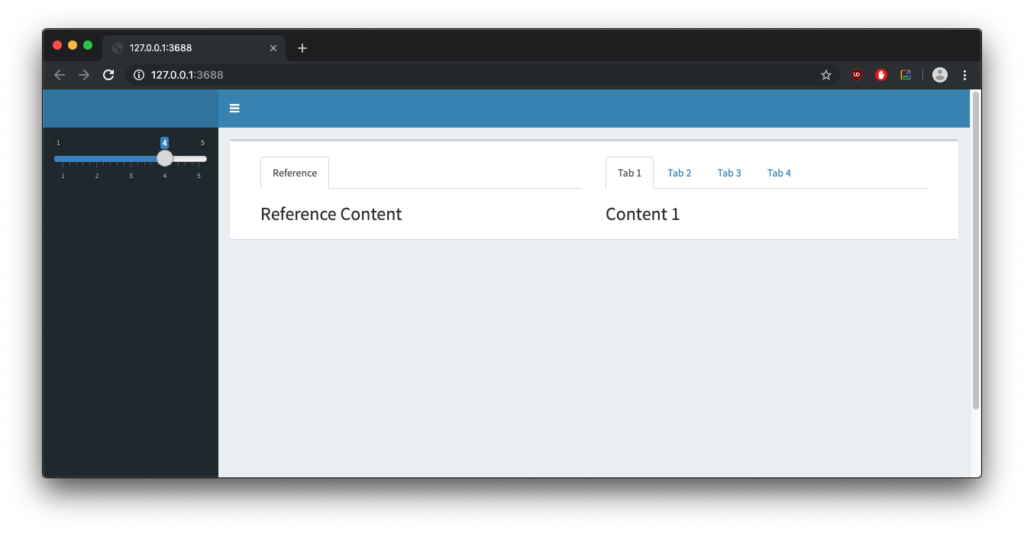
As you can see, renderUI offers a very flexible and dynamic approach to offer to UI design when being used in conjunction with lapply and the more advanced do.call.
Try using these tools next time you build an app and bring the same reactivity to Shiny’s UI as you already used to utilize in its server part.
Introduction
Here at STATWORX, we value reader-friendly presentations of our work. For many R users, the choice is usually a Markdown file that generates a .html or .pdf document, or a Shiny application, which provides users with an easily navigable dashboard.
What if you want to construct a dashboard-style presentation without much hassle? Well, look no further. R Studio’s package flexdashboard gives data scientists a Markdown-based way of easily setting up dashboards without having to resort to full-on front end development. Using Shiny may be a bit too involved when the goal is to present your work in a dashboard.
Why should you learn about flexdashboards ? If you’re familiar with R Markdown and know a bit about Shiny, flexdashboards are easy to learn and give you an alternative to Shiny dashboards.
In this post, you will learn the basics on how to design a flexdashboard. By the end of this article, you’ll be able to :
- build a simple dashboard involving multiple pages
- put tabs on each page and adjust the layout
- integrate widgets
- deploy your Shiny document on ShinyApps.io.
The basic rules
To set up a flexdashboard, install the package from CRAN using the standard command. To get started, enter the following into the console:
rmarkdown::draft(file = "my_dashboard", template = "flex_dashboard", package = "flexdashboard")This function creates a .Rmd file with the name associated file name, and uses the package’s flexdashboard template. Rendering your newly created dashboard, you get a column-oriented layout with a header, one page, and three boxes. By default, the page is divided into columns, and the left-hand column is made to be double the height of the two right-hand boxes.
You can change the layout-orientation to rows and also select a different theme. Adding runtime: shiny to the YAML header allows you to use HTML widgets.
Each row (or column) is created using the ——— header, and the panels themselves are created with a ### header followed by the title of the panel. You can introduce tabsetting for each row by adding the {.tabset} attribute after its name. To add a page, use the (=======) header and put the page name above it. Row height can be modified by using {.data-height = } after a row name if you chose a row-oriented layout. Depending on the layout, it may make sense to use {.data-width = } instead.
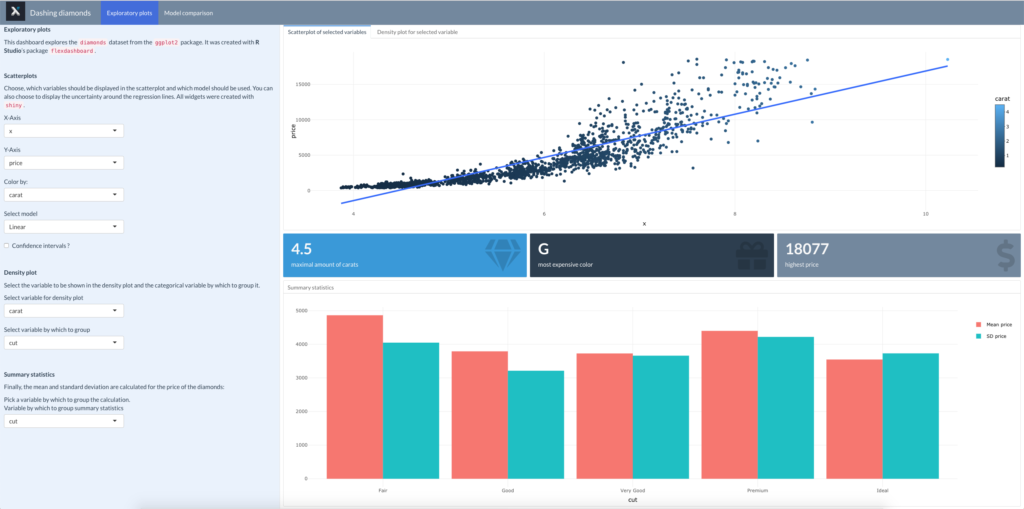
Here, I’ll design a dashboard which explores the famous diamonds dataset, found in the ggplot2 package. While the first page contains some exploratory plots, the second page compares the performance of a linear model and a ridge regression in predicting the price.
This is the skeleton of the dashboard (minus R code and descriptive text):
---
title: "Dashing diamonds"
output:
  flexdashboard::flex_dashboard:
    orientation: rows
    vertical_layout: fill
    css: bootswatch-3.3.5-4/flatly/bootstrap.css
    logo: STATWORX_2.jpg
runtime: shiny
---

Exploratory plots
=======================================================================

Sidebar {.sidebar data-width=700}
-----------------------------------------------------------------------

**Exploratory plots**

<br>

**Scatterplots**

<br>

**Density plot**

<br>

**Summary statistics**

<br>


Row {.tabset}
-----------------------------------------------------------------------

### Scatterplot of selected variables

### Density plot for selected variable

Row
-----------------------------------------------------------------------

### Maximum carats {data-width=50}

### Most expensive color {data-width=50}

### Maximal price {data-width=50}

Row {data-height=500}
-----------------------------------------------------------------------

### Summary statistics {data-width=500}

Model comparison
=======================================================================

Sidebar {.sidebar data-width=700}
-----------------------------------------------------------------------

**Model comparison**

<br>

Row{.tabset}
-----------------------------------------------------------------------

 **Comparison of Predictions and Target**

### Linear Model

### Ridge Regression

Row
-----------------------------------------------------------------------
### Densities of predictions vs. target
The sidebars were added by specifying the attribute {.sidebar} after the name, followed by a page or row header. Page headers (========) create global sidebars, whereas local sidebars are made using row headers (---------). If you choose a global sidebar, it appears on all pages whereas a local sidebar only appears on the page it is put on. In general, it’s a good idea to add the sidebar after the beginning of the page and before the first row of the page. Sidebars are also good for adding descriptions of what your dashboard/application is about. Here I also changed the width using the attribute data-width. That widens the sidebar and makes the description easier to read. You can also display outputs in your sidebar by adding code chunks below it.
Adding interactive widgets
Now that the basic layout is done let’s add some interactivity. Below the description in the sidebar on the first page, I’ve added several widgets.
```{r}
selectInput("x", "X-Axis", choices = names(train_df), selected = "x")
selectInput("y", "Y-Axis", choices = names(train_df), selected = "price")
selectInput("z", "Color by:", choices = names(train_df), selected = "carat")
selectInput("model_type", "Select model", choices = c("LOESS" = "loess", "Linear" = "lm"), selected = "lm")
checkboxInput("se", "Confidence intervals ?")
```Notice that the widgets are identical to those you typically find in a Shiny application and they’ll work because runtime: shiny is specified in the YAML.
To make the plots react to changes in the date selection, you need to specify the input ID’s of your widgets within the appropriate render function. For example, the scatterplot is rendered as a plotly output:
```{r}
renderPlotly({
p <- train_df %>%
ggplot(aes_string(x = input$x, y = input$y, col = input$z)) +
geom_point() +
theme_minimal() +
geom_smooth(method = input$model_type, position = "identity", se = input$se) +
labs(x = input$x, y = input$y)
p %>% ggplotly()
})
```You can use the render functions you would also use in a Shiny application. Of course, you don’t have to use render-functions to display graphics, but they have the advantage of resizing the plots whenever the browser window is resized.
Adding value boxes
Aside from plots and tables, one of the more stylish features of dashboards are value boxes. flexdashboard provides its own function for value boxes, with which you can nicely convey information about key indicators relevant to your work. Here, I’ll add three such boxes displaying the maximal price, the most expensive color of diamonds and the maximal amount of carats found in the dataset.
flexdashboard::valueBox(max(train_df$carat),
                        caption = "maximal amount of carats",
                        color = "info",
                        icon = "fa-gem")
There are multiple sources from which icons can be drawn. In this example, I’ve used the gem icon from font awesome. This code chunk follows a header for what would otherwise be a plot or a table, i.e., a ### header.
Final touches and deployment
To finalize your dashboard, you can add a logo and chose from one of several themes, or attach a CSS file. Here, I’ve added a bootswatch theme and modified the colors slightly. Most themes require the logo to be 48×48 pixels large.
---
title: "Dashing diamonds"
output:
  flexdashboard::flex_dashboard:
    orientation: rows
    vertical_layout: fill
    css: bootswatch-3.3.5-4/flatly/bootstrap.css
    logo: STATWORX_2.jpg
runtime: shiny
---
After creating your dashboard with runtime: shiny, it can be hosted on ShinyApps.io, provided you have an account. You also need to install the package rsconnect. The document can be published with the ‘publish to server’ in RStudio or with:
rsconnect::deployDoc('path')You can use this function after you’ve obtained your account and authorized it using rsconnect::setAccountInfo() with an access token and a secret provided by the website. Make sure that all of the necessary files are part of the same folder. RStudio’s publish to server has the advantage of automatically recognizing the external files your application requires. You can view the example dashboard here and the code on our GitHub page.
Recap
In this post, you’ve learned how to set up a flexdashboard, customize and deploy it – all without knowing JavaScript or CSS, or even much R Shiny. However, what you’ve learned here is only the beginning! This powerful package also allows you to create storyboards, integrate them in a more modularized way with R Shiny and even set up dashboards for mobile devices. We will explore these topics together in future posts. Stay tuned!