My colleague An previously published a chart documenting his journey from Data Science to Data Engineering at statworx. His post showed which skills data engineers require for their daily work. If you are unfamiliar with data engineering, it is a field that revolves around storing, processing, and transferring data in a secure and efficient way.
In this post, I will discuss these skill requirements more in depth. Since there are quite a few topics to learn about, I propose the following order:
- A programming language
- The basics of git & version control
- The UNIX command line
- REST APIs & networking basics
- Database systems
- Containerization
- The cloud
While this may differ from your personal learning experience, I have found this order to be more manageable for beginners. If you’re interested in a brief rundown of key data engineering technologies, you may also appreciate this post by my colleague Andre on this topic.
Learning how to program – which languages do I need?
As in other data related roles, coding is a mandatory skill for data engineers. Besides SQL, data engineers use other programming languages to solve their problems. There are many programming languages that can be used in data engineering, but Python is certainly one of the best options. It has become the lingua franca in data driven jobs, and it’s perfect for executing ETL jobs and writing data pipelines. Not only is the language relatively easy to learn and syntactically elegant, but it also provides integration with tools and frameworks that are critical in data engineering, such as Apache Airflow, Apache Spark, REST APIs and relational database systems like PostgresSQL.
Alongside the programming language, you will probably end up choosing an IDE (Integrated Development Environment). Popular choices for Python are PyCharm and VSCode. Regardless of your choice, your IDE probably will introduce you to the basics of version control, as most IDEs have a graphical interface to use git & version control. Once you are comfortable with the basics, you can learn more about git and version control.
git & version control tools – tracking source code
In an agile team several data engineers typically work on a project. It is therefore important to ensure that all changes to data pipelines and other parts of the code base can be tracked, reviewed, and integrated. This usually means versioning source code in a remote source code management system such as GitHub and ensuring all changes are fully tested prior to production deployments.
I strongly recommend that you learn git on the command line to utilize its full power. Although most IDEs provide interfaces to git, certain features may not be fully available. Furthermore, learning git on the command line provides a good entry point to learn more about shell commands.
The UNIX command line – a fundamental skill
Many of the jobs that run in the cloud or on-premises servers and other frameworks are executed using shell commands and scripts. In these situations, there are no graphical user interfaces, which is why data engineers must be familiar with the command line to edit files, run commands, and navigate the system. Whether its bash, zsh or another shell, being able to write scripts to automate tasks without needing to use a programming language such as Python can be unavoidable, especially on deployment servers. Since command line programs are used in so many different scenarios, they also apply to REST APIs and database systems.
REST APIs & Networks – how services talk to each other
Modern applications are usually not designed as monoliths. Instead, functionalities are often contained in separate modules that run as microservices. This makes the overall architecture more flexible, and the design may evolve more easily, without requiring developers to pull out code from a large application.
How, then, are such modules able to talk to each other? The answer lies in representational State transfer (REST) over a network. The most common protocol, HTTP, is used by services to send and receive data. Learning the basics of how HTTP requests are structured, which HTTP verbs are typically used to accomplish tasks and how to practically implement such functionalities in the programming language of your choice is crucial. Python offers frameworks such as fastAPI and Flask. Check out this article for a concrete example of how to build a REST API with Flask.
Networks also play a key role here since they enable isolation of important systems like databases and REST APIs. Configuring networks can sometimes be necessary, which is why you should know the basics. Once you are familiar with REST APIs, it makes sense to move on to database systems because REST APIs often don’t store data themselves, but instead function as standardized interfaces to access data from a database.
Database systems – organizing data
As a data engineer, you will spend a considerable amount of time operating databases, either to collect, store, transfer, clean, or just consult data. Hence, data engineers must have a good knowledge of database management. This entails being fluent with SQL (Structured Query Language), the basic language to interact with databases, and having expertise with some of the most popular SQL dialects, including MySQL, SQL Server, and PostgreSQL. In addition to relational databases, data engineers need to be familiar with NoSQL (“Not only SQL”) databases, which are rapidly becoming the go-to systems for Big Data and real-time applications. Therefore, although the number of NoSQL engines is on the rise, data engineers should at least understand the difference between NoSQL database types and the use cases for each of them. With databases and REST APIs under your belt, you will need to deploy them somehow. Enter containers.
Containerization – packaging your software
Containerization is the packaging of software code with the operating system (OS) libraries and dependencies required to run the code to create a single lightweight executable—called a container—that runs consistently on any infrastructure. More portable and resource-efficient than virtual machines (VMs), containers have become the de facto compute units of modern cloud-native applications. To get better understanding of how containers make AI solutions scalable, read our whitepaper on containers.
In order to containerize applications, most engineers use docker, an open-source tool for building images and running containers. Packaging code almost always involves command line tools, such as the docker command line interface. But not only applications or REST APIs may be containerized. Data Engineers frequently run data processing tasks in containers to stabilize the runtime environment. Such tasks must be ordered and scheduled, which is where orchestration tools come in.
Orchestration – automating data processing
One of the main roles of data engineers is to create data pipelines with ETL technologies and orchestration frameworks. In this section, we could list many technologies, since the number of frameworks is ever increasing.
Data engineers should know or be comfortable with some of the best known – such as Apache Airflow, a popular orchestration framework for planning, generating, and tracking data pipelines.
Maintaining an instance of such an orchestration framework yourself can be quite cumbersome. As the technology stack grows, maintenance often becomes a full-time job. To alleviate this burden, cloud providers offer readymade solutions.
The cloud – into production without too much maintenance
Among the many cloud providers, it makes sense to pick one of the big three: Amazon Web Services (AWS), Google Cloud Platform (GCP) and Microsoft Azure. All of them offer different services to solve standard data engineering tasks such as ingesting data, scheduling and orchestrating data processing jobs, securely storing data and making it available to business users and data scientists. Due to the plethora of offerings, it makes sense for data engineers to familiarize themselves with the pricing when choosing a solution.
If you have a good understanding of, say, database systems then grasping database systems in the cloud should not be too difficult. However, certain technologies such as Apache Spark on Databricks may be difficult to explore without access to the cloud. In this case, I would recommend setting up an account on the cloud platform of your choice and start experimenting.
High effort, high reward
Let us recap: to become a data engineer, you will need to learn:
- A programming language
- The basics of git & version control
- The UNIX command line
- REST APIs & networking basics
- Database systems
- Containerization
- The cloud
While this seems like a lot to learn, I would urge you not to be discouraged. Virtually all of the skills listed above are transferrable to other roles, so learning them will help you almost regardless of your exact career trajectory. If you have a data science background like me, some of these topics will already be familiar to you. Personally, I find the networking to be the most challenging to grasp, as it is often handled by IT professionals on the client side.
You are probably wondering how to get started in practice. Working on individual projects will help you learn the basics of most of these steps. Common data engineering projects include setting up database systems and orchestrating jobs to regularly update the database. There are many publicly available datasets on kaggle and APIs, such as the coinbase API, from which to pull data for your personal project. You may complete the first steps locally and eventually migrate your project to the cloud.
At statworx, we deal intensively with how to get the best possible results from large language models (LLMs). In this blog post, I present five approaches that have proven successful both in research and in our own work with LLMs. While this text is limited to the manual design of prompts for text generation, image generation and automated prompt search will be the topic of future posts.
Mega models herald new paradigm
The arrival of the revolutionary language model GPT-3 was not only a turning point for the research field of language modeling (NLP) but has incidentally heralded a paradigm shift in AI development: prompt learning. Prior to GPT-3, the standard was fine-tuning of medium-sized language models such as BERT, which, thanks to re-training with new data, would adapt the pre-trained model to the desired use case. Such fine-tuning requires exemplary data for the desired application, as well as the computational capabilities to at least partially re-train the model.
The new large language models such as OpenAI’s GPT-3 and BigScience’s BLOOM, on the other hand, have already been trained by their development teams with such enormous amounts of resources that these models have achieved a new level of independence in their intended use: These LLMs no longer require elaborate fine-tuning to learn their specific purpose, but already produce impressive results using targeted instruction (“prompt”) in natural language.
So, we are in the midst of a revolution in AI development: Thanks to prompt learning, interaction with models no longer takes place via code, but in natural language. This is a giant step forward for the democratization of language modeling. Generating text or, most recently, even creating images requires no more than rudimentary language skills. However, this does not mean that compelling or impressive results are accessible to all. High quality outputs require high quality inputs. For us users, this means that engineering efforts in NLP are no longer focused on model architecture or training data, but on the design of the instructions that models receive in natural language. Welcome to the age of prompt engineering.
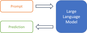
Figure 1: From prompt to prediction with a large language model.
Prompts are more than just snippets of text
Templates facilitate the handling of prompts
Since LLMs have not been trained on a specific use case, it is up to the prompt design to provide the model with the exact task. So-called “prompt templates” are used for this purpose. A template defines the structure of the input that is passed on to the model. Thus, the template takes over the function of fine-tuning and determines the expected output of the model for a specific use case. Using sentiment analysis as an example, a simple prompt template might look like this:
The expressed sentiment in text [X] is: [Z]
The model thus searches for a token z, that, based on the trained parameters and the text in location [X], maximizes the probability of the masked token in location [Z]. The template thus specifies the desired context of the problem to be solved and defines the relationship between the input at position [X] and the output to be predicted at position [Z]. The modular structure of templates enables the systematic processing of a large number of texts for the desired use case.

Figure 2: Prompt templates define the structure of a prompt.
Prompts do not necessarily need examples
The template presented is an example of a so-called “0-Shot” prompt, since there is only an instruction, without any demonstration with examples in the template. Originally, LLMs were called “Few-Shot Learners” by the developers of GPT-3, i.e., models whose performance can be maximized with a selection of solved examples of the problem (Brown et al., 2020). However, a follow-up study showed that with strategic prompt design, 0-shot prompts, without a large number of examples, can achieve comparable performance (Reynolds & McDonell, 2021). Thus, since different approaches are also used in research, the next section presents 5 strategies for effective prompt template design.
5 Strategies for Effective Prompt Design
Task demonstration
In the conventional few-shot setting, the problem to be solved is narrowed down by providing several examples. The solved example cases are supposed to take a similar function as the additional training samples during the fine-tuning process and thus define the specific use case of the model. Text translation is a common example for this strategy, which can be represented with the following prompt template:
French: „Il pleut à Paris“
English: „It’s raining in Paris“
French: „Copenhague est la capitale du Danemark“
English: „Copenhagen is the capital of Denmark“
[…]
French: [X]
English: [Z]
While the solved examples are good for defining the problem setting, they can also cause problems. “Semantic contamination” refers to the phenomenon of the LLM interpreting the content of the translated sentences as relevant to the prediction. Examples in the semantic context of the task produce better results – and those out of context can lead to the prediction Z being “contaminated” in terms of its content (Reynolds & McDonell, 2021). Using the above template for translating complex facts, the model might well interpret the input sentence as a statement about a major European city in ambiguous cases.
Task Specification
Recent research shows that with good prompt design, even the 0-shot approach can yield competitive results. For example, it has been demonstrated that LLMs do not require pre-solved examples at all, as long as the problem is defined as precisely as possible in the prompt (Reynolds & McDonell, 2021). This specification can take different forms, but it is always based on the same idea: to describe as precisely as possible what is to be solved, but without demonstrating how.
A simple example of the translation case would be the following prompt:
Translate from French to English [X]: [Z]
This may already work, but the researchers recommend making the prompt as descriptive as possible and explicitly mentioning translation quality:
A French sentence is provided: [X]. The masterful French translator flawlessly translates the sentence to English: [Z]
This helps the model locate the desired problem solution in the space of the learned tasks.
![]()
Figure 3: A clear task description can greatly increase the forecasting quality.
This is also recommended in use cases outside of translations. A text can be summarized with a simple command:
Summarize the following text: [X]: [Z]
However, better results can be expected with a more concrete prompt:
Rephrase this sentence with easy words so a child understands it,
emphasize practical applications and examples: [X]: [Z]
The more accurate the prompt, the greater the control over the output.
Prompts as constraints
Taken to its logical conclusion, the approach of controlling the model simply means constraining the model’s behavior through careful prompt design. This perspective is useful because during training, LLMs learn to complete many different sorts of texts and can thus solve a wide range of problems. With this design strategy, the basic approach to prompt design changes from describing the problem to excluding undesirable results by constraining model behavior. Which prompt leads to the desired result and only to the desired result? The following prompt indicates a translation task, but beyond that, it does not include any approaches to prevent the sentence from simply being continued into a story by the model.
Translate French to English Il pleut à Paris
One approach to improve this prompt is to use both semantic and syntactic means:
Translate this French sentence to English: “Il pleut à Paris.”
The use of syntactic elements such as the colon and quotation marks makes it clear where the sentence to be translated begins and ends. Also, the specification by sentence expresses that it is only about a single sentence. These measures reduce the likelihood that this prompt will be misunderstood and not treated as a translation problem.
Use of “memetic proxies”
This strategy can be used to increase the density of information in a prompt and avoid long descriptions through culturally understood context. Memetic proxies can be used in task descriptions and use implicitly understood situations or personae instead of detailed instructions:
A primary school teacher rephrases the following sentence: [X]: [Z]
This prompt is less descriptive than the previous example of rephrasing in simple words. However, the situation described contains a much higher density of information: The mentioning of an elementary school teacher already implies that the outcome should be understandable to children and thus hopefully increases the likelihood of practical examples in the output. Similarly, prompts can describe fictional conversations with well-known personalities so that the output reflects their worldview or way of speaking:
In this conversation, Yoda responds to the following question: [X]
Yoda: [Z]
This approach helps to keep prompts short by using implicitly understood context and to increase the information density within a prompt. Memetic proxies are also used in prompt design for other modalities. In image generation models such as DALL-e 2, the suffix “Trending on Artstation” often leads to higher quality results, although semantically no statements are made about the image to be generated.
Metaprompting
Metaprompting is how the research team of one study describes the approach of enriching prompts with instructions that are tailored to the task at hand. They describe this as a way to constrain a model with clearer instructions so that the task at hand can be better accomplished (Reynolds & McDonell, 2021). The following example can help to solve mathematical problems more reliably and to make the reasoning path comprehensible:
[X]. Let us solve this problem step-by-step: [Z]
Similarly, multiple choice questions can be enriched with metaprompts so that the model actually chooses an option in the output rather than continuing the list:
[X] in order to solve this problem, let us analyze each option and choose the best: [Z]
Metaprompts thus represent another means of constraining model behavior and results.
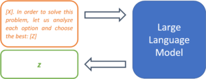
Figure 4: Metaprompts can be used to define procedures for solving problems.
Outlook
Prompt learning is a very young paradigm, and the closely related prompt engineering is still in its infancy. However, the importance of sound prompt writing skills will undoubtedly only increase. Not only language models such as GPT-3, but also the latest image generation models require their users to have solid prompt design skills in order to create convincing results. The strategies presented are both research and practice proven approaches to systematically writing prompts that are helpful for getting better results from large language models.
In a future blog post, we will use this experience with text generation to unlock best practices for another category of generative models: state-of-the-art diffusion models for image generation, such as DALL-e 2, Midjourney, and Stable Diffusion.
Sources
Brown, Tom B. et al. 2020. “Language Models Are Few-Shot Learners.” arXiv:2005.14165 [cs]. http://arxiv.org/abs/2005.14165 (March 16, 2022).
Reynolds, Laria, and Kyle McDonell. 2021. “Prompt Programming for Large Language Models: Beyond the Few-Shot Paradigm.” http://arxiv.org/abs/2102.07350 (July 1, 2022).
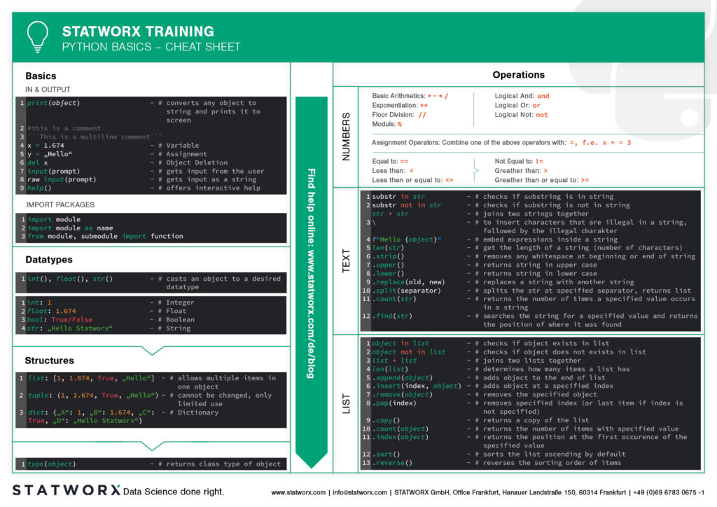
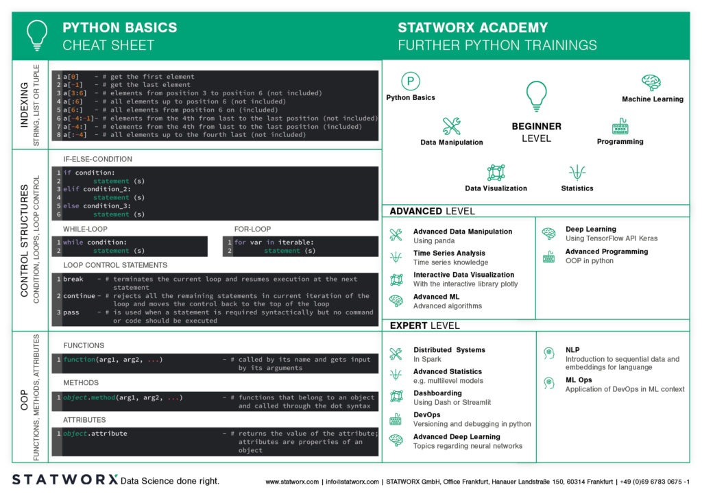
Do you want to learn Python? Or are you an R pro and you regularly miss the important functions and commands when working with Python? Or maybe you need a little reminder from time to time while coding? That’s exactly why cheatsheets were invented!
Cheatsheets help you in all these situations. Our first cheatsheet with Python basics is the start of a new blog series, where more cheatsheets will follow in our unique STATWORX style.
So you can be curious about our series of new Python cheatsheets that will cover basics as well as packages and workspaces relevant to Data Science.
Our cheatsheets are freely available for you to download, without registration or any other paywall.
Why have we created new cheatsheets?
As an experienced R user you will search endlessly for state-of-the-art Python cheatsheets similiar to those known from R Studio.
Sure, there are a lot of cheatsheets for every topic, but they differ greatly in design and content. As soon as we use several cheatsheets in different designs, we have to reorientate ourselves again and again and thus lose a lot of time in total. For us as data scientists it is important to have uniform cheatsheets where we can quickly find the desired function or command.
We want to counteract this annoying search for information. Therefore, we would like to regularly publish new cheatsheets in a design language on our blog in the future – and let you all participate in this work relief.
What does the first cheatsheet contain?
Our first cheatsheet in this series is aimed primarily at Python novices, R users who use Python less often, or peoples who are just starting to use it. It facilitates the introduction and overview in Python.
It makes it easier to get started and get an overview of Python. Basic syntax, data types, and how to use them are introduced, and basic control structures are introduced. This way, you can quickly access the content you learned in our STATWORX Academy, for example, or recall the basics for your next programming project.
What does the STATWORX Cheatsheet Episode 2 cover?
The next cheatsheet will cover the first step of a data scientist in a new project: Data Wrangling. Also, you can expect a cheatsheet for pandas about data loading, selection, manipulation, aggregation and merging. Happy coding!
Did you ever want to make your machine learning model available to other people, but didn’t know how? Or maybe you just heard about the term API, and want to know what’s behind it? Then this post is for you!
Here at STATWORX, we use and write APIs daily. For this article, I wrote down how you can build your own API for a machine learning model that you create and the meaning of some of the most important concepts like REST. After reading this short article, you will know how to make requests to your API within a Python program. So have fun reading and learning!
What is an API?
API is short for Application Programming Interface. It allows users to interact with the underlying functionality of some written code by accessing the interface. There is a multitude of APIs, and chances are good that you already heard about the type of API, we are going to talk about in this blog post: The web API.
This specific type of API allows users to interact with functionality over the internet. In this example, we are building an API that will provide predictions through our trained machine learning model. In a real-world setting, this kind of API could be embedded in some type of application, where a user enters new data and receives a prediction in return. APIs are very flexible and easy to maintain, making them a handy tool in the daily work of a Data Scientist or Data Engineer.
An example of a publicly available machine learning API is Time Door. It provides Time Series tools that you can integrate into your applications. APIs can also be used to make data available, not only machine learning models.
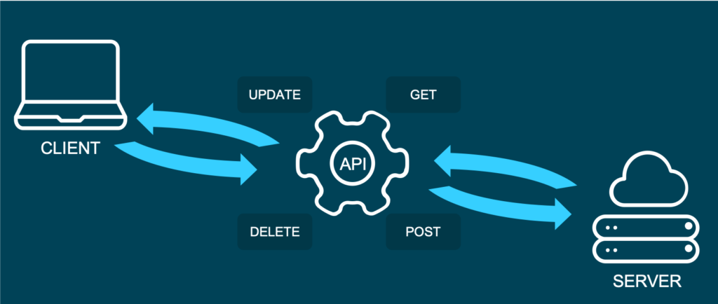
And what is REST?
Representational State Transfer (or REST) is an approach that entails a specific style of communication through web services. When using some of the REST best practices to implement an API, we call that API a “REST API”. There are other approaches to web communication, too (such as the Simple Object Access Protocol: SOAP), but REST generally runs on less bandwidth, making it preferable to serve your machine learning models.
In a REST API, the four most important types of requests are:
- GET
- PUT
- POST
- DELETE
For our little machine learning application, we will mostly focus on the POST method, since it is very versatile, and lots of clients can’t send GET methods.
It’s important to mention that APIs are stateless. This means that they don’t save the inputs you give during an API call, so they don’t preserve the state. That’s significant because it allows multiple users and applications to use the API at the same time, without one user request interfering with another.
The Model
For this How-To-article, I decided to serve a machine learning model trained on the famous iris dataset. If you don’t know the dataset, you can check it out here. When making predictions, we will have four input parameters: sepal length, sepal width, petal length, and finally, petal width. Those will help to decide which type of iris flower the input is.
For this example I used the scikit-learn implementation of a simple KNN (K-nearest neighbor) algorithm to predict the type of iris:
# model.py
from sklearn import datasets
from sklearn.model_selection import train_test_split
from sklearn.neighbors import KNeighborsClassifier
from sklearn.metrics import accuracy_score
from sklearn.externals import joblib
import numpy as np


def train(X,y):

    # train test split
    X_train, X_test, y_train, y_test = train_test_split(X, y, test_size=0.3)

    knn = KNeighborsClassifier(n_neighbors=1)

    # fit the model
    knn.fit(X_train, y_train)
    preds = knn.predict(X_test)
    acc = accuracy_score(y_test, preds)
    print(f'Successfully trained model with an accuracy of {acc:.2f}')

    return knn

if __name__ == '__main__':

    iris_data = datasets.load_iris()
    X = iris_data['data']
    y = iris_data['target']

    labels = {0 : 'iris-setosa',
              1 : 'iris-versicolor',
              2 : 'iris-virginica'}

    # rename integer labels to actual flower names
    y = np.vectorize(labels.__getitem__)(y)

    mdl = train(X,y)

    # serialize model
    joblib.dump(mdl, 'iris.mdl')
As you can see, I trained the model with 70% of the data and then validated with 30% out of sample test data. After the model training has taken place, I serialize the model with the joblib library. Joblib is basically an alternative to pickle, which preserves the persistence of scikit estimators, which include a large number of numpy arrays (such as the KNN model, which contains all the training data). After the file is saved as a joblib file (the file ending thereby is not important by the way, so don’t be confused that some people call it .model or .joblib), it can be loaded again later in our application.
The API with Python and Flask
To build an API from our trained model, we will be using the popular web development package Flask and Flask-RESTful. Further, we import joblib to load our model and numpy to handle the input and output data.
In a new script, namely app.py, we can now set up an instance of a Flask app and an API and load the trained model (this requires saving the model in the same directory as the script):
from flask import Flask
from flask_restful import Api, Resource, reqparse
from sklearn.externals import joblib
import numpy as np

APP = Flask(__name__)
API = Api(APP)

IRIS_MODEL = joblib.load('iris.mdl')
The second step now is to create a class, which is responsible for our prediction. This class will be a child class of the Flask-RESTful class Resource. This lets our class inherit the respective class methods and allows Flask to do the work behind your API without needing to implement everything.
In this class, we can also define the methods (REST requests) that we talked about before. So now we implement a Predict class with a .post() method we talked about earlier.
The post method allows the user to send a body along with the default API parameters. Usually, we want the body to be in JSON format. Since this body is not delivered directly in the URL, but as a text, we have to parse this text and fetch the arguments. The flask _restful package offers the RequestParser class for that. We simply add all the arguments we expect to find in the JSON input with the .add_argument() method and parse them into a dictionary. We then convert it into an array and return the prediction of our model as JSON.
class Predict(Resource):

    @staticmethod
    def post():
        parser = reqparse.RequestParser()
        parser.add_argument('petal_length')
        parser.add_argument('petal_width')
        parser.add_argument('sepal_length')
        parser.add_argument('sepal_width')

        args = parser.parse_args()  # creates dict

        X_new = np.fromiter(args.values(), dtype=float)  # convert input to array

        out = {'Prediction': IRIS_MODEL.predict([X_new])[0]}

        return out, 200
You might be wondering what the 200 is that we are returning at the end: For APIs, some HTTP status codes are displayed when sending requests. You all might be familiar with the famous 404 - page not found code. 200 just means that the request has been received successfully. You basically let the user know that everything went according to plan.
In the end, you just have to add the Predict class as a resource to the API, and write the main function:
API.add_resource(Predict, '/predict')

if __name__ == '__main__':
    APP.run(debug=True, port='1080')
The '/predict' you see in the .add_resource() call, is the so-called API endpoint. Through this endpoint, users of your API will be able to access and send (in this case) POST requests. If you don’t define a port, port 5000 will be the default.
You can see the whole code for the app again here:
# app.py
from flask import Flask
from flask_restful import Api, Resource, reqparse
from sklearn.externals import joblib
import numpy as np

APP = Flask(__name__)
API = Api(APP)

IRIS_MODEL = joblib.load('iris.mdl')


class Predict(Resource):

    @staticmethod
    def post():
        parser = reqparse.RequestParser()
        parser.add_argument('petal_length')
        parser.add_argument('petal_width')
        parser.add_argument('sepal_length')
        parser.add_argument('sepal_width')

        args = parser.parse_args()  # creates dict

        X_new = np.fromiter(args.values(), dtype=float)  # convert input to array

        out = {'Prediction': IRIS_MODEL.predict([X_new])[0]}

        return out, 200


API.add_resource(Predict, '/predict')

if __name__ == '__main__':
    APP.run(debug=True, port='1080')
Run the API
Now it’s time to run and test our API!
To run the app, simply open a terminal in the same directory as your app.py script and run this command.
python run app.pyYou should now get a notification, that the API runs on your localhost in the port you defined. There are several ways of accessing the API once it is deployed. For debugging and testing purposes, I usually use tools like Postman. We can also access the API from within a Python application, just like another user might want to do to use your model in their code.
We use the requests module, by first defining the URL to access and the body to send along with our HTTP request:
import requests

url = 'http://127.0.0.1:1080/predict'  # localhost and the defined port + endpoint
body = {
    "petal_length": 2,
    "sepal_length": 2,
    "petal_width": 0.5,
    "sepal_width": 3
}
response = requests.post(url, data=body)
response.json()
The output should look something like this:
Out[1]: {'Prediction': 'iris-versicolor'}That’s how easy it is to include an API call in your Python code! Please note that this API is just running on your localhost. You would have to deploy the API to a live server (e.g., on AWS) for others to access it.
Conclusion
In this blog article, you got a brief overview of how to build a REST API to serve your machine learning model with a web interface. Further, you now understand how to integrate simple API requests into your Python code. For the next step, maybe try securing your APIs? If you are interested in learning how to build an API with R, you should check out this post. I hope that this gave you a solid introduction to the concept and that you will be building your own APIs immediately. Happy coding!
Introduction
When working on data science projects in R, exporting internal R objects as files on your hard drive is often necessary to facilitate collaboration. Here at STATWORX, we regularly export R objects (such as outputs of a machine learning model) as .RDS files and put them on our internal file server. Our co-workers can then pick them up for further usage down the line of the data science workflow (such as visualizing them in a dashboard together with inputs from other colleagues).
Over the last couple of months, I came to work a lot with RDS files and noticed a crucial shortcoming: The base R saveRDS function does not allow for any kind of archiving of existing same-named files on your hard drive. In this blog post, I will explain why this might be very useful by introducing the basics of serialization first and then showcasing my proposed solution: A wrapper function around the existing base R serialization framework.
Be wary of silent file replacements!
In base R, you can easily export any object from the environment to an RDS file with:
saveRDS(object = my_object, file = "path/to/dir/my_object.RDS")However, including such a line somewhere in your script can carry unintended consequences: When calling saveRDS multiple times with identical file names, R silently overwrites existing, identically named .RDS files in the specified directory. If the object you are exporting is not what you expect it to be — for example due to some bug in newly edited code — your working copy of the RDS file is simply overwritten in-place. Needless to say, this can prove undesirable.
If you are familiar with this pitfall, you probably used to forestall such potentially troublesome side effects by commenting out the respective lines, then carefully checking each time whether the R object looked fine, then executing the line manually. But even when there is nothing wrong with the R object you seek to export, it can make sense to retain an archived copy of previous RDS files: Think of a dataset you run through a data prep script, and then you get an update of the raw data, or you decide to change something in the data prep (like removing a variable). You may wish to archive an existing copy in such cases, especially with complex data prep pipelines with long execution time.
Don’t get tangled up in manual renaming
You could manually move or rename the existing file each time you plan to create a new one, but that’s tedious, error-prone, and does not allow for unattended execution and scalability. For this reason, I set out to write a carefully designed wrapper function around the existing saveRDS call, which is pretty straightforward: As a first step, it checks if the file you attempt to save already exists in the specified location. If it does, the existing file is renamed/archived (with customizable options), and the “updated” file will be saved under the originally specified name.
This approach has the crucial advantage that the existing code that depends on the file name remaining identical (such as readRDS calls in other scripts) will continue to work with the latest version without any needs for adjustment! No more saving your objects as “models_2020-07-12.RDS”, then combing through the other scripts to replace the file name, only to repeat this process the next day. At the same time, an archived copy of the — otherwise overwritten — file will be kept.
What are RDS files anyways?
Before I walk you through my proposed solution, let’s first examine the basics of serialization, the underlying process behind high-level functions like saveRDS.
Simply speaking, serialization is the “process of converting an object into a stream of bytes so that it can be transferred over a network or stored in a persistent storage.” Stack Overflow: What is serialization?
There is also a low-level R interface, serialize, which you can use to explore (un-)serialization first-hand: Simply fire up R and run something like serialize(object = c(1, 2, 3), connection = NULL). This call serializes the specified vector and prints the output right to the console. The result is an odd-looking raw vector, with each byte separately represented as a pair of hex digits. Now let’s see what happens if we revert this process:
s <- serialize(object = c(1, 2, 3), connection = NULL)
print(s)
# >  [1] 58 0a 00 00 00 03 00 03 06 00 00 03 05 00 00 00 00 05 55 54 46 2d 38 00 00 00 0e 00
# > [29] 00 00 03 3f f0 00 00 00 00 00 00 40 00 00 00 00 00 00 00 40 08 00 00 00 00 00 00

unserialize(s)
# > 1 2 3
The length of this raw vector increases rapidly with the complexity of the stored information: For instance, serializing the famous, although not too large, iris dataset results in a raw vector consisting of 5959 pairs of hex digits!
Besides the already mentioned saveRDS function, there is also the more generic save function. The former saves a single R object to a file. It allows us to restore the object from that file (with the counterpart readRDS), possibly under a different variable name: That is, you can assign the contents of a call to readRDS to another variable. By contrast, save allows for saving multiple R objects, but when reading back in (with load), they are simply restored in the environment under the object names they were saved with. (That’s also what happens automatically when you answer “Yes” to the notorious question of whether to “save the workspace image to ~/.RData” when quitting RStudio.)
Creating the archives
Obviously, it’s great to have the possibility to save internal R objects to a file and then be able to re-import them in a clean session or on a different machine. This is especially true for the results of long and computationally heavy operations such as fitting machine learning models. But as we learned earlier, one wrong keystroke can potentially erase that one precious 3-hour-fit fine-tuned XGBoost model you ran and carefully saved to an RDS file yesterday.

Digging into the wrapper
So, how did I go about fixing this? Let’s take a look at the code. First, I define the arguments and their defaults: The object and file arguments are taken directly from the wrapped function, the remaining arguments allow the user to customize the archiving process: Append the archive file name with either the date the original file was archived or last modified, add an additional timestamp (not just the calendar date), or save the file to a dedicated archive directory. For more details, please check the documentation here. I also include the ellipsis ... for additional arguments to be passed down to saveRDS. Additionally, I do some basic input handling (not included here).
save_rds_archive <- function(object,
                             file = "",
                             archive = TRUE,
                             last_modified = FALSE,
                             with_time = FALSE,
                             archive_dir_path = NULL,
                             ...) {
The main body of the function is basically a series of if/else statements. I first check if the archive argument (which controls whether the file should be archived in the first place) is set to TRUE, and then if the file we are trying to save already exists (note that “file” here actually refers to the whole file path). If it does, I call the internal helper function create_archived_file, which eliminates redundancy and allows for concise code.
if (archive) {

    # check if file exists
    if (file.exists(file)) {

      archived_file <- create_archived_file(file = file,
                                            last_modified = last_modified,
                                            with_time = with_time)
Composing the new file name
In this function, I create the new name for the file which is to be archived, depending on user input: If last_modified is set, then the mtime of the file is accessed. Otherwise, the current system date/time (= the date of archiving) is taken instead. Then the spaces and special characters are replaced with underscores, and, depending on the value of the with_time argument, the actual time information (not just the calendar date) is kept or not.
To make it easier to identify directly from the file name what exactly (date of archiving vs. date of modification) the indicated date/time refers to, I also add appropriate information to the file name. Then I save the file extension for easier replacement (note that “.RDS”, “.Rds”, and “.rds” are all valid file extensions for RDS files). Lastly, I replace the current file extension with a concatenated string containing the type info, the new date/time suffix, and the original file extension. Note here that I add a “$” sign to the regex which is to be matched by gsub to only match the end of the string: If I did not do that and the file name would be something like “my_RDS.RDS”, then both matches would be replaced.
# create_archived_file.R

create_archived_file <- function(file, last_modified, with_time) {

  # create main suffix depending on type
  suffix_main <- ifelse(last_modified,
                        as.character(file.info(file)$mtime),
                        as.character(Sys.time()))

  if (with_time) {

    # create clean date-time suffix
    suffix <- gsub(pattern = " ", replacement = "_", x = suffix_main)
    suffix <- gsub(pattern = ":", replacement = "-", x = suffix)

    # add "at" between date and time
    suffix <- paste0(substr(suffix, 1, 10), "_at_", substr(suffix, 12, 19))

  } else {

    # create date suffix
    suffix <- substr(suffix_main, 1, 10)

  }

  # create info to paste depending on type
  type_info <- ifelse(last_modified,
                      "_MODIFIED_on_",
                      "_ARCHIVED_on_")

  # get file extension (could be any of "RDS", "Rds", "rds", etc.)
  ext <- paste0(".", tools::file_ext(file))

  # replace extension with suffix
  archived_file <- gsub(pattern = paste0(ext, "$"),
                        replacement = paste0(type_info,
                                             suffix,
                                             ext),
                        x = file)

  return(archived_file)

}
Archiving the archives?
By way of example, with last_modified = FALSE and with_time = TRUE, this function would turn the character file name “models.RDS” into “models_ARCHIVED_on_2020-07-12_at_11-31-43.RDS”. However, this is just a character vector for now — the file itself is not renamed yet. For this, we need to call the base R file.rename function, which provides a direct interface to your machine’s file system. I first check, however, whether a file with the same name as the newly created archived file string already exists: This could well be the case if one appends only the date (with_time = FALSE) and calls this function several times per day (or potentially on the same file if last_modified = TRUE).
Somehow, we are back to the old problem in this case. However, I decided that it was not a good idea to archive files that are themselves archived versions of another file since this would lead to too much confusion (and potentially too much disk space being occupied). Therefore, only the most recent archived version will be kept. (Note that if you still want to keep multiple archived versions of a single file, you can set with_time = TRUE. This will append a timestamp to the archived file name up to the second, virtually eliminating the possibility of duplicated file names.) A warning is issued, and then the already existing archived file will be overwritten with the current archived version.
The last puzzle piece: Renaming the original file
To do this, I call the file.rename function, renaming the “file” originally passed by the user call to the string returned by the helper function. The file.rename function always returns a boolean indicating if the operation succeeded, which I save to a variable temp to inspect later. Under some circumstances, the renaming process may fail, for instance due to missing permissions or OS-specific restrictions. We did set up a CI pipeline with GitHub Actions and continuously test our code on Windows, Linux, and MacOS machines with different versions of R. So far, we didn’t run into any problems. Still, it’s better to provide in-built checks.
It’s an error! Or is it?
The problem here is that, when renaming the file on disk failed, file.rename raises merely a warning, not an error. Since any causes of these warnings most likely originate from the local file system, there is no sense in continuing the function if the renaming failed. That’s why I wrapped it into a tryCatch call that captures the warning message and passes it to the stop call, which then terminates the function with the appropriate message.
Just to be on the safe side, I check the value of the temp variable, which should be TRUE if the renaming succeeded, and also check if the archived version of the file (that is, the result of our renaming operation) exists. If both of these conditions hold, I simply call saveRDS with the original specifications (now that our existing copy has been renamed, nothing will be overwritten if we save the new file with the original name), passing along further arguments with ....
        if (file.exists(archived_file)) {
          warning("Archived copy already exists - will overwrite!")
        }

        # rename existing file with the new name
        # save return value of the file.rename function
        # (returns TRUE if successful) and wrap in tryCatch
        temp <- tryCatch({file.rename(from = file,
                                      to = archived_file)
        },
        warning = function(e) {
          stop(e)
        })

      }

      # check return value and if archived file exists
      if (temp & file.exists(archived_file)) {
        # then save new file under specified name
        saveRDS(object = object, file = file, ...)
      }

    }
These code snippets represent the cornerstones of my function. I also skipped some portions of the source code for reasons of brevity, chiefly the creation of the “archive directory” (if one is specified) and the process of copying the archived file into it. Please refer to our GitHub for the complete source code of the main and the helper function.
Finally, to illustrate, let’s see what this looks like in action:
x <- 5
y <- 10
z <- 20

## save to RDS
saveRDS(x, "temp.RDS")
saveRDS(y, "temp.RDS")

## "temp.RDS" is silently overwritten with y
## previous version is lost
readRDS("temp.RDS")
#> [1] 10

save_rds_archive(z, "temp.RDS")
## current version is updated
readRDS("temp.RDS")
#> [1] 20

## previous version is archived
readRDS("temp_ARCHIVED_on_2020-07-12.RDS")
#> [1] 10
Great, how can I get this?
The function save_rds_archive is now included in the newly refactored helfRlein package (now available in version 1.0.0!) which you can install directly from GitHub:
# install.packages("devtools")
devtools::install_github("STATWORX/helfRlein")
Feel free to check out additional documentation and the source code there. If you have any inputs or feedback on how the function could be improved, please do not hesitate to contact me or raise an issue on our GitHub.
Conclusion
That’s it! No more manually renaming your precious RDS files — with this function in place, you can automate this tedious task and easily keep a comprehensive archive of previous versions. You will be able to take another look at that one model you ran last week (and then discarded again) in the blink of an eye. I hope you enjoyed reading my post — maybe the function will come in handy for you someday!
In my previous blog post, I have shown you how to run your R-scripts inside a docker container. For many of the projects we work on here at STATWORX, we end up using the RShiny framework to build our R-scripts into interactive applications. Using containerization for the deployment of ShinyApps has a multitude of advantages. There are the usual suspects such as easy cloud deployment, scalability, and easy scheduling, but it also addresses one of RShiny’s essential drawbacks: Shiny creates only a single R session per app, meaning that if multiple users access the same app, they all work with the same R session, leading to a multitude of problems. With the help of Docker, we can address this issue and start a container instance for every user, circumventing this problem by giving every user access to their own instance of the app and their individual corresponding R session.
If you’re not familiar with building R-scripts into a docker image or with Docker terminology, I would recommend you to first read my previous blog post.
So let’s move on from simple R-scripts and run entire ShinyApps in Docker now!
The Setup
Setting up a project
It is highly advisable to use RStudio’s project setup when working with ShinyApps, especially when using Docker. Not only do projects make it easy to keep your RStudio neat and tidy, but they also allow us to use the renv package to set up a package library for our specific project. This will come in especially handy when installing the needed packages for our app to the Docker image.
For demonstration purposes, I decided to use an example app created in a previous blog post, which you can clone from the STATWORX GitHub repository. It is located in the “example-app” subfolder and consists of the three typical scripts used by ShinyApps (global.R, ui.R, and server.R) as well as files belonging to the renv package library. If you choose to use the example app linked above, then you won’t have to set up your own RStudio Project, you can instead open “example-app.Rproj”, which opens the project context I have already set up. If you choose to work along with an app of your own and haven’t created a project for it yet, you can instead set up your own by following the instructions provided by RStudio.
Setting up a package library
The RStudio project I provided already comes with a package library stored in the renv.lock file. If you prefer to work with your own app, you can create your own renv.lock file by installing the renv package from within your RStudio project and executing renv::init(). This initializes renv for your project and creates a renv.lock file in your project root folder. You can find more information on renv over at RStudio’s introduction article on it.
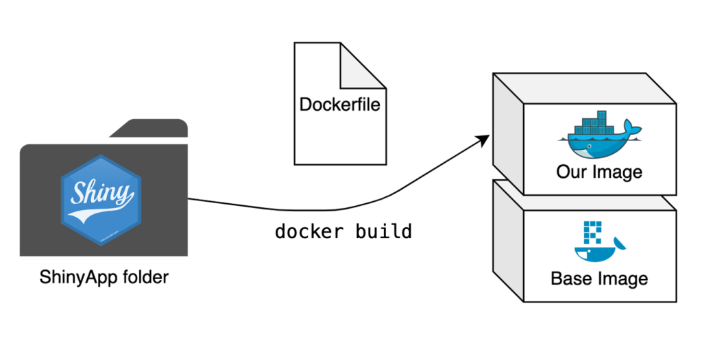
The Dockerfile
The Dockerfile is once again the central piece of creating a Docker image. We now aim to repeat this process for an entire app where we previously only built a single script into an image. The step from a single script to a folder with multiple scripts is small, but there are some significant changes needed to make our app run smoothly.
# Base image https://hub.docker.com/u/rocker/
FROM rocker/shiny:latest

# system libraries of general use
## install debian packages
RUN apt-get update -qq && apt-get -y --no-install-recommends install \
    libxml2-dev \
    libcairo2-dev \
    libsqlite3-dev \
    libmariadbd-dev \
    libpq-dev \
    libssh2-1-dev \
    unixodbc-dev \
    libcurl4-openssl-dev \
    libssl-dev

## update system libraries
RUN apt-get update && \
    apt-get upgrade -y && \
    apt-get clean

# copy necessary files
## renv.lock file
COPY /example-app/renv.lock ./renv.lock
## app folder
COPY /example-app ./app

# install renv & restore packages
RUN Rscript -e 'install.packages("renv")'
RUN Rscript -e 'renv::restore()'

# expose port
EXPOSE 3838

# run app on container start
CMD ["R", "-e", "shiny::runApp('/app', host = '0.0.0.0', port = 3838)"]
The base image
The first difference is in the base image. Because we’re dockerizing a ShinyApp here, we can save ourselves a lot of work by using the rocker/shiny base image. This image handles the necessary dependencies for running a ShinyApp and comes with multiple R packages already pre-installed.
Necessary files
It is necessary to copy all relevant scripts and files for your app to your Docker image, so the Dockerfile does precisely that by copying the entire folder containing the app to the image.
We can also make use of renv to handle package installation for us. This is why we first copy the renv.lock file to the image separately. We also need to install the renv package separately by using the Dockerfile’s ability to execute R-code by prefacing it with RUN Rscript -e. This package installation allows us to then call renv directly and restore our package library inside the image with renv::restore(). Now our entire project package library will be installed in our Docker image, with the exact same version and source of all the packages as in your local development environment. All this with just a few lines of code in our Dockerfile.
Starting the App at Runtime
At the very end of our Dockerfile, we tell the container to execute the following R-command:
shiny::runApp('/app', host = '0.0.0.0', port = 3838)The first argument allows us to specify the file path to our scripts, which in our case is ./app. For the exposed port, I have chosen 3838, as this is the default choice for RStudio Server, but can be freely changed to whatever suits you best.
With the final command in place every container based on this image will start the app in question automatically at runtime (and of course close it again once it’s been terminated).
The Finishing Touches
With the Dockerfile set up we’re now almost finished. All that remains is building the image and starting a container of said image.
Building the image
We open the terminal, navigate to the folder containing our new Dockerfile, and start the building process:
docker build -t my-shinyapp-image . Starting a container
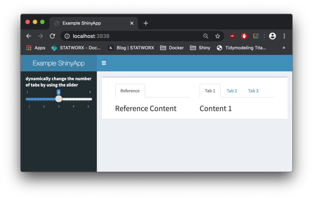
After the building process has finished, we can now test our newly built image by starting a container:
docker run -d --rm -p 3838:3838 my-shinyapp-imageAnd there it is, running on localhost:3838.
Outlook
Now that you have your ShinyApp running inside a Docker container, it is ready for deployment! Having containerized our app already makes this process a lot easier; there are further tools we can employ to ensure state-of-the-art security, scalability, and seamless deployment. Stay tuned until next time, when we’ll go deeper into the full range of RShiny and Docker capabilities by introducing ShinyProxy.
From my experience here at STATWORX, the best way to learn something is by trying it out yourself – with a little help from a friend! In this article, I will focus on giving you a hands-on guide on how to build a dashboard in Python. As a framework, we will be using Dash, and the goal is to create a basic dashboard with a dropdown and two reactive graphs:
Developed as an open-source library by Plotly, the Python framework Dash is built on top of Flask, Plotly.js, and React.js. Dash allows the building of interactive web applications in pure Python and is particularly suited for sharing insights gained from data.
In case you’re interested in interactive charting with Python, I highly recommend my colleague Markus’ blog post Plotly – An Interactive Charting Library
For our purposes, a basic understanding of HTML and CSS can be helpful. Nevertheless, I will provide you with external resources and explain every step thoroughly, so you’ll be able to follow the guide.
The source code can be found on GitHub.
Prerequisites
The project comprises a style sheet called style.css, sample stock data stockdata2.csv and the actual Dash application app.py
Load the Stylesheet
If you want your dashboard to look like the one above, please download the file style.css from our STATWORX GitHub. That is completely optional and won’t affect the functionalities of your app. Our stylesheet is a customized version of the stylesheet used by the Dash Uber Rides Demo. Dash will automatically load any .css-file placed in a folder named assets.
dashapp
    |--assets
        |-- style.css
    |--data
        |-- stockdata2.csv
    |-- app.py
The documentation on external resources in dash can be found here.
Load the Data
Feel free to use the same data we did (stockdata2.csv), or any pick any data with the following structure:
| date | stock | value | change |
|---|---|---|---|
| 2007-01-03 | MSFT | 23.95070 | -0.1667 |
| 2007-01-03 | IBM | 80.51796 | 1.0691 |
| 2007-01-03 | SBUX | 16.14967 | 0.1134 |
import pandas as pd

# Load data
df = pd.read_csv('data/stockdata2.csv', index_col=0, parse_dates=True)
df.index = pd.to_datetime(df['Date'])
Getting Started – How to start a Dash app
After installing Dash (instructions can be found here), we are ready to start with the application. The following statements will load the necessary packages dash and dash_html_components. Without any layout defined, the app won’t start. An empty html.Div will suffice to get the app up and running.
import dash
import dash_html_components as html
If you have already worked with the WSGI web application framework Flask, the next step will be very familiar to you, as Dash uses Flask under the hood.
# Initialise the app
app = dash.Dash(__name__)

# Define the app
app.layout = html.Div()
# Run the app
if __name__ == '__main__':
    app.run_server(debug=True)
How a .css-files changes the layout of an app
The module dash_html_components provides you with several html components, also check out the documentation.
Worth to mention is that the nesting of components is done via the children attribute.
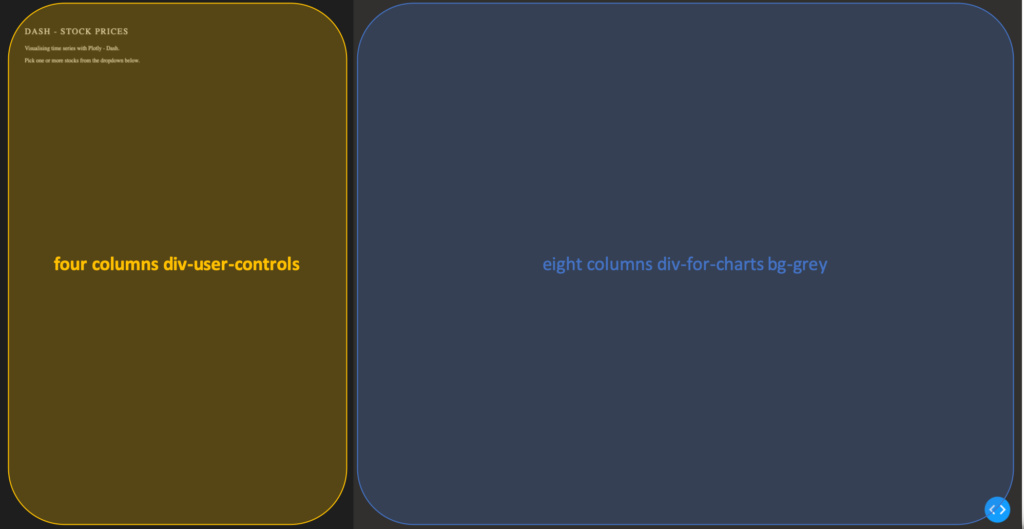
app.layout = html.Div(children=[
                      html.Div(className='row',  # Define the row element
                               children=[
                                  html.Div(className='four columns div-user-controls'),  # Define the left element
                                  html.Div(className='eight columns div-for-charts bg-grey')  # Define the right element
                                  ])
                                ])
The first html.Div() has one child. Another html.Div named row, which will contain all our content. The children of row are four columns div-user-controls and eight columns div-for-charts bg-grey.
The style for these div components come from our style.css.
Now let’s first add some more information to our app, such as a title and a description. For that, we use the Dash Components H2 to render a headline and P to generate html paragraphs.
children = [
    html.H2('Dash - STOCK PRICES'),
    html.P('''Visualising time series with Plotly - Dash'''),
    html.P('''Pick one or more stocks from the dropdown below.''')
]
Switch to your terminal and run the app with python app.py.

The basics of an app’s layout
Another nice feature of Flask (and hence Dash) is hot-reloading. It makes it possible to update our app on the fly without having to restart the app every time we make a change to our code.
Running our app with debug=True also adds a button to the bottom right of our app, which lets us take a look at error messages, as well a Callback Graph. We will come back to the Callback Graph in the last section of the article when we’re done implementing the functionalities of the app.
Charting in Dash – How to display a Plotly-Figure
With the building blocks for our web app in place, we can now define a plotly-graph. The function dcc.Graph() from dash_core_components uses the same figure argument as the plotly package. Dash translates every aspect of a plotly chart to a corresponding key-value pair, which will be used by the underlying JavaScript library Plotly.js.
In the following section, we will need the express version of plotly.py, as well as the Package Dash Core Components. Both packages are available with the installation of Dash.
import dash_core_components as dcc
import plotly.express as px
Dash Core Components has a collection of useful and easy-to-use components, which add interactivity and functionalities to your dashboard.
Plotly Express is the express-version of plotly.py, which simplifies the creation of a plotly-graph, with the drawback of having fewer functionalities.
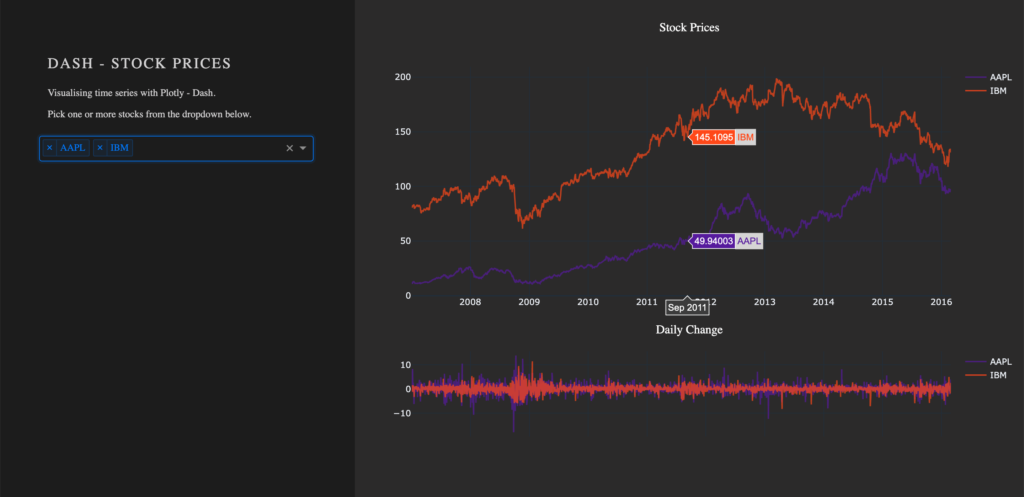
To draw a plot on the right side of our app, add a dcc.Graph() as a child to the html.Div() named eight columns div-for-charts bg-grey. The component dcc.Graph() is used to render any plotly-powered visualization. In this case, it’s figure will be created by px.line() from the Python package plotly.express. As the express version of Plotly has limited native configurations, we are going to change the layout of our figure with the method update_layout(). Here, we use rgba(0, 0, 0, 0) to set the background transparent. Without updating the default background- and paper color, we would have a big white box in the middle of our app. As dcc.Graph() only renders the figure in the app; we can’t change its appearance once it’s created.
dcc.Graph(id='timeseries',
          config={'displayModeBar': False},
          animate=True,
          figure=px.line(df,
                         x='Date',
                         y='value',
                         color='stock',
                         template='plotly_dark').update_layout(
                                   {'plot_bgcolor': 'rgba(0, 0, 0, 0)',
                                    'paper_bgcolor': 'rgba(0, 0, 0, 0)'})
                                    )
After Dash reload the application, you will end up in something like that: A dashboard with a plotted graph:
Creating a Dropdown Menu
Another core component is dcc.dropdown(), which is used – you’ve guessed it – to create a dropdown menu. The available options in the dropdown menu are either given as arguments or supplied by a function. For our dropdown menu, we need a function that returns a list of dictionaries. The list contains dictionaries with two keys, label and value. These dictionaries provide the available options to the dropdown menu. The value of label is displayed in our app. The value of value will be exposed for other functions to use, and should not be changed. If you prefer the full name of a company to be displayed instead of the short name, you can do so by changing the value of the key label to Microsoft. For the sake of simplicity, we will use the same value for the keys label and value.
Add the following function to your script, before defining the app’s layout.
# Creates a list of dictionaries, which have the keys 'label' and 'value'.
def get_options(list_stocks):
    dict_list = []
    for i in list_stocks:
        dict_list.append({'label': i, 'value': i})

    return dict_list
With a function that returns the names of stocks in our data in key-value pairs, we can now add dcc.Dropdown() from the Dash Core Components to our app. Add a html.Div() as child to the list of children of four columns div-user-controls, with the argument className=div-for-dropdown. This html.Div() has one child, dcc.Dropdown().
We want to be able to select multiple stocks at the same time and a selected default value, so our figure is not empty on startup. Set the argument multi=True and chose a default stock for value.
 html.Div(className='div-for-dropdown',
          children=[
              dcc.Dropdown(id='stockselector',
                           options=get_options(df['stock'].unique()),
                           multi=True,
                           value=[df['stock'].sort_values()[0]],
                           style={'backgroundColor': '#1E1E1E'},
                           className='stockselector')
                    ],
          style={'color': '#1E1E1E'})
The id and options arguments in dcc.Dropdown() will be important in the next section. Every other argument can be changed. If you want to try out different styles for the dropdown menu, follow the link for a list of different dropdown menus.
Working with Callbacks
How to add interactive functionalities to your app
Callbacks add interactivity to your app. They can take inputs, for example, certain stocks selected via a dropdown menu, pass these inputs to a function and pass the return value of the function to another component. We will write a function that returns a figure based on provided stock names. A callback will pass the selected values from the dropdown to the function and return the figure to a dcc.Grapph() in our app.
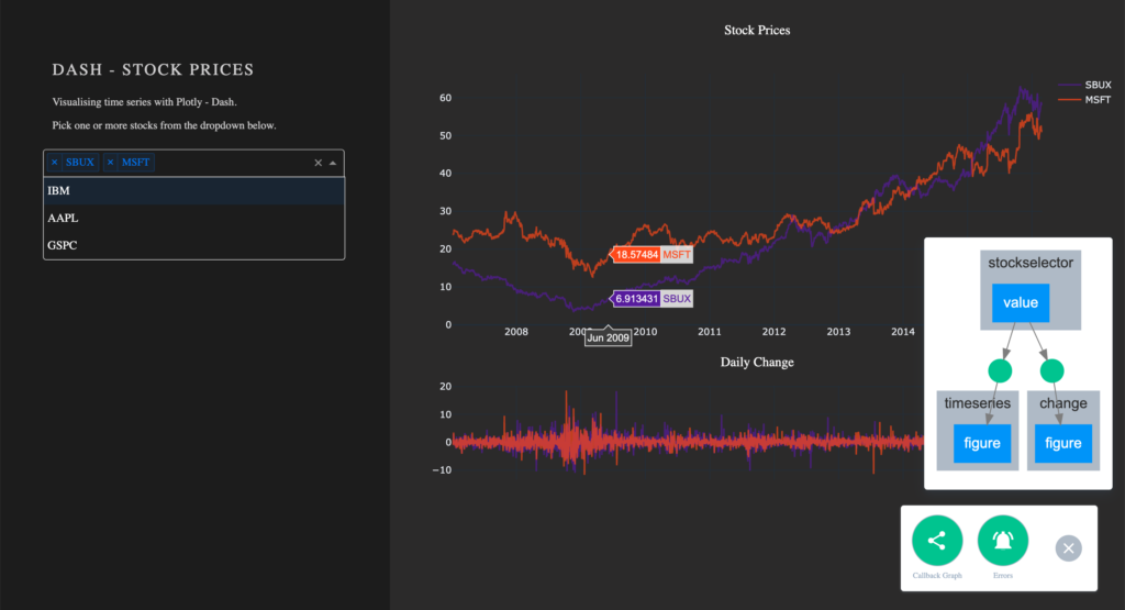
At this point, the selected values in the dropdown menu do not change the stocks displayed in our graph. For that to happen, we need to implement a callback. The callback will handle the communication between our dropdown menu 'stockselector' and our graph 'timeseries'. We can delete the figure we have previously created, as we won’t need it anymore.
We want two graphs in our app, so we will add another dcc.Graph() with a different id.
- Remove the
figureargument fromdcc.Graph(id='timeseries') - Add another
dcc.Graph()withclassName='change'as child to thehtml.Div()namedeight columns div-for-charts bg-grey.
dcc.Graph(id='timeseries', config={'displayModeBar': False})
dcc.Graph(id='change', config={'displayModeBar': False})
Callbacks add interactivity to your app. They can take Inputs from components, for example certain stocks selected via a dropdown menu, pass these inputs to a function and pass the returned values from the function back to components.
In our implementation, a callback will be triggered when a user selects a stock. The callback uses the value of the selected items in the dropdown menu (Input) and passes these values to our functions update_timeseries() and update_change(). The functions will filter the data based on the passed inputs and return a plotly figure from the filtered data. The callback then passes the figure returned from our functions back to the component specified in the output.
A callback is implemented as a decorator for a function. Multiple inputs and outputs are possible, but for now, we will start with a single input and a single output. We need the class dash.dependencies.Input and dash.dependencies.Output.
Add the following line to your import statements.
from dash.dependencies import Input, OutputInput() and Output() take the id of a component (e.g. in dcc.Graph(id='timeseries') the components id is 'timeseries') and the property of a component as arguments.
Example Callback:
# Update Time Series
@app.callback(Output('id of output component', 'property of output component'),
              [Input('id of input component', 'property of input component')])
def arbitrary_function(value_of_first_input):
    '''
    The property of the input component is passed to the function as value_of_first_input.
    The functions return value is passed to the property of the output component.
    '''
    return arbitrary_output
If we want our stockselector to display a time series for one or more specific stocks, we need a function. The value of our input is a list of stocks selected from the dropdown menu stockselector.
Implementing Callbacks
The function draws the traces of a plotly-figure based on the stocks which were passed as arguments and returns a figure that can be used by dcc.Graph(). The inputs for our function are given in the order in which they were set in the callback. Names chosen for the function’s arguments do not impact the way values are assigned.
Update the figure time series:
@app.callback(Output('timeseries', 'figure'),
              [Input('stockselector', 'value')])
def update_timeseries(selected_dropdown_value):
    ''' Draw traces of the feature 'value' based one the currently selected stocks '''
    # STEP 1
    trace = []
    df_sub = df
    # STEP 2
    # Draw and append traces for each stock
    for stock in selected_dropdown_value:
        trace.append(go.Scatter(x=df_sub[df_sub['stock'] == stock].index,
                                 y=df_sub[df_sub['stock'] == stock]['value'],
                                 mode='lines',
                                 opacity=0.7,
                                 name=stock,
                                 textposition='bottom center'))
    # STEP 3
    traces = [trace]
    data = [val for sublist in traces for val in sublist]
    # Define Figure
    # STEP 4
    figure = {'data': data,
              'layout': go.Layout(
                  colorway=["#5E0DAC", '#FF4F00', '#375CB1', '#FF7400', '#FFF400', '#FF0056'],
                  template='plotly_dark',
                  paper_bgcolor='rgba(0, 0, 0, 0)',
                  plot_bgcolor='rgba(0, 0, 0, 0)',
                  margin={'b': 15},
                  hovermode='x',
                  autosize=True,
                  title={'text': 'Stock Prices', 'font': {'color': 'white'}, 'x': 0.5},
                  xaxis={'range': [df_sub.index.min(), df_sub.index.max()]},
              ),

              }

    return figure
STEP 1
- A
tracewill be drawn for each stock. Create an emptylistfor each trace from the plotly figure.
STEP 2
Within the for-loop, a trace for a plotly figure will be drawn with the function go.Scatter().
- Iterate over the stocks currently selected in our dropdown menu, draw a trace, and append that trace to our list from step 1.
STEP 3
- Flatten the traces
STEP 4
Plotly figures are dictionaries with the keys data and layout. The value of data is our flattened list with the traces we have drawn. The layout is defined with the plotly class go.Layout().
- Add the trace to our figure
- Define the layout of our figure
Now we simply repeat the steps above for our second graph. Just change the data for our y-Axis to change and slightly adjust the layout.
Update the figure change:
@app.callback(Output('change', 'figure'),
              [Input('stockselector', 'value')])
def update_change(selected_dropdown_value):
    ''' Draw traces of the feature 'change' based one the currently selected stocks '''
    trace = []
    df_sub = df
    # Draw and append traces for each stock
    for stock in selected_dropdown_value:
        trace.append(go.Scatter(x=df_sub[df_sub['stock'] == stock].index,
                                 y=df_sub[df_sub['stock'] == stock]['change'],
                                 mode='lines',
                                 opacity=0.7,
                                 name=stock,
                                 textposition='bottom center'))
    traces = [trace]
    data = [val for sublist in traces for val in sublist]
    # Define Figure
    figure = {'data': data,
              'layout': go.Layout(
                  colorway=["#5E0DAC", '#FF4F00', '#375CB1', '#FF7400', '#FFF400', '#FF0056'],
                  template='plotly_dark',
                  paper_bgcolor='rgba(0, 0, 0, 0)',
                  plot_bgcolor='rgba(0, 0, 0, 0)',
                  margin={'t': 50},
                  height=250,
                  hovermode='x',
                  autosize=True,
                  title={'text': 'Daily Change', 'font': {'color': 'white'}, 'x': 0.5},
                  xaxis={'showticklabels': False, 'range': [df_sub.index.min(), df_sub.index.max()]},
              ),
              }

    return figure
Run your app again. You are now able to select one or more stocks from the dropdown. For each selected item, a line plot will be generated in the graph. By default, the dropdown menu has search functionalities, which makes the selection out of many available options an easy task.
Visualize Callbacks – Callback Graph
With the callbacks in place and our app completed, let’s take a quick look at our callback graph. If you are running your app with debug=True, a button will appear in the bottom right corner of the app. Here we have access to a callback graph, which is a visual representation of the callbacks which we have implemented in our code. The graph shows that our components timeseries and change display a figure based on the value of the component stockselector. If your callbacks don’t work how you expect them to, especially when working on larger and more complex apps, this tool will come in handy.
Conclusion
Let’s recap the most important building blocks of Dash. Getting the App up and running requires just a couple lines of code. A basic understanding of HTML and CSS is enough to create a simple Dash dashboard. You don’t have to worry about creating interactive charts, Plotly already does that for you. Making your dashboard reactive is done via Callbacks, which are functions with the users’ interaction as the input.
If you liked this blog, feel free to contact me via LinkedIn or Email. I am curious to know what you think and always happy to answer any questions about data, my journey to data science, or the exciting things we do here at STATWORX.
Thank you for reading!
At STATWORX, coding is our bread and butter. Because our projects involve many different people in several organizations across multiple generations of programmers, writing clean code is essential. The main requirements for well-structured and readable code are comments and sections. In RStudio, these sections are defined by comments that end with at least four dashes ---- (you can also use trailing equal signs ==== or hashes ####). In my opinion, the code is even more clear if the dashes cover the whole range of 80 characters (why you should not exceed the 80 characters limit). That’s how my code usually looks like:
# loading packages -------------------------------------------------------------
library(dplyr)

# load data --------------------------------------------------------------------
my_iris <- as_tibble(iris)

# prepare data -----------------------------------------------------------------
my_iris_preped <- my_iris %>%
  filter(Species == "virginica") %>%
  mutate_if(is.numeric, list(squared = sqrt))

# ...
Clean, huh? Well, yes, but neither of the three options available to achieve this are as neat as I want it to be:
- Press
-for some time. - Copy a certain amount of dashes and insert them sequentially. Both options often result in too many dashes, so I have to remove the redundant ones.
- Use the shortcut to insert a new section (CMD/STRG + SHIFT + R). However, you cannot neatly include it after you wrote your comments.
Wouldn’t it be nice to have a keyboard shortcut that included the right amount of dashes up from the cursor position? “Easy as can be,” I thought before trying to define a custom shortcut in RStudio.
Unfortunately, it turned out not to be that easy. There is a manual from RStudio that actually covers how you can create your shortcut, but it requires you to put it in a package first. Since I have not been an expert in R package development myself, I decided to go the full distance in this blog post. By following it step by step, you should be able to define your shortcuts within a few minutes.
Note: This article is not about creating a CRAN-worthy package, but covers what is necessary to define your own shortcuts. If you have already created packages before, you can skip the parts about package development and jump directly to what is new to you.
Setting up an R package
First of all, open RStudio and create an R package directory. For this, please do the following steps:
- Go to “New Project…”
- “New Directory”
- “R Package”
- Select an awesome package name of your choice. In this example, I named my package
shoRtcut - In “Create project as subdirectory of:” select a directory of your choice. A new folder with your package name will be created in this directory.
Tada, everything necessary for a powerful R Package has been set up. RStudio also automatically provides a dummy function hello(). Since we do not like to have this function in our own package, move to the “R” folder in your project and delete the hello.R file. Do the same in the “man” folder and delete hello.md.
Creating an Addin Function
Now we can start and define our function. For this, we need the wonderful packages usethis and devtools. These provide all the functionality we need for the next steps.
Defining the Addin Function
Via the use_r() function, we define a new R script file with the given name. That should correspond to the name of the function we are about to create. In my case, I call it set_new_chapter.
# use this function to automatically create a new r script for your function
usethis::use_r("set_new_chapter")
You are directly forwarded to the created file. Now the tricky part begins, defining a function that does what you want. When defining shortcuts that interact with an R script in RStudio, you will soon discover the package rstudioapi. With its functions, you can grab all information from RStudio and make it available within R. Let me guide you through it step by step.
- As per usual, I set up a regular R function and define its name as
set_new_chapter. Next, I define up until which limit I want to include the dashes. You will note that I rather setncharsto 81 than 80. This is because the number corresponds to the cursor position after including the dashes. You will notice that when you write text, the cursor automatically jumps to the position right after the newly typed character. After you have written your 80th character, the cursor will be at position 81. - Now we have to find out where the cursor is currently located. This information can be unearthed by the
getActiveDocumentContext()function. The returned object returns quite a bit of information, but we are only interested in the cursor position regarding the column. Why the column? You can think of the script like a matrix. Hitting return brings you to a new row, typing a character into a new column. Having a font with equal space characters, which is the default setting in RStudio makes this concept easy to see. - By sneaking into the nested list, we find the information we are looking for and store it in
context_col. Now we check whether the cursor is already at “column” 81. If not, there is space in which we insert the dashes. For this final step, we can use another function:insertText. - As its name implies, it inserts text in an R script or console. You can either specify a specific position in the document or, by leaving it empty, insert text at the current cursor position, which is exactly what I want right now. As the final step, I need to find out the number of dashes that should be inserted. That’s the difference between the current cursor location and its target position. For example, if the cursor blinks at column 51, meaning I already have typed 50 characters, I want to insert 30 dashes.
- To document the function, I use the “Code” > “Insert Roxygen Skeleton” feature and fill it out appropriately.
This is what my final function looks like.
#' Insert dashes from courser position to up to 80 characters
#'
#' @return dashes inside RStudio
set_new_chapter <- function(){
# set limit to which position dashes should be included
nchars <- 81
# grab current document information
context <- rstudioapi::getActiveDocumentContext()
# extract horizontal courser position in document
context_col <- context![selection[[1]]](https://www.statworx.com/wp-content/ql-cache/quicklatex.com-00de0437beef075188210e33286d8e37_l3.png "Rendered by QuickLaTeX.com") range$end["column"]
# if a line has less than 81 characters, insert hyphens at the current line
# up to 80 characters
if (nchars > context_col) {
rstudioapi::insertText(strrep("-", nchars - context_col))
}
}
range$end["column"]
# if a line has less than 81 characters, insert hyphens at the current line
# up to 80 characters
if (nchars > context_col) {
rstudioapi::insertText(strrep("-", nchars - context_col))
}
}Defining the Function AS and Addin
Now we must somehow tell RStudio that this particular function should be used as an addin rather than a regular function. For this, go to “File” > “New File” > “Text File” and include the following text:
Name: Insert Dashes (---)
Description: Inserts `---` at the cursor position up to 80 characters.
Binding: set_new_chapter
Interactive: falseNameis a short description of what the addin does. This will be displayed when you want to set the shortcut later.Descriptionis a longer description of its functionality.Bindingsets the name of the function that should be called by the shortcut.Interactivedefines whether this addin is interactive (e.g., runs a Shiny application) or not.
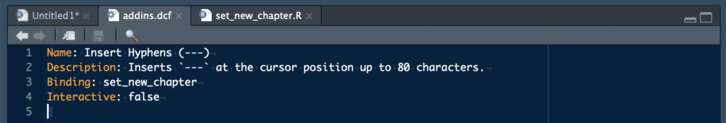
You now must save this file as “addins.dcf” in your project with the following path: “inst” > “rstudio”. The result should look like this:
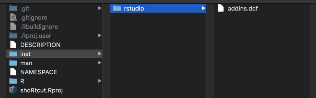
Finalize the Package
To wrap everything up and make the shortcut available to you and your colleagues, we only have to call a few more functions. Not all these steps are necessary, yet it is good practice to create a proper package.
# OPTIONAL: define the license of your package
usethis::use_mit_license(name = "Matthias Nistler")

# define dependencies you use in your package
usethis::use_package("rstudioapi")

# OPTIONAL: include your function description to the manual
roxygen2::roxygenise()

# check for errors
devtools::check()

# update/create your package
devtools::build()

> ✓  checking for file ‘/Users/matthiasnistler/Projekte/2020/blog_shoRtcut/DESCRIPTION’ ...
> ─  preparing ‘shoRtcut’:
> ✓  checking DESCRIPTION meta-information ...
> ─  checking for LF line-endings in source and make files and shell scripts
> ─  checking for empty or unneeded directories
> ─  building ‘shoRtcut_0.0.0.9000.tar.gz’
> [1] "/Users/matthiasnistler/Projekte/2020/shoRtcut_0.0.0.9000.tar.gz"
There you go! You just created an awesome package and distributed it to your friends and colleagues.
Make the shortcut available
For the last step, you have to install your package and set a keyboard combination for your shortcut. For this, use the following specification of install.packages:
install.packages(
    # same path as above
  "/Users/matthiasnistler/Projekte/2020/shoRtcut_0.0.0.9000.tar.gz",
  # indicate it is a local file
  repos = NULL)

# check if everything works
shoRtcut:::set_new_chapter()
Now go to “Tools” > “Modify Keyboard Shortcuts…” and search for “dashes”. Here you can define the keyboard combination by clicking inside the empty “Shortcut” field and pressing the desired key combination on your keyboard. Click “Apply”, and that’s it!
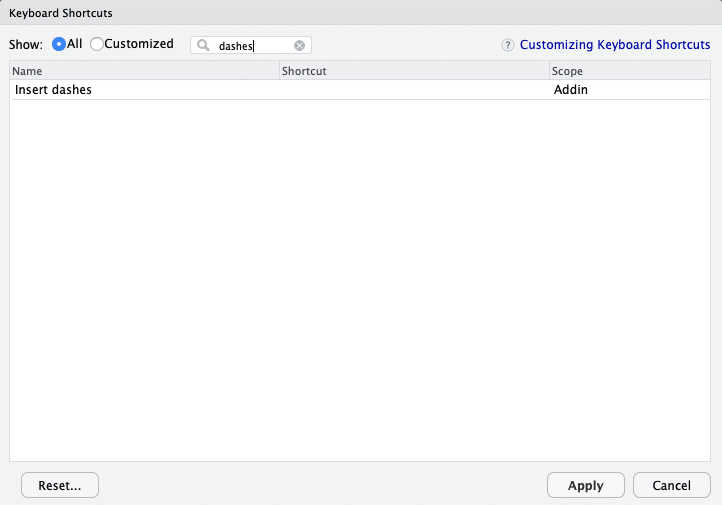
In case you are just here to use my shortcut, you can install it via remotes::install_github("mnist91/shoRtcut").
Congratulations!
You made it! Now you can use your own RStudio shortcut. Exciting, isn’t it?
But that’s not all there is – next week, I will give you an introduction to the wonderful world of R package naming. So stay tuned and happy coding!
Data operations is an increasingly important part of data science because it enables companies to feed large business data back into production effectively. We at STATWORX, therefore, operationalize our models and algorithms by translating them into Application Programming Interfaces (APIs). Representational State Transfer (REST) APIs are well suited to be implemented as part of a modern micro-services infrastructure. They are flexible, easy to deploy, scale, and maintain, and they are further accessible by multiple clients and client types at the same time. Their primary purpose is to simplify programming by abstracting the underlying implementation and only exposing objects and actions that are needed for any further development and interaction.
An additional advantage of APIs is that they allow for an easy combination of code written in different programming languages or by different development teams. This is because APIs are naturally separated from each other, and communication with and between APIs is handled by IP or URL (http), typically using JSON or XML format. Imagine, e.g., an infrastructure, where an API that’s written in Python and one that’s written in R communicate with each other and serve an application written in JavaScript.
In this blog post, I will show you how to translate a simple R script, which transforms tables from wide to long format, into a REST API with the R package Plumber and how to run it locally or with Docker. I have created this example API for our trainee program, and it serves our new data scientists and engineers as a starting point to familiarize themselves with the subject.
Translate the R Script
Transforming an R script into a REST API is quite easy. All you need, in addition to R and RStudio, is the package Plumber and optionally Docker. REST APIs can be interacted with by sending a REST Request, and the probably most commonly used ones are GET, PUT, POST, and DELETE. Here is the code of the example API, that transforms tables from wide to long or from long to wide format:
## transform wide to long and long to wide format
#' @post /widelong
#' @get /widelong
function(req) {
  # library
  require(tidyr)
  require(dplyr)
  require(magrittr)
  require(httr)
  require(jsonlite)

  # post body
  body <- jsonlite::fromJSON(req$postBody)

  .data <- body$.data
  .trans <- body$.trans
  .key <- body$.key
  .value <- body$.value
  .select <- body$.select

  # wide or long transformation
  if(.trans == 'l' || .trans == 'long') {
    .data %<>% gather(key = !!.key, value = !!.value, !!.select)
    return(.data)
  } else if(.trans == 'w' || .trans == 'wide') {
    .data %<>% spread(key = !!.key, value = !!.value)
    return(.data)
  } else {
    print('Please specify the transformation')
  }
}
As you can see, it is a standard R function, that is extended by the special plumber comments @post and @get, which enable the API to respond to those types of requests. It is necessary to add the path, /widelong, to any incoming request. That is done because it is possible to stack several API functions, which respond to different paths. We could, e.g., add another function with the path /naremove to our API, which removes NAs from tables.
The R function itself has one function argument req, which is used to receive a (POST) Request Body. In general, there are two different possibilities to send additional arguments and objects to a REST API, the header and the body. I decided to use a body only and no header at all, which makes the API cleaner, safer and allows us to send larger objects. A header could, e.g., be used to set some optional function arguments, but should be used sparsely otherwise.
Using a body with the API is also the reason to allow for GET and POST Requests (@post, @get) at the same time. While some clients prefer to send a body with a GET Request, when they do not permanently post something to the server etc., many other clients do not have the option to send a body with a GET Request at all. In this case, it is mandatory to add a POST Request. Typical clients are Applications, Integrated Development Environments (IDEs), and other APIs. By accepting both request types, our API, therefore, gains greater response flexibility.
For the request-response format of the API, I have decided to stick with the JavaScript Object Notation (JSON), which is probably the most common format. It would be possible to use Extensible Markup Language (XML) with R Plumber instead as well. The decision for one or the other will most likely depend on which additional R packages you want to use or on which format the API’s clients are predominantly using. The R packages that are used to handle REST Requests in my example API are jsonlite and httr. The three Tidyverse packages are used to do the table transformation to wide or long.
RUN the API
The finished REST API can be run locally with R or RStudio as follows:
library(plumber)

widelong_api <- plumber::plumb("./path/to/directory/widelongwide.R")
widelong_api$run(host = '127.0.0.1', port = 8000)
Upon starting the API, the Plumber package provides us with an IP address, and a port and a client, e.g., another R instance, can now begin to send REST Requests. It also opens a browser tool called Swagger, which can be useful to check if your API is working as intended. Once the development of an API is finished, I would suggest to build a docker image and run it in a container. That makes the API highly portable and independent of its host system. Since we want to use most APIs in production and deploy them to, e.g., a company server or the cloud, this is especially important. Here is the Dockerfile to build the docker image of the example API:
FROM trestletech/plumber

# Install dependencies
RUN apt-get update --allow-releaseinfo-change && apt-get install -y
    liblapack-dev
    libpq-dev

# Install R packages
RUN R -e "install.packages(c('tidyr', 'dplyr', 'magrittr', 'httr', 'jsonlite'),
repos = 'https://cran.us.r-project.org')"

# Add API
COPY ./path/to/directory/widelongwide.R /widelongwide.R

# Make port available
EXPOSE 8000

# Entrypoint
ENTRYPOINT ["R", "-e",
"widelong <- plumber::plumb('widelongwide.R');
widelong$run(host = '0.0.0.0', port= 8000)"]

CMD ["/widelongwide.R"]
Send a REST Request
The wide-long example API can generally respond to any client sending a POST or GET Request with a Body in JSON format, that contains a table in csv format and all needed information on how to transform it. Here is an example for a web application, which I have written for our trainee program to supplement the wide-long API:
The application is written in R Shiny, which is a great R package to transform your static plots and outputs into an interactive dashboard. If you are interested in how to create dashboards in R, check out other posts on our STATWORX Blog.
Last but not least here is an example on how to send a REST Request from R or RStudio:
library(httr)
library(jsonlite)
options(stringsAsFactors = FALSE)

# url for local testing
url <- "https://127.0.0.1:8000"

# url for docker container
url <- "https://0.0.0.0:8000"

# read example stock data
.data <- read.csv('./path/to/data/stocks.csv')

# create example body
body <- list(
  .data = .data,
  .trans = "w",
  .key = "stock",
  .value = "price",
  .select = c("X","Y","Z")
)

# set API path
path <- 'widelong'

# send POST Request to API
raw.result <- POST(url = url, path = path, body = body, encode = 'json')

# check status code
raw.result$status_code

# retrieve transformed example stock data
.t_data <- fromJSON(rawToChar(raw.result$content))
As you can see, it is quite easy to make REST Requests in R. If you need some test data, you could use the stocks data example from the Tidyverse.
Summary
In this blog post, I showed you how to translate a simple R script, which transforms tables from wide to long format, into a REST API with the R package Plumber and how to run it locally or with Docker. I hope you enjoyed the read and learned something about operationalizing R scripts into REST APIs with the R package Plumber and how to run them locally and with Docker. You are of welcome to copy and use any code from this blog post to start and create your REST APIs with R.
Until then, stay tuned and visit our STATWORX Blog again soon.
We’re hiring!
Data Engineering is your jam and you’re looking for a job? We’re currently looking for Junior Consultants and Consultants in Data Engineering. Check the requirements and benefits of working with us on our career site. We’re looking forward to your application!
Nearly one year ago, I analyzed how we use emojis in our Slack messages. Since then, STATWORX grew, and we are a lot more people now! So, I just wanted to check if something changed.
Last time, I did not show our custom emojis, since they are, of course, not available in the fonts I used. This time, I will incorporate them with geom_image(). It is part of the ggimage package from Guangchuang Yu, which you can find here on his Github. With geom_image() you can include images like .png files to your ggplot.
What changed since last year?
Let’s first have a look at the amount of emojis we are using. In the plot below, you can see that since my last analysis in October 2018 (red line) the amount of emojis is rising. Not as much as I thought it would, but compared to the previous period, we now have more days with a usage of over 100 emojis per day!
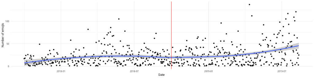
Like last time, our top emoji is ????, followed by ???? and ????. But sneaking in at number ten is one of our custom emojis: party_hat_parrot!
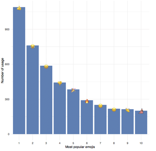
How to include custom images?
In my previous blogpost, I hid all our custom emojis behind❓since they were not part of the font. It did not occur to me to use their images, even though the package is from the same creator! So, to make up for my ignorance, I grabbed the top 30 custom emojis and downloaded their images from our Slack servers, saved them as .png and made sure they are all roughly the same size.
To use geom_image() I just added the path of the images to my data (the … are just an abbreviation for the complete path).
                NAME COUNT REACTION IMAGE
1:          alnatura    25       63 .../custom/alnatura.png
2:              blog    19       20 .../custom/blog.png
3:           dataiku    15       22 .../custom/dataiku.png
4: dealwithit_parrot     3      100 .../custom/dealwithit_parrot.png
5:      deananddavid    31       18 .../custom/deananddavid.png
This would have been enough to just add the images now, but since I wanted the NAME attribute as a label, I included geom_text_repel from the ggrepel library. This makes handling of non-overlapping labels much simpler!
ggplot(custom_dt, aes( x = REACTION, y = COUNT, label = NAME)) +
  geom_image(aes(image = IMAGE), size = 0.04) +
  geom_text_repel(point.padding = 0.9, segment.alpha = 0) +
  xlab("as reaction") +
  ylab("within message") +
  theme_minimal()
Usually, if a label is “too far” away from the marker, geom_text_repel includes a line to indicate where the labels belong. Since these lines would overlap the images, I used segment.alpha = 0 to make them invisible. With point.padding = 0.9 I gave the labels a bit more space, so it looks nicer. Depending on the size of the plot, this needs to be adjusted. In the plot, one can see our usage of emojis within a message (y-axis) and as a reaction (x-axis).
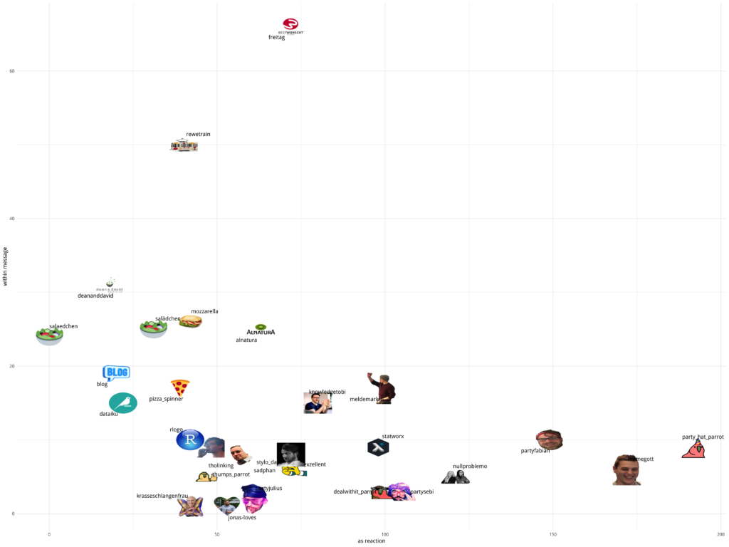
To combine the emoji font and custom emojis, I used the following data and code — really… why did I not do this last time? ???? Since the UNICODE is NA when I want to use the IMAGE, there is no “double plotting”.
                     EMOJI REACTION COUNT  SUM PLACE    UNICODE   IMAGE
 1:                    :+1:     1090     0 1090     1 U0001f44d
 2:                   :joy:      609   152  761     2 U0001f602
 3:                 :smile:       91   496  587     3 U0001f604
 4:                    :-1:      434     9  443     4 U0001f44e
 5:                  :tada:      346    38  384     5 U0001f389
 6:                  :fire:      274    17  291     6 U0001f525
 7: :slightly_smiling_face:        1   250  251     7 U0001f642
 8:                  :wink:       27   191  218     8 U0001f609
 9:                  :clap:      201    13  214     9 U0001f44f
10:      :party_hat_parrot:      192     9  201    10       <NA>  .../custom/party_hat_parrot.png
quartz()
ggplot(plotdata2, aes(x = PLACE, y = SUM, label = UNICODE)) +
  geom_bar(stat = "identity", fill = "steelblue") +
  geom_text(family="EmojiOne") +
  xlab("Most popular emojis") +
  ylab("Number of usage") +
  scale_fill_brewer(palette = "Paired") +
  geom_image(aes(image = IMAGE), size = 0.04) +
  theme_minimal()
ps = grid.export(paste0(main_path, "plots/top-10-used-emojis.svg"), addClass=T)
dev.off()
The meaning behind emojis
Now we know what our top emojis are. But what is the rest of the world doing? Thanks to Emojimore for providing me with this overview! On their site, you can find meanings for a lot more emojis.
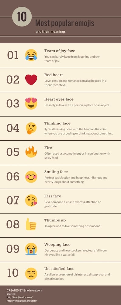
Behind each of our custom emojis is a story as well. For example, all the food emojis are helping us every day to decide where to eat and provide information on what everyone is planning for lunch! And if you do not agree with the decision, just react with sadphan to let the others know about your feelings. If you want to know the whole stories behind all custom emojis or even help create new ones, then maybe you should join our team — check out our available job offers here!