The Hidden Risks of Black-Box Algorithms
Reading and evaluating countless resumes in the shortest possible time and making recommendations for suitable candidates – this is now possible with artificial intelligence in applicant management. This is because advanced AI technologies can efficiently analyze even large volumes of complex data. In HR management, this not only saves valuable time in the pre-selection process but also enables applicants to be contacted more quickly. Artificial intelligence also has the potential to make application processes fairer and more equitable.
However, real-world experience has shown that artificial intelligence is not always “fair”. A few years ago, for example, an Amazon recruiting algorithm stirred up controversy for discriminating against women when selecting candidates. Additionally, facial recognition algorithms have repeatedly led to incidents of discrimination against People of Color.
One reason for this is that complex AI algorithms independently calculate predictions and results based on the data fed into them. How exactly they arrive at a particular result is not initially comprehensible. This is why they are also known as black-box algorithms. In Amazon’s case, the AI determined suitable applicant profiles based on the current workforce, which was predominantly male, and thus made biased decisions. In a similar way, algorithms can reproduce stereotypes and reinforce discrimination.
Principles for Trustworthy AI
The Amazon incident shows that transparency is highly relevant in the development of AI solutions to ensure that they function ethically. This is why transparency is also one of the seven statworx Principles for trustworthy AI. The employees at statworx have collectively defined the following AI principles: Human-centered, transparent, ecological, respectful, fair, collaborative, and inclusive. These serve as orientations for everyday work with artificial intelligence. Universally applicable standards, rules, and laws do not yet exist. However, this could change in the near future.
The European Union (EU) has been discussing a draft law on the regulation of artificial intelligence for some time. Known as the AI Act, this draft has the potential to be a gamechanger for the global AI industry. This is because it is not only European companies that are targeted by this draft law. All companies offering AI systems on the European market, whose AI-generated output is used within the EU, or operate AI systems for internal use within the EU would be affected. The requirements that an AI system must meet depend on its application.
Recruiting algorithms are likely to be classified as high-risk AI. Accordingly, companies would have to fulfill comprehensive requirements during the development, publication, and operation of the AI solution. Among other things, companies are required to comply with data quality standards, prepare technical documentation, and establish risk management. Violations may result in heavy fines of up to 6% of global annual sales. Therefore, companies should already start dealing with the upcoming requirements and their AI algorithms. Explainable AI methods (XAI) can be a useful first step. With their help, black-box algorithms can be better understood, and the transparency of the AI solution can be increased.
Unlocking the Black Box with Explainable AI Methods
XAI methods enable developers to better interpret the concrete decision-making processes of algorithms. This means that it becomes more transparent how an algorithm has formed patterns and rules and makes decisions. As a result, potential problems such as discrimination in the application process can be discovered and corrected. Thus, XAI not only contributes to greater transparency of AI but also favors its ethical use and thus increases the conformity of an AI with the upcoming AI Act.
Some XAI methods are even model-agnostic, i.e. applicable to any AI algorithm from decision trees to neural networks. The field of research around XAI has grown strongly in recent years, which is why there is now a wide variety of methods. However, our experience shows that there are large differences between different methods in terms of the reliability and meaningfulness of their results. Furthermore, not all methods are equally suitable for robust application in practice and for gaining the trust of external stakeholders. Therefore, we have identified our top 3 methods based on the following criteria for this blog post:
- Is the method model agnostic, i.e. does it work for all types of AI models?
- Does the method provide global results, i.e. does it say anything about the model as a whole?
- How meaningful are the resulting explanations?
- How good is the theoretical foundation of the method?
- Can malicious actors manipulate the results or are they trustworthy?
Our Top 3 XAI Methods at a Glance
Using the above criteria, we selected three widely used and proven methods that are worth diving a bit deeper into: Permutation Feature Importance (PFI), SHAP Feature Importance, and Accumulated Local Effects (ALE). In the following, we explain how each of these methods work and what they are used for. We also discuss their advantages and disadvantages and illustrate their application using the example of a recruiting AI.
Efficiently Identify Influencial Variables with Permutation Feature Importance
The goal of Permutation Feature Importance (PFI) is to find out which variables in the data set are particularly crucial for the model to make accurate predictions. In the case of the recruiting example, PFI analysis can shed light on what information the model relies on to make its decision. For example, if gender emerges as an influential factor here, it can alert the developers to potential bias in the model. In the same way, a PFI analysis creates transparency for external users and regulators. Two things are needed to compute PFI:
- An accuracy metric such as the error rate (proportion of incorrect predictions out of all predictions).
- A test data set that can be used to determine accuracy.
In the test data set, one variable after the other is concealed from the model by adding random noise. Then, the accuracy of the model is determined over the transformed test dataset. From there, we conclude that those variables whose concealment affects model accuracy the most are particularly important. Once all variables are analyzed and sorted, we obtain a visualization like Figure 1. Using our artificially generated sample data set, we can derive the following: Work experience did not play a major role in the model, but ratings from the interview were influencial.
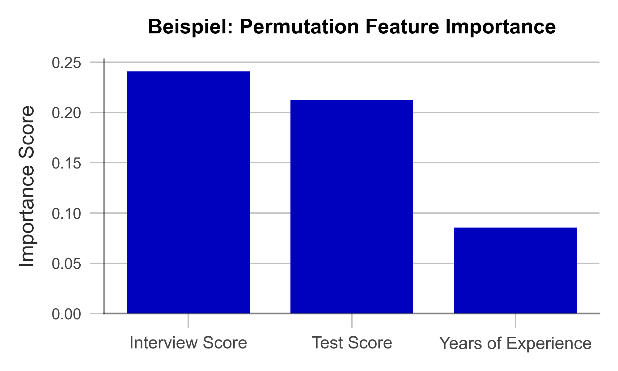
Figure 1 – Permutation Feature Importance using the example of a recruiting AI (data artificially generated).
A great strength of PFI is that it follows a clear mathematical logic. The correctness of its explanation can be proven by statistical considerations. Furthermore, there are hardly any manipulable parameters in the algorithm with which the results could be deliberately distorted. This makes PFI particularly suitable for gaining the trust of external observers. Finally, the computation of PFI is very resource efficient compared to other XAI methods.
One weakness of PFI is that it can provide misleading explanations under some circumstances. If a variable is assigned a low PFI value, it does not always mean that the variable is unimportant to the issue. For example, if the bachelor’s degree grade has a low PFI value, this may simply be because the model can simply look at the master’s degree grade instead since they are usually similar. Such correlated variables can complicate the interpretation of the results. Nonetheless, PFI is an efficient and useful method for creating transparency in black-box models.
| Strengths | Weaknesses |
|---|---|
| Little room for malicious manipulation of results | Does not consider interactions between variables |
| Efficient computation |
Uncover Complex Relationships with SHAP Feature Importance
SHAP Feature Importance is a method for explaining black box models based on game theory. The goal is to quantify the contribution of each variable to the prediction of the model. As such, it closely resembles Permutation Feature Importance at first glance. However, unlike PFI, SHAP Feature Importance provides results that can account for complex relationships between multiple variables.
SHAP is based on a concept from game theory: Shapley values. Shapley values are a fairness criterion that assigns a weight to each variable that corresponds to its contribution to the outcome. This is analogous to a team sport, where the winning prize is divided fairly among all players, according to their contribution to the victory. With SHAP, we can look at every individual obversation in the data set and analyze what contribution each variable has made to the prediction of the model.
If we now determine the average absolute contribution of a variable across all observations in the data set, we obtain the SHAP Feature Importance. Figure 2 illustrates the results of this analysis. The similarity to the PFI is evident, even though the SHAP Feature Importance only places the rating of the job interview in second place.
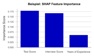
Figure 2 – SHAP Feature Importance using the example of a recruiting AI (data artificially generated).
A major advantage of this approach is the ability to account for interactions between variables. By simulating different combinations of variables, it is possible to show how the prediction changes when two or more variables vary together. For example, the final grade of a university degree should always be considered in the context of the field of study and the university. In contrast to the PFI, the SHAP Feature Importance takes this into account. Also, Shapley Values, once calculated, are the basis of a wide range of other useful XAI methods.
However, one weakness of the method is that it is more computationally expensive than PFI. Efficient implementations are available only for certain types of AI algorithms like decision trees or random forests. Therefore, it is important to carefully consider whether a given problem requires a SHAP Feature Importance analysis or whether PFI is sufficient.
| Strengths | Weaknesses |
|---|---|
| Little room for malicious manipulation of results | Calculation is computationally expensive |
| Considers complex interactions between variables |
Focus in on Specific Variables with Accumulated Local Effects
Accumulated Local Effects (ALE) is a further development of the commonly used Partial Dependence Plots (PDP). Both methods aim at simulating the influence of a certain variable on the prediction of the model. This can be used to answer questions such as “Does the chance of getting a management position increase with work experience?” or “Does it make a difference if I have a 1.9 or a 2.0 on my degree certificate?”. Therefore, unlike the previous two methods, ALE makes a statement about the model’s decision-making, not about the relevance of certain variables.
In the simplest case, the PDP, a sample of observations is selected and used to simulate what effect, for example, an isolated increase in work experience would have on the model prediction. Isolated means that none of the other variables are changed in the process. The average of these individual effects over the entire sample can then be visualized (Figure 3, above). Unfortunately, PDP’s results are not particularly meaningful when variables are correlated. For example, let us look at university degree grades. PDP simulates all possible combinations of grades in bachelor’s and master’s programs. Unfortunately, this results in cases that rarely occur in the real world, e.g., an excellent bachelor’s degree and a terrible master’s degree. The PDP has no sense for unreaslistic cases, and the results may suffer accordingly.
ALE analysis, on the other hand, attempts to solve this problem by using a more realistic simulation that adequately represents the relationships between variables. Here, the variable under consideration, e.g., bachelor’s grade, is divided into several sections (e.g., 6.0-5.1, 5.0-4.1, 4.0-3.1, 3.0-2.1, and 2.0-1.0). Now, the simulation of the bachelor’s grade increase is performed only for individuals in the respective grade group. This prevents unrealistic combinations from being included in the analysis. An example of an ALE plot can be found in Figure 3 (below). Here, we can see that ALE identifies a negative impact of work experience on the chance of employment, which PDP was unable to find. Is this behavior of the AI desirable? For example, does the company want to hire young talent in particular? Or is there perhaps an unwanted age bias behind it? In both cases, the ALE plot helps to create transparency and to identify undesirable behavior.
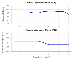
Figure 3- Partial Dependence Plot and Accumulated Local Effects using a Recruiting AI as an example (data artificially generated).
In summary, ALE is a suitable method to gain insight into the influence of a certain variable on the model prediction. This creates transparency for users and even helps to identify and fix unwanted effects and biases. A disadvantage of the method is that ALE can only analyze one or two variables together in the same plot, meaningfully. Thus, to understand the influence of all variables, multiple ALE plots must be generated, which makes the analysis less compact than PFI or a SHAP Feature Importance.
| Strengths | Weaknesses |
|---|---|
| Considers complex interactions between variables | Only one or two variables can be analyzed in one ALE plot |
| Little room for malicious manipulation of results |
Build Trust with Explainable AI Methods
In this post, we presented three Explainable AI methods that can help make algorithms more transparent and interpretable. This also favors meeting the requirements of the upcoming AI Act. Even though it has not yet been passed, we recommend to start working on creating transparency and traceability for AI models based on the draft law as soon as possible. Many Data Scientists have little experience in this field and need further training and time to familiarize with XAI concepts before they can identify relevant algorithms and implement effective solutions. Therefore, it makes sense to familiarize yourself with our recommended methods preemptively.
With Permutation Feature Importance (PFI) and SHAP Feature Importance, we demonstrated two techniques to determine the relevance of certain variables to the prediction of the model. In summary, SHAP Feature Importance is a powerful method for explaining black-box models that considers the interactions between variables. PFI, on the other hand, is easier to implement but less powerful for correlated data. Which method is most appropriate in a particular case depends on the specific requirements.
We also introduced Accumulated Local Effects (ALE), a technique that can analyze and visualize exactly how an AI responds to changes in a specific variable. The combination of one of the two feature importance methods with ALE plots for selected variables is particularly promising. This can provide a theoretically sound and easily interpretable overview of the model – whether it is a decision tree or a deep neural network.
The application of Explainable AI is a worthwhile investment – not only to build internal and external trust in one’s own AI solutions. Rather, we expect that the skillful use of interpretation-enhancing methods can help avoid impending fines due to the requirements of the AI Act, prevents legal consequences, and protects those affected from harm – as in the case of incomprehensible recruiting software.
Our free AI Act Quick Check helps you assess whether any of your AI systems could be affected by the AI Act: https://www.statworx.com/en/ai-act-tool/
Sources & Further Information:
https://www.faz.net/aktuell/karriere-hochschule/buero-co/ki-im-bewerbungsprozess-und-raus-bist-du-17471117.html (last opened 03.05.2023)
https://t3n.de/news/diskriminierung-deshalb-platzte-amazons-traum-vom-ki-gestuetzten-recruiting-1117076/ (last opened 03.05.2023)
For more information on the AI Act: https://www.statworx.com/en/content-hub/blog/how-the-ai-act-will-change-the-ai-industry-everything-you-need-to-know-about-it-now/
Statworx principles: https://www.statworx.com/en/content-hub/blog/statworx-ai-principles-why-we-started-developing-our-own-ai-guidelines/
Christoph Molnar: Interpretable Machine Learning: https://christophm.github.io/interpretable-ml-book/
Image Sources
AdobeStock 566672394 – by TheYaksha
Introduction
Forecasts are of central importance in many industries. Whether it’s predicting resource consumption, estimating a company’s liquidity, or forecasting product sales in retail, forecasts are an indispensable tool for making successful decisions. Despite their importance, many forecasts still rely primarily on the prior experience and intuition of experts. This makes it difficult to automate the relevant processes, potentially scale them, and provide efficient support. Furthermore, experts may be biased due to their experiences and perspectives or may not have all the relevant information necessary for accurate predictions.
These reasons have led to the increasing importance of data-driven forecasts in recent years, and the demand for such predictions is accordingly strong.
At statworx, we have already successfully implemented a variety of projects in the field of forecasting. As a result, we have faced many challenges and become familiar with numerous industry-specific use cases. One of our internal working groups, the Forecasting Cluster, is particularly passionate about the world of forecasting and continuously develops their expertise in this area.
Based on our collected experiences, we now aim to combine them in a user-friendly tool that allows anyone to obtain initial assessments for specific forecasting use cases depending on the data and requirements. Both customers and employees should be able to use the tool quickly and easily to receive methodological recommendations. Our long-term goal is to make the tool publicly accessible. However, we are first testing it internally to optimize its functionality and usefulness. We place special emphasis on ensuring that the tool is intuitive to use and provides easily understandable outputs.
Although our Recommender Tool is still in the development phase, we would like to provide an exciting sneak peek.
Common Challenges
Model Selection
In the field of forecasting, there are various modeling approaches. We differentiate between three central approaches:
- Time Series Models
- Tree-based Models
- Deep Learning Models
There are many criteria that can be used when selecting a model. For univariate time series data with strong seasonality and trends, classical time series models such as (S)ARIMA and ETS are appropriate. On the other hand, for multivariate time series data with potentially complex relationships and large amounts of data, deep learning models are a good choice. Tree-based models like LightGBM offer greater flexibility compared to time series models, are well-suited for interpretability due to their architecture, and tend to have lower computational requirements compared to deep learning models.
Seasonality
Seasonality refers to recurring patterns in a time series that occur at regular intervals (e.g. daily, weekly, monthly, or yearly). Including seasonality in the modeling is important to capture these regular patterns and improve the accuracy of forecasts. Time series models such as SARIMA, ETS, or TBATS can explicitly account for seasonality. For tree-based models like LightGBM, seasonality can only be considered by creating corresponding features, such as dummies for relevant seasonalities. One way to explicitly account for seasonality in deep learning models is by using sine and cosine functions. It is also possible to use a deseasonalized time series. This involves removing the seasonality initially, followed by modeling on the deseasonalized time series. The resulting forecasts are then supplemented with seasonality by applying the process used for deseasonalization in reverse. However, this process adds another level of complexity, which is not always desirable.
Hierarchical Data
Especially in the retail industry, hierarchical data structures are common as products can often be represented at different levels of granularity. This frequently results in the need to create forecasts for different hierarchies that do not contradict each other. The aggregated forecasts must therefore match the disaggregated forecasts. There are various approaches to this. With top-down and bottom-up methods, forecasts are created at one level and then disaggregated or aggregated downstream. Reconciliation methods such as Optimal Reconciliation involve creating forecasts at all levels and then reconciling them to ensure consistency across all levels.
Cold Start
In a cold start, the challenge is to forecast products that have little or no historical data. In the retail industry, this usually refers to new product introductions. Since it is not possible to train a model for these products due to the lack of history, alternative approaches must be used. A classic approach to performing a cold start is to rely on expert knowledge. Experts can provide initial estimates of demand, which can serve as a starting point for forecasting. However, this approach can be highly subjective and cannot be scaled. Similarly, similar products or potential predecessor products can be referenced. Grouping of products can be done based on product categories or clustering algorithms such as K-Means. Using cross-learning models trained on many products represents a scalable option.
Recommender Concept
With our Recommender Tool, we aim to address different problem scenarios to enable the most efficient development process. It is an interactive tool where users can provide inputs based on their objectives or requirements and the characteristics of the available data. Users can also prioritize certain requirements, and the output will prioritize those accordingly. Based on these inputs, the tool generates methodological recommendations that best cover the solution requirements, depending on the available data characteristics. Currently, the outputs consist of a purely content-based representation of the recommendations, providing concrete guidelines for central topics such as model selection, pre-processing, and feature engineering. The following example provides an idea of the conceptual approach:

The output presented here is based on a real project where the implementation in R and the possibility of local interpretability were of central importance. At the same time, new products were frequently introduced, which should also be forecasted by the developed solution. To achieve this goal, several global models were trained using Catboost. Thanks to this approach, over 200 products could be included in the training. Even for newly introduced products where no historical data was available, forecasts could be generated. To ensure the interpretability of the forecasts, SHAP values were used. This made it possible to clearly explain each prediction based on the features used.
Summary
The current development is focused on creating a tool optimized for forecasting. Through its use, we aim to increase efficiency in forecasting projects. By combining gathered experience and expertise, the tool will offer guidelines for modeling, pre-processing, and feature engineering, among other topics. It will be designed to be used by both customers and employees to quickly and easily obtain estimates and methodological recommendations. An initial test version will be available soon for internal use, but the tool is ultimately intended to be made accessible to external users as well. In addition to the technical output currently in development, a less technical output will also be available. The latter will focus on the most important aspects and their associated efforts. In particular, the business perspective in the form of expected efforts and potential trade-offs between effort and benefit will be covered by this.
Benefit from our forecasting expertise!
If you need support in addressing the challenges in your forecasting projects or have a forecasting project planned, we are happy to provide our expertise and experience to assist you.
In this blog, we will explore the Bagging algorithm and a computational more efficient variant thereof, Subagging. With minor modifications, these algorithms are also known as Random Forest and are widely applied here at STATWORX, in industry and academia.
Almost all statistical prediction and learning problems encounter a bias-variance tradeoff. This is particularly pronounced for so-called unstable predictors. While yielding low biased estimates due to flexible adaption to the data, those kind of predictors react very sensitive to small changes in the underlying dataset and have hence high variance. A common example are Regression Tree predictors.
Bagging bypasses this tradeoff by reducing the variance of the unstable predictor while leaving its bias mostly unaffected.
Method
In particular, Bagging uses repeated bootstrap sampling to construct multiple versions of the same prediction model (e.g. Regression Trees) and averages over the resulting predictions.
Let’s see how Bagging works in detail:
- Construct a bootstrap sample
 (with replacement) of the original i.i.d. data at hand
  .
. - Fit a Regression Tree to the bootstrap sample – we will denote the tree predictor by
 .
. - Repeat Steps one and two
 many times and calculate
  .
.
OK – so let us take a glimpse into the construction phase: We draw in total different bootstrap samples simultaneously from the original data. Then to each of those samples, a tree is fitted and the (in-sample) fitted values are averaged in Step 3 yielding the Bagged predictor.
The variance-reduction happens in Step 3. To see this, consider the following toy example.
Let  be i.i.d. random variables with
 ![mu = E[X_1]](https://www.statworx.com/wp-content/ql-cache/quicklatex.com-8d1e61ff4341c8b98546b5f06ea1c286_l3.png "Rendered by QuickLaTeX.com") and
and ![sigma^2 = Var[X_1]](https://www.statworx.com/wp-content/ql-cache/quicklatex.com-b724041449c3f061d386341641055208_l3.png "Rendered by QuickLaTeX.com") and let
and let  . Easy re-formulations show that
![Var[bar{X}]=frac{sigma^2}{n} leq sigma^2](https://www.statworx.com/wp-content/ql-cache/quicklatex.com-1b356cbd0bca00d37d4f619bf2bc85df_l3.png "Rendered by QuickLaTeX.com")
![E[bar{X}]=mu](https://www.statworx.com/wp-content/ql-cache/quicklatex.com-db5ea84d71e61e23e4e6cc03d85fc459_l3.png "Rendered by QuickLaTeX.com")
We observe that indeed the variance of the mean is weakly smaller than for the individual random variables while the sample mean is unbiased.
It is widely discussed in the literature why Bagging works and it remains an open research question. Bühlmann and Yu (2002) propose a subsampling variant of Bagging, called Subagging, which is more traceable from a theoretical point of view.
In particular, Bühlmann and Yu (2002) replace the bootstrap procedure of Bagging by subsampling without replacement. Essentially, we are only changing Step 1 of our Bagging algorithm by randomly drawing  times without replacement from our original data with
  and get hence a subset of size . With this variant at hand, it is possible to state upper bounds for the variance and mean squared error of the predictor given an appropriate choice of the subsample size .
Simulation Set-Up
As the theory is a little bit cumbersome and involves knowledge in real analysis, we simulate the main findings of Bühlmann and Yu (2002).
Let’s compare the mean-squared prediction error (MSPE) of the Regression Tree, Bagged and Subagged predictor and illustrate the theory part a little bit more.
In order to do this, we consider the following model
![\[y_{i} = f(mathbf{x}_{i}) + epsilon_{i}\]](https://www.statworx.com/wp-content/ql-cache/quicklatex.com-fac65249cd8277d64df338753120c175_l3.png "Rendered by QuickLaTeX.com")
where  is the regression function,
 ![mathbf{x}_{i} sim U^{10}[0,1]](https://www.statworx.com/wp-content/ql-cache/quicklatex.com-684737032bd3390fb1be5728555dca3a_l3.png "Rendered by QuickLaTeX.com") is the design matrix generated from a uniform distribution and
is the design matrix generated from a uniform distribution and  is the error term (
 ).
).
For the true data-generating process (DGP), we consider the following model which is quite frequently used in the machine learning literature and termed “Friedman #1”-model:
![\[f(mathbf{x}) = 10 sin(pi x^{(1)} x^{(2)}) + 20(x^{(3)} - frac{1}{2})^{2} + 10 x^{(4)} + 5 x^{(5)}\]](https://www.statworx.com/wp-content/ql-cache/quicklatex.com-47c742bcab33a7fab912db936efab46e_l3.png "Rendered by QuickLaTeX.com")
where  is the
  -th column of the design matrix
  (for
(for  ).
).
As you can see, this model is highly non-linear – Regression Tree models shall therefore be appropriate to approximate our DGP.
To evaluate the prediction performance of Bagging and Subagging predictors we conduct a Monte Carlo simulation in Python.
We first import the relevant packages.
<span class="hljs-keyword"><span class="hljs-keyword">import</span></span> numpy <span class="hljs-keyword"><span class="hljs-keyword">as</span></span> np
<span class="hljs-keyword"><span class="hljs-keyword">import</span></span> sklearn.model_selection
<span class="hljs-keyword"><span class="hljs-keyword">import</span></span> sklearn.ensemble
<span class="hljs-keyword"><span class="hljs-keyword">import</span></span> simulation_class
<span class="hljs-keyword"><span class="hljs-keyword">import</span></span> math
<span class="hljs-keyword"><span class="hljs-keyword">from</span></span> sklearn.metrics <span class="hljs-keyword"><span class="hljs-keyword">import</span></span> mean_squared_error
<span class="hljs-keyword"><span class="hljs-keyword">from</span></span> sklearn.tree <span class="hljs-keyword"><span class="hljs-keyword">import</span></span> DecisionTreeRegressor
The module simulation_class is a user-specified class that we will not discuss in this blog post but in a subsequent one.
Further, we specify the simulation set-up:
<span class="hljs-comment"><span class="hljs-comment"># Number of regressors</span></span>
n_reg = <span class="hljs-number"><span class="hljs-number">10</span></span>

<span class="hljs-comment"><span class="hljs-comment"># Observations</span></span>
n_obs = <span class="hljs-number"><span class="hljs-number">500</span></span>

<span class="hljs-comment"><span class="hljs-comment"># Simulation runs</span></span>
n_sim = <span class="hljs-number"><span class="hljs-number">50</span></span>

<span class="hljs-comment"><span class="hljs-comment"># Number of trees, i.e. number of bootstrap samples (Step 1)</span></span>
n_tree = <span class="hljs-number"><span class="hljs-number">50</span></span>

<span class="hljs-comment"><span class="hljs-comment"># Error Variance</span></span>
sigma = <span class="hljs-number"><span class="hljs-number">1</span></span>

<span class="hljs-comment"><span class="hljs-comment"># Grid for subsample size</span></span>
start_grid = <span class="hljs-number"><span class="hljs-number">0.1</span></span>
end_grid = <span class="hljs-number"><span class="hljs-number">1</span></span>
n_grid = <span class="hljs-number"><span class="hljs-number">100</span></span>

grid_range = np.linspace(start_grid, end_grid, num = n_grid)
Below we will explain in more detail what we need the grid specification.
To store our simulation results we set up containers.
<span class="hljs-comment"><span class="hljs-comment"># Container Set-up</span></span>
mse_temp_bagging = np.empty(shape = (n_obs, n_sim))
mse_temp_subagging = np.empty(shape = (n_obs, n_sim))

y_predict_bagging = np.empty(shape = (n_obs, n_sim))
y_predict_subagging = np.empty(shape = (n_obs, n_sim))

mse_decomp = np.empty(shape = (len(grid_range),<span class="hljs-number"><span class="hljs-number">2</span></span>))
With this initialization at hand, we generate the test and train data by the simulation_class module.
<span class="hljs-comment"><span class="hljs-comment">#Creation of Simulation-Data</span></span>
train_setup = simulation_class.simulation(n_reg = n_reg,
                                          n_obs = n_obs,
                                          n_sim = n_sim,
                                          sigma = sigma,
                                          random_seed_design = <span class="hljs-number"><span class="hljs-number">0</span></span>,
                                          random_seed_noise =  <span class="hljs-number"><span class="hljs-number">1</span></span>)

test_setup = simulation_class.simulation(n_reg = n_reg,
                                         n_obs = n_obs,
                                         n_sim = n_sim,
                                         sigma = sigma,
                                         random_seed_design = <span class="hljs-number"><span class="hljs-number">2</span></span>,
                                         random_seed_noise = <span class="hljs-number"><span class="hljs-number">3</span></span>)

f_train = train_setup.friedman_model()
X_train, y_train = train_setup.error_term(f_train)

f_test = test_setup.friedman_model()
X_test, y_test = test_setup.error_term(f_test)
As we have generated the data for our “Friedman #1”-model we are now able to simulate the mean squared error of the Bagged predictor and Subagged predictor. In Python, both algorithms are implemented via the BaggingRegressor method of the sklearn.ensemble package. Observe that for the Subagged predictor we need to specify the parameter max_samples in the BaggingRegressor. This ensures that we can draw a subsample size  with subsample fraction
  from the original data. Indeed, for the subsample fraction we have already specified the grid above by the variable
 grid_range .
<span class="hljs-comment"><span class="hljs-comment">#Subagging-Simulation</span></span>
<span class="hljs-keyword"><span class="hljs-keyword">for</span></span> index, a <span class="hljs-keyword"><span class="hljs-keyword">in</span></span> enumerate(grid_range):
    <span class="hljs-keyword"><span class="hljs-keyword">for</span></span> i <span class="hljs-keyword"><span class="hljs-keyword">in</span></span> range(<span class="hljs-number"><span class="hljs-number">0</span></span>, n_sim):
        <span class="hljs-comment"><span class="hljs-comment"># bagged estimator</span></span>
        bagging = sklearn.ensemble.BaggingRegressor(
            bootstrap = <span class="hljs-keyword"><span class="hljs-keyword">True</span></span>,
            n_estimators = <span class="hljs-number"><span class="hljs-number">50</span></span>)

        y_predict_bagging[:,i] = bagging.fit(
            X_train,
            y_train[:,i]).predict(X_test)

        mse_temp_bagging[:,i] = mean_squared_error(
            y_test[:,i],
            y_predict_bagging[:,i])

        <span class="hljs-comment"><span class="hljs-comment"># subagged estimator</span></span>
        subagging = sklearn.ensemble.BaggingRegressor(
            max_samples = math.ceil(a*n_obs),
            bootstrap = <span class="hljs-keyword"><span class="hljs-keyword">False</span></span>,
            n_estimators = <span class="hljs-number"><span class="hljs-number">50</span></span>)

        y_predict_subagging[:,i] = subagging.fit(
            X_train,
            y_train[:,i]).predict(X_test)

        mse_temp_subagging[:,i] = mean_squared_error(
            y_test[:,i],
            y_predict_subagging[:,i])

    mse_decomp[index, <span class="hljs-number"><span class="hljs-number">1</span></span>] = np.mean(mse_temp_bagging)
    mse_decomp[index, <span class="hljs-number"><span class="hljs-number">2</span></span>] = np.mean(mse_temp_subagging)
On my GitHub-Account you can find additional code which also calculates the simulated bias and variance for the fully grown tree and the Bagged tree.
Results
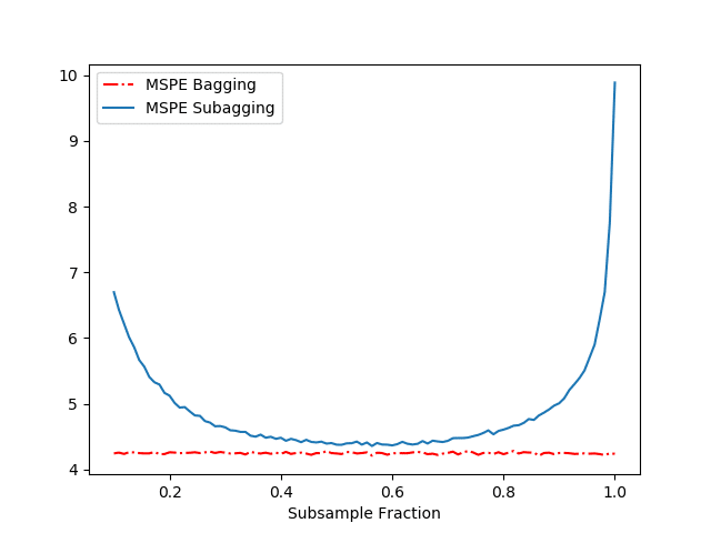
The results of our above simulation can be found in Figure 1.
Let us first compare the performance in terms of MSPE of the Regression Tree and the Bagged predictor. Table 1 shows us that Bagging drastically reduces the MSPE by decreasing the variance while almost not affecting the bias. (Recall – the mean squared prediction error is just the sum of the squared bias of the estimate, variance of the estimate and the variance of the error term (not reported).)
Table 1: Performance of fully grown tree and Bagged Predictor
| Predictor | Tree (fully grown) | Bagged Tree |
|---|---|---|
 |
3.47 | 2.94 |
 |
6.13 | 0.35 |
 |
10.61 | 4.26 |
Figure 1 displays the MSPE as a function of the subsample fraction for the Bagged and Subagged predictor (our above code). Together with Figure 1 and Table 1, we make several observations:
- We see that both the Bagged and Subagged predictor outperform a single tree (in terms of MSPE).
- For a subsampling fraction of approximately 0.5, Subagging achieves nearly the same prediction performance as Bagging while coming at a lower computational cost.
References
- Breiman, L.: Bagging predictors. Machine Learning, 24, 123–140 (1996).
- Bühlmann, P., Yu, B.: Analyzing bagging. Annals of Statistics 30, 927–961 (2002).