We at work a lot with R and often use the same little helper functions within our projects. These functions ease our daily work life by reducing repetitive code parts or by creating overviews of our projects. To share these functions within our teams and with others as well, I started to collect them and created an R package out of them called . Besides sharing, I also wanted to have some use cases to improve my debugging and optimization skills. With time the package grew, and more and more functions came together. Last time I presented each function as part of an advent calendar. For our new website launch, I combined all of them into this one and will present each current function from the package.
Most functions were developed when there was a problem, and one needed a simple solution. For example, the text shown was too long and needed to be shortened (see evenstrings). Other functions exist to reduce repetitive tasks – like reading in multiple files of the same type (see read_files). Therefore, these functions might be useful to you, too!
You can check out our
1. char_replace
This little helper replaces non-standard characters (such as the German umlaut “ä”) with their standard equivalents (in this case, “ae”). It is also possible to force all characters to lower case, trim whitespaces, or replace whitespaces and dashes with underscores.
Let’s look at a small example with different settings:
x <- " Élizàldë-González Strasse"
char_replace(x, to_lower = TRUE)
[1] "elizalde-gonzalez strasse"char_replace(x, to_lower = TRUE, to_underscore = TRUE)[1] "elizalde_gonzalez_strasse"char_replace(x, to_lower = FALSE, rm_space = TRUE, rm_dash = TRUE)[1] "ElizaldeGonzalezStrasse"
2. checkdir
This little helper checks a given folder path for existence and creates it if needed.
checkdir(path = "testfolder/subfolder")file.exists() and dir.create()
3. clean_gc
This little helper frees your memory from unused objects. Well, basically, it just calls gc() a few times. I used this some time ago for a project where I worked with huge data files. Even though we were lucky enough to have a big server with 500GB RAM, we soon reached its limits. Since we typically parallelize several processes, we needed to preserve every bit and byte of RAM we could get. So, instead of having many lines like this one:
gc();gc();gc();gc()clean_gc() for convenience. Internally, gc()
Some further thoughts
gc() and its usefulness. If you want to learn more about this, I suggest you check out the
4. count_na
This little helper counts missing values within a vector.
x <- c(NA, NA, 1, NaN, 0)
count_na(x)3sum(is.na(x)) counting the NA values. If you want the mean instead of the sum, you can set prop = TRUE
5. evenstrings
This little helper splits a given string into smaller parts with a fixed length. But why? I needed this function while creating a plot with a long title. The text was too long for one line, and I wanted to separate it nicely instead of just cutting it or letting it run over the edges.
Given a long string like…
long_title <- c("Contains the months: January, February, March, April, May, June, July, August, September, October, November, December")split = "," with a maximum length of char = 60
short_title <- evenstrings(long_title, split = ",", char = 60)The function has two possible output formats, which can be chosen by setting newlines = TRUE or FALSE:
- one string with line separators
\n - a vector with each sub-part.
Another use case could be a message that is printed at the console with cat():
cat(long_title)Contains the months: January, February, March, April, May, June, July, August, September, October, November, Decembercat(short_title)Contains the months: January, February, March, April, May,
June, July, August, September, October, November, December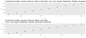
Code for plot example
p1 <- ggplot(data.frame(x = 1:10, y = 1:10),
  aes(x = x, y = y)) +
  geom_point() +
  ggtitle(long_title)

p2 <- ggplot(data.frame(x = 1:10, y = 1:10),
  aes(x = x, y = y)) +
  geom_point() +
  ggtitle(short_title)

multiplot(p1, p2)
6. get_files
This little helper does the same thing as the “Find in files” search within RStudio. It returns a vector with all files in a given folder that contain the search pattern. In your daily workflow, you would usually use the shortcut key SHIFT+CTRL+F. With get_files() you can use this functionality within your scripts.
7. get_network
This little helper aims to visualize the connections between R functions within a project as a flowchart. Herefore, the input is a directory path to the function or a list with the functions, and the outputs are an adjacency matrix and an igraph object. As an example, we use :
net <- get_network(dir = "flowchart/R_network_functions/", simplify = FALSE)
g1 <- net$igraph
Input
There are five parameters to interact with the function:
- A path
dirwhich shall be searched. - A character vector
variationswith the function’s definition string -the default isc(" <- function", "<- function", "<-function"). - A
patterna string with the file suffix – the default is"\\.R$". - A boolean
simplifythat removes functions with no connections from the plot. - A named list
all_scripts, which is an alternative todir. This is mainly just used for testing purposes.
For normal usage, it should be enough to provide a path to the project folder.
Output
The given plot shows the connections of each function (arrows) and also the relative size of the function’s code (size of the points). As mentioned above, the output consists of an adjacency matrix and an igraph object. The matrix contains the number of calls for each function. The igraph object has the following properties:
- The names of the functions are used as label.
- The number of lines of each function (without comments and empty ones) are saved as the size.
- The folder‘s name of the first folder in the directory.
- A color corresponding to the folder.
With these properties, you can improve the network plot, for example, like this:
library(igraph)

# create plots ------------------------------------------------------------
l <- layout_with_fr(g1)
colrs <- rainbow(length(unique(V(g1)$color)))

plot(g1,
     edge.arrow.size = .1,
     edge.width = 5*E(g1)$weight/max(E(g1)$weight),
     vertex.shape = "none",
     vertex.label.color = colrs[V(g1)$color],
     vertex.label.color = "black",
     vertex.size = 20,
     vertex.color = colrs[V(g1)$color],
     edge.color = "steelblue1",
     layout = l)
legend(x = 0,
       unique(V(g1)$folder), pch = 21,
       pt.bg = colrs[unique(V(g1)$color)],
       pt.cex = 2, cex = .8, bty = "n", ncol = 1)
8. get_sequence
This little helper returns indices of recurring patterns. It works with numbers as well as with characters. All it needs is a vector with the data, a pattern to look for, and a minimum number of occurrences.
Let’s create some time series data with the following code.
library(data.table)

# random seed
set.seed(20181221)

# number of observations
n <- 100

# simulationg the data
ts_data <- data.table(DAY = 1:n, CHANGE = sample(c(-1, 0, 1), n, replace = TRUE))
ts_data[, VALUE := cumsum(CHANGE)]
This is nothing more than a random walk since we sample between going down (-1), going up (1), or staying at the same level (0). Our time series data looks like this:
Assume we want to know the date ranges when there was no change for at least four days in a row.
ts_data[, get_sequence(x = CHANGE, pattern = 0, minsize = 4)] min max
[1,] 45 48
[2,] 65 69We can also answer the question if the pattern “down-up-down-up” is repeating anywhere:
ts_data[, get_sequence(x = CHANGE, pattern = c(-1,1), minsize = 2)] min max
[1,] 88 91geom_rect
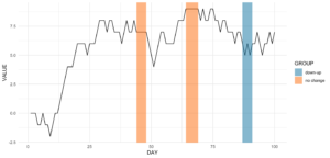
Code for the plot
rect <- data.table(
  rbind(ts_data[, get_sequence(x = CHANGE, pattern = c(0), minsize = 4)],
        ts_data[, get_sequence(x = CHANGE, pattern = c(-1,1), minsize = 2)]),
  GROUP = c("no change","no change","down-up"))

ggplot(ts_data, aes(x = DAY, y = VALUE)) +
  geom_line() +
  geom_rect(data = rect,
  inherit.aes = FALSE,
  aes(xmin = min - 1,
  xmax = max,
  ymin = -Inf,
  ymax = Inf,
  group = GROUP,
  fill = GROUP),
  color = "transparent",
  alpha = 0.5) +
  scale_fill_manual(values = statworx_palette(number = 2, basecolors = c(2,5))) +
  theme_minimal()
9. intersect2
This little helper returns the intersect of multiple vectors or lists. I found this function , thought it is quite useful and adjusted it a bit.
intersect2(list(c(1:3), c(1:4)), list(c(1:2),c(1:3)), c(1:2))[1] 1 2Internally, the problem of finding the intersection is solved recursively, if an element is a list and then stepwise with the next element.
10. multiplot
This little helper combines multiple ggplots into one plot. This is a function taken from .
An advantage over facets is, that you don’t need all data for all plots within one object. Also you can freely create each single plot – which can sometimes also be a disadvantage.
With the layout parameter you can arrange multiple plots with different sizes. Let’s say you have three plots and want to arrange them like this:
1    2    2
1    2    2
3 3 3multiplot
multiplot(plotlist = list(p1, p2, p3),
          layout = matrix(c(1,2,2,1,2,2,3,3,3), nrow = 3, byrow = TRUE))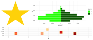
Code for plot example
# star coordinates
c1  =   cos((2*pi)/5)
c2  =   cos(pi/5)
s1  =   sin((2*pi)/5)
s2  =   sin((4*pi)/5)

data_star <- data.table(X = c(0, -s2, s1, -s1, s2),
                        Y = c(1, -c2, c1, c1, -c2))

p1 <- ggplot(data_star, aes(x = X, y = Y)) +
  geom_polygon(fill = "gold") +
  theme_void()

# tree
set.seed(24122018)
n <- 10000
lambda <- 2
data_tree <- data.table(X = c(rpois(n, lambda), rpois(n, 1.1*lambda)),
                        TYPE = rep(c("1", "2"), each = n))
data_tree <- data_tree[, list(COUNT = .N), by = c("TYPE", "X")]
data_tree[TYPE == "1", COUNT := -COUNT]

p2 <- ggplot(data_tree, aes(x = X, y = COUNT, fill = TYPE)) +
  geom_bar(stat = "identity") +
  scale_fill_manual(values = c("green", "darkgreen")) +
  coord_flip() +
  theme_minimal()

# gifts
data_gifts <- data.table(X = runif(5, min = 0, max = 10),
                         Y = runif(5, max = 0.5),
                         Z = sample(letters[1:5], 5, replace = FALSE))

p3 <- ggplot(data_gifts, aes(x = X, y = Y)) +
  geom_point(aes(color = Z), pch = 15, size = 10) +
  scale_color_brewer(palette = "Reds") +
  geom_point(pch = 12, size = 10, color = "gold") +
  xlim(0,8) +
  ylim(0.1,0.5) +
  theme_minimal() +
  theme(legend.position="none")
11. na_omitlist
This little helper removes missing values from a list.
y <- list(NA, c(1, NA), list(c(5:6, NA), NA, "A"))There are two ways to remove the missing values, either only on the first level of the list or wihtin each sub level.
na_omitlist(y, recursive = FALSE)[[1]]
[1] 1 NA
[[2]]
[[2]][[1]]
[1] 5 6 NA
[[2]][[2]]
[1] NA
[[2]][[3]]
[1] "A"na_omitlist(y, recursive = TRUE)[[1]]
[1] 1
[[2]]
[[2]][[1]]
[1] 5 6
[[2]][[2]]
[1] "A"12. %nin%
%in%
all.equal( c(1,2,3,4) %nin% c(1,2,5),
          !c(1,2,3,4) %in%  c(1,2,5))
[1] TRUE.
13. object_size_in_env
This little helper shows a table with the size of each object in the given environment.
If you are in a situation where you have coded a lot and your environment is now quite messy, object_size_in_env helps you to find the big fish with respect to memory usage. Personally, I ran into this problem a few times when I looped over multiple executions of my models. At some point, the sessions became quite large in memory and I did not know why! With the help of object_size_in_env and some degubbing I could locate the object that caused this problem and adjusted my code accordingly.
First, let us create an environment with some variables.
# building an environment
this_env <- new.env()
assign("Var1", 3, envir = this_env)
assign("Var2", 1:1000, envir = this_env)
assign("Var3", rep("test", 1000), envir = this_env)format(object.size()) is used. With the unit the output format can be changed (eg. "B", "MB" or "GB"
# checking the size
object_size_in_env(env = this_env, unit = "B")
OBJECT SIZE UNIT
1: Var3 8104 B
2: Var2 4048 B
3: Var1 56 B14. print_fs
This little helper returns the folder structure of a given path. With this, one can for example add a nice overview to the documentation of a project or within a git. For the sake of automation, this function could run and change parts wihtin a log or news file after a major change.
If we take a look at the same example we used for the get_network function, we get the following:
print_fs("~/flowchart/", depth = 4)1 flowchart
2 ¦--create_network.R
3 ¦--getnetwork.R
4 ¦--plots
5 ¦ ¦--example-network-helfRlein.png
6 ¦ °--improved-network.png
7 ¦--R_network_functions
8 ¦ ¦--dataprep
9 ¦ ¦ °--foo_01.R
10 ¦ ¦--method
11 ¦ ¦ °--foo_02.R
12 ¦ ¦--script_01.R
13 ¦ °--script_02.R
14 °--README.md With depth we can adjust how deep we want to traverse through our folders.
15. read_files
This little helper reads in multiple files of the same type and combines them into a data.table. Which kind of file reading function should be used can be choosen by the FUN argument.
If you have a list of files, that all needs to be loaded in with the same function (e.g. read.csv), instead of using lapply and rbindlist now you can use this:
read_files(files, FUN = readRDS)
read_files(files, FUN = readLines)
read_files(files, FUN = read.csv, sep = ";")
Internally, it just uses lapply and rbindlist but you dont have to type it all the time. The read_files combines the single files by their column names and returns one data.table. Why data.table? Because I like it. But, let’s not go down the rabbit hole of data.table vs dplyr ().
16. save_rds_archive
This little helper is a wrapper around base R saveRDS() and checks if the file you attempt to save already exists. If it does, the existing file is renamed / archived (with a time stamp), and the “updated” file will be saved under the specified name. This means that existing code which depends on the file name remaining constant (e.g., readRDS() calls in other scripts) will continue to work while an archived copy of the – otherwise overwritten – file will be kept.
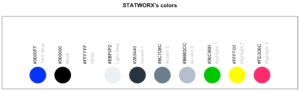
17. sci_palette
This little helper returns a set of colors which we often use at statworx. So, if – like me – you cannot remeber each hex color code you need, this might help. Of course these are our colours, but you could rewrite it with your own palette. But the main benefactor is the plotting method – so you can see the color instead of only reading the hex code.
To see which hex code corresponds to which colour and for what purpose to use it
sci_palette(scheme = "new")Tech Blue Black White Light Grey Accent 1 Accent 2 Accent 3
"#0000FF" "#000000" "#FFFFFF" "#EBF0F2" "#283440" "#6C7D8C" "#B6BDCC"
Highlight 1 Highlight 2 Highlight 3
"#00C800" "#FFFF00" "#FE0D6C"
attr(,"class")
[1] "sci"plot()
plot(sci_palette(scheme = "new"))
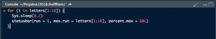
18. statusbar
This little helper prints a progress bar into the console for loops.
There are two nessecary parameters to feed this function:
runis either the iterator or its numbermax.runis either all possible iterators in the order they are processed or the maximum number of iterations.
So for example it could be run = 3 and max.run = 16 or run = "a" and max.run = letters[1:16].
Also there are two optional parameter:
percent.maxinfluences the width of the progress barinfois an additional character, which is printed at the end of the line. By default it isrun.
A little disadvantage of this function is, that it does not work with parallel processes. If you want to have a progress bar when using apply functions check out .
19. statworx_palette
This little helper is an addition to yesterday’s . We picked colors 1, 2, 3, 5 and 10 to create a flexible color palette. If you need 100 different colors – say no more!
In contrast to sci_palette() the return value is a character vector. For example if you want 16 colors:
statworx_palette(16, scheme = "old")[1] "#013848" "#004C63" "#00617E" "#00759A" "#0087AB" "#008F9C" "#00978E" "#009F7F"
[9] "#219E68" "#659448" "#A98B28" "#ED8208" "#F36F0F" "#E45A23" "#D54437" "#C62F4B"If we now plot those colors, we get this nice rainbow like gradient.
library(ggplot2)

ggplot(plot_data, aes(x = X, y = Y)) +
  geom_point(pch = 16, size = 15, color = statworx_palette(16, scheme = "old")) +
  theme_minimal()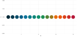
reorder parameter, which samples the color’s order so that neighbours might be a bit more distinguishable. Also if you want to change the used colors, you can do so with basecolors
ggplot(plot_data, aes(x = X, y = Y)) +
  geom_point(pch = 16, size = 15,
             color = statworx_palette(16, basecolors = c(4,8,10), scheme = "new")) +
  theme_minimal()
20. strsplit
This little helper adds functionality to the base R function strsplit – hence the same name! It is now possible to split before, after or between a given delimiter. In the case of between you need to specify two delimiters.
An earlier version of this function can be found , where I describe the used regular expressions, if you are interested.
Here is a little example on how to use the new strsplit.
text <- c("This sentence should be split between should and be.")

strsplit(x = text, split = " ")
strsplit(x = text, split = c("should", " be"), type = "between")
strsplit(x = text, split = "be", type = "before")
[[1]]
[1] "This" "sentence" "should" "be" "split" "between" "should" "and"
[9] "be."
[[1]]
[1] "This sentence should" " be split between should and be."
[[1]]
[1] "This sentence should " "be split " "between should and "
[4] "be."21. to_na
This little helper is just a convenience function. Some times during your data preparation, you have a vector with infinite values like Inf or -Inf or even NaN values. Thos kind of value can (they do not have to!) mess up your evaluation and models. But most functions do have a tendency to handle missing values. So, this little helper removes such values and replaces them with NA.
A small exampe to give you the idea:
test <- list(a = c("a", "b", NA),
             b = c(NaN, 1,2, -Inf),
             c = c(TRUE, FALSE, NaN, Inf))

lapply(test, to_na)
$a
[1] "a" "b" NA
$b
[1] NA 1 2 NA
$c
[1] TRUE FALSE NA Since there are different types of NA depending on the other values within a vector. You might want to check the format if you do to_na
test <- list(NA, c(NA, "a"), c(NA, 2.3), c(NA, 1L))
str(test)
List of 4
$ : logi NA
$ : chr [1:2] NA "a"
$ : num [1:2] NA 2.3
$ : int [1:2] NA 122. trim
This little helper removes leading and trailing whitespaces from a string. With trimws was introduced, which does the exact same thing. This just shows, it was not a bad idea to write such a function. 😉
x <- c("  Hello world!", "  Hello world! ", "Hello world! ")
trim(x, lead = TRUE, trail = TRUE)
[1] "Hello world!" "Hello world!" "Hello world!"The lead and trail parameters indicates if only leading, trailing or both whitspaces should be removed.
Conclusion
I hope that the helfRlein package makes your work as easy as it is for us here at statworx. If you have any questions or input about the package, please send us an email to: blog@statworx.com
In the field of Data Science – as the name suggests – the topic of data, from data cleaning to feature engineering, is one of the cornerstones. Having and evaluating data is one thing, but how do you actually get data for new problems?
If you are lucky, the data you need is already available. Either by downloading a whole dataset or by using an API. Often, however, you have to gather information from websites yourself – this is called web scraping. Depending on how often you want to scrape data, it is advantageous to automate this step.
This post will be about exactly this automation. Using web scraping and GitHub Actions as an example, I will show how you can create your own data sets over a more extended period. The focus will be on the experience I have gathered over the last few months.
The code I used and the data I collected can be found in this GitHub repository.
Search for data – the initial situation
During my research for the blog post about gasoline prices, I also came across data on the utilization of parking garages in Frankfurt am Main. Obtaining this data laid the foundation for this post. After some thought and additional research, other thematically appropriate data sources came to mind:
- Road utilization
- S-Bahn and subway delays
- Events nearby
- Weather data
However, it quickly became apparent that I could not get all this data, as it is not freely available or allowed to be stored. Since I planned to store the collected data on GitHub and make it available, this was a crucial point for which data came into question. For these reasons, railway data fell out completely. I only found data for Cologne for road usage, and I wanted to avoid using the Google API as that definitely brings its own challenges. So, I was left with event and weather data.
For the weather data of the German Weather Service, the rdwd package can be used. Since this data is already historized, it is irrelevant for this blog post. The GitHub Actions have proven to be very useful to get the remaining event and park data, even if they are not entirely trivial to use. Especially the fact that they can be used free of charge makes them a recommendable tool for such projects.
Scraping the data
Since this post will not deal with the details of web scraping, I refer you here to the post by my colleague David.
The parking data is available here in XML format and is updated every 5 minutes. Once you understand the structure of the XML, it’s a simple matter of accessing the right index, and you have the data you want. In the function get_parking_data(), I have summarized everything I need. It creates a record for the area and a record for the individual parking garages.
Example data extract area
parkingAreaOccupancy;parkingAreaStatusTime;parkingAreaTotalNumberOfVacantParkingSpaces;
totalParkingCapacityLongTermOverride;totalParkingCapacityShortTermOverride;id;TIME
0.08401977;2021-12-01T01:07:00Z;556;150;607;1[Anlagenring];2021-12-01T01:07:02.720Z
0.31417114;2021-12-01T01:07:00Z;513;0;748;4[Bahnhofsviertel];2021-12-01T01:07:02.720Z
0.351417;2021-12-01T01:07:00Z;801;0;1235;5[Dom / Römer];2021-12-01T01:07:02.720Z
0.21266666;2021-12-01T01:07:00Z;1181;70;1500;2[Zeil];2021-12-01T01:07:02.720Z
Example data extract facility
parkingFacilityOccupancy;parkingFacilityStatus;parkingFacilityStatusTime;
totalNumberOfOccupiedParkingSpaces;totalNumberOfVacantParkingSpaces;
totalParkingCapacityLongTermOverride;totalParkingCapacityOverride;
totalParkingCapacityShortTermOverride;id;TIME
0.02;open;2021-12-01T01:02:00Z;4;196;150;350;200;24276[Turmcenter];2021-12-01T01:07:02.720Z
0.11547912;open;2021-12-01T01:02:00Z;47;360;0;407;407;18944[Alte Oper];2021-12-01T01:07:02.720Z
0.0027472528;open;2021-12-01T01:02:00Z;1;363;0;364;364;24281[Hauptbahnhof Süd];2021-12-01T01:07:02.720Z
0.609375;open;2021-12-01T01:02:00Z;234;150;0;384;384;105479[Baseler Platz];2021-12-01T01:07:02.720Z
For the event data, I scrape the page stadtleben.de. Since it is a HTML that is quite well structured, I can access the tabular event overview via the tag “kalenderListe”. The result is created by the function get_event_data().
Example data extract event
eventtitle;views;place;address;eventday;eventdate;request
Magical Sing Along - Das lustigste Mitsing-Event;12576;Bürgerhaus;64546 Mörfelden-Walldorf, Westendstraße 60;Freitag;2022-03-04;2022-03-04T02:24:14.234833Z
Velvet-Bar-Night;1460;Velvet Club;60311 Frankfurt, Weißfrauenstraße 12-16;Freitag;2022-03-04;2022-03-04T02:24:14.234833Z
Basta A-cappella-Band;465;Zeltpalast am Deutsche Bank Park;60528 Frankfurt am Main, Mörfelder Landstraße 362;Freitag;2022-03-04;2022-03-04T02:24:14.234833Z
BeThrifty Vintage Kilo Sale | Frankfurt | 04. & 05. …;1302;Batschkapp;60388 Frankfurt am Main, Gwinnerstraße 5;Freitag;2022-03-04;2022-03-04T02:24:14.234833Z
Automation of workflows – GitHub Actions
The basic framework is in place. I have a function that writes the park and event data to a .csv file when executed. Since I want to query the park data every 5 minutes and the event data three times a day for security, GitHub Actions come into play.
With this function of GitHub, workflows can be scheduled and executed in addition to actions triggered during merging or committing. For this purpose, a .yml file is created in the folder /.github/workflows.
The main components of my workflow are:
- The
schedule– Every ten minutes, the functions should be executed - The OS – Since I develop locally on a Mac, I use the
macOS-latesthere. - Environment variables – This contains my GitHub token and the path for the package management
renv. - The individual
stepsin the workflow itself.
The workflow goes through the following steps:
- Setup R
- Load packages with renv
- Run script to scrape data
- Run script to update the README
- Pushing the new data back into git
Each of these steps is very small and clear in itself; however, as is often the case, the devil is in the details.
Limitation and challenges
Over the last few months, I’ve been tweaking and optimizing my workflow to deal with the bugs and issues. In the following, you will find an overview of my condensed experiences with GitHub Actions from the last months.
Schedule problems
If you want to perform time-critical actions, you should use other services. GitHub Action does not guarantee that the jobs will be timed exactly (or, in some cases, that they will be executed at all).
| Time span in minutes | <= 5 | <= 10 | <= 20 | <= 60 | > 60 |
| Number of queries | 1720 | 2049 | 5509 | 3023 | 194 |
You can see that the planned five-minute intervals were not always adhered to. I should plan a larger margin here in the future.
Merge conflicts
In the beginning, I had two workflows, one for the park data and one for the events. If they overlapped in time, there were merge conflicts because both processes updated the README with a timestamp. Over time, I switched to a workflow including error handling.
Even if one run took longer and the next one had already started, there were merge conflicts in the .csv data when pushing. Long runs were often caused by the R setup and the loading of the packages. Consequently, I extended the schedule interval from five to ten minutes.
Format adjustments
There were a few situations where the paths or structure of the scraped data changed, so I had to adjust my functions. Here the setting to get an email if a process failed was very helpful.
Lack of testing capabilities
There is no way to test a workflow script other than to run it. So, after a typo in the evening, one can wake up to a flood of emails with spawned runs in the morning. Still, that shouldn’t stop you from doing a local test run.
No data update
Since the end of December, the parking data has not been updated or made available. This shows that even if you have an automatic process, you should still continue to monitor it. I only noticed this later, which meant that my queries at the end of December always went nowhere.
Conclusion
Despite all these complications, I still consider the whole thing a massive success. Over the last few months, I’ve been studying the topic repeatedly and have learned the tricks described above, which will also help me solve other problems in the future. I hope that all readers of this blog post could also take away some valuable tips and thus learn from my mistakes.
Since I have now collected a good half-year of data, I can deal with the evaluation. But this will be the subject of another blog post.
Introduction
When working on data science projects in R, exporting internal R objects as files on your hard drive is often necessary to facilitate collaboration. Here at STATWORX, we regularly export R objects (such as outputs of a machine learning model) as .RDS files and put them on our internal file server. Our co-workers can then pick them up for further usage down the line of the data science workflow (such as visualizing them in a dashboard together with inputs from other colleagues).
Over the last couple of months, I came to work a lot with RDS files and noticed a crucial shortcoming: The base R saveRDS function does not allow for any kind of archiving of existing same-named files on your hard drive. In this blog post, I will explain why this might be very useful by introducing the basics of serialization first and then showcasing my proposed solution: A wrapper function around the existing base R serialization framework.
Be wary of silent file replacements!
In base R, you can easily export any object from the environment to an RDS file with:
saveRDS(object = my_object, file = "path/to/dir/my_object.RDS")However, including such a line somewhere in your script can carry unintended consequences: When calling saveRDS multiple times with identical file names, R silently overwrites existing, identically named .RDS files in the specified directory. If the object you are exporting is not what you expect it to be — for example due to some bug in newly edited code — your working copy of the RDS file is simply overwritten in-place. Needless to say, this can prove undesirable.
If you are familiar with this pitfall, you probably used to forestall such potentially troublesome side effects by commenting out the respective lines, then carefully checking each time whether the R object looked fine, then executing the line manually. But even when there is nothing wrong with the R object you seek to export, it can make sense to retain an archived copy of previous RDS files: Think of a dataset you run through a data prep script, and then you get an update of the raw data, or you decide to change something in the data prep (like removing a variable). You may wish to archive an existing copy in such cases, especially with complex data prep pipelines with long execution time.
Don’t get tangled up in manual renaming
You could manually move or rename the existing file each time you plan to create a new one, but that’s tedious, error-prone, and does not allow for unattended execution and scalability. For this reason, I set out to write a carefully designed wrapper function around the existing saveRDS call, which is pretty straightforward: As a first step, it checks if the file you attempt to save already exists in the specified location. If it does, the existing file is renamed/archived (with customizable options), and the “updated” file will be saved under the originally specified name.
This approach has the crucial advantage that the existing code that depends on the file name remaining identical (such as readRDS calls in other scripts) will continue to work with the latest version without any needs for adjustment! No more saving your objects as “models_2020-07-12.RDS”, then combing through the other scripts to replace the file name, only to repeat this process the next day. At the same time, an archived copy of the — otherwise overwritten — file will be kept.
What are RDS files anyways?
Before I walk you through my proposed solution, let’s first examine the basics of serialization, the underlying process behind high-level functions like saveRDS.
Simply speaking, serialization is the “process of converting an object into a stream of bytes so that it can be transferred over a network or stored in a persistent storage.” Stack Overflow: What is serialization?
There is also a low-level R interface, serialize, which you can use to explore (un-)serialization first-hand: Simply fire up R and run something like serialize(object = c(1, 2, 3), connection = NULL). This call serializes the specified vector and prints the output right to the console. The result is an odd-looking raw vector, with each byte separately represented as a pair of hex digits. Now let’s see what happens if we revert this process:
s <- serialize(object = c(1, 2, 3), connection = NULL)
print(s)
# >  [1] 58 0a 00 00 00 03 00 03 06 00 00 03 05 00 00 00 00 05 55 54 46 2d 38 00 00 00 0e 00
# > [29] 00 00 03 3f f0 00 00 00 00 00 00 40 00 00 00 00 00 00 00 40 08 00 00 00 00 00 00

unserialize(s)
# > 1 2 3
The length of this raw vector increases rapidly with the complexity of the stored information: For instance, serializing the famous, although not too large, iris dataset results in a raw vector consisting of 5959 pairs of hex digits!
Besides the already mentioned saveRDS function, there is also the more generic save function. The former saves a single R object to a file. It allows us to restore the object from that file (with the counterpart readRDS), possibly under a different variable name: That is, you can assign the contents of a call to readRDS to another variable. By contrast, save allows for saving multiple R objects, but when reading back in (with load), they are simply restored in the environment under the object names they were saved with. (That’s also what happens automatically when you answer “Yes” to the notorious question of whether to “save the workspace image to ~/.RData” when quitting RStudio.)
Creating the archives
Obviously, it’s great to have the possibility to save internal R objects to a file and then be able to re-import them in a clean session or on a different machine. This is especially true for the results of long and computationally heavy operations such as fitting machine learning models. But as we learned earlier, one wrong keystroke can potentially erase that one precious 3-hour-fit fine-tuned XGBoost model you ran and carefully saved to an RDS file yesterday.

Digging into the wrapper
So, how did I go about fixing this? Let’s take a look at the code. First, I define the arguments and their defaults: The object and file arguments are taken directly from the wrapped function, the remaining arguments allow the user to customize the archiving process: Append the archive file name with either the date the original file was archived or last modified, add an additional timestamp (not just the calendar date), or save the file to a dedicated archive directory. For more details, please check the documentation here. I also include the ellipsis ... for additional arguments to be passed down to saveRDS. Additionally, I do some basic input handling (not included here).
save_rds_archive <- function(object,
                             file = "",
                             archive = TRUE,
                             last_modified = FALSE,
                             with_time = FALSE,
                             archive_dir_path = NULL,
                             ...) {
The main body of the function is basically a series of if/else statements. I first check if the archive argument (which controls whether the file should be archived in the first place) is set to TRUE, and then if the file we are trying to save already exists (note that “file” here actually refers to the whole file path). If it does, I call the internal helper function create_archived_file, which eliminates redundancy and allows for concise code.
if (archive) {

    # check if file exists
    if (file.exists(file)) {

      archived_file <- create_archived_file(file = file,
                                            last_modified = last_modified,
                                            with_time = with_time)
Composing the new file name
In this function, I create the new name for the file which is to be archived, depending on user input: If last_modified is set, then the mtime of the file is accessed. Otherwise, the current system date/time (= the date of archiving) is taken instead. Then the spaces and special characters are replaced with underscores, and, depending on the value of the with_time argument, the actual time information (not just the calendar date) is kept or not.
To make it easier to identify directly from the file name what exactly (date of archiving vs. date of modification) the indicated date/time refers to, I also add appropriate information to the file name. Then I save the file extension for easier replacement (note that “.RDS”, “.Rds”, and “.rds” are all valid file extensions for RDS files). Lastly, I replace the current file extension with a concatenated string containing the type info, the new date/time suffix, and the original file extension. Note here that I add a “$” sign to the regex which is to be matched by gsub to only match the end of the string: If I did not do that and the file name would be something like “my_RDS.RDS”, then both matches would be replaced.
# create_archived_file.R

create_archived_file <- function(file, last_modified, with_time) {

  # create main suffix depending on type
  suffix_main <- ifelse(last_modified,
                        as.character(file.info(file)$mtime),
                        as.character(Sys.time()))

  if (with_time) {

    # create clean date-time suffix
    suffix <- gsub(pattern = " ", replacement = "_", x = suffix_main)
    suffix <- gsub(pattern = ":", replacement = "-", x = suffix)

    # add "at" between date and time
    suffix <- paste0(substr(suffix, 1, 10), "_at_", substr(suffix, 12, 19))

  } else {

    # create date suffix
    suffix <- substr(suffix_main, 1, 10)

  }

  # create info to paste depending on type
  type_info <- ifelse(last_modified,
                      "_MODIFIED_on_",
                      "_ARCHIVED_on_")

  # get file extension (could be any of "RDS", "Rds", "rds", etc.)
  ext <- paste0(".", tools::file_ext(file))

  # replace extension with suffix
  archived_file <- gsub(pattern = paste0(ext, "$"),
                        replacement = paste0(type_info,
                                             suffix,
                                             ext),
                        x = file)

  return(archived_file)

}
Archiving the archives?
By way of example, with last_modified = FALSE and with_time = TRUE, this function would turn the character file name “models.RDS” into “models_ARCHIVED_on_2020-07-12_at_11-31-43.RDS”. However, this is just a character vector for now — the file itself is not renamed yet. For this, we need to call the base R file.rename function, which provides a direct interface to your machine’s file system. I first check, however, whether a file with the same name as the newly created archived file string already exists: This could well be the case if one appends only the date (with_time = FALSE) and calls this function several times per day (or potentially on the same file if last_modified = TRUE).
Somehow, we are back to the old problem in this case. However, I decided that it was not a good idea to archive files that are themselves archived versions of another file since this would lead to too much confusion (and potentially too much disk space being occupied). Therefore, only the most recent archived version will be kept. (Note that if you still want to keep multiple archived versions of a single file, you can set with_time = TRUE. This will append a timestamp to the archived file name up to the second, virtually eliminating the possibility of duplicated file names.) A warning is issued, and then the already existing archived file will be overwritten with the current archived version.
The last puzzle piece: Renaming the original file
To do this, I call the file.rename function, renaming the “file” originally passed by the user call to the string returned by the helper function. The file.rename function always returns a boolean indicating if the operation succeeded, which I save to a variable temp to inspect later. Under some circumstances, the renaming process may fail, for instance due to missing permissions or OS-specific restrictions. We did set up a CI pipeline with GitHub Actions and continuously test our code on Windows, Linux, and MacOS machines with different versions of R. So far, we didn’t run into any problems. Still, it’s better to provide in-built checks.
It’s an error! Or is it?
The problem here is that, when renaming the file on disk failed, file.rename raises merely a warning, not an error. Since any causes of these warnings most likely originate from the local file system, there is no sense in continuing the function if the renaming failed. That’s why I wrapped it into a tryCatch call that captures the warning message and passes it to the stop call, which then terminates the function with the appropriate message.
Just to be on the safe side, I check the value of the temp variable, which should be TRUE if the renaming succeeded, and also check if the archived version of the file (that is, the result of our renaming operation) exists. If both of these conditions hold, I simply call saveRDS with the original specifications (now that our existing copy has been renamed, nothing will be overwritten if we save the new file with the original name), passing along further arguments with ....
        if (file.exists(archived_file)) {
          warning("Archived copy already exists - will overwrite!")
        }

        # rename existing file with the new name
        # save return value of the file.rename function
        # (returns TRUE if successful) and wrap in tryCatch
        temp <- tryCatch({file.rename(from = file,
                                      to = archived_file)
        },
        warning = function(e) {
          stop(e)
        })

      }

      # check return value and if archived file exists
      if (temp & file.exists(archived_file)) {
        # then save new file under specified name
        saveRDS(object = object, file = file, ...)
      }

    }
These code snippets represent the cornerstones of my function. I also skipped some portions of the source code for reasons of brevity, chiefly the creation of the “archive directory” (if one is specified) and the process of copying the archived file into it. Please refer to our GitHub for the complete source code of the main and the helper function.
Finally, to illustrate, let’s see what this looks like in action:
x <- 5
y <- 10
z <- 20

## save to RDS
saveRDS(x, "temp.RDS")
saveRDS(y, "temp.RDS")

## "temp.RDS" is silently overwritten with y
## previous version is lost
readRDS("temp.RDS")
#> [1] 10

save_rds_archive(z, "temp.RDS")
## current version is updated
readRDS("temp.RDS")
#> [1] 20

## previous version is archived
readRDS("temp_ARCHIVED_on_2020-07-12.RDS")
#> [1] 10
Great, how can I get this?
The function save_rds_archive is now included in the newly refactored helfRlein package (now available in version 1.0.0!) which you can install directly from GitHub:
# install.packages("devtools")
devtools::install_github("STATWORX/helfRlein")
Feel free to check out additional documentation and the source code there. If you have any inputs or feedback on how the function could be improved, please do not hesitate to contact me or raise an issue on our GitHub.
Conclusion
That’s it! No more manually renaming your precious RDS files — with this function in place, you can automate this tedious task and easily keep a comprehensive archive of previous versions. You will be able to take another look at that one model you ran last week (and then discarded again) in the blink of an eye. I hope you enjoyed reading my post — maybe the function will come in handy for you someday!
“There is no way you know Thomas! What a coincidence! He’s my best friend’s saxophone teacher! This cannot be true. Here we are, at the other end of the world and we meet? What are the odds?” Surely, not only us here at STATWORX have experienced similar situations, be it in a hotel’s lobby, on the far away hiking trail or in the pub in that city you are completely new to. However, the very fact that this story is so suspiciously relatable might indicate that the chances of being socially connected to a stranger by a short chain of friends of friends isn’t too low after all.
Lots of research has been done in this field, one particular popular result being the 6-Handshake-Rule. It states that most people living on this planet are connected by a chain of six handshakes or less. In the general setting of graphs, in which edges connect nodes, this is often referred to as the so-called small-world-effect. That is to say, the typical number of edges needed to get from node A to node B grows logarithmically in population size (i.e., # nodes). Note that, up until now, no geographic distance has been included in our consideration, which seems inadequate as it plays a significant role in social networks.
When analyzing data from social networks such as Facebook or Instagram, three observations are especially striking:
- Individuals who are geographically farther away from each other are less likely to connect, i.e., people from the same city are more likely to connect.
- Few individuals have extremely many connections. Their number of connections follows a heavy-tailed Pareto distribution. Such individuals interact as hubs in the network. That could be a celebrity or just a really popular kid from school.
- Connected individuals tend to share a set of other individuals they are both connected to (e.g., “friend cliques”). This is called the clustering property.
A model that explains these observations
Clearly, due to the characteristics of social networks mentioned above, only a model that includes geographic distances of the individuals makes sense. Also, to account for the occurrence of hubs, research has shown that reasonable models attach a random weight to each node (which can be regarded as the social attractiveness of the respective individual). A model that accounts for all three properties is the following: First, randomly place nodes in space with a certain intensity  , which can be done with a Poisson process. Then, with an independent uniformly distributed weight
  attached to each node
  , every two nodes get connected by an edge with a probability
![\[p_{xy} =mathbb{P}(xtext{ is connected to } y):=varphi(frac{1}{beta}U_x^gamma U_y^gamma vert x-yvert^d)\]](https://www.statworx.com/wp-content/ql-cache/quicklatex.com-07ec50c52e3fb8422c9cf614fe5f3e6a_l3.png "Rendered by QuickLaTeX.com")
where  is the dimension of the model (here:
  as we’ll simulate the model on the plane), model parameter
 ![gammain [0,1]](https://www.statworx.com/wp-content/ql-cache/quicklatex.com-cb8bd20004079d9e4c1c36e7a8664eb7_l3.png "Rendered by QuickLaTeX.com") controls the impact of the weights, model parameter
controls the impact of the weights, model parameter  squishes the overall input to the profile function
  , which is a monotonously decreasing, normalized function that returns a value between
  and
and  .
.
That is, of course, what we want because its output shall be a probability. Take a moment to go through the effects of different  and
and  on
on  . A higher yields a smaller input value for and thereby a higher connection probability. Similarly, a high entails a lower
  (as
(as ![Uin [0,1]](https://www.statworx.com/wp-content/ql-cache/quicklatex.com-0a9217d587881c069c94a7f084285b33_l3.png "Rendered by QuickLaTeX.com") ) and thus a higher connection probability. All this comprises a scale-free random connection model, which can be seen as a generalization of the model by Deprez and Würthrich. So much about the theory. Now that we have a model, we can use this to generate synthetic data that should look similar to real-world data. So let’s simulate!
) and thus a higher connection probability. All this comprises a scale-free random connection model, which can be seen as a generalization of the model by Deprez and Würthrich. So much about the theory. Now that we have a model, we can use this to generate synthetic data that should look similar to real-world data. So let’s simulate!
Obtain data through simulation
From here on, the simulation is pretty straight forward. Don’t worry about specific numbers at this point.
library(tidyverse)
library(fields)
library(ggraph)
library(tidygraph)
library(igraph)
library(Matrix)

# Create a vector with plane dimensions. The random nodes will be placed on the plane.
plane <- c(1000, 1000)

poisson_para <- .5 * 10^(-3) # Poisson intensity parameter
beta <- .5 * 10^3
gamma <- .4

# Number of nodes is Poisson(gamma)*AREA - distributed
n_nodes <- rpois(1, poisson_para * plane[1] * plane[2])
weights <- runif(n_nodes) # Uniformly distributed weights

# The Poisson process locally yields node positions that are completely random.
x = plane[1] * runif(n_nodes)
y = plane[2] * runif(n_nodes)

phi <- function(z) { # Connection function
  pmin(z^(-1.8), 1)
}
What we need next is some information on which nodes are connected. That means, we need to first get the connection probability by evaluating for each pair of nodes and then flipping a biased coin, accordingly. This yields a  encoding, where means that the two respective nodes are connected and that they’re not. We can gather all the information for all pairs in a matrix that is commonly known as the adjacency matrix.
# Distance matrix needed as input
dist_matrix <-rdist(tibble(x,y))

weight_matrix <- outer(weights, weights, FUN="*") # Weight matrix

con_matrix_prob <- phi(1/beta * weight_matrix^gamma*dist_matrix^2)# Evaluation

con_matrix <- Matrix(rbernoulli(1,con_matrix_prob), sparse=TRUE) # Sampling
con_matrix <- con_matrix * upper.tri(con_matrix) # Transform to symmetric matrix
adjacency_matrix <- con_matrix + t(con_matrix)
Visualization with ggraph
In an earlier post we praised visNetwork as our go-to package for beautiful interactive graph visualization in R. While this remains true, we also have lots of love for tidyverse, and ggraph (spoken “g-giraffe”) as an extension of ggplot2 proves to be a comfortable alternative for non-interactive graph plots, especially when you’re already familiar with the grammar of graphics. In combination with tidygraph, which lets us describe a graph as two tidy data frames (one for the nodes and one for the edges), we obtain a full-fledged tidyverse experience. Note that tidygraph is based on a graph manipulation library called igraph from which it inherits all functionality and “exposes it in a tidy manner”. So before we get cracking with the visualization in ggraph, let’s first tidy up our data with tidygraph!

Make graph data tidy again!
Let’s attach some new columns to the node dataframe which will be useful for visualization. After we created the tidygraph object, this can be done in the usual dplyr fashion after using activate(nodes)and activate(edges)for accessing the respective dataframes.
# Create Igraph object
graph <- graph_from_adjacency_matrix(adjacency_matrix, mode="undirected")

# Make a tidygraph object from it. Igraph methods can still be called on it.
tbl_graph <- as_tbl_graph(graph)

hub_id <- which.max(degree(graph))

# Add spacial positions, hub distance and degree information to the nodes.
tbl_graph <- tbl_graph %>%
  activate(nodes) %>%
  mutate(
    x = x,
    y = y,
    hub_dist = replace_na(bfs_dist(root = hub_id), Inf),
    degree = degree(graph),
    friends_of_friends = replace_na(local_ave_degree(), 0),
    cluster = as.factor(group_infomap())
  )
Tidygraph supports most of igraphs methods, either directly or in the form of wrappers. This also applies to most of the functions used above. For example breadth-first search is implemented as the bfs_* family, wrapping igraph::bfs(), the group_graphfamily wraps igraphs clustering functions and local_ave_degree() wraps igraph::knn().
Let’s visualize!
GGraph is essentially built around three components: Nodes, Edges and Layouts. Nodes that are connected by edges compose a graph which can be created as an igraph object. Visualizing the igraph object can be done in numerous ways: Remember that nodes usually are not endowed with any coordinates. Therefore, arranging them in space can be done pretty much arbitrarily. In fact, there’s a specific research branch called graph drawing that deals with finding a good layout for a graph for a given purpose.
Usually, the main criteria of a good layout are aesthetics (which is often interchangeable with clearness) and capturing specific graph properties. For example, a layout may force the nodes to form a circle, a star, two parallel lines, or a tree (if the graph’s data allows for it). Other times you might want to have a layout with a minimal number of intersecting edges. Fortunately, in ggraph all the layouts from igraph can be used.
We start with a basic plot by passing the data and the layout to ggraph(), similar to what you would do with ggplot() in ggplot2. We can then add layers to the plot. Nodes can be created by using geom_node_point()and edges by using geom_edge_link(). From then on, it’s full-on ggplot2-style.
# Add coord_fixed() for fixed axis ratio!
basic <- tbl_graph %>%
ggraph(layout = tibble(V(.) y)) +
geom_edge_link(width = .1) +
geom_node_point(aes(size = degree, color = degree)) +
scale_color_gradient(low = "dodgerblue2", high = "firebrick4") +
coord_fixed() +
guides(size = FALSE)
y)) +
geom_edge_link(width = .1) +
geom_node_point(aes(size = degree, color = degree)) +
scale_color_gradient(low = "dodgerblue2", high = "firebrick4") +
coord_fixed() +
guides(size = FALSE)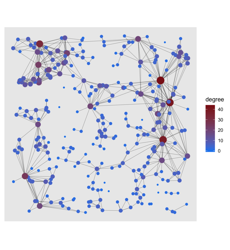
To see more clearly what nodes are essential to the network, the degree, which is the number of edges a node is connected with, was highlighted for each node. Another way of getting a good overview of the graph is to show a visual decomposition of the components. Nothing easier than that!
cluster <- tbl_graph %>%
  ggraph(layout = tibble(V(.)y)) +
  geom_edge_link(width = .1) +
  geom_node_point(aes(size = degree, color = cluster)) +
  coord_fixed() +
  theme(legend.position = "none")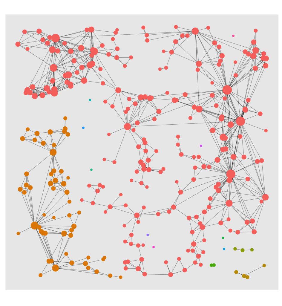
Wouldn’t it be interesting to visualize the reach of a hub node? Let’s do it with a facet plot:
# Copy of tbl_graph with columns that indicate weather in n - reach of hub.
reach_graph <- function(n) {
  tbl_graph %>%
    activate(nodes) %>%
    mutate(
      reach = n,
      reachable = ifelse(hub_dist <= n, "reachable", "non_reachable"),
      reachable = ifelse(hub_dist == 0, "Hub", reachable)
    )
}
# Tidygraph allows to bind graphs. This means binding rows of the node and edge dataframes.
evolving_graph <- bind_graphs(reach_graph(0), reach_graph(1), reach_graph(2), reach_graph(3))

evol <- evolving_graph %>%
  ggraph(layout = tibble(V(.)y)) +
  geom_edge_link(width = .1, alpha = .2) +
  geom_node_point(aes(size = degree, color = reachable)) +
  scale_size(range = c(.5, 2)) +
  scale_color_manual(values = c("Hub" = "firebrick4",
                                "non_reachable" = "#00BFC4",
                                "reachable" = "#F8766D","")) +
  coord_fixed() +
  facet_nodes(~reach, ncol = 4, nrow = 1, labeller = label_both) +
  theme(legend.position = "none")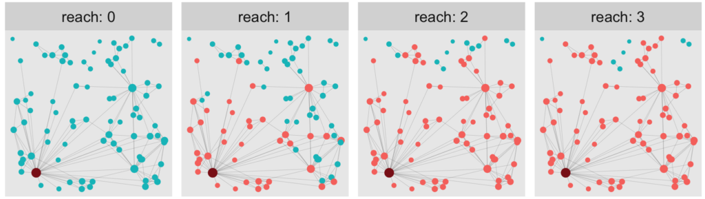
A curious observation
At this point, there are many graph properties (including the three above but also cluster sizes and graph distances) that are worth taking a closer look at, but this is beyond the scope of this blogpost. However, let’s look at one last thing. Somebody just recently told me about a very curious fact about social networks that seems paradoxical at first: Your average friend on Facebook (or Instagram) has way more friends than the average user of that platform.
It sounds odd, but if you think about it for a second, it is not too surprising. Sampling from the pool of your friends is very different from sampling from all users on the platform (entirely at random). It’s exactly those very prominent people who have a much higher probability of being among your friends. Hence, when calculating the two averages, we receive very different results.
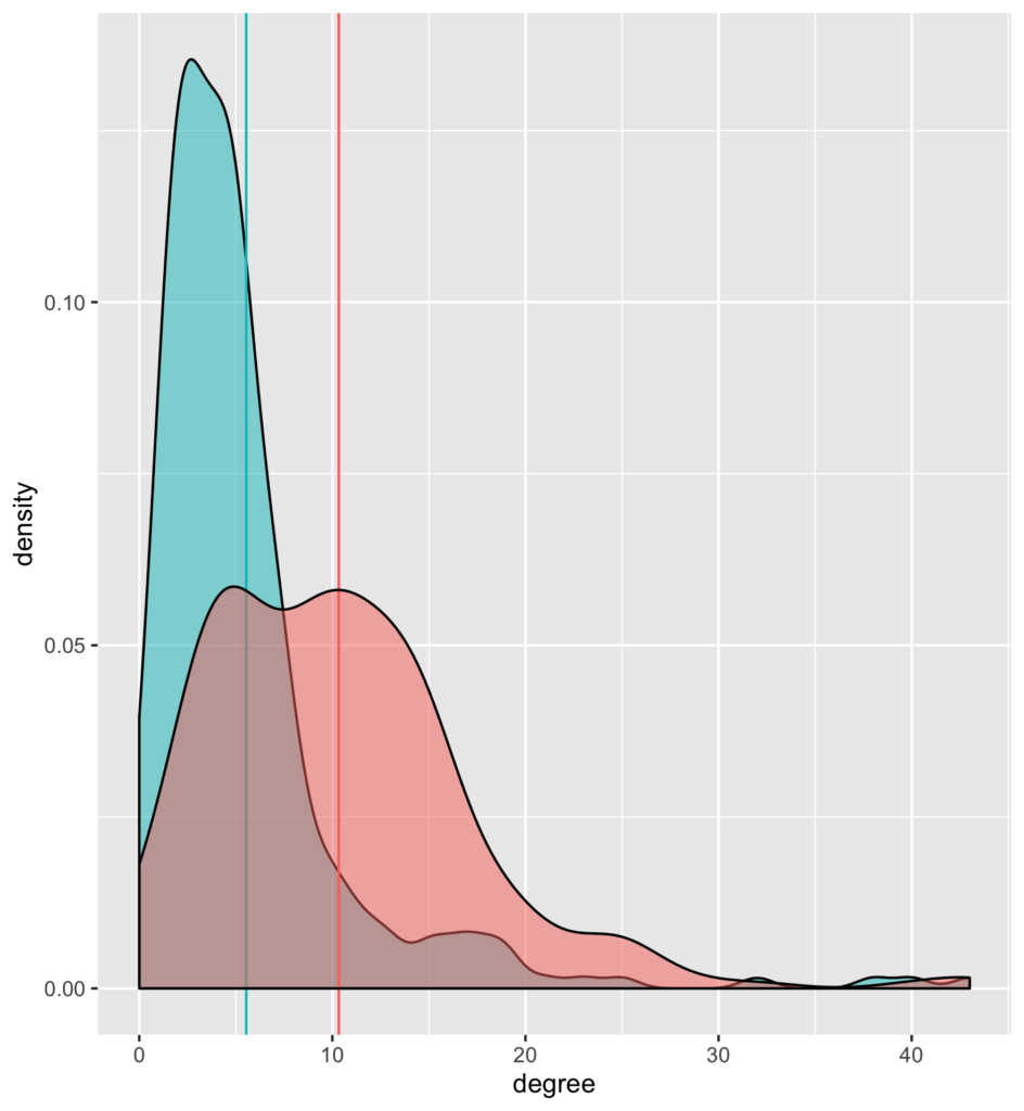
As can be seen, the model also reflects that property: In the small excerpt of the graph that we simulate, the average node has a degree of around 5 (blue intercept). The degree of connected nodes is over 10 on average (red intercept).
Conclusion
In the first part, I introduced a model that describes the features of real-life data of social networks well. In the second part, we obtained artificial data from that model and used it to create an igraph object (by means of the adjacency matrix). The latter can then be transformed into a tidygraph object, allowing us to easily make manipulation on the node and edge tibble to calculate any graph statistic (e.g., the degree) we like. Further, the tidygraph object is then used for conveniently visualizing the network through Ggraph.
I hope that this post has sparked your interest in network modeling and has given you an idea of how seamlessly graph manipulation and visualization with Tidygraph and Ggraph merge into the usual tidyverse workflow. Have a wonderful day!
In my previous blog post, I have shown you how to run your R-scripts inside a docker container. For many of the projects we work on here at STATWORX, we end up using the RShiny framework to build our R-scripts into interactive applications. Using containerization for the deployment of ShinyApps has a multitude of advantages. There are the usual suspects such as easy cloud deployment, scalability, and easy scheduling, but it also addresses one of RShiny’s essential drawbacks: Shiny creates only a single R session per app, meaning that if multiple users access the same app, they all work with the same R session, leading to a multitude of problems. With the help of Docker, we can address this issue and start a container instance for every user, circumventing this problem by giving every user access to their own instance of the app and their individual corresponding R session.
If you’re not familiar with building R-scripts into a docker image or with Docker terminology, I would recommend you to first read my previous blog post.
So let’s move on from simple R-scripts and run entire ShinyApps in Docker now!
The Setup
Setting up a project
It is highly advisable to use RStudio’s project setup when working with ShinyApps, especially when using Docker. Not only do projects make it easy to keep your RStudio neat and tidy, but they also allow us to use the renv package to set up a package library for our specific project. This will come in especially handy when installing the needed packages for our app to the Docker image.
For demonstration purposes, I decided to use an example app created in a previous blog post, which you can clone from the STATWORX GitHub repository. It is located in the “example-app” subfolder and consists of the three typical scripts used by ShinyApps (global.R, ui.R, and server.R) as well as files belonging to the renv package library. If you choose to use the example app linked above, then you won’t have to set up your own RStudio Project, you can instead open “example-app.Rproj”, which opens the project context I have already set up. If you choose to work along with an app of your own and haven’t created a project for it yet, you can instead set up your own by following the instructions provided by RStudio.
Setting up a package library
The RStudio project I provided already comes with a package library stored in the renv.lock file. If you prefer to work with your own app, you can create your own renv.lock file by installing the renv package from within your RStudio project and executing renv::init(). This initializes renv for your project and creates a renv.lock file in your project root folder. You can find more information on renv over at RStudio’s introduction article on it.
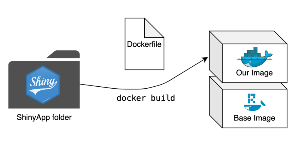
The Dockerfile
The Dockerfile is once again the central piece of creating a Docker image. We now aim to repeat this process for an entire app where we previously only built a single script into an image. The step from a single script to a folder with multiple scripts is small, but there are some significant changes needed to make our app run smoothly.
# Base image https://hub.docker.com/u/rocker/
FROM rocker/shiny:latest

# system libraries of general use
## install debian packages
RUN apt-get update -qq && apt-get -y --no-install-recommends install \
    libxml2-dev \
    libcairo2-dev \
    libsqlite3-dev \
    libmariadbd-dev \
    libpq-dev \
    libssh2-1-dev \
    unixodbc-dev \
    libcurl4-openssl-dev \
    libssl-dev

## update system libraries
RUN apt-get update && \
    apt-get upgrade -y && \
    apt-get clean

# copy necessary files
## renv.lock file
COPY /example-app/renv.lock ./renv.lock
## app folder
COPY /example-app ./app

# install renv & restore packages
RUN Rscript -e 'install.packages("renv")'
RUN Rscript -e 'renv::restore()'

# expose port
EXPOSE 3838

# run app on container start
CMD ["R", "-e", "shiny::runApp('/app', host = '0.0.0.0', port = 3838)"]
The base image
The first difference is in the base image. Because we’re dockerizing a ShinyApp here, we can save ourselves a lot of work by using the rocker/shiny base image. This image handles the necessary dependencies for running a ShinyApp and comes with multiple R packages already pre-installed.
Necessary files
It is necessary to copy all relevant scripts and files for your app to your Docker image, so the Dockerfile does precisely that by copying the entire folder containing the app to the image.
We can also make use of renv to handle package installation for us. This is why we first copy the renv.lock file to the image separately. We also need to install the renv package separately by using the Dockerfile’s ability to execute R-code by prefacing it with RUN Rscript -e. This package installation allows us to then call renv directly and restore our package library inside the image with renv::restore(). Now our entire project package library will be installed in our Docker image, with the exact same version and source of all the packages as in your local development environment. All this with just a few lines of code in our Dockerfile.
Starting the App at Runtime
At the very end of our Dockerfile, we tell the container to execute the following R-command:
shiny::runApp('/app', host = '0.0.0.0', port = 3838)The first argument allows us to specify the file path to our scripts, which in our case is ./app. For the exposed port, I have chosen 3838, as this is the default choice for RStudio Server, but can be freely changed to whatever suits you best.
With the final command in place every container based on this image will start the app in question automatically at runtime (and of course close it again once it’s been terminated).
The Finishing Touches
With the Dockerfile set up we’re now almost finished. All that remains is building the image and starting a container of said image.
Building the image
We open the terminal, navigate to the folder containing our new Dockerfile, and start the building process:
docker build -t my-shinyapp-image . Starting a container
After the building process has finished, we can now test our newly built image by starting a container:
docker run -d --rm -p 3838:3838 my-shinyapp-imageAnd there it is, running on localhost:3838.
Outlook
Now that you have your ShinyApp running inside a Docker container, it is ready for deployment! Having containerized our app already makes this process a lot easier; there are further tools we can employ to ensure state-of-the-art security, scalability, and seamless deployment. Stay tuned until next time, when we’ll go deeper into the full range of RShiny and Docker capabilities by introducing ShinyProxy.
Because You Are Interested In Data Science, You Are Interested In This Blog Post
If you love streaming movies and tv series online as much as we do here at STATWORX, you’ve probably stumbled upon recommendations like “Customers who viewed this item also viewed…” or “Because you have seen …, you like …”. Amazon, Netflix, HBO, Disney+, etc. all recommend their products and movies based on your previous user behavior – But how do these companies know what their customers like? The answer is collaborative filtering.
In this blog post, I will first explain how collaborative filtering works. Secondly, I’m going to show you how to develop your own small movie recommender with the R package recommenderlab and provide it in a shiny application.
Different Approaches
There are several approaches to give a recommendation. In the user-based collaborative filtering (UBCF), the users are in the focus of the recommendation system. For a new proposal, the similarities between new and existing users are first calculated. Afterward, either the n most similar users or all users with a similarity above a specified threshold are consulted. The average ratings of the products are formed via these users and, if necessary, weighed according to their similarity. Then, the x highest rated products are displayed to the new user as a suggestion.
For the item-based collaborative filtering IBCF, however, the focus is on the products. For every two products, the similarity between them is calculated in terms of their ratings. For each product, the k most similar products are identified, and for each user, the products that best match their previous purchases are suggested.
Those and other collaborative filtering methods are implemented in the recommenderlab package:
- ALS_realRatingMatrix: Recommender for explicit ratings based on latent factors, calculated by alternating least squares algorithm.
- ALS_implicit_realRatingMatrix: Recommender for implicit data based on latent factors, calculated by alternating least squares algorithm.
- IBCF_realRatingMatrix: Recommender based on item-based collaborative filtering.
- LIBMF_realRatingMatrix: Matrix factorization with LIBMF via package recosystem.
- POPULAR_realRatingMatrix: Recommender based on item popularity.
- RANDOM_realRatingMatrix: Produce random recommendations (real ratings).
- RERECOMMEND_realRatingMatrix: Re-recommends highly-rated items (real ratings).
- SVD_realRatingMatrix: Recommender based on SVD approximation with column-mean imputation.
- SVDF_realRatingMatrix: Recommender based on Funk SVD with gradient descend.
- UBCF_realRatingMatrix: Recommender based on user-based collaborative filtering.
Developing your own Movie Recommender
Dataset
To create our recommender, we use the data from movielens. These are film ratings from 0.5 (= bad) to 5 (= good) for over 9000 films from more than 600 users. The movieId is a unique mapping variable to merge the different datasets.
head(movie_data) movieId title genres
1 1 Toy Story (1995) Adventure|Animation|Children|Comedy|Fantasy
2 2 Jumanji (1995) Adventure|Children|Fantasy
3 3 Grumpier Old Men (1995) Comedy|Romance
4 4 Waiting to Exhale (1995) Comedy|Drama|Romance
5 5 Father of the Bride Part II (1995) Comedy
6 6 Heat (1995) Action|Crime|Thrillerhead(ratings_data) userId movieId rating timestamp
1 1 1 4 964982703
2 1 3 4 964981247
3 1 6 4 964982224
4 1 47 5 964983815
5 1 50 5 964982931
6 1 70 3 964982400To better understand the film ratings better, we display the number of different ranks and the average rating per film. We see that in most cases, there is no evaluation by a user. Furthermore, the average ratings contain a lot of “smooth” ranks. These are movies that only have individual ratings, and therefore, the average score is determined by individual users.
# ranting_vector
0         0.5    1      1.5    2      2.5   3      3.5    4       4.5   5
5830804   1370   2811   1791   7551   5550  20047  13136  26818   8551  13211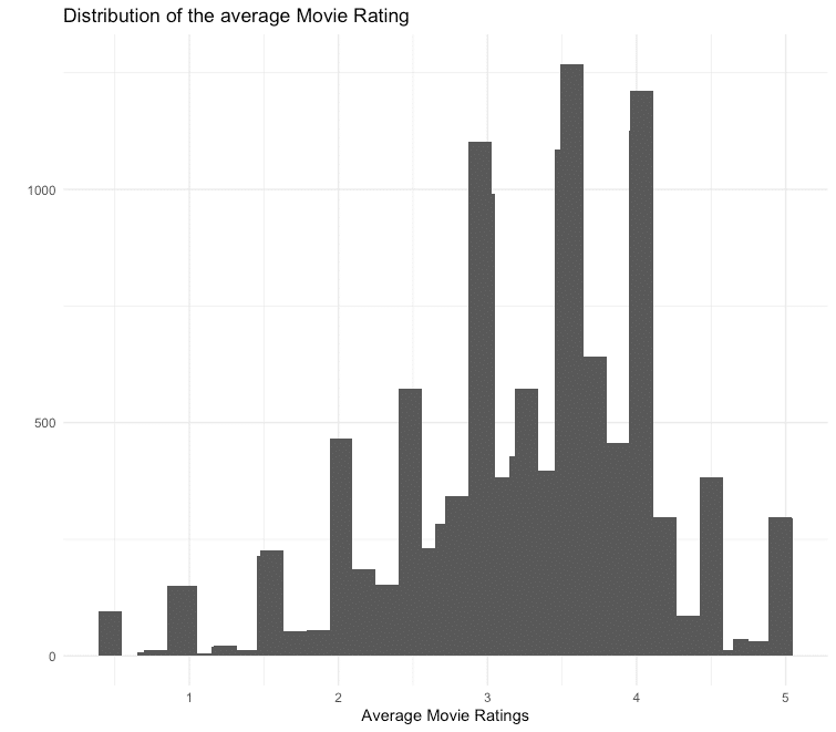
In order not to let individual users influence the movie ratings too much, the movies are reduced to those that have at least 50 ratings.
## Min. 1st Qu. Median Mean 3rd Qu. Max.
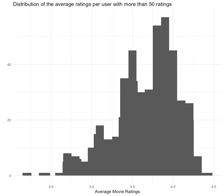
## 2.208 3.444 3.748 3.665 3.944 4.429Under the assumption that the ratings of users who regularly give their opinion are more precise, we also only consider users who have given at least 50 ratings. For the films filtered above, we receive the following average ratings per user:
You can see that the distribution of the average ratings is left-skewed, which means that many users tend to give rather good ratings. To compensate for this skewness, we normalize the data.
ratings_movies_norm <- normalize(ratings_movies)Model Training and Evaluation
To train our recommender and subsequently evaluate it, we carry out a 10-fold cross-validation. Also, we train both an IBCF and a UBCF recommender, which in turn calculate the similarity measure via cosine similarity and Pearson correlation. A random recommendation is used as a benchmark. To evaluate how many recommendations can be given, different numbers are tested via the vector n_recommendations.
eval_sets <- evaluationScheme(data = ratings_movies_norm,
                              method = "cross-validation",
                              k = 10,
                              given = 5,
                              goodRating = 0)

models_to_evaluate <- list(
  `IBCF Cosinus` = list(name = "IBCF",
                        param = list(method = "cosine")),
  `IBCF Pearson` = list(name = "IBCF",
                        param = list(method = "pearson")),
  `UBCF Cosinus` = list(name = "UBCF",
                        param = list(method = "cosine")),
  `UBCF Pearson` = list(name = "UBCF",
                        param = list(method = "pearson")),
  `Zufälliger Vorschlag` = list(name = "RANDOM", param=NULL)
)

n_recommendations <- c(1, 5, seq(10, 100, 10))

list_results <- evaluate(x = eval_sets,
                         method = models_to_evaluate,
                         n = n_recommendations)
We then have the results displayed graphically for analysis.
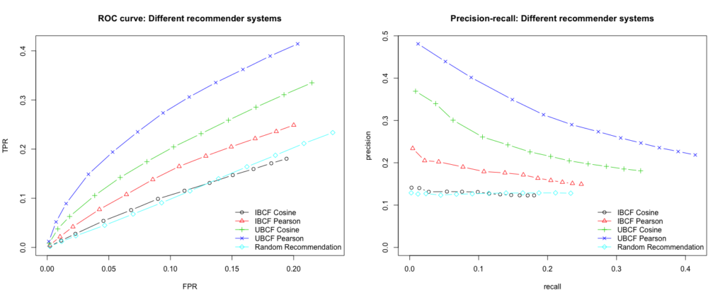
We see that the best performing model is built by using UBCF and the Pearson correlation as a similarity measure. The model consistently achieves the highest true positive rate for the various false-positive rates and thus delivers the most relevant recommendations. Furthermore, we want to maximize the recall, which is also guaranteed at every level by the UBCF Pearson model. Since the n most similar users (parameter nn) are used to calculate the recommendations, we will examine the results of the model for different numbers of users.
vector_nn <- c(5, 10, 20, 30, 40)

models_to_evaluate <- lapply(vector_nn, function(nn){
  list(name = "UBCF",
       param = list(method = "pearson", nn = vector_nn))
})
names(models_to_evaluate) <- paste0("UBCF mit ", vector_nn, "Nutzern")
list_results <- evaluate(x = eval_sets,
                         method = models_to_evaluate,
                         n = n_recommendations)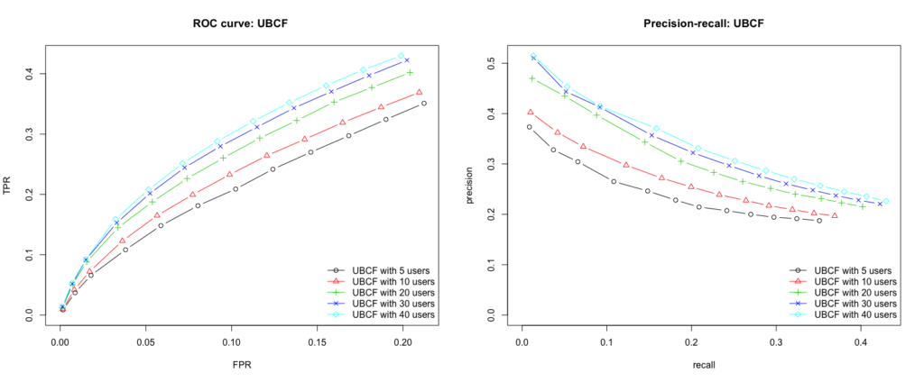
Conclusion
Our user based collaborative filtering model with the Pearson correlation as a similarity measure and 40 users as a recommendation delivers the best results. To test the model by yourself and get movie suggestions for your own flavor, I created a small Shiny App.
However, there is no guarantee that the suggested movies really meet the individual taste. Not only is the underlying data set relatively small and can still be distorted by user ratings, but the tech giants also use other data such as age, gender, user behavior, etc. for their models.
But what I can say is: Data Scientists who read this blog post also read the other blog posts by STATWORX.
Shiny-App
Here you can find the Shiny App. To get your own movie recommendation, select up to 10 movies from the dropdown list, rate them on a scale from 0 (= bad) to 5 (= good) and press the run button. Please note that the app is located on a free account of shinyapps.io. This makes it available for 25 hours per month. If the 25 hours are used and therefore the app is this month no longer available, you will find the code here to run it on your local RStudio.
When I started with R, I soon discovered that, more often than not, a package name has a particular meaning. For example, the first package I ever installed was foreign. The name corresponds to its ability to read and write data from other foreign psources to R. While this and many other names are rather straightforward, others are much less intuitive. The name of a package often conveys a story, which is inspired by a general property of its functions. And sometimes I just don’t get the deeper meaning, because English is not my native language.
In this blog post, I will shed light on the wonderful world of package names. After this journey, you will not only admire the creativity of R package creators; you’ll also be king or queen at your next class reunion! Or at least at the next R-Meetup.
Before we start, and I know that you are eager to continue, I have two remarks about this article. First: Sometimes, I refer to official explanations from the authors or other sources; other times, it’s just my personal explanation of why a package is called that way. So if you know better or otherwise, do not hesitate to contact me. Second: There are currently 15,341 packages on CRAN, and I am sure there are a lot more naming mysteries and ingenuities to discover than any curious blog reader would like to digest in one sitting. Therefore, I focussed on the most famous packages and added some of my other preferences.
But enough of the talking now, let’s start!
dplyr (diːˈplaɪə)
![]() You might have noticed that many packages contain the string plyr, e.g.
You might have noticed that many packages contain the string plyr, e.g. dbplyr, implyr, dtplyr, and so on. This homophone of pliers corresponds to its refining of base R apply-functions as part of the “split-apply-combine” strategy. Instead of doing all steps for data analysis and manipulation at once, you split the problem into manageable pieces, apply your function to each piece, and combine everything together afterward. We see this approach in perfection when we use the pipe operator. The first part of each package just refers to the object it is applied upon. So the d stands for data frames, db for databases, im for Apache Impala, dt for data tables, and so on… Sources: Hadley Wickham
lubridate (ˈluːbrɪdeɪt)
![]() This wonderful package makes it so easy and smooth to work with dates and times in R. You could say it goes like a clockwork. In German, there is a proverb with the same meaning (“Das läuft wie geschmiert”), that can literally be translated to: “It works as lubricated”
This wonderful package makes it so easy and smooth to work with dates and times in R. You could say it goes like a clockwork. In German, there is a proverb with the same meaning (“Das läuft wie geschmiert”), that can literally be translated to: “It works as lubricated”
ggplot2 (ʤiːʤiːplɒt tuː)
 Leland Wilkinson wrote a book in which he defined multiple components that a comprehensive plot is made of. You have to define the data you want to show, what kind of plot it should be, e.g., points or lines, the scales of the axes, the legend, axis titles, etc. These parts, he called them layers, should be built on top of each other. The title of this influential piece of paper is Grammar of Graphics. Once you got it, it enables you to build complex yet meaningful plots with concise styling across packages. That’s because its logic has also been used by many other packages like plotly, rBokeh, visNetwork, or apexcharter. Sources: ggplot2
data.table (ˈdeɪtə ˈteɪbl) – logo
![]() Okay, full disclosure, I am a tidyverse guy, and one of my sons shall be named Hadley. At least one. However, this does not mean that I don’t appreciate the very powerful package
Okay, full disclosure, I am a tidyverse guy, and one of my sons shall be named Hadley. At least one. However, this does not mean that I don’t appreciate the very powerful package data.table. Occasionally, I take the liberty and exploit its functions to improve the performance of my code (hello fread() and rbindlist()). Anyway, the name itself is pretty straightforward – but did you notice how cool the logo is?! Well, there is obviously the name “data.table” and the square brackets that are fundamental in data.table syntax. Likewise, there is the assignment by reference operator, a.k.a. the walrus operator. “Wait, stop,” your inner marine mammal researcher says, “isn’t this a sea lion on top there?!” Yes indeed! The sea lion is used to highlight that it is an R package since, of course, it shouts R! R!. Source: Rdatatable
tibble (tɪbl)
![]() Regular base R data frames are nice, but did you ever print a data frame in the console, unaware that it is 10 million rows long? Good luck with interrupting R without quitting the whole session. That might be one of the reasons why the tidyverse uses another type of data frames: tibbles. The name tibble could just stem from its similar sound to table, but I suspect there is more to it than meets the eye. Did you ever hear the story about Tibbles and Stephen Island’s Wren? NO? Then let me take you to New Zealand, AD 1894. Between the northern and southern main islands of NZ, there is a small and uninhabited island: Stephen Island. Its rocks have been the downfall of many poor souls that tried to pass the Cook Strait. Therefore, it was decided to build a lighthouse as that ships shall henceforth pass safely and undamaged.
Regular base R data frames are nice, but did you ever print a data frame in the console, unaware that it is 10 million rows long? Good luck with interrupting R without quitting the whole session. That might be one of the reasons why the tidyverse uses another type of data frames: tibbles. The name tibble could just stem from its similar sound to table, but I suspect there is more to it than meets the eye. Did you ever hear the story about Tibbles and Stephen Island’s Wren? NO? Then let me take you to New Zealand, AD 1894. Between the northern and southern main islands of NZ, there is a small and uninhabited island: Stephen Island. Its rocks have been the downfall of many poor souls that tried to pass the Cook Strait. Therefore, it was decided to build a lighthouse as that ships shall henceforth pass safely and undamaged.  Due to its isolation, Stephen Island was the only habitat for many rare species. One of these was Lyall’s wren, a small flightless passerine. It did not know any predators and lived its life in joy and harmony, until… The arrival of the first lighthouse keeper. His name was David Lyall and he was a man interested in natural history and, facing a long and lonely time on his own at Stephen Island, the owner of a cat. This cat was not satisfied by just comforting Mr. Lyall and enjoying beach walks. Shortly after his arrival, Mr. Lyall noticed the carcasses of little birds, seemingly slaughtered and dishonored by a fierce predator. Interested in biology as he was, he found out that these small birds were a distinct species. He preserved some carcasses in alcohol and sent them to a friend. This was in October 1894. A scientific article about the wren was published in an ornithology journal, soon making the specimen a sought-after collector’s item. The summer in New Zealand goes on and in February 1895, four bird-watchers arrived at Stephen Island. They were looking for this cute little wren and found… none. Within a few months, Mr. Lyalls hungry cat made the whole species go extinct. On March 16, 1895, the Christchurch newspaper The Press wrote: “there is very good reason to believe that the bird is no longer to be found on the island, and, as it is not known to exist anywhere else, it has apparently become quite extinct. This is probably a record performance in the way of extermination.”. The name of the cat? Tibbles. Sources: Wikipedia; All About Birds; Oddity Central Indicator: the fridge of Hadley Wickham’s parents
purrr (pɜːɜː)
![]() This extension of the base R
This extension of the base R apply-functions has been one of my favorites lately. The concise usage of purrr enables powerful functional programming that, in turn, makes your code faster, more readable, and more stable. Or, as Mr. Wickham states, it makes “your pure R functions purr“. Also, note its parallelized sibling furrr. Sources: Hadley Wickham
Amelia (əˈmiːlɪə)
 During my Master’s degree, I had a course about missing data and multiple imputations. One of the packages we used, or rather analyzed, was
 Amelia. It turned out that this package is named after an impressive woman: Amelia Earhart. Living in the early 20th century, she was an aviation pioneer and feminist. She has been the first woman to fly solo across the Atlantic, a remarkable achievement and an inspiration for women to start a technical career. Unfortunately, she disappeared during a flight over the central pacific at age 39 and is thus… missing. ba dum-tss Source: Gary King – Co-Author
magrittr (maɡʁitə)
![]() The conciseness of coding with
The conciseness of coding with dplyr or its siblings is not imaginable without the pipe operator %>%. This allows you to write and read code from top to bottom and from left to right, just like regular text. Pipes are no special feature of R, yet I am sure René Magritte had nothing else in mind when he painted The Treachery of Images in 1929 with its slogan: “Ceci n’est pas une pipe“. The logo designers just made a slight adjustment to his painting. Or should I say: unearthed the meaning that has always been behind it?! Sources: Vignette, revolutionanalytics.com
batman (ˈbætmən)
![]() Data science can be quite fun if it weren’t for the data. Especially when working with textual data, typos and inconsistent coding can be very cumbersome. For example, you’ve got questionnaire data consisting of yes/no questions. For R, this corresponds to
Data science can be quite fun if it weren’t for the data. Especially when working with textual data, typos and inconsistent coding can be very cumbersome. For example, you’ve got questionnaire data consisting of yes/no questions. For R, this corresponds to TRUE/FALSE, but who would write this in a questionnaire? In fact, when we try to convert such data to logical values by calling as.logical(), almost every string becomes NA. Lost and doomed? NO! Cause who is more expert to determine actual NA‘s than nananananana… batman!
Homeric (həʊˈmɛrɪk)
 Hey, you made it all the way down here?! You deserve a little treat! What about a soft, sweet, and special-sprinkled donut? And who would be better suitable to present it to you, than the best-known lover of donuts himself: Homer Simpson! Just help yourself:
 Homeric::PlotDoughnut(1, col = "magenta") Source: Homeric Documentation
fcuk (fʌk)

Error in view(my_data): could not find function "view" Are you sick and tired of this or similar error messages? Do you regularly employ your ample stock of swear words to describe the stupidity of inconsistent usage of camel or snake case function names across packages? Or do you just type faster than your shadow, causing minor typos in your, otherwise, excellent code? There is help! Just go and install the amazing fcuk package and useless error messages are a thing of the past.
hellno (hɛl nəʊ)
 Slip into the role of a dedicated R user. I can only imagine the troubles I had to have with a specific default argument value of a base R function to write an entire package that just handles this case. I am talking about the tormentor of many beginRs when working with
 as.data.frame(): stringsAsFactors = TRUE. But I do not only change it to FALSE! Also, I create my own FALSE value and name it HELLNO.
Honorable mentions
gremlin: package for mixed-effects model REML incorporating Generalized Inverses.harrietr: named after Charles Darwin’s pet giant tortoise. A package for phylogenetic and evolutionary biology data manipulations.beginr: it helps where we’ve all been, searching for ages until settingpch = 16.charlatan: worse than creating dubious medicine, this one makes fake data.fauxpas: explains what specific HTTP errors mean.fishualize: give your plots a fishy look.greybox: why just thinking black or white? This is a package for time series analysis.vroom: it reads data so fast to R, you almost can hear it making vroom vroom.helfRlein: some little helper functions, inspired by the German word Helferlein = little helper.
At STATWORX, coding is our bread and butter. Because our projects involve many different people in several organizations across multiple generations of programmers, writing clean code is essential. The main requirements for well-structured and readable code are comments and sections. In RStudio, these sections are defined by comments that end with at least four dashes ---- (you can also use trailing equal signs ==== or hashes ####). In my opinion, the code is even more clear if the dashes cover the whole range of 80 characters (why you should not exceed the 80 characters limit). That’s how my code usually looks like:
# loading packages -------------------------------------------------------------
library(dplyr)

# load data --------------------------------------------------------------------
my_iris <- as_tibble(iris)

# prepare data -----------------------------------------------------------------
my_iris_preped <- my_iris %>%
  filter(Species == "virginica") %>%
  mutate_if(is.numeric, list(squared = sqrt))

# ...
Clean, huh? Well, yes, but neither of the three options available to achieve this are as neat as I want it to be:
- Press
-for some time. - Copy a certain amount of dashes and insert them sequentially. Both options often result in too many dashes, so I have to remove the redundant ones.
- Use the shortcut to insert a new section (CMD/STRG + SHIFT + R). However, you cannot neatly include it after you wrote your comments.
Wouldn’t it be nice to have a keyboard shortcut that included the right amount of dashes up from the cursor position? “Easy as can be,” I thought before trying to define a custom shortcut in RStudio.
Unfortunately, it turned out not to be that easy. There is a manual from RStudio that actually covers how you can create your shortcut, but it requires you to put it in a package first. Since I have not been an expert in R package development myself, I decided to go the full distance in this blog post. By following it step by step, you should be able to define your shortcuts within a few minutes.
Note: This article is not about creating a CRAN-worthy package, but covers what is necessary to define your own shortcuts. If you have already created packages before, you can skip the parts about package development and jump directly to what is new to you.
Setting up an R package
First of all, open RStudio and create an R package directory. For this, please do the following steps:
- Go to “New Project…”
- “New Directory”
- “R Package”
- Select an awesome package name of your choice. In this example, I named my package
shoRtcut - In “Create project as subdirectory of:” select a directory of your choice. A new folder with your package name will be created in this directory.
Tada, everything necessary for a powerful R Package has been set up. RStudio also automatically provides a dummy function hello(). Since we do not like to have this function in our own package, move to the “R” folder in your project and delete the hello.R file. Do the same in the “man” folder and delete hello.md.
Creating an Addin Function
Now we can start and define our function. For this, we need the wonderful packages usethis and devtools. These provide all the functionality we need for the next steps.
Defining the Addin Function
Via the use_r() function, we define a new R script file with the given name. That should correspond to the name of the function we are about to create. In my case, I call it set_new_chapter.
# use this function to automatically create a new r script for your function
usethis::use_r("set_new_chapter")
You are directly forwarded to the created file. Now the tricky part begins, defining a function that does what you want. When defining shortcuts that interact with an R script in RStudio, you will soon discover the package rstudioapi. With its functions, you can grab all information from RStudio and make it available within R. Let me guide you through it step by step.
- As per usual, I set up a regular R function and define its name as
set_new_chapter. Next, I define up until which limit I want to include the dashes. You will note that I rather setncharsto 81 than 80. This is because the number corresponds to the cursor position after including the dashes. You will notice that when you write text, the cursor automatically jumps to the position right after the newly typed character. After you have written your 80th character, the cursor will be at position 81. - Now we have to find out where the cursor is currently located. This information can be unearthed by the
getActiveDocumentContext()function. The returned object returns quite a bit of information, but we are only interested in the cursor position regarding the column. Why the column? You can think of the script like a matrix. Hitting return brings you to a new row, typing a character into a new column. Having a font with equal space characters, which is the default setting in RStudio makes this concept easy to see. - By sneaking into the nested list, we find the information we are looking for and store it in
context_col. Now we check whether the cursor is already at “column” 81. If not, there is space in which we insert the dashes. For this final step, we can use another function:insertText. - As its name implies, it inserts text in an R script or console. You can either specify a specific position in the document or, by leaving it empty, insert text at the current cursor position, which is exactly what I want right now. As the final step, I need to find out the number of dashes that should be inserted. That’s the difference between the current cursor location and its target position. For example, if the cursor blinks at column 51, meaning I already have typed 50 characters, I want to insert 30 dashes.
- To document the function, I use the “Code” > “Insert Roxygen Skeleton” feature and fill it out appropriately.
This is what my final function looks like.
#' Insert dashes from courser position to up to 80 characters
#'
#' @return dashes inside RStudio
set_new_chapter <- function(){
# set limit to which position dashes should be included
nchars <- 81
# grab current document information
context <- rstudioapi::getActiveDocumentContext()
# extract horizontal courser position in document
context_col <- context![selection[[1]]](https://www.statworx.com/wp-content/ql-cache/quicklatex.com-00de0437beef075188210e33286d8e37_l3.png "Rendered by QuickLaTeX.com") range$end["column"]
# if a line has less than 81 characters, insert hyphens at the current line
# up to 80 characters
if (nchars > context_col) {
rstudioapi::insertText(strrep("-", nchars - context_col))
}
}
range$end["column"]
# if a line has less than 81 characters, insert hyphens at the current line
# up to 80 characters
if (nchars > context_col) {
rstudioapi::insertText(strrep("-", nchars - context_col))
}
}Defining the Function AS and Addin
Now we must somehow tell RStudio that this particular function should be used as an addin rather than a regular function. For this, go to “File” > “New File” > “Text File” and include the following text:
Name: Insert Dashes (---)
Description: Inserts `---` at the cursor position up to 80 characters.
Binding: set_new_chapter
Interactive: falseNameis a short description of what the addin does. This will be displayed when you want to set the shortcut later.Descriptionis a longer description of its functionality.Bindingsets the name of the function that should be called by the shortcut.Interactivedefines whether this addin is interactive (e.g., runs a Shiny application) or not.
You now must save this file as “addins.dcf” in your project with the following path: “inst” > “rstudio”. The result should look like this:
Finalize the Package
To wrap everything up and make the shortcut available to you and your colleagues, we only have to call a few more functions. Not all these steps are necessary, yet it is good practice to create a proper package.
# OPTIONAL: define the license of your package
usethis::use_mit_license(name = "Matthias Nistler")

# define dependencies you use in your package
usethis::use_package("rstudioapi")

# OPTIONAL: include your function description to the manual
roxygen2::roxygenise()

# check for errors
devtools::check()

# update/create your package
devtools::build()

> ✓  checking for file ‘/Users/matthiasnistler/Projekte/2020/blog_shoRtcut/DESCRIPTION’ ...
> ─  preparing ‘shoRtcut’:
> ✓  checking DESCRIPTION meta-information ...
> ─  checking for LF line-endings in source and make files and shell scripts
> ─  checking for empty or unneeded directories
> ─  building ‘shoRtcut_0.0.0.9000.tar.gz’
> [1] "/Users/matthiasnistler/Projekte/2020/shoRtcut_0.0.0.9000.tar.gz"
There you go! You just created an awesome package and distributed it to your friends and colleagues.
Make the shortcut available
For the last step, you have to install your package and set a keyboard combination for your shortcut. For this, use the following specification of install.packages:
install.packages(
    # same path as above
  "/Users/matthiasnistler/Projekte/2020/shoRtcut_0.0.0.9000.tar.gz",
  # indicate it is a local file
  repos = NULL)

# check if everything works
shoRtcut:::set_new_chapter()
Now go to “Tools” > “Modify Keyboard Shortcuts…” and search for “dashes”. Here you can define the keyboard combination by clicking inside the empty “Shortcut” field and pressing the desired key combination on your keyboard. Click “Apply”, and that’s it!
In case you are just here to use my shortcut, you can install it via remotes::install_github("mnist91/shoRtcut").
Congratulations!
You made it! Now you can use your own RStudio shortcut. Exciting, isn’t it?
But that’s not all there is – next week, I will give you an introduction to the wonderful world of R package naming. So stay tuned and happy coding!
In my last blog post, I wrote about networks and their visualization in R. For the coloring of the objects, I clustered the Les Miserables characters in several groups with Louvain, a Community detection algorithm.
Community detection algorithms are not only useful for grouping characters in French lyrics. At STATWORX, we use these methods to give our clients insights into their product portfolio, customer, or market structure. In this blog post, I want to show you the magic behind Community detection and give you a theoretical introduction into the Louvain and Infomap algorithm.
Find groups with a high density of connections within and a low density between groups
Networks are useful constructs to schematize the organization of interactions in social and biological systems. They are just as well suited to represent interactions in the economy, especially in marketing. Such an interaction can be a joint purchase of two or more products or a joint comparison of products in online shops or on price comparison portals.
Networks consist of objects and connections between the objects. The connections, also called edges, can be weighted according to certain criteria. In marketing, for example, the number or frequency of joint purchases of two products is a significant weighting of the connection between these two products. Mostly, such real networks are so big and complex that we have to simplify their structure to get useful information from them. The methods of community detection help to find groups in the network with a high density of connections within and a low density of links between groups.
We will have a look at the two methods Louvain Community Detection and Infomap because they gave the best results in the study of Lancchinetti and Fortunato (2009) when applied to different benchmarks on Community Detection methods.
Louvain: Build clusters with high modularity in large networks
The Louvain Community Detection method, developed by Blondel et al. (2008), is a simple algorithm that can quickly find clusters with high modularity in large networks.
Modularity
The so-called modularity measures the density of connections within clusters compared to the density of connections between clusters (Blondel 2008). It is used as an objective function to be maximized for some community detection techniques and takes on values between -1 and 1. In the case of weighted connections between the objects, we can define the modularity with the following formula:
![\[Q=frac{1}{2m}sumnolimits_{p,q} [A_{pq}-frac{k_{p}k_{q}}{2m}]delta(C_{p}, C_{q})\]](https://www.statworx.com/wp-content/ql-cache/quicklatex.com-22447b198b190b6a38e7cee41c2d63c0_l3.png "Rendered by QuickLaTeX.com")
 : Weight of a connection between object
  and
and 
 :
:  = Sum of the weights of all connections originating from the object
 : Cluster to which the object has been assigned
 : Dummy variable that takes the value 1 if both objects and are assigned to the same cluster
 :
:  = Sum of the weights of all connections between all existing objects, divided by 2
Phases
The algorithm is divided into two phases, which are repeated until the modularity cannot be maximized further. In the 1st phase, each object is considered as a separate cluster. For each object  , its neighbors
  are checked for whether the modularity increases if is removed from its cluster and into the cluster of an object is assigned. The object is then assigned to the cluster, which maximizes the increase in modularity. However, this only applies in the case of a positive increase. If no positive increase in modularity can be realized by shifting, the object remains in its previous cluster. The process described above will be repeated and sequentially performed for all objects until no improvement in modularity can be achieved. An object is often viewed and assigned several times. The 1st phase thus stops when a local maximum has been found, i.e., if no individual displacement of an object can improve the modularity.
Building on the clusters formed in the 1st phase, a new network is created in the 2nd phase whose objects are now the clusters themselves, which were formed in the 1st phase. To obtain weights for the connections between the clusters, the sum of the weights of the connections between the objects of two corresponding clusters is used. If such a new network was formed with “metacluster”, the steps of the 1st phase will be applied to the new network next, and the modularity will be further optimized. A complete run of both phases is called a pass. Such passes are repeatedly carried out until there is no more change in the cluster, and a maximum of modularity is achieved.
Infomap: Minimize the description length of a random walk
The Infomap method was first introduced by Rosvall and Bergstrom (2008). The procedure of the algorithm is in the core identical to the procedure of Blondel. The algorithm repeats the two described phases until an objective function is optimized. However, as an objective function to be optimized, Infomap does not use modularity but the so-called map equation.
Map Equation
The map equation exploits the duality between finding cluster structures in networks and minimizing the description length of the motion of a so-called random walk (Bohlin 2014). This random walker randomly moves from object to object in the network. The more the connection of an object is weighted, the more likely the random walker will use that connection to reach the next object. The goal is to form clusters in which the random walker stays as long as possible, i.e., the weights of the connections within the cluster should take on greater values than the weights of the connections between objects of different clusters. The map equation code structure is designed to compress the descriptive length of the random walk when the random walker lasts for extended periods of time in certain regions of the network. Therefore, the goal is to minimize the map equation, which is defined as follows for weighted but undirected networks (Rosvall 2009):
![\[L(M)=wcurvearrowright log(wcurvearrowright)-2sum_{k=1}^K w_{k}curvearrowright log(w_{i}curvearrowright)-sum_{i=1}^N w_{i}log(w_{i})+sum_{k=1}^K (w_{k}curvearrowright+w_{i})log(w_{k}curvearrowright+w_{k})\]](https://www.statworx.com/wp-content/ql-cache/quicklatex.com-ce671b137e4e601501d6a6411931baa8_l3.png "Rendered by QuickLaTeX.com")
with:
 : Network with
  objects (
 ) and
) and  clusters (
 )
)
 : relative weight of all connections of an object i, that is the sum of the weights of all connections of an object divided by the sum of the weights of all connections of the network
 :
:  : Sum of the relative weights of all connections of the objects of the cluster
 : Sum of the relative weights of all connections of the objects of the cluster leaving the cluster (connections to objects from other clusters)
 :
:  = Sum of the weights of all connections between objects from different clusters
This definition of the map equation is based on the so-called entropy, the average information content, or the information density of a message. This term is based on Shannon’s Source Coding Theorem, from the field of Information Theory (Rosvall 2009).
The procedure described above is hereafter referred to as the main algorithm. Objects that were assigned to the same cluster in the first phase of the main algorithm when the new network was created can only be moved together in the second phase. A previously optimal shift into a specific cluster no longer necessarily has to be optimal in a later pass (Rosvall 2009).
Extensions
Thus, theoretically, there may be even better cluster divisions than the main algorithm solution. In order to improve the solution of the main algorithm, there are two extensions compared to Louvain Community Detection:
Subcluster shift: The subcluster shift sees each cluster as its own network and applies the main algorithm to that network. Thus, one or more subclusters in each cluster, in the previous step, create optimal partitioning of the network. All subclusters are reassigned to their cluster and can now be moved freely between the clusters. By applying the main algorithm, it can be tested whether the shift of one subcluster into another cluster leads to a minimization of the map equation compared to the previously optimal cluster distribution (Rosvall 2009).
Single object displacement: Each object is again considered as a separate cluster so that the displacement of individual objects between the optimal clusters determined in the previous step is possible. By applying the main algorithm, it can be determined whether the displacement of individual objects between the clusters can lead to further optimization of the map equation (Rosvall 2009). The two extensions are repeated sequentially until the map equation cannot be further minimized and an optimum has been achieved.
How does the Louvain algorithm work in an easy example?
As we can see, the core of both methods is to build clusters and reallocate objects in two phases to optimize an objective function. To get a better understanding of how these two phases work, let me illustrate the Louvain Community Detection method with an easy example, a network with six nodes:

1st Phase
In the beginning, each object is separated into its own cluster, and we have to check if the modularity gets maximized if we assign it to another cluster. Only a positive change in modularity leads to a cluster shift.
For object A, for example, the calculations behind it look like the following:
A → B: 
A → C: 
A → E: 
Similarly, we can check for all other objects if a shift to another cluster maximizes the modularity:
B → C: 
C → D:
D → F: 
E → F: 

2nd Phase
Now we try to combine the clusters built in the 1st phase:
Orange → Green: 
Orange → Yellow: 
Green → Yellow: 
We can see that none of the assignments of a cluster to another cluster can improve the modularity. Hence we can finish Pass 1.

Because we have no change in the second phase of pass 1, no further passes are required because a maximum of modularity is already achieved. In larger networks, of course, more passes are required, since there the clusters can consist of significantly more objects.
In R only the package igraph is needed to apply both methods
All we need to use these two Community detection algorithms is the package igraph, which is a collection of network analysis tools and in addition a list or a matrix with the connections between the objects in our network.
In our example we use the Les Misérables Characters network to cluster the characters in several groups. Therefore, we load the dataset lesmis, which you can find in the package geomnet.
We need to extract the edges out of lesmis and convert it into a data.frame. Afterward, you have to convert this into an igraph graph. To use the weights of every connection, we need to rename the weight column so that the algorithm can identify the weights. The resulting graph can be used as the input for the two algorithms.
# Libraries --------------------------------------------------------------

library(igraph)
library(geomnet)


# Data Preparation -------------------------------------------------------

#Load dataset
data(lesmis)

#Edges
edges <- as.data.frame(lesmis[1])
colnames(edges) <- c("from", "to", "weight")

#Create graph for the algorithms
g <- graph_from_data_frame(edges, directed = FALSE)
Now we are ready to find the communities with the functions cluster_louvain() respectively cluster_infomap()
Furthermore, we can have a look to which community the characters are associated (membership()) or get a list with all communities and their members (communities()).
# Community Detection ----------------------------------------------------

# Louvain
lc <- cluster_louvain(g)
membership(lc)
communities(lc)
plot(lc, g)

# Infomap
imc <- cluster_infomap(g)
membership(imc)
communities(imc)
plot(lc, g)
If you want to visualize these results afterward, have a look at my last blog post or use the above-shown plot() function for fast visualization. As you can see in the following, the fast plotting option is not as beautiful as with the package visNetwork. In addition, it is also not interactive.
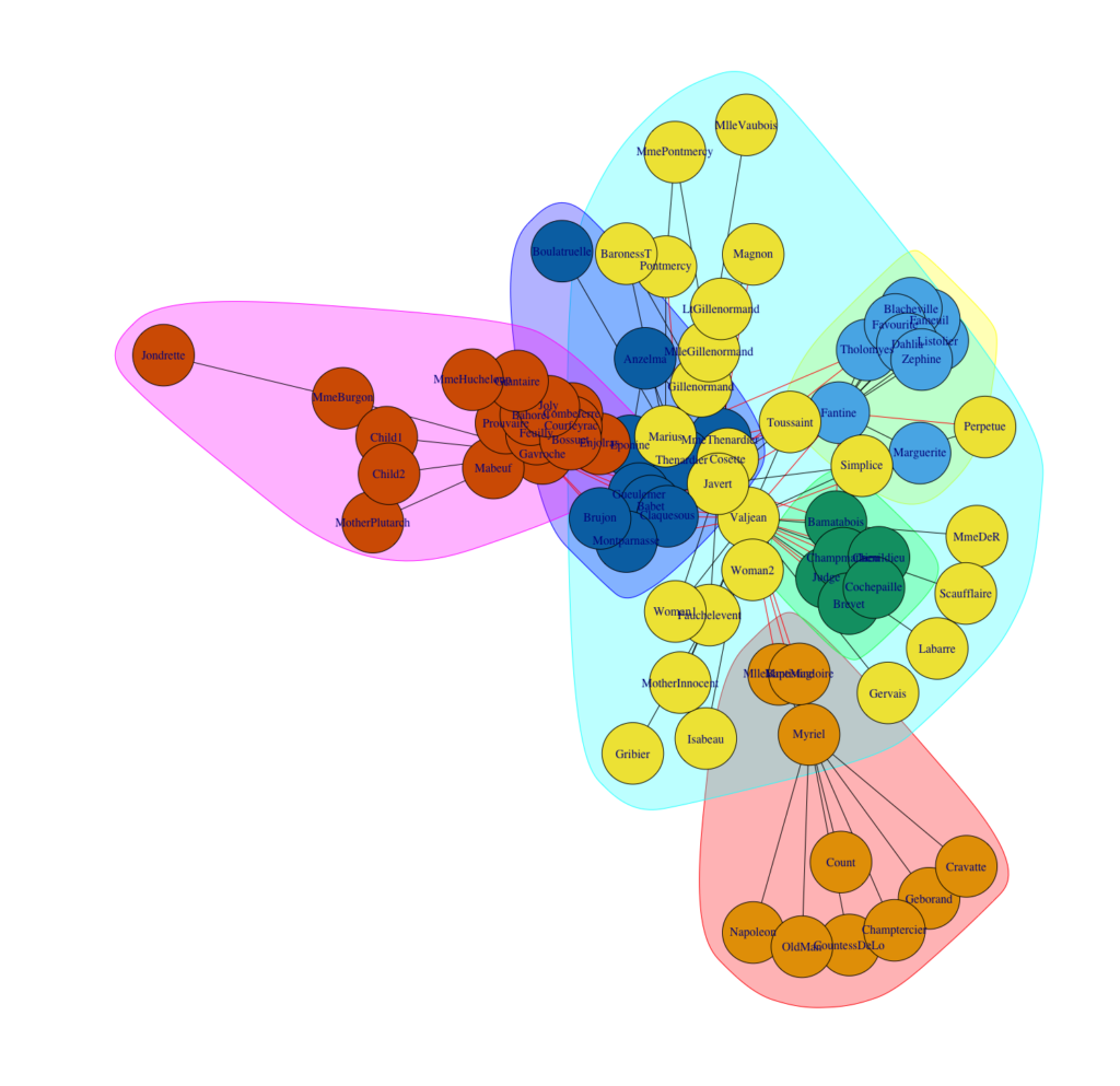
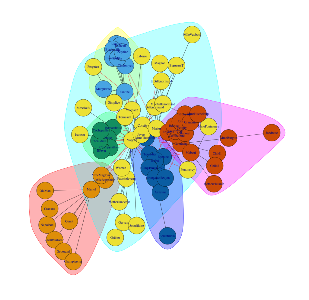
Conclusion
Both algorithms outperform other community detection algorithms (Lancchinetti, 2009). They have excellent performance, and Infomap delivers slightly better results in this study than Louvain. Moreover, we should consider two additional facts when choosing between these two algorithms.
First, both algorithms do their job very fast. If we apply them on large networks, we can see that Louvain outperforms dramatically.
Second, Louvain cannot separate outliers. This could explain why the algorithms divide people into almost identical clusters, but Infomap cuts out a few people from some clusters, and they form their own cluster. We should keep these points in mind when we have to decide between both algorithms. Another approach could be to use them both and compare their solutions.
Did I spark your interest to cluster your own networks? Feel free to use my code or contact me if you have any questions.
References
- Blondel, Vincent D. / Guillaume, Jean L. / Lambiotte, Renaud / Lefebvre, Etienne (2008), “Fast unfolding of communities in large networks”, Journal of Statistical Mechanics: Theory and Experiment, Jg.2008, Nr.10, P10008
- Bohlin, Ludvig / Edler, Daniel / Lancichinetti, Andrea / Rosvall, Martin (2014), “Community Detection and Visualization of Networks with the Map Equation Framework”, in: Measuring Scholary Impact: Methods and Practice (Ding, Ying / Rousseau, Ronald / Wolfram, Dietmar, Eds.), S.3-34, Springer-Verlag, Berlin
- Lancichinetti, Andrea / Fortunato, Santo (2009), ” Community detection algorithms: a comparative analysis”, Physical review E, Jg.80, Nr.5, 056117
- Rosvall, Martin / Bergstrom, Carl T. (2008), “Maps of random walks on complexe net- works reveal community structure”, Proceedings of the National Academy of Sciences USA, Jg.105, Nr.4, S.1118-1123
- Rosvall, Martin / Axellson, Daniel / Bergstrom, Carl T. (2009), “The map equation”, The European Physical Journal Special Topics, Jg.178, Nr.1, S.13-23
At STATWORX, deploying our project results with the help of Shiny has become part of our daily business. Shiny is a great way of letting users interact with their own data and the data science products that we provide.
Applying the philosophy of reactivity to your app’s UI is an interesting way of bringing your apps closer in line with the spirit of the Shiny package. Shiny was designed to be reactive, so why limit this to only the server-side of your app? Introducing dynamic UI elements to your apps will help you reduce visual clutter, make for cleaner code and enhance the overall feel of your applications.
I have previously discussed the advantages of using renderUI in combination with lapply and do.call in the first part of this series on dynamic UI elements in Shiny. Building onto this I would like to expand our toolbox for reactive UI design with a few more options.
The objective
In this particular case, we’re trying to build an app where one of the inputs reacts to another input dynamically. Let’s assume we’d like to present the user with multiple options to choose from in the shape of a selectInput. Let’s also assume that one of the options may call for more input from the user, let’s say a comment, to explain more clearly the previous selection. One way to do this would be to add a static textInput or similar to the app. A much more elegant solution would be to conditionally render the second input to only appear if the proper option had been selected. The image below shows how this would look in practice.
There are multiple ways of going about this in Shiny. I’d like to introduce two of them to you, both of which lead to the same result but with a few key differences between them.
A possible solution: req
What req is usually used for
req is a function from the Shiny package whose purpose is to check whether certain requirements are met before proceeding with your calculations inside a reactive environment. Usually this is used to avoid red error messages popping up in your ShinyApp UI when an element of your app depends on an input that doesn’t have a set value yet. You may have seen one of these before:

These errors usually disappear once you have assigned a value to the needed inputs. req makes it so that your desired output is only calculated once its required inputs have been set, thus offering an elegant way to avoid the rather garish-looking error messages in your app’s UI.
How we can make use of req
In terms of reactive UI design, we can make use of req‘s functionality to introduce conditional statements to our uiOutputs. This is achieved by using renderUI and req in combination as shown in the following example:
output$conditional_comment <- renderUI({
    # specify condition
    req(input$select == "B")

    # execute only if condition is met
    textAreaInput(inputId = "comment",
                  label = "please add a comment",
                  placeholder = "write comment here")
  })
Within req the condition to be met is specified and the rest of the code inside the reactive environment created by renderUI is only executed if that condition is met. What is nice about this solution is that if the condition has not been met there will be no red error messages or other visual clutter popping up in your app, just like what we’ve seen at the beginning of this chapter.
A simple example app
Here’s the complete code for a small example app:
library(shiny)
library(shinydashboard)

ui <- dashboardPage(

  dashboardHeader(),
  dashboardSidebar(
    selectInput(inputId = "select",
                label = "please select an option",
                choices = LETTERS[1:3]),
    uiOutput("conditional_comment")
  ),
  dashboardBody(
    uiOutput("selection_text"),
    uiOutput("comment_text")
  )
)

server <- function(input, output) {

  output$selection_text <- renderUI({
    paste("The selected option is", input$select)
  })

  output$conditional_comment <- renderUI({
    req(input$select == "B")
    textAreaInput(inputId = "comment",
                  label = "please add a comment",
                  placeholder = "write comment here")
  })

  output$comment_text <- renderText({
    input$comment
  })
}

shinyApp(ui = ui, server = server)
If you try this out by yourself you will find that the comment box isn’t hidden or disabled when it isn’t being shown, it simply doesn’t exist unless the selectInput takes on the value of “B”. That is because the uiOutput object containing the desired textAreaInput isn’t being rendered unless the condition stated inside of req is satisfied.
The popular choice: conditionalPanel
Out of all the tools available for reactive UI design this is probably the most widely used. The results obtained with conditionalPanel are quite similar to what req allowed us to do in the example above, but there are a few key differences.
How does this differ from req?
conditionalPanel was designed to specifically enable Shiny-programmers to conditionally show or hide UI elements. Unlike the req-method, conditionalPanel is evaluated within the UI-part of the app, meaning that it doesn’t rely on renderUI to conditionally render the various inputs of the shinyverse. But wait, you might ask, how can Shiny evaluate any conditions in the UI-side of the app? Isn’t that sort of thing always done in the server-part? Well yes, that is true if the expression is written in R. To get around this, conditionalPanel relies on JavaScript to evaluate its conditions. After stating the condition in JS we can add any given UI-elements to our conditionalPanel as shown below:
conditionalPanel(
      # specify condition
      condition = "input.select == 'B'",

      # execute only if condition is met
      textAreaInput(inputId = "comment",
                    label = "please add a comment",
                    placeholder = "write comment here")
    )
This code chunk displays the same behavior as the example shown in the last chapter with one major difference: It is now part of our ShinyApp’s UI-function unlike the req-solution, which was a uiOutput calculated in the server part of the app and later passed to our UI-function as a list element.
A simple example app:
Rewriting the app to include conditionalPanel instead of req yields a script that looks something like this:
library(shiny)
library(shinydashboard)

ui <- dashboardPage(

  dashboardHeader(),
  dashboardSidebar(
    selectInput(inputId = "select",
                label = "please select an option",
                choices = LETTERS[1:3]),
    conditionalPanel(
      condition = "input.select == 'B'",
      textAreaInput(inputId = "comment",
                    label = "please add a comment",
                    placeholder = "write comment here")
    )
  ),
  dashboardBody(
    uiOutput("selection_text"),
    textOutput("comment_text")
    )
)

server <- function(input, output) {

  output$selection_text <- renderUI({
    paste("The selected option is", input$select)
  })

  output$comment_text <- renderText({
    input$comment
  })
}

shinyApp(ui = ui, server = server)
With these two simple examples, we have demonstrated multiple ways of letting your displayed UI elements react to how a user interacts with your app – both on the server, as well as the UI side of the application. In order to keep things simple, I have used a basic textAreaInput for this demonstration, but both renderUI and conditionalPanel can hold so much more than just a simple input element.
So get creative and utilize these tools, maybe even in combination with the functions from part 1 of this series, to make your apps even shinier!