Business success hinges on how companies interact with their customers. No company can afford to provide inadequate care and support. On the contrary, companies that offer fast and precise handling of customer inquiries can distinguish themselves from the competition, build trust in their brand, and retain people in the long run. Our collaboration with Geberit, a leading manufacturer of sanitary technology in Europe, demonstrates how this can be achieved at an entirely new level through the use of generative AI.
What is generative AI?
Generative AI models automatically create content from existing texts, images, and audio files. Thanks to intelligent algorithms and deep learning, this content is hardly distinguishable, if at all, from human-made content. This allows companies to offer their customers personalized user experiences, interact with them automatically, and create and distribute relevant digital content tailored to their target audience. GenAI can also tackle complex tasks by processing vast amounts of data, recognizing patterns, and learning new skills. This technology enables unprecedented gains in productivity. Routine tasks like data preparation, report generation, and database searches can be automated and greatly optimized with suitable models.
The Challenge: One Million Emails
Geberit faced a challenge: every year, one million emails landed in various mailboxes of the customer service department of Geberit’s German distribution company. It was common for inquiries to end up in the wrong departments, leading to significant additional effort.
The Solution: An AI-powered Email Bot
To correct this misdirection, we developed an AI system that automatically assigns emails to the correct departments. This intelligent classification system was trained with a dataset of anonymized customer inquiries and utilizes advanced machine and deep learning methods, including Google’s BERT model.
The Highlight: Automated Response Suggestions with ChatGPT
But the innovation didn’t stop there. The system was further developed to generate automated response emails. ChatGPT is used to create customer-specific suggestions. Customer service agents only need to review the generated emails and can send them directly.
The Result: 70 Percent Better Sorting
The result of this groundbreaking solution speaks for itself: a reduction of misassigned emails by over 70 percent. This not only means significant time savings of almost three full working months but also an optimization of resources. The success of the project is making waves at Geberit: a central mailbox for all inquiries, expansion into other country markets, and even a digital assistant are in the planning.
Customer Service 2.0 – Innovation, Efficiency, Satisfaction
The introduction of GenAI has not only revolutionized Geberit’s customer service but also demonstrates the potential in the targeted application of AI technologies. Intelligent classification of inquiries and automated response generation not only saves resources but also increases customer satisfaction. A pioneering example of how AI is shaping the future of customer service.
Intelligent chatbots are one of the most exciting and already visible applications of Artificial Intelligence. Since the beginning of 2023, ChatGPT and similar models have enabled straightforward interactions with large AI language models, providing an impressive range of everyday assistance. Whether it’s tutoring in statistics, recipe ideas for a three-course meal with specific ingredients, or a haiku on a particular topic, modern chatbots deliver answers in an instant. However, they still face a challenge: although these models have learned a lot during training, they aren’t actually knowledge databases. As a result, they often produce nonsensical content—albeit convincingly.
The ability to provide a large language model with its own documents offers a solution to this problem. This is precisely what our partner Microsoft asked us for on a special occasion.
Microsoft’s Azure cloud platform has proven itself as a top-tier platform for the entire machine learning process in recent years. To facilitate entry into Azure, Microsoft asked us to implement an exciting AI application in Azure and document it down to the last detail. This so-called MicroHack is designed to provide interested parties with an accessible resource for an exciting use case.
We dedicated our MicroHack to the topic of “Retrieval-Augmented Generation” to elevate large language models to the next level. The requirements were simple: build an AI chatbot in Azure, enable it to process information from your own documents, document every step of the project, and publish the results on the official MicroHacks GitHub repository as challenges and solutions—freely accessible to all.
Wait, why does AI need to read documents?
Large Language Models (LLMs) impress not only with their creative abilities but also as collections of compressed knowledge. During the extensive training process of an LLM, the model learns not only the grammar of a language but also semantics and contextual relationships. In short, large language models acquire knowledge. This enables an LLM to be queried and generate convincing answers—with a catch. While the learned language skills of an LLM often suffice for the vast majority of applications, the same cannot be said for learned knowledge. Without retraining on additional documents, the knowledge level of an LLM remains static.
This leads to the following problems:
- Trained LLMs may have extensive general or even specialized knowledge, but they cannot provide information from non-publicly accessible sources.
- The knowledge of a trained LLM quickly becomes outdated. The so-called “training cutoff” means that the LLM cannot make statements about events, documents, or sources that occurred or were created after the start of training.
- The technical nature of large language models as text completion machines leads them to invent facts when they haven’t learned a suitable answer. These so-called “hallucinations” mean that the answers of an LLM are never completely trustworthy without verification—regardless of how convincing they may seem.
However, machine learning also has a solution for these problems: “Retrieval-augmented Generation” (RAG). This term refers to a workflow that doesn’t just have an LLM answer a simple question but extends this task with a “knowledge retrieval” component: the search for relevant knowledge in a database.
The concept of RAG is simple: search a database for a document that answers the question posed. Then, use a generative LLM to answer the question based on the found passage. This transforms an LLM into a chatbot that answers questions with information from its own database—solving the problems described above.
What happens exactly in such a “RAG”?
RAG consists of two steps: “Retrieval” and “Generation”. For the Retrieval component, a so-called “semantic search” is employed: a database of documents is searched using vector search. Vector search means that the similarity between question and documents isn’t determined by the intersection of keywords, but by the distance between numerical representations of the content of all documents and the query, known as embedding vectors. The idea is remarkably simple: the closer two texts are in content, the smaller their vector distance. As the first puzzle piece, we need a machine learning model that creates robust embeddings for our texts. With this, we then extract the most suitable documents from the database, whose content will hopefully answer our query.
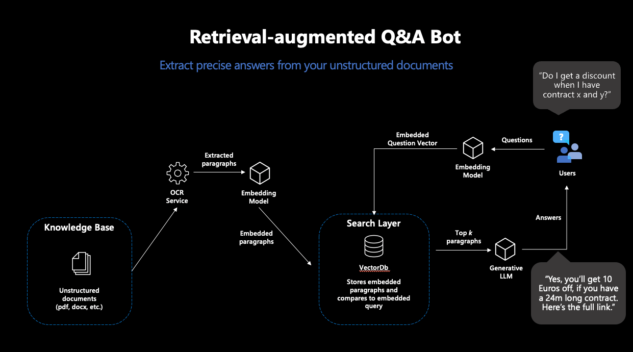
Figure 1: Representation of the typical RAG workflow
Modern vector databases make this process very easy: when connected to an embedding model, these databases store documents directly with their corresponding embeddings—and return the most similar documents to a search query.
Based on the contents of the found documents, an answer to the question is generated in the next step. For this, a generative language model is needed, which receives a suitable prompt for this purpose. Since generative language models do nothing more than continue given text, careful prompt design is necessary to minimize the model’s room for interpretation in solving this task. This way, users receive answers to their queries that were generated based on their own documents—and thus are not dependent on the training data for their content.
How can such a workflow be implemented in Azure?
For the implementation of such a workflow, we needed four separate steps—and structured our MicroHack accordingly:
Step 1: Setup for Document Processing in Azure
In the first step, we laid the foundations for the RAG pipeline. Various Azure services for secure password storage, data storage, and processing of our text documents had to be prepared.
As the first major piece of the puzzle, we used the Azure Form Recognizer, which reliably extracts text from scanned documents. This text should serve as the basis for our chatbot and therefore needed to be extracted, embedded, and stored in a vector database from the documents. From the many offerings for vector databases, we chose Chroma.
Chroma offers many advantages: the database is open-source, provides a developer-friendly API for use, and supports high-dimensional embedding vectors. OpenAI’s embeddings are 1536-dimensional, which is not supported by all vector databases. For the deployment of Chroma, we used an Azure VM along with its own Chroma Docker container.
However, the Azure Form Recognizer and the Chroma instance alone were not sufficient for our purposes: to transport the contents of our documents into the vector database, we had to integrate the individual parts into an automated pipeline. The idea here was that every time a new document is stored in our Azure data store, the Azure Form Recognizer should become active, extract the content from the document, and then pass it on to Chroma. Next, the contents should be embedded and stored in the database—so that the document will become part of the searchable space and can be used to answer questions in the future. For this, we used an Azure Function, a service that executes code as soon as a defined trigger occurs—such as the upload of a document in our defined storage.
To complete this pipeline, only one thing was missing: the embedding model.
Step 2: Completion of the Pipeline
For all machine learning components, we used the OpenAI service in Azure. Specifically, we needed two models for the RAG workflow: an embedding model and a generative model. The OpenAI service offers several models for these purposes.
For the embedding model, “text-embedding-ada-002” was the obvious choice, OpenAI’s newest model for calculating embeddings. This model was used twice: first for creating the embeddings of the documents, and secondly for calculating the embedding of the search query. This was essential: to calculate reliable vector similarities, the embeddings for the search must come from the same model.
With that, the Azure Function could be completed and deployed—the text processing pipeline was complete. In the end, the functional pipeline looked like this:
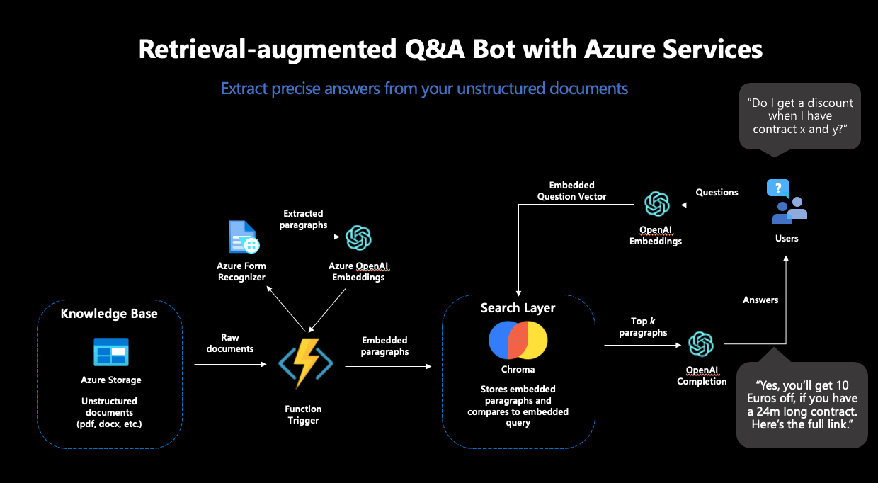
Figure 2: The complete RAG workflow in Azure
Step 3: Answer Generation
To complete the RAG workflow, an answer should be generated based on the documents found in Chroma. We decided to use “GPT3.5-turbo” for text generation, which is also available in the OpenAI service.
This model needed to be instructed to answer the posed question based on the content of the documents returned by Chroma. Careful prompt engineering was necessary for this. To prevent hallucinations and get as accurate answers as possible, we included both a detailed instruction and several few-shot examples in the prompt. In the end, we settled on the following prompt:
"""I want you to act like a sentient search engine which generates natural sounding texts to answer user queries. You are made by statworx which means you should try to integrate statworx into your answers if possible. Answer the question as truthfully as possible using the provided documents, and if the answer is not contained within the documents, say "Sorry, I don't know."
Examples:
Question: What is AI?
Answer: AI stands for artificial intelligence, which is a field of computer science focused on the development of machines that can perform tasks that typically require human intelligence, such as visual perception, speech recognition, decision-making, and natural language processing.
Question: Who won the 2014 Soccer World Cup?
Answer: Sorry, I don't know.
Question: What are some trending use cases for AI right now?
Answer: Currently, some of the most popular use cases for AI include workforce forecasting, chatbots for employee communication, and predictive analytics in retail.
Question: Who is the founder and CEO of statworx?
Answer: Sebastian Heinz is the founder and CEO of statworx.
Question: Where did Sebastian Heinz work before statworx?
Answer: Sorry, I don't know.
Documents:\n"""
Finally, the contents of the found documents were appended to the prompt, providing the generative model with all the necessary information.
Step 4: Frontend Development and Deployment of a Functional App
To interact with the RAG system, we built a simple streamlit app that also allowed for the upload of new documents to our Azure storage—thereby triggering the document processing pipeline again and expanding the search space with additional documents.
For the deployment of the streamlit app, we used the Azure App Service, designed to quickly and scalably deploy simple applications. For an easy deployment, we integrated the streamlit app into a Docker image, which could be accessed over the internet in no time thanks to the Azure App Service.
And this is what our finished app looked like:
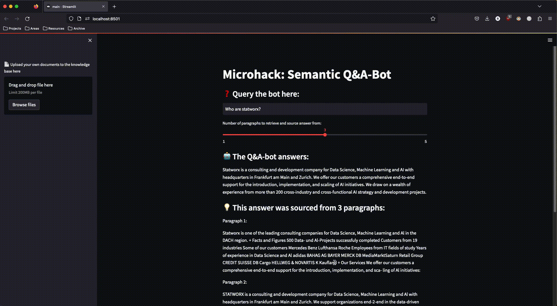
Figure 3: The finished streamlit app in action
What did we learn from the MicroHack?
During the implementation of this MicroHack, we learned a lot. Not all steps went smoothly from the start, and we were forced to rethink some plans and decisions. Here are our five takeaways from the development process:
Not all databases are equal.
We changed our choice of vector database several times during development: from OpenSearch to ElasticSearch and ultimately to Chroma. While OpenSearch and ElasticSearch offer great search functions (including vector search), they are still not AI-native vector databases. Chroma, on the other hand, was designed from the ground up to be used in conjunction with LLMs—and therefore proved to be the best choice for this project.
Chroma is a great open-source vector DB for smaller projects and prototyping.
Chroma is particularly suitable for smaller use cases and rapid prototyping. While the open-source database is still too young and immature for large-scale production systems, Chroma’s simple API and straightforward deployment allow for the rapid development of simple use cases; perfect for this MicroHack.
Azure Functions are a fantastic solution for executing smaller pieces of code on demand.
Azure Functions are ideal for running code that isn’t needed at pre-planned intervals. The event triggers were perfect for this MicroHack: the code is only needed when a new document is uploaded to Azure. Azure Functions take care of all the infrastructure; we only needed to provide the code and the trigger.
Azure App Service is great for deploying streamlit apps.
Our streamlit app couldn’t have had an easier deployment than with the Azure App Service. Once we had integrated the app into a Docker image, the service took care of the entire deployment—and scaled the app according to demand.
Networking should not be underestimated.
For all the services used to work together, communication between the individual services must be ensured. The development process required a considerable amount of networking and whitelisting, without which the functional pipeline would not have worked. For the development process, it’s essential to allocate enough time for the deployment of networking.
The MicroHack was a great opportunity to test the capabilities of Azure for a modern machine learning workflow like RAG. We thank Microsoft for the opportunity and support, and we are proud to have contributed our in-house MicroHack to the official GitHub repository. You can find the complete MicroHack, including challenges, solutions, and documentation, here on the official MicroHacks GitHub—allowing you to guide a similar chatbot with your own documents in Azure.
Data science applications provide insights into large and complex data sets, oftentimes including powerful models that have been carefully crafted to fulfill customer needs. However, the insights generated are not useful unless they are presented to the end-users in an accessible and understandable way. This is where building a web app with a well-designed frontend comes into the picture: it helps to visualize customizable insights and provides a powerful interface that users can leverage to make informed decisions effectively.
In this article, we will discuss why a frontend is useful in the context of data science applications and which steps it takes to get there! We will also give a brief overview of popular frontend and backend frameworks and when these setups should be used.
Three reasons why a frontend is useful for data science
In recent years, the field of data science has witnessed a rapid expansion in the range and complexity of available data. While Data Scientists excel in extracting meaningful insights from raw data, effectively communicating these findings to stakeholders remains a unique challenge. This is where a frontend comes into play. A frontend, in the context of data science, refers to the graphical interface that allows users to interact with and visualize data-driven insights. We will explore three key reasons why incorporating a frontend into the data science workflow is essential for successful analysis and communication.
Visualize data insights
A frontend helps to present the insights generated by data science applications in an accessible and understandable way. By visualizing data insights with charts, graphs, and other visual aids, users can better understand patterns and trends in the data.
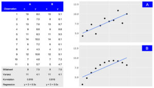
Depiction of two datasets (A and B) that share summary statistics even though the distribution differs. While the tabular view provides detailed information, the visual presentation makes the general association between observations easily accessible.
Customize user experiences
Dashboards and reports can be highly customized to meet the specific needs of different user groups. A well-designed frontend allows users to interact with the data in a way that is most relevant to their requirements, enabling them to gain insights more quickly and effectively.
Enable informed decision-making
By presenting results from Machine Learning models and outcomes of explainable AI methods via an easy-to-understand frontend, users receive a clear and understandable representation of data insights, facilitating informed decisions. This is especially important in industries like financial trading or smart cities, where real-time insights can drive optimization and competitive advantage.
Four stages from ideation to a first prototype
When dealing with data science models and results, the frontend is the part of the application with which users will interact. Therefore, it should be clear that building a useful and productive frontend will take time and effort. Before the actual development, it is crucial to define the purpose and goals of the application. To identify and prioritize these requirements, multiple iterations of brainstorming and feedback sessions are needed. During these sessions, the frontend will travers from a simple sketch over a wireframe and mockup to the first prototype.

Sketch
The first stage involves creating a rough sketch of the frontend. It includes identifying the different components and how they might look. To create a sketch, it is helpful to have a planning session, where the functional requirements and visual ideas are clarified and shared. During this session, a first sketch is created with simple tools like an online whiteboard (e.g., Miro) or even pen and paper can be sufficient.
Wireframe
When the sketching is done, the individual parts of the application need to be connected to understand their interactions and how they will work together. This is an important stage as potential problems can be identified before the development process starts. Wireframes showcase the usage from a user’s point of view and incorporate the application’s requirements. They can also be created on a Miro board or with tools like Figma.
Mockup
After the sketching and wireframe stage, the next step is to create a mockup of the frontend. This involves creating a visually appealing design that is easy to use and understand. With tools like Figma, mockups can be quickly created, and they also provide an interactive demo that can showcase the interaction within the frontend. At this stage, it is important to ensure that the design is consistent with the company’s brand and style guidelines, because first impressions tend to stick.
Prototype
Once the mockup is complete, it is time to build a working prototype of the frontend and connect it to the backend infrastructure. To ensure scalability later, the used framework and the given infrastructure need to be evaluated. This decision will impact the tools used for this stage and will be discussed in the following sections.
There are many Options for Frontend Development
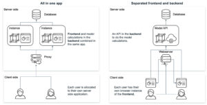
Most data scientists are familiar with R or Python. Therefore, the first go-to solutions to develop frontend applications like dashboards are often R Shiny, Dash, or streamlit. These tools have the advantage that data preparation and model calculation steps can be implemented within the same framework as the dashboard. Visualizations are closely linked to the used data and models and changes can often be integrated by the same developer. For some projects this might be enough, but as soon as a certain threshold of scalability is reached it becomes beneficial to separate backend model calculation and frontend user interactions.
Though it is possible to implement this kind of separation in R or Python frameworks, under the hood, these libraries translate their output into files that the browser can process, like HTML, CSS or JavaScript. By using JavaScript directly with the relevant libraries, the developers gain more flexibility and adjustability. Some good examples that offer a wide range of visualizations are D3.js, Sigma.js or Plotly.js with which richer user interface with modern and visually appealing designs can be created.
That being said, the range of JavaScript based frameworks is still vast and growing. The most popular used ones are React, Angular, Vue and Svelte. Comparing them in performance, community and learning curve shows some differences, that in the end depend on the specific use cases and preferences (more details can be found here or here).
Being “the programming language of the Web”, JavaScript has been around for a long time. It’s diverse and versatile ecosystem with the advantages mentioned above is proof of that. Not only do the directly used libraries play a part in this, but also the wide and powerful range of developer tools that exist, which make the lives of developers easier.
Considerations for the Backend Architecture
Next to the ideation the questions about the development framework and infrastructure need to be answered. Combining the visualizations (frontend) with the data logic (backend) in one application has both pros and cons.
One approach is to use highly opinionated technologies such as R Shiny or Python’s Dash, where both frontend and backend are developed together in the same application. This has the advantage of making it easier to integrate data analysis and visualization into a web application. It helps users to interact with data directly through a web browser and view visualizations in real-time. Especially R Shiny offers a wide range of packages for data science and visualization that can be easily integrated into a web application, making it a popular choice for developers working in data science.
On the other hand, separating the frontend and backend using different frameworks like Node.js and Python provides more flexibility and control over the application development process. Frontend frameworks like Vue and React offer a wide range of features and libraries for building intuitive user interfaces and interactions, while backend frameworks like Express.js, Flask and Django provide robust tools for building stable and scalable server-side code. This approach allows developers to choose the best tools for each aspect of the application, which can result in better performance, easier maintenance, and more customizability. However, it can also add complexity to the development process and requires more coordination between frontend and backend developers.
Hosting a JavaScript-based frontend offers several advantages over hosting an R Shiny or Python Dash application. JavaScript frameworks like React, Angular, or Vue.js provide high-performance rendering and scalability, allowing for complex UI components and large-scale applications. These frameworks also offer more flexibility and customization options for creating custom UI elements and implementing complex user interactions. Furthermore, JavaScript-based frontends are cross-platform compatible, running on web browsers, desktop applications, and mobile apps, making them more versatile. Lastly, JavaScript is the language of the web, enabling easier integration with existing technology stacks. Ultimately, the choice of technology depends on the specific use case, development team expertise, and application requirements.
Conclusion
Building a frontend for a data science application is crucial in effectively communicating insights to the end-users. It helps to present the data in an easily digestible manner and enables the users to make informed decisions. To ensure that the needs and requirements are utilized correctly and efficiently, the right framework and infrastructure must be evaluated. We suggest that solutions in R or Python are a good starting point, but applications in JavaScript might scale better in the long run.
If you are looking to build a frontend for your data science application, feel free to contact our team of experts who can guide you through the process and provide the necessary support to bring your visions to life.
The Hidden Risks of Black-Box Algorithms
Reading and evaluating countless resumes in the shortest possible time and making recommendations for suitable candidates – this is now possible with artificial intelligence in applicant management. This is because advanced AI technologies can efficiently analyze even large volumes of complex data. In HR management, this not only saves valuable time in the pre-selection process but also enables applicants to be contacted more quickly. Artificial intelligence also has the potential to make application processes fairer and more equitable.
However, real-world experience has shown that artificial intelligence is not always “fair”. A few years ago, for example, an Amazon recruiting algorithm stirred up controversy for discriminating against women when selecting candidates. Additionally, facial recognition algorithms have repeatedly led to incidents of discrimination against People of Color.
One reason for this is that complex AI algorithms independently calculate predictions and results based on the data fed into them. How exactly they arrive at a particular result is not initially comprehensible. This is why they are also known as black-box algorithms. In Amazon’s case, the AI determined suitable applicant profiles based on the current workforce, which was predominantly male, and thus made biased decisions. In a similar way, algorithms can reproduce stereotypes and reinforce discrimination.
Principles for Trustworthy AI
The Amazon incident shows that transparency is highly relevant in the development of AI solutions to ensure that they function ethically. This is why transparency is also one of the seven statworx Principles for trustworthy AI. The employees at statworx have collectively defined the following AI principles: Human-centered, transparent, ecological, respectful, fair, collaborative, and inclusive. These serve as orientations for everyday work with artificial intelligence. Universally applicable standards, rules, and laws do not yet exist. However, this could change in the near future.
The European Union (EU) has been discussing a draft law on the regulation of artificial intelligence for some time. Known as the AI Act, this draft has the potential to be a gamechanger for the global AI industry. This is because it is not only European companies that are targeted by this draft law. All companies offering AI systems on the European market, whose AI-generated output is used within the EU, or operate AI systems for internal use within the EU would be affected. The requirements that an AI system must meet depend on its application.
Recruiting algorithms are likely to be classified as high-risk AI. Accordingly, companies would have to fulfill comprehensive requirements during the development, publication, and operation of the AI solution. Among other things, companies are required to comply with data quality standards, prepare technical documentation, and establish risk management. Violations may result in heavy fines of up to 6% of global annual sales. Therefore, companies should already start dealing with the upcoming requirements and their AI algorithms. Explainable AI methods (XAI) can be a useful first step. With their help, black-box algorithms can be better understood, and the transparency of the AI solution can be increased.
Unlocking the Black Box with Explainable AI Methods
XAI methods enable developers to better interpret the concrete decision-making processes of algorithms. This means that it becomes more transparent how an algorithm has formed patterns and rules and makes decisions. As a result, potential problems such as discrimination in the application process can be discovered and corrected. Thus, XAI not only contributes to greater transparency of AI but also favors its ethical use and thus increases the conformity of an AI with the upcoming AI Act.
Some XAI methods are even model-agnostic, i.e. applicable to any AI algorithm from decision trees to neural networks. The field of research around XAI has grown strongly in recent years, which is why there is now a wide variety of methods. However, our experience shows that there are large differences between different methods in terms of the reliability and meaningfulness of their results. Furthermore, not all methods are equally suitable for robust application in practice and for gaining the trust of external stakeholders. Therefore, we have identified our top 3 methods based on the following criteria for this blog post:
- Is the method model agnostic, i.e. does it work for all types of AI models?
- Does the method provide global results, i.e. does it say anything about the model as a whole?
- How meaningful are the resulting explanations?
- How good is the theoretical foundation of the method?
- Can malicious actors manipulate the results or are they trustworthy?
Our Top 3 XAI Methods at a Glance
Using the above criteria, we selected three widely used and proven methods that are worth diving a bit deeper into: Permutation Feature Importance (PFI), SHAP Feature Importance, and Accumulated Local Effects (ALE). In the following, we explain how each of these methods work and what they are used for. We also discuss their advantages and disadvantages and illustrate their application using the example of a recruiting AI.
Efficiently Identify Influencial Variables with Permutation Feature Importance
The goal of Permutation Feature Importance (PFI) is to find out which variables in the data set are particularly crucial for the model to make accurate predictions. In the case of the recruiting example, PFI analysis can shed light on what information the model relies on to make its decision. For example, if gender emerges as an influential factor here, it can alert the developers to potential bias in the model. In the same way, a PFI analysis creates transparency for external users and regulators. Two things are needed to compute PFI:
- An accuracy metric such as the error rate (proportion of incorrect predictions out of all predictions).
- A test data set that can be used to determine accuracy.
In the test data set, one variable after the other is concealed from the model by adding random noise. Then, the accuracy of the model is determined over the transformed test dataset. From there, we conclude that those variables whose concealment affects model accuracy the most are particularly important. Once all variables are analyzed and sorted, we obtain a visualization like Figure 1. Using our artificially generated sample data set, we can derive the following: Work experience did not play a major role in the model, but ratings from the interview were influencial.
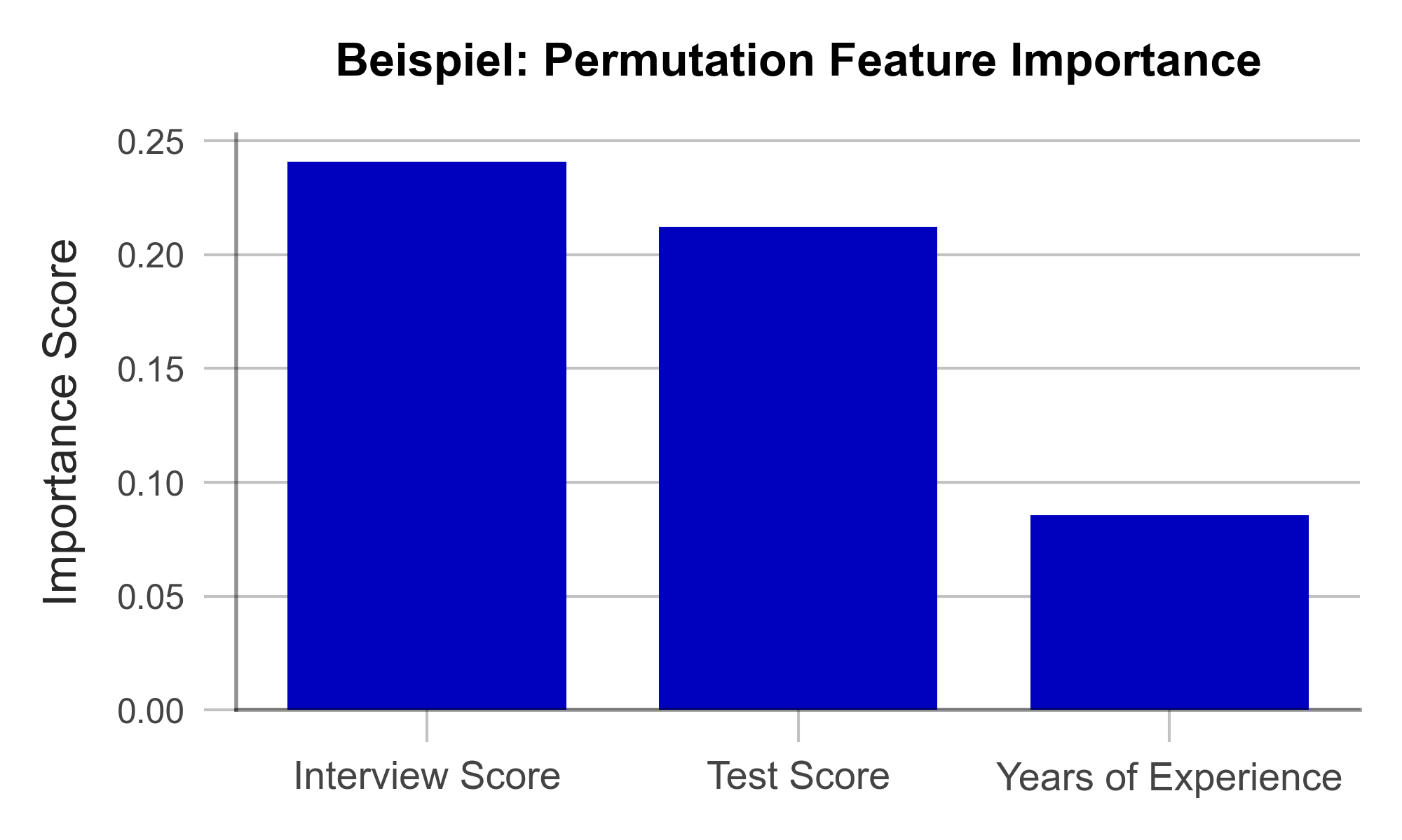
Figure 1 – Permutation Feature Importance using the example of a recruiting AI (data artificially generated).
A great strength of PFI is that it follows a clear mathematical logic. The correctness of its explanation can be proven by statistical considerations. Furthermore, there are hardly any manipulable parameters in the algorithm with which the results could be deliberately distorted. This makes PFI particularly suitable for gaining the trust of external observers. Finally, the computation of PFI is very resource efficient compared to other XAI methods.
One weakness of PFI is that it can provide misleading explanations under some circumstances. If a variable is assigned a low PFI value, it does not always mean that the variable is unimportant to the issue. For example, if the bachelor’s degree grade has a low PFI value, this may simply be because the model can simply look at the master’s degree grade instead since they are usually similar. Such correlated variables can complicate the interpretation of the results. Nonetheless, PFI is an efficient and useful method for creating transparency in black-box models.
| Strengths | Weaknesses |
|---|---|
| Little room for malicious manipulation of results | Does not consider interactions between variables |
| Efficient computation |
Uncover Complex Relationships with SHAP Feature Importance
SHAP Feature Importance is a method for explaining black box models based on game theory. The goal is to quantify the contribution of each variable to the prediction of the model. As such, it closely resembles Permutation Feature Importance at first glance. However, unlike PFI, SHAP Feature Importance provides results that can account for complex relationships between multiple variables.
SHAP is based on a concept from game theory: Shapley values. Shapley values are a fairness criterion that assigns a weight to each variable that corresponds to its contribution to the outcome. This is analogous to a team sport, where the winning prize is divided fairly among all players, according to their contribution to the victory. With SHAP, we can look at every individual obversation in the data set and analyze what contribution each variable has made to the prediction of the model.
If we now determine the average absolute contribution of a variable across all observations in the data set, we obtain the SHAP Feature Importance. Figure 2 illustrates the results of this analysis. The similarity to the PFI is evident, even though the SHAP Feature Importance only places the rating of the job interview in second place.
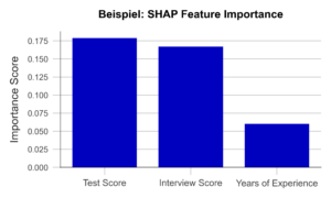
Figure 2 – SHAP Feature Importance using the example of a recruiting AI (data artificially generated).
A major advantage of this approach is the ability to account for interactions between variables. By simulating different combinations of variables, it is possible to show how the prediction changes when two or more variables vary together. For example, the final grade of a university degree should always be considered in the context of the field of study and the university. In contrast to the PFI, the SHAP Feature Importance takes this into account. Also, Shapley Values, once calculated, are the basis of a wide range of other useful XAI methods.
However, one weakness of the method is that it is more computationally expensive than PFI. Efficient implementations are available only for certain types of AI algorithms like decision trees or random forests. Therefore, it is important to carefully consider whether a given problem requires a SHAP Feature Importance analysis or whether PFI is sufficient.
| Strengths | Weaknesses |
|---|---|
| Little room for malicious manipulation of results | Calculation is computationally expensive |
| Considers complex interactions between variables |
Focus in on Specific Variables with Accumulated Local Effects
Accumulated Local Effects (ALE) is a further development of the commonly used Partial Dependence Plots (PDP). Both methods aim at simulating the influence of a certain variable on the prediction of the model. This can be used to answer questions such as “Does the chance of getting a management position increase with work experience?” or “Does it make a difference if I have a 1.9 or a 2.0 on my degree certificate?”. Therefore, unlike the previous two methods, ALE makes a statement about the model’s decision-making, not about the relevance of certain variables.
In the simplest case, the PDP, a sample of observations is selected and used to simulate what effect, for example, an isolated increase in work experience would have on the model prediction. Isolated means that none of the other variables are changed in the process. The average of these individual effects over the entire sample can then be visualized (Figure 3, above). Unfortunately, PDP’s results are not particularly meaningful when variables are correlated. For example, let us look at university degree grades. PDP simulates all possible combinations of grades in bachelor’s and master’s programs. Unfortunately, this results in cases that rarely occur in the real world, e.g., an excellent bachelor’s degree and a terrible master’s degree. The PDP has no sense for unreaslistic cases, and the results may suffer accordingly.
ALE analysis, on the other hand, attempts to solve this problem by using a more realistic simulation that adequately represents the relationships between variables. Here, the variable under consideration, e.g., bachelor’s grade, is divided into several sections (e.g., 6.0-5.1, 5.0-4.1, 4.0-3.1, 3.0-2.1, and 2.0-1.0). Now, the simulation of the bachelor’s grade increase is performed only for individuals in the respective grade group. This prevents unrealistic combinations from being included in the analysis. An example of an ALE plot can be found in Figure 3 (below). Here, we can see that ALE identifies a negative impact of work experience on the chance of employment, which PDP was unable to find. Is this behavior of the AI desirable? For example, does the company want to hire young talent in particular? Or is there perhaps an unwanted age bias behind it? In both cases, the ALE plot helps to create transparency and to identify undesirable behavior.
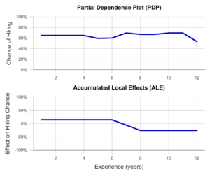
Figure 3- Partial Dependence Plot and Accumulated Local Effects using a Recruiting AI as an example (data artificially generated).
In summary, ALE is a suitable method to gain insight into the influence of a certain variable on the model prediction. This creates transparency for users and even helps to identify and fix unwanted effects and biases. A disadvantage of the method is that ALE can only analyze one or two variables together in the same plot, meaningfully. Thus, to understand the influence of all variables, multiple ALE plots must be generated, which makes the analysis less compact than PFI or a SHAP Feature Importance.
| Strengths | Weaknesses |
|---|---|
| Considers complex interactions between variables | Only one or two variables can be analyzed in one ALE plot |
| Little room for malicious manipulation of results |
Build Trust with Explainable AI Methods
In this post, we presented three Explainable AI methods that can help make algorithms more transparent and interpretable. This also favors meeting the requirements of the upcoming AI Act. Even though it has not yet been passed, we recommend to start working on creating transparency and traceability for AI models based on the draft law as soon as possible. Many Data Scientists have little experience in this field and need further training and time to familiarize with XAI concepts before they can identify relevant algorithms and implement effective solutions. Therefore, it makes sense to familiarize yourself with our recommended methods preemptively.
With Permutation Feature Importance (PFI) and SHAP Feature Importance, we demonstrated two techniques to determine the relevance of certain variables to the prediction of the model. In summary, SHAP Feature Importance is a powerful method for explaining black-box models that considers the interactions between variables. PFI, on the other hand, is easier to implement but less powerful for correlated data. Which method is most appropriate in a particular case depends on the specific requirements.
We also introduced Accumulated Local Effects (ALE), a technique that can analyze and visualize exactly how an AI responds to changes in a specific variable. The combination of one of the two feature importance methods with ALE plots for selected variables is particularly promising. This can provide a theoretically sound and easily interpretable overview of the model – whether it is a decision tree or a deep neural network.
The application of Explainable AI is a worthwhile investment – not only to build internal and external trust in one’s own AI solutions. Rather, we expect that the skillful use of interpretation-enhancing methods can help avoid impending fines due to the requirements of the AI Act, prevents legal consequences, and protects those affected from harm – as in the case of incomprehensible recruiting software.
Our free AI Act Quick Check helps you assess whether any of your AI systems could be affected by the AI Act: https://www.statworx.com/en/ai-act-tool/
Sources & Further Information:
https://www.faz.net/aktuell/karriere-hochschule/buero-co/ki-im-bewerbungsprozess-und-raus-bist-du-17471117.html (last opened 03.05.2023)
https://t3n.de/news/diskriminierung-deshalb-platzte-amazons-traum-vom-ki-gestuetzten-recruiting-1117076/ (last opened 03.05.2023)
For more information on the AI Act: https://www.statworx.com/en/content-hub/blog/how-the-ai-act-will-change-the-ai-industry-everything-you-need-to-know-about-it-now/
Statworx principles: https://www.statworx.com/en/content-hub/blog/statworx-ai-principles-why-we-started-developing-our-own-ai-guidelines/
Christoph Molnar: Interpretable Machine Learning: https://christophm.github.io/interpretable-ml-book/
Image Sources
AdobeStock 566672394 – by TheYaksha
Introduction
Forecasts are of central importance in many industries. Whether it’s predicting resource consumption, estimating a company’s liquidity, or forecasting product sales in retail, forecasts are an indispensable tool for making successful decisions. Despite their importance, many forecasts still rely primarily on the prior experience and intuition of experts. This makes it difficult to automate the relevant processes, potentially scale them, and provide efficient support. Furthermore, experts may be biased due to their experiences and perspectives or may not have all the relevant information necessary for accurate predictions.
These reasons have led to the increasing importance of data-driven forecasts in recent years, and the demand for such predictions is accordingly strong.
At statworx, we have already successfully implemented a variety of projects in the field of forecasting. As a result, we have faced many challenges and become familiar with numerous industry-specific use cases. One of our internal working groups, the Forecasting Cluster, is particularly passionate about the world of forecasting and continuously develops their expertise in this area.
Based on our collected experiences, we now aim to combine them in a user-friendly tool that allows anyone to obtain initial assessments for specific forecasting use cases depending on the data and requirements. Both customers and employees should be able to use the tool quickly and easily to receive methodological recommendations. Our long-term goal is to make the tool publicly accessible. However, we are first testing it internally to optimize its functionality and usefulness. We place special emphasis on ensuring that the tool is intuitive to use and provides easily understandable outputs.
Although our Recommender Tool is still in the development phase, we would like to provide an exciting sneak peek.
Common Challenges
Model Selection
In the field of forecasting, there are various modeling approaches. We differentiate between three central approaches:
- Time Series Models
- Tree-based Models
- Deep Learning Models
There are many criteria that can be used when selecting a model. For univariate time series data with strong seasonality and trends, classical time series models such as (S)ARIMA and ETS are appropriate. On the other hand, for multivariate time series data with potentially complex relationships and large amounts of data, deep learning models are a good choice. Tree-based models like LightGBM offer greater flexibility compared to time series models, are well-suited for interpretability due to their architecture, and tend to have lower computational requirements compared to deep learning models.
Seasonality
Seasonality refers to recurring patterns in a time series that occur at regular intervals (e.g. daily, weekly, monthly, or yearly). Including seasonality in the modeling is important to capture these regular patterns and improve the accuracy of forecasts. Time series models such as SARIMA, ETS, or TBATS can explicitly account for seasonality. For tree-based models like LightGBM, seasonality can only be considered by creating corresponding features, such as dummies for relevant seasonalities. One way to explicitly account for seasonality in deep learning models is by using sine and cosine functions. It is also possible to use a deseasonalized time series. This involves removing the seasonality initially, followed by modeling on the deseasonalized time series. The resulting forecasts are then supplemented with seasonality by applying the process used for deseasonalization in reverse. However, this process adds another level of complexity, which is not always desirable.
Hierarchical Data
Especially in the retail industry, hierarchical data structures are common as products can often be represented at different levels of granularity. This frequently results in the need to create forecasts for different hierarchies that do not contradict each other. The aggregated forecasts must therefore match the disaggregated forecasts. There are various approaches to this. With top-down and bottom-up methods, forecasts are created at one level and then disaggregated or aggregated downstream. Reconciliation methods such as Optimal Reconciliation involve creating forecasts at all levels and then reconciling them to ensure consistency across all levels.
Cold Start
In a cold start, the challenge is to forecast products that have little or no historical data. In the retail industry, this usually refers to new product introductions. Since it is not possible to train a model for these products due to the lack of history, alternative approaches must be used. A classic approach to performing a cold start is to rely on expert knowledge. Experts can provide initial estimates of demand, which can serve as a starting point for forecasting. However, this approach can be highly subjective and cannot be scaled. Similarly, similar products or potential predecessor products can be referenced. Grouping of products can be done based on product categories or clustering algorithms such as K-Means. Using cross-learning models trained on many products represents a scalable option.
Recommender Concept
With our Recommender Tool, we aim to address different problem scenarios to enable the most efficient development process. It is an interactive tool where users can provide inputs based on their objectives or requirements and the characteristics of the available data. Users can also prioritize certain requirements, and the output will prioritize those accordingly. Based on these inputs, the tool generates methodological recommendations that best cover the solution requirements, depending on the available data characteristics. Currently, the outputs consist of a purely content-based representation of the recommendations, providing concrete guidelines for central topics such as model selection, pre-processing, and feature engineering. The following example provides an idea of the conceptual approach:

The output presented here is based on a real project where the implementation in R and the possibility of local interpretability were of central importance. At the same time, new products were frequently introduced, which should also be forecasted by the developed solution. To achieve this goal, several global models were trained using Catboost. Thanks to this approach, over 200 products could be included in the training. Even for newly introduced products where no historical data was available, forecasts could be generated. To ensure the interpretability of the forecasts, SHAP values were used. This made it possible to clearly explain each prediction based on the features used.
Summary
The current development is focused on creating a tool optimized for forecasting. Through its use, we aim to increase efficiency in forecasting projects. By combining gathered experience and expertise, the tool will offer guidelines for modeling, pre-processing, and feature engineering, among other topics. It will be designed to be used by both customers and employees to quickly and easily obtain estimates and methodological recommendations. An initial test version will be available soon for internal use, but the tool is ultimately intended to be made accessible to external users as well. In addition to the technical output currently in development, a less technical output will also be available. The latter will focus on the most important aspects and their associated efforts. In particular, the business perspective in the form of expected efforts and potential trade-offs between effort and benefit will be covered by this.
Benefit from our forecasting expertise!
If you need support in addressing the challenges in your forecasting projects or have a forecasting project planned, we are happy to provide our expertise and experience to assist you.
Monitoring Data Science workflows
Long gone are the days when a data science project only consisted of loosely coupled notebooks for data processing and model training that the data scientists ran occasionally on their laptops. With maturity, the projects have grown into big software projects with multiple contributors and dependencies, and multiple modules with numerous classes and functions. The Data Science workflow, usually starting with data pre-processing, feature engineering, model training, tuning, evaluating, and lastly inferring– referred to as an ML pipeline, is being modularized. This modularization makes the process more scalable and automatable, ergo suitable to run in container orchestration systems or on cloud infrastructure. Extracting valuable model or data-related KPIs, if done manually, can be a labor-intense task, more so if with increasing and/or automated re-runs. This information is important for comparing different models and observing trends like distribution shifts in the training data. It can also be used for detecting unusual values, from imbalanced classes to inflated outlier deletions – whatever might be deemed necessary to ensure a model´s robustness. Libraries like MLFlow can be used to store all these sorts of metrics. Besides, operationalizing ML pipelines heavily relies on tracking run-related information for efficient troubleshooting, as well as maintaining or improving the pipeline´s resource consumption.
This not only holds in the world of data science. Today’s microservice-based architectures also add to the fact that maintaining and managing deployed code requires unified supervision. It can drastically cut the operation and maintenance hours needed by a DevOps team due to a more holistic understanding of the processes involved, plus simultaneously reduce error-related downtimes.
It is important to understand how different forms of monitoring aim to tackle the above-stated implications and how model- and data-related metrics can fit this objective too. In fact, while MLFlow has been established as the industry standard for supervision of ML-related metrics, tracking them along with all the operational information can be appealing as well.
Logs vs Metrics
Logs provide an event-based snapshot – Metrics give a bird’s eye overview
A log is a point in time, written out record (e.g., stdout/stderr) of an event that occurs discontinuously, at no pre-defined intervals. Depending on the application, logs carry information such as timestamp, trigger, name, description, and/or result of the event. Events can be anything from simple requests to user logins that the developer of the underlying code deemed important. When following best practices during this process, it can save a lot of hassle and time in setting up downstream monitoring tools. Using dedicated log libraries and writing meaningful log messages fits the bill
INFO[2021-01-06T17:44:13.368024402-08:00] starting *secrets.YamlSecrets
INFO[2021-01-06T17:44:13.368679356-08:00] starting *config.YamlConfig
INFO[2021-01-06T17:44:13.369046236-08:00] starting *s3.DefaultService
INFO[2021-01-06T17:44:13.369518352-08:00] starting *lambda.DefaultService
ERROR[2021-01-06T17:44:13.369694698-08:00] http server error   error="listen tcp 127.0.0.1:6060: bind: address already in use"
Fig. 1: textual event logs
Although the data footprint of a single log is negligible, log streams can exponentiate rapidly. This results in the fact that storing every single log does not scale well, especially in the shape of semi-structured text data. For debugging or auditing, however, storing logs as-is might be unavoidable. Archive storage solutions or retention periods can help.
In other cases, parsing and extracting logs on the move into other formats, like key-value pairs, further addresses these limitations. It can also preserve a lot of the event´s information while having a much lower footprint.
{
  time: "2021-01-06T17:44:13-08:00",
  mode: "reader",
  debug_http_error: "listen tcp 127.0.0.1:6061: bind: address already in use"
  servicePort: 8089,
  duration_ms: 180262
}
Fig. 2: structured event logs
Another form of reducing this footprint can be done through sampling methods, with metrics being the most prominent representatives.
A metric represents a numeric measure of a particular target (specific event) evenly distributed over intervals of time. Mathematical aggregations like sums or averages are common transformations that keep such metrics relatively small data-wise
{
   time: "2022-01-06T17:44:13-08:00",
   Duration_ms: 60,
   sum_requests: 500,
   sum_hits_endpoint_1: 250,
   sum_hits_endpoint_2: 117,
   avg_duration: 113,
 }
Fig. 3: metrics
Thus, metrics are well suited for gradually reducing the data resolution into wider frequencies like daily, weekly, or even longer periods of analysis. Additionally, metrics tend to be better unifiable across multiple applications as they carry highly structured data compared to raw log messages. While this reduces the issues mentioned before, it does come at the cost of granularity. This makes metrics perfect for high-frequency events where a single event´s information is less important. Monitoring compute resources is an example of this. Both takes have their right to exist in any monitoring setup as different use cases fit the different objectives. Consider this more tangible example of a small shop to showcase their main differences:
The total balance of a bank account may fluctuate over time due to withdraws and deposits (that can occur at any point in time). If one is only concerned that there is money in the account, tracking an aggerated metric periodically should be sufficient. If one is interested in the total inflow linked to a specific client, though, logging every transaction is inevitable.
Architecture and tool stack
In most modern cloud stacks, such as Azure Appservice, most logging on infrastructure and request-side is shipped with the service itself. This can come costly with increasing volume, however. Defining the use cases, understanding the deployment environment, and matching it with the logging architecture is part of the job instruction of DevOps teams.
From a developer’s perspective, there are plenty of open-source tools that can deliver valuable monitoring solutions that only need some effort for orchestration. Leaner setups can consist of only a backend server like a time series database and a tool for visualization. More complex systems can incorporate multiple logging systems with multiple dedicated log shippers, alert managers, and other intermediate components (see picture). Some of these tools might be necessary for making logs accessible in the first place or for unifying different log streams. Understanding the workings and service area of each component is, therefore, a pivotal part.
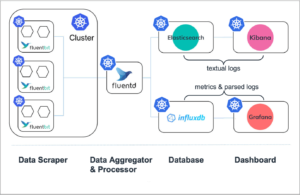
Fig. 4: Monitoring flow of applications deployed in a Kubernetes Cluster (altered, from https://logz.io/blog/fluentd-vs-fluent-bit/)
Database & Design
Logs, at least when following the best practices of including a timestamp, and metrics are usually time series data that can be stored in a time series database. Although in cases where textual logs get stored as-is, other architectures utilize document-oriented types of storage with a powerful query engine on top (like ElasticSearch). Besides storage-related differences, the backend infrastructure is split into two different paradigms: push and pull. These paradigms address the questions of who is responsible (client or backend) for ingesting the data initially.
Choosing one over the other depends on the use case or type of information that should be persisted. For instance, push services are well apt for event logging where the information of a single event is important. However, this makes them also more prone to get overwhelmed by receiving too many requests which lowers robustness. On the other hand, pull systems are perfectly fit for scraping periodical information which is in line with the composition of metrics.
Dashboard & Alerting
To better comprehend the data and spot any irregularities, dashboards come in quite handy. Monitoring systems are largely suited for simple, “less complex” querying as performance matters. The purpose of these tools is specialized for the problems being tackled and they offer a more limited inventory than some of the prominent software like PowerBI. This does not make them less powerful in their area of use, however. Tools like Grafana, which is excellent at handling log-based metrics data, can connect to various database backends and build customized solutions dating from multiple sources. Tools like Kibana, which have their edge in text-based log analyses, provide users with a large querying toolkit for root cause analysis and diagnostics. It is worth mentioning that both tools expand their scope to support both worlds.

Fig. 5 Grafana example dashboard (https://grafana.com/grafana/)
While monitoring is great at spotting irregularities (proactive) and targeted analysis of faulty systems (reactive), being informed about application failures right when they occur allows DevOps teams to take instant action. Alert managers provide the capability of poking for events and triggering alerts on all sorts of different communication channels, such as messaging, incidents managing programs, or via plain email.
Scrapers, Aggregators, and Shippers
Given the fact that not every microservice exposes an endpoint where logs and log-based metrics can be assessed or extracted – remember the differences between push and pull – intermediaries must chip in. Services like scrapers extract and format logs from different sources, aggregators perform some sort of combining actions (generating metrics) and shippers can pose as a push service for push-based backends. Fluentd is a perfect candidate that incorporates all the mentioned capabilities while still maintaining a smallish footprint.
End-to-end monitoring
There are paid-tier services that make a run at providing a holistic one-fits-all system for any sort of application, architecture, and independently from cloud vendors, which can be a game changer for DevOps teams. However, leaner setups can also do a cost-effective and reliable job.
When ruling out the necessity of collecting full-text logs, many standard use cases can be realized with a time series database as the backend. InfluxDB is well suited and easy to spin up with mature integrability into Grafana. Grafana, as a dashboard tool, pairs well with Prometheus´ alter manager service. As an intermediary, fluentd is perfectly fitted to extract the textual logs and perform the necessary transformations. As InfluxDB is push-based, fluentd also takes care that the data get into InfluxDB.
Building on said tools, the example infrastructure covers everything from the Data Science pipeline to the later deployed model APIs, with Dashboards dedicated to each use case. Before a new trainings-run gets approved for production, the ML metrics mentioned at the beginning, provide a good entry point to observe the model´s legitimacy. Simple user statistics, like total and unique requests, give a fair overview of its usage once the model is deployed. By tracking response times, e.g. of an API call, bottlenecks can be disclosed easily.
At the resource level, the APIs along with each pipeline step are monitored to observe any irregularities, like sudden spikes in memory consumption. Tracking the resources over time can also determine whether the types of VM that are being used are over- or underutilized. Optimizing these metrics can potentially cut unnecessary costs. Lastly, pre-defined failure events, such as an unreachable API or failed trainings runs should trigger an alert with an Email being sent out.
Fig. 6: Deployed infrastructure with logging streams and monitoring stack.
The entire architecture, consisting of the monitoring infrastructure, the data science pipeline, and deployed APIs, can all run in a (managed) Kubernetes cluster. From a DevOps perspective, knowing Kubernetes is already half the battle. This open-source stack can be scaled up and down and is not bound to any paid-tier subscription model which provides great flexibility and cost-efficiency. Plus, onboarding new log streams, deployed apps or multiple pipelines can be done painlessly. Even single frameworks could be swapped out. For instance, if Grafana is not suitable anymore, just use another visualization tool that can integrate with the backend and matches the use case requirements.
Conclusion
Logging and monitoring are pivotal parts of modern infrastructures not just since applications were modularized and shipped into the cloud. Yet, they surely exacerbate the struggles of not being set up properly. In addition to the increasing operationalization of the ML workflow, the need for organizations to establish well-thought-out monitoring solutions in order to keep track of models, data, and everything around them is also growing steadily.
While there are dedicated platforms designed to address these challenges, the charming idea behind the presented infrastructure is that it consists of only a single entry point for Data Science, MLOps, and Devops teams and is highly extensible.