In the last post of this series, we took a first look at strategies for the effective visualization and exploration of data patterns within large data sets. Namely, we examined ways to overcome overplotting, with a focus on a two-dimensional feature space defined by two continuous features. However, oftentimes we want to visualize the distribution of data across several subgroups. For example, subgroups are defined by the categories of one feature or even multiple features. As noted in the discussion of overplotting, the mapping of subgroups onto aesthetics, e.g. color, can get quite confusing. This is especially the case for larger numbers of subgroups with overlaying distributions. Therefore, in this blog post, we are going to explore a different strategy: faceting.
To do so we are going to use gglot2’s diamonds data set, which comprises information on the price and other features of almost 54,000 diamonds.
In this post, we are taking a look at facet_grid and facet_wrap. The basic functionality of both methods is the generation of small multiples of a basic plot for data subsets, defined by the categories of one feature or the unique combinations of categories of several features. The resulting visualizations make it easy to identify similarities or differences in the patterns of the subsets.
rm( list = ls())

library(ggplot2)
library(dplyr)

# Pooling and relabeling some categories for sake of clarity
df_diamonds<- diamonds %>%
  mutate(color = ifelse(color == "D" | color == "E" | color == "F",
                        "Colorless",
                        "Yellowish"),
         clarity = ifelse(clarity == "I1" | clarity == "SI2" | clarity == "SI1",
                          "Included",
                          "Nearly Flawless"))

# Generating the base plot
plot_base <- ggplot(data = df_diamonds) +
  geom_histogram(aes(x = price),
                 color = "#A7256A",
                 fill = "#A7256A",
                 alpha = 0.7) +
  theme_minimal() +
  labs(x = "Price in $")
Content and layout of panels
Of course, the most defining parameters of facetted plots are the considered subsets, which for both facet_grid and facet_wrap can be defined via formula notation.
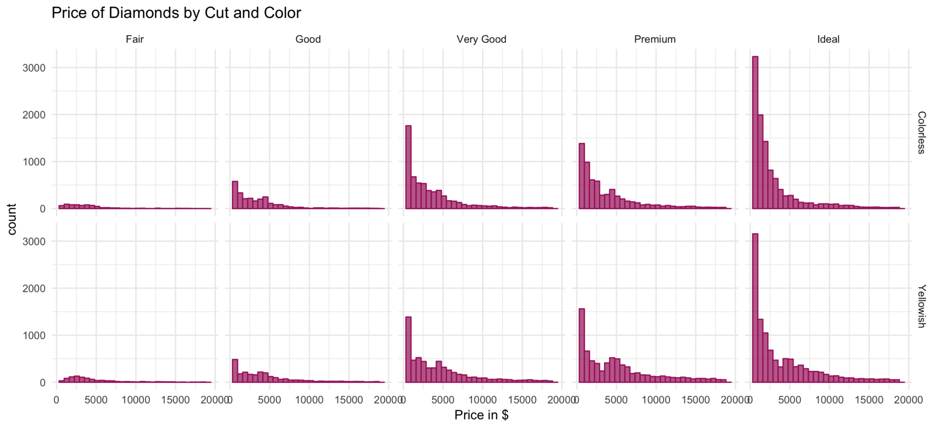
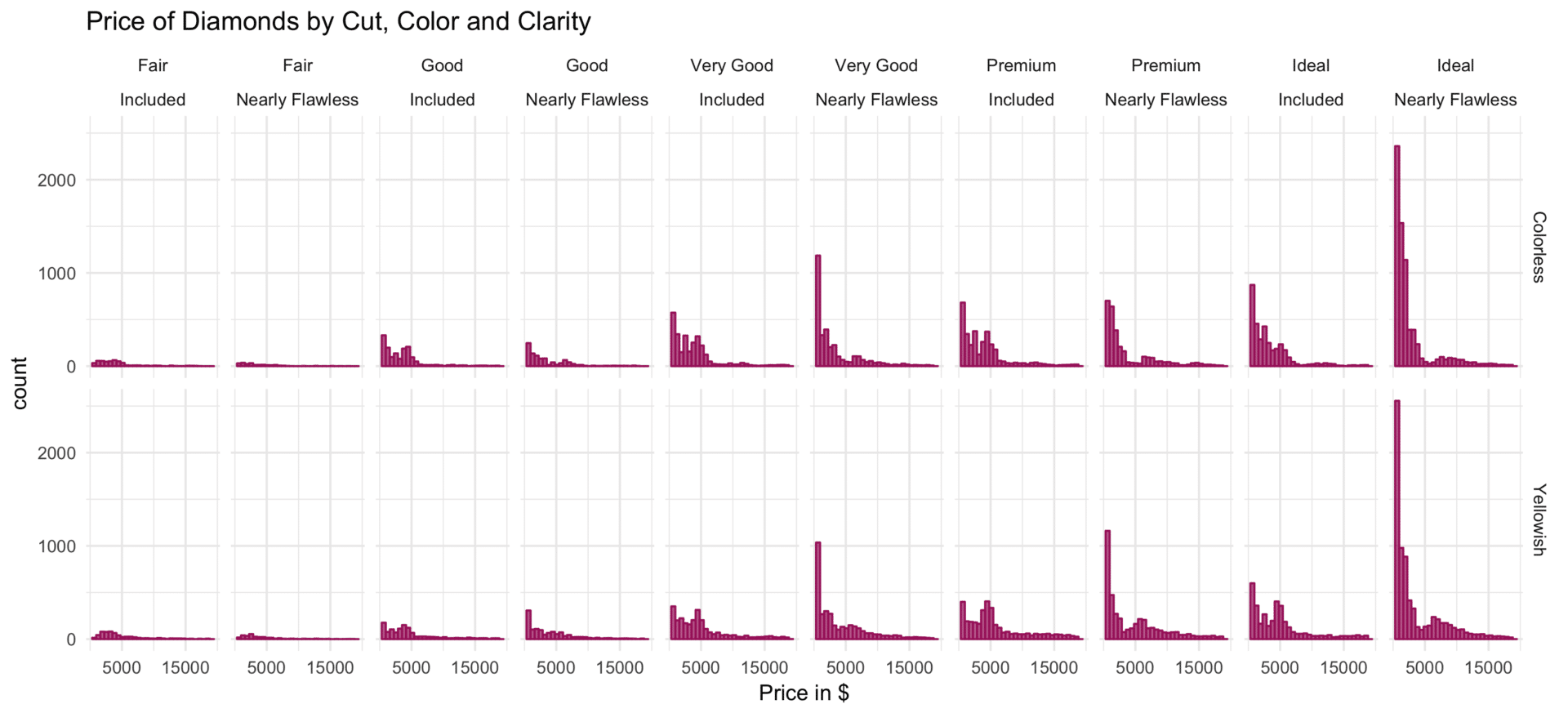
Basically, facet_grid creates the plot version of a contingency table: a two-dimensional grid of plots. The features mapped on the columns (right) and rows (left), divided by a ~, are to be specified in the facets argument. Rows, as well as columns of the grid, also can be defined by the combinations of multiple features, which is to be indicated by adding all to be crossed features with a +. If either rows or columns are not specified . is used as a placeholder.
# facet_grid: cut in rows
# aligned horizontal scales facilitate comparisons of feature on x-axis
plot_base +
  facet_grid(cut ~ .) +
  ggtitle("Price of Diamonds by Cut")
ggsave("facet-grid-rows.png", width = 11, height = 5)

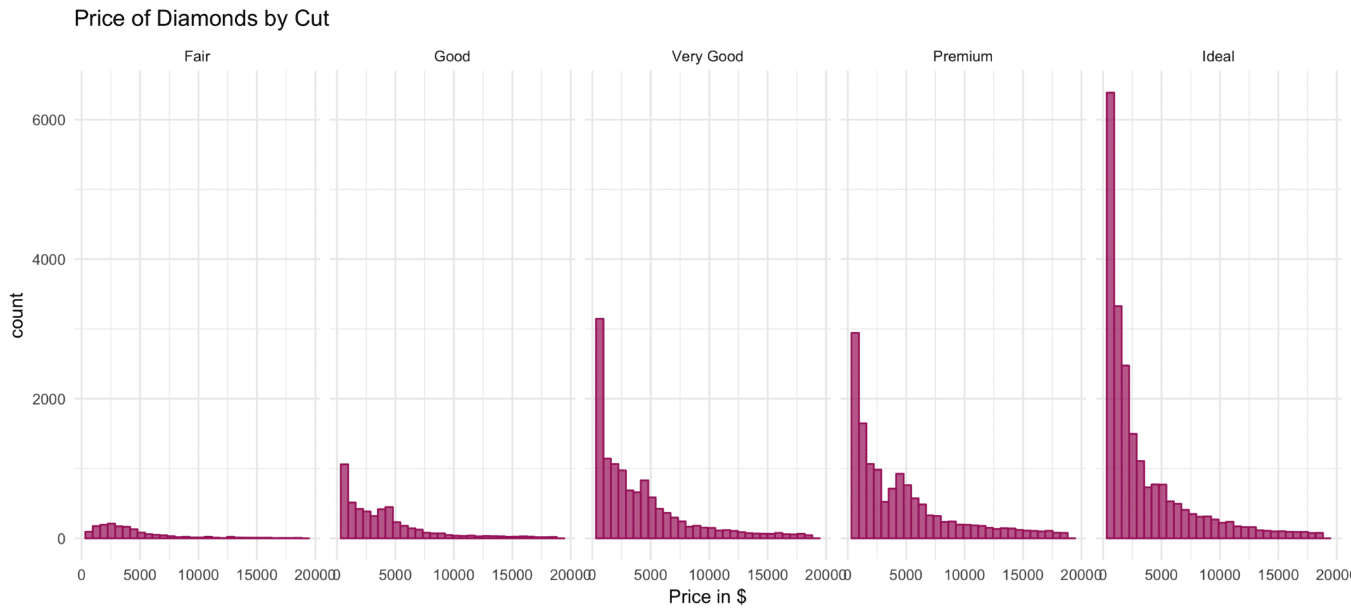
# facet_grid: cut in columns
# aligned vertical scales facilitate comparisons of feature on y-axis
plot_base +
  facet_grid(facets = . ~ cut) +
  ggtitle("Price of Diamonds by Cut")
ggsave("facet-grid-colums.png", width = 11, height = 5)
# facet_grid: cut in columns, color in rows
plot_base +
  facet_grid(facets = color ~ cut) +
  ggtitle("Price of Diamonds by Cut and Color")
ggsave("facet-grid-colums-and-rows.png", width = 11, height = 5)
# facet_grid: all combinations of cut and clarity in columns, color in rows
plot_base +
  facet_grid(facets = color ~ cut + clarity)+
  ggtitle("Price of Diamonds by Cut, Color and Clarity") +
  scale_x_continuous(breaks = c(5000, 15000)) # less x axis breaks
ggsave("facet-grid-colums-and-xrows.png", width = 11, height = 5)
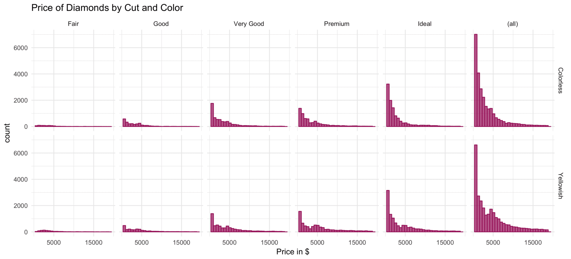
Just as in contingency tables, marginal total plots combining all data within a given row or column can be added via the margins argument. If margins is set to TRUE, all marginal total plots are enabled, margins also can be set to a character vector to enable margin plots for all specified variables.
# facet_grid: cut in columns, color in rows, margins for cut
plot_base +
  facet_grid(facets = color ~ cut,
             margins = "cut") +
  ggtitle("Price of Diamonds by Cut and Color") +
  scale_x_continuous(breaks = c(5000, 15000)) # less axis breaks
ggsave("facet-grid-one-margin.png", width = 11, height = 5)
# facet_grid: cut in columns, color in rows, all margins
plot_base +
  facet_grid(facets = color ~ cut,
             margins = TRUE) +
  ggtitle("Price of Diamonds by Cut and Color") +
  scale_x_continuous(breaks = c(5000, 15000)) # less axis breaks
ggsave("facet-grid-all-margins.png", width = 11, height = 5)
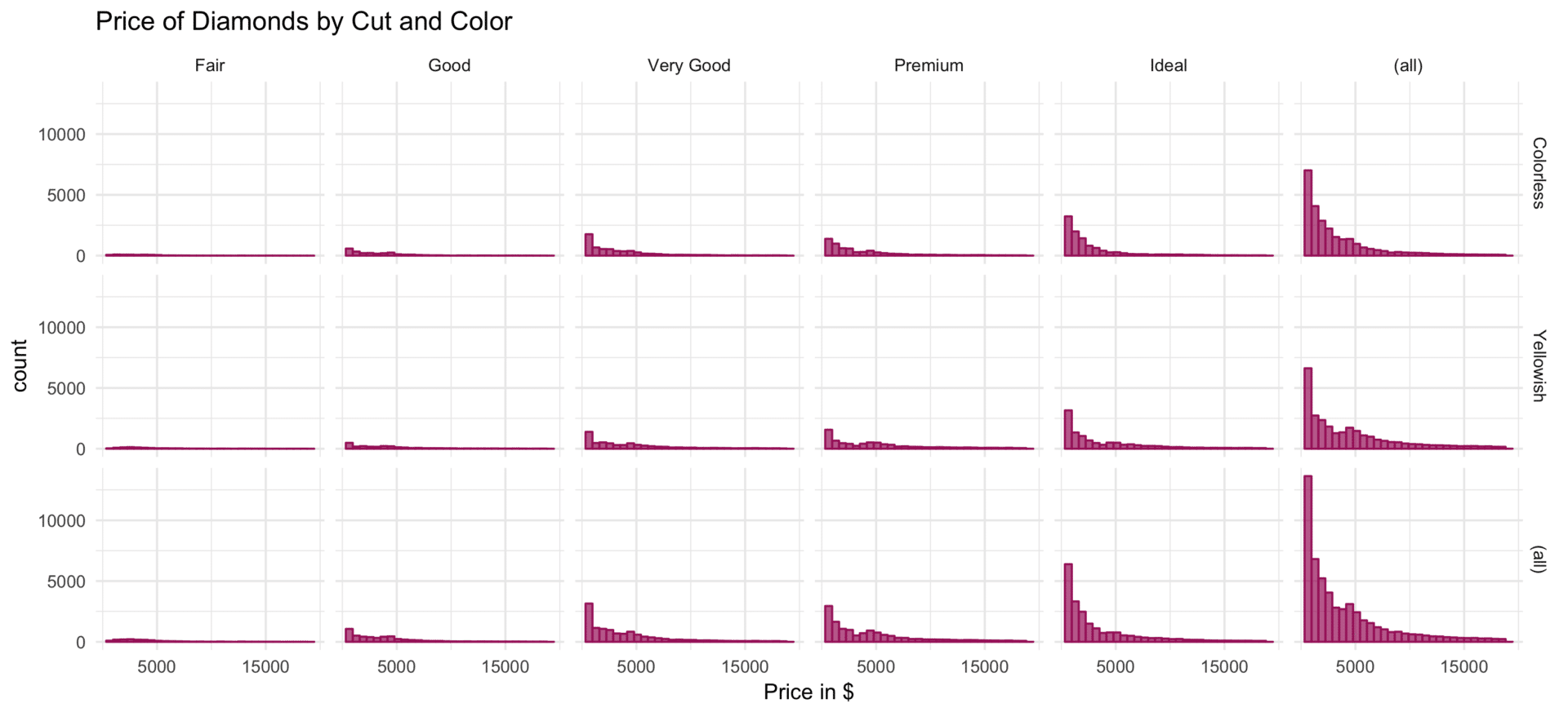
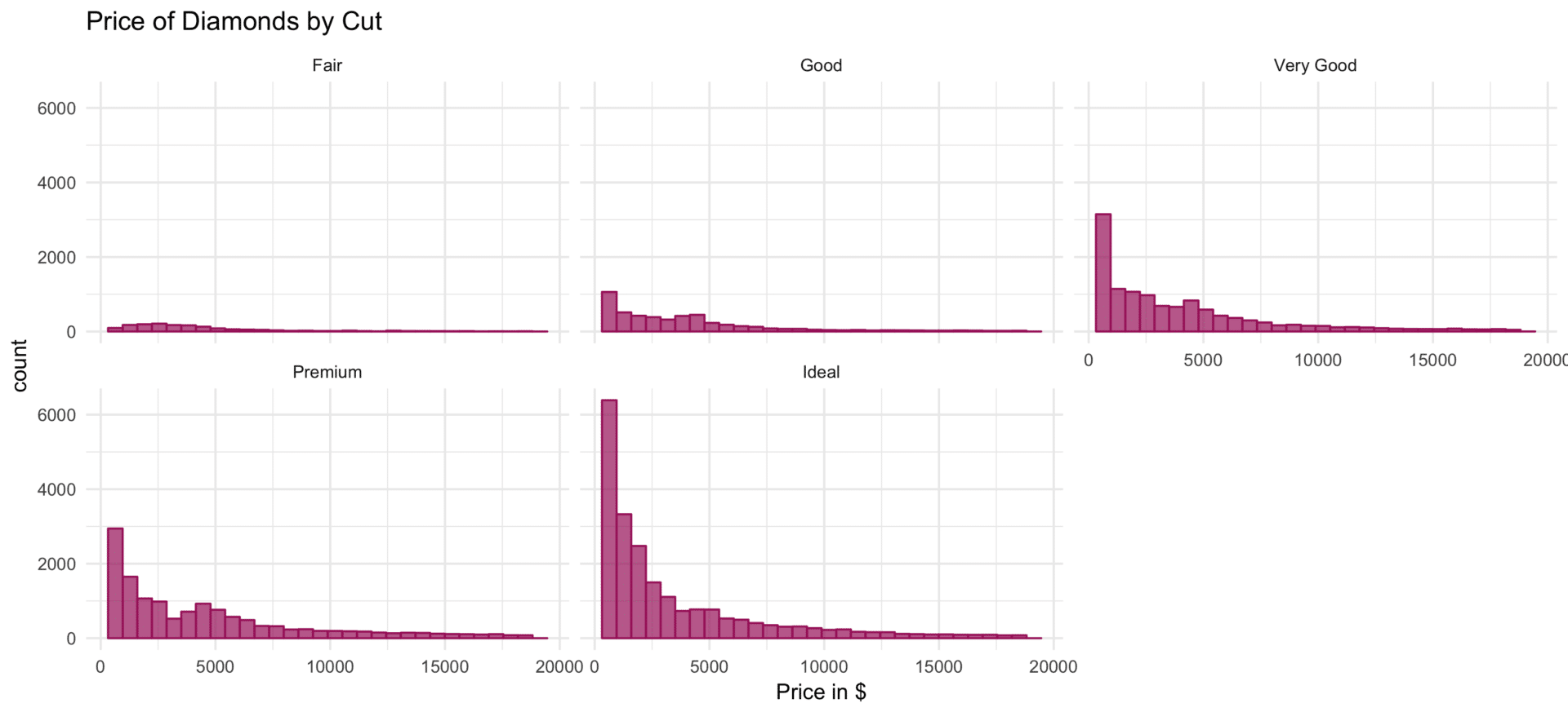
Other than facet_grid, facet_wrap generates a one-dimensional sequence of multiples, which only are arranged two-dimensionally. To accentuate the intrinsic one-dimensionality of the plot sequence, conventionally within the formula specification of the facets argument, the features which are to define the subsets are combined by + and placed behind the ~.
# facet_wrap: one variable
plot_base +
  facet_wrap(facets =  ~ cut) +
  ggtitle("Price of Diamonds by Cut")
ggsave("facet-wrap-one-var.png", width = 11, height = 5)
# facet_wrap: multiple variables
plot_base +
  facet_wrap(facets = ~ cut + color) +
  ggtitle("Price of Diamonds by Cut and Color")
ggsave("facet-wrap-multiple-vars.png", width = 11, height = 5)
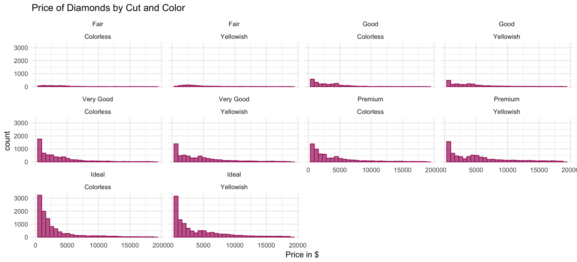
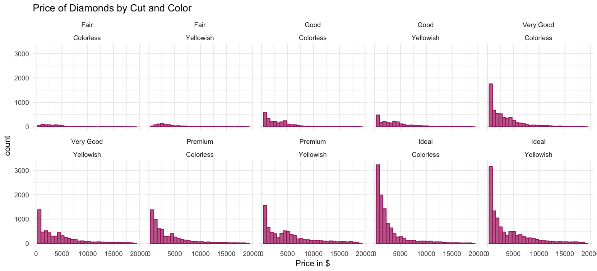
To arrange the panels most efficiently, the layout of panels is oriented as square as possible. However, the nrow and ncol arguments allow to specify the number of panels within the rows and columns.
# facet_wrap: multiple variables, nrow defined
plot_base +
  facet_wrap(facets = ~ cut + color,
             nrow = 2) +
  ggtitle("Price of Diamonds by Cut and Color")
ggsave("facet-wrap-nrow.png", width = 11, height = 5)
# facet_wrap: multiple variables, ncol defined
plot_base +
  facet_wrap(facets = ~ cut + color,
             ncol = 3) +
  ggtitle("Price of Diamonds by Cut and Color")
ggsave("facet-wrap-ncol.png", width = 11, height = 5)
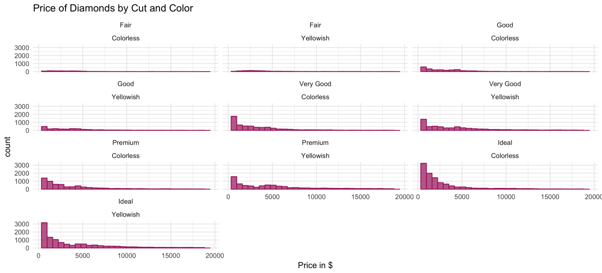
Further, the overall order of the panels can be defined the dir argument. If the argument is set to v panels are arranged across columns, starting from the top of the most left column. If the argument is set to h panels pertaining are arranged across rows starting on the left-hand side of the first row.
# facet_wrap: dir v
plot_base +
  facet_wrap(facets = ~ cut ,
             dir = "v") +
  ggtitle("Price of Diamonds by Cut")
ggsave("facet-wrap-v.png", width = 11, height = 5)
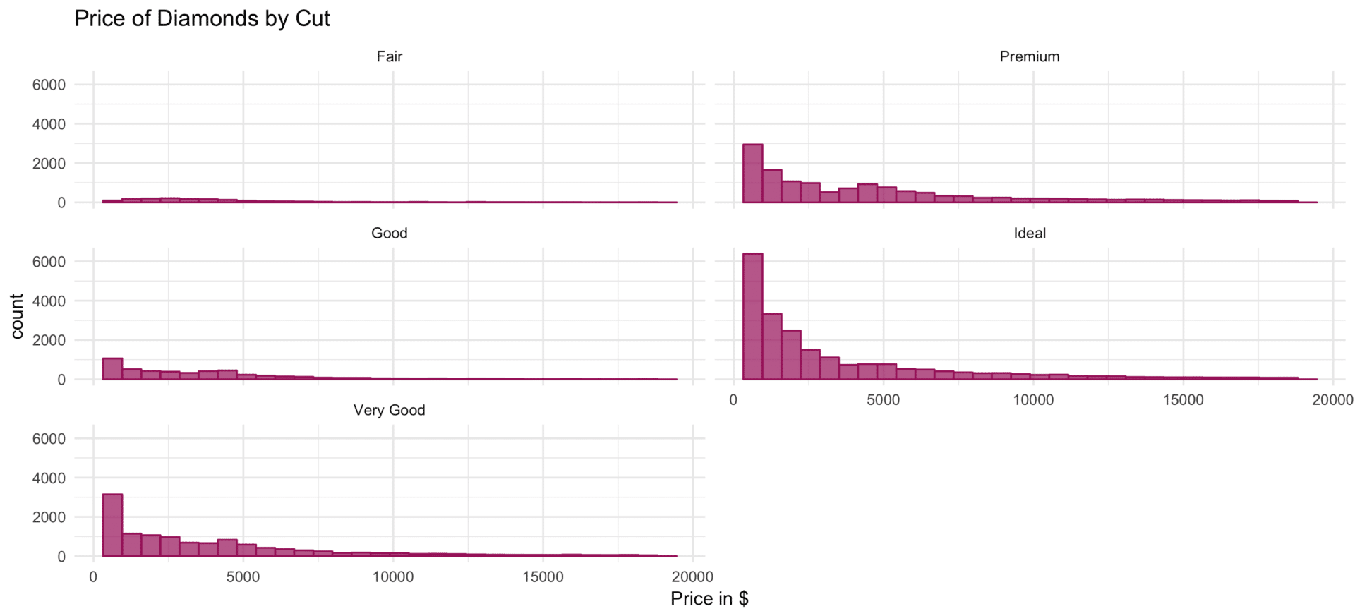
# facet_wrap: dir h
plot_base +
  facet_wrap(facets = ~ cut ,
             dir = "h") +
  ggtitle("Price of Diamonds by Cut")
ggsave("facet-wrap-h.png", width = 11, height = 5)

It is way beyond the scope of this post to exhaustively discuss all arguments of facet_grid and facet_wrap, but we briefly take a look at some more “cosmetic” parameters that concern the position of panel labels and the layout of panels themselves.
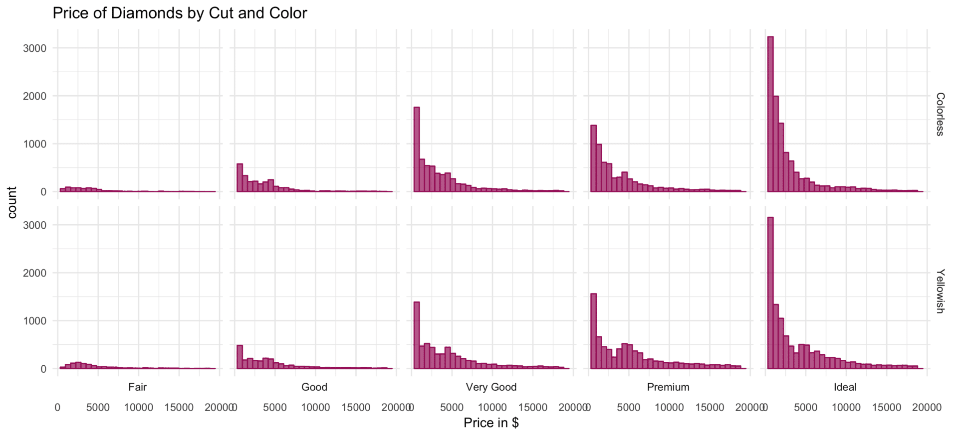
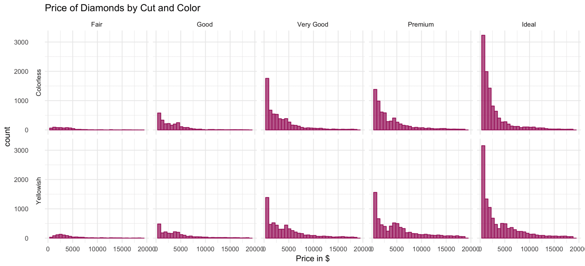
Within facet_grid, the position of panel labels can be controlled via the argument switch. By default, the labels in the columns, respectively rows, are displayed on top respectively right-hand side. When switch is set to x, y, or both column labels are displayed on the bottom, row labels on the left or both, respectively.
# facet_grid: switch x
plot_base +
  facet_grid(facets = color ~ cut,
             switch = "x") +
  ggtitle("Price of Diamonds by Cut and Color")
ggsave("facet-grid-switch-x.png", width = 11, height = 5)
# facet_grid: switch y
plot_base +
  facet_grid(facets = color ~ cut,
             switch = "y") +
  ggtitle("Price of Diamonds by Cut and Color")
ggsave("facet-grid-switch-y.png", width = 11, height = 5)
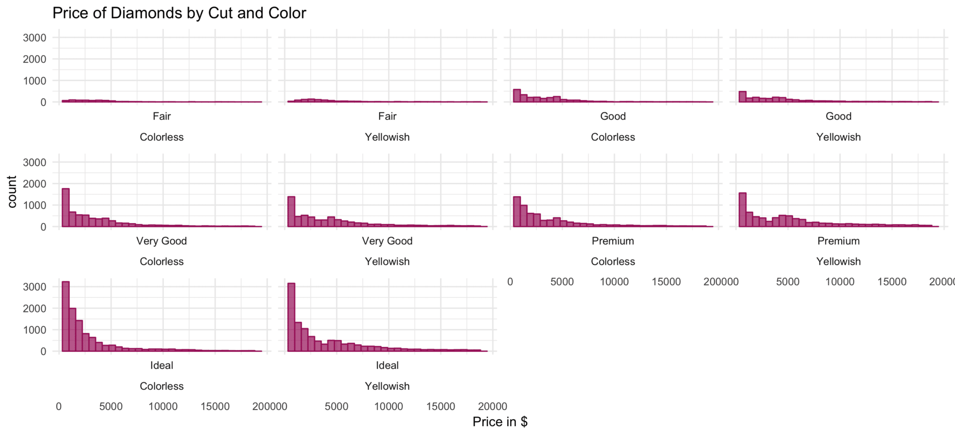
For facet_wrap this can be achieved by setting the argument strip.position to top, bottom, left or right.
# facet_wrap: strip.position left
plot_base +
  facet_wrap(facets = ~ cut + color,
             strip.position = "left") +
  ggtitle("Price of Diamonds by Cut and Color")
ggsave("facet-wrap-strpos-left.png", width = 11, height = 5)
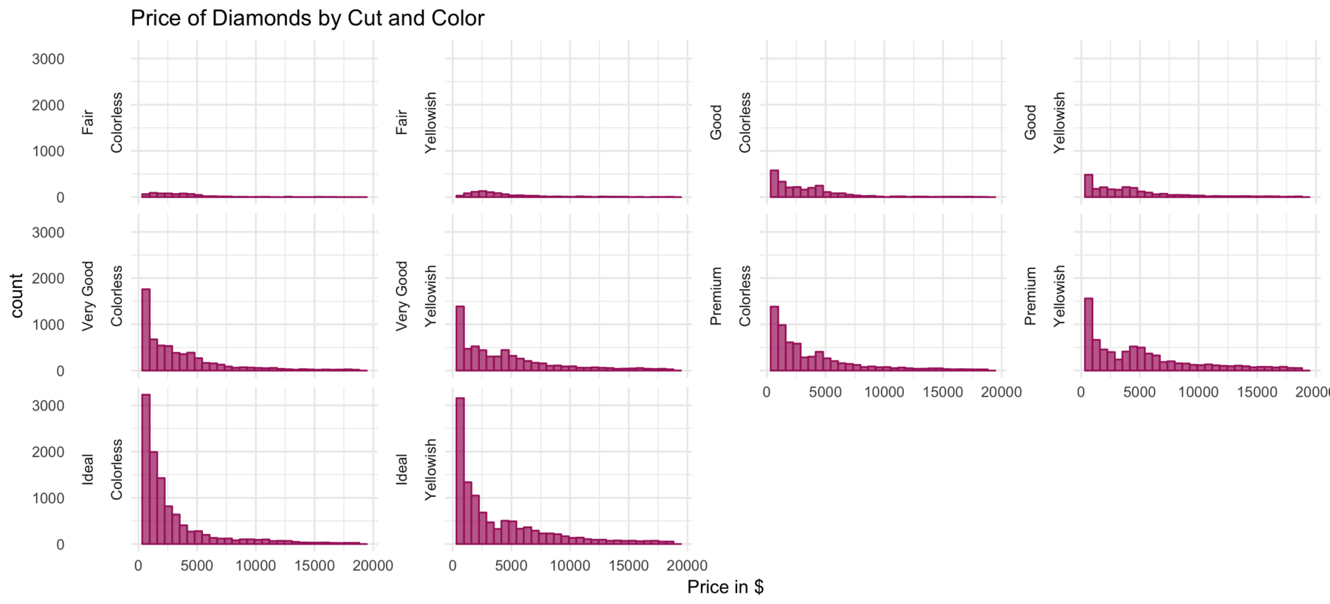
# facet_wrap: strip.position top
plot_base +
  facet_wrap(facets = ~ cut + color,
             strip.position = "bottom") +
  ggtitle("Price of Diamonds by Cut and Color")
ggsave("facet-wrap-strpos-bottom.png", width = 11, height = 5)
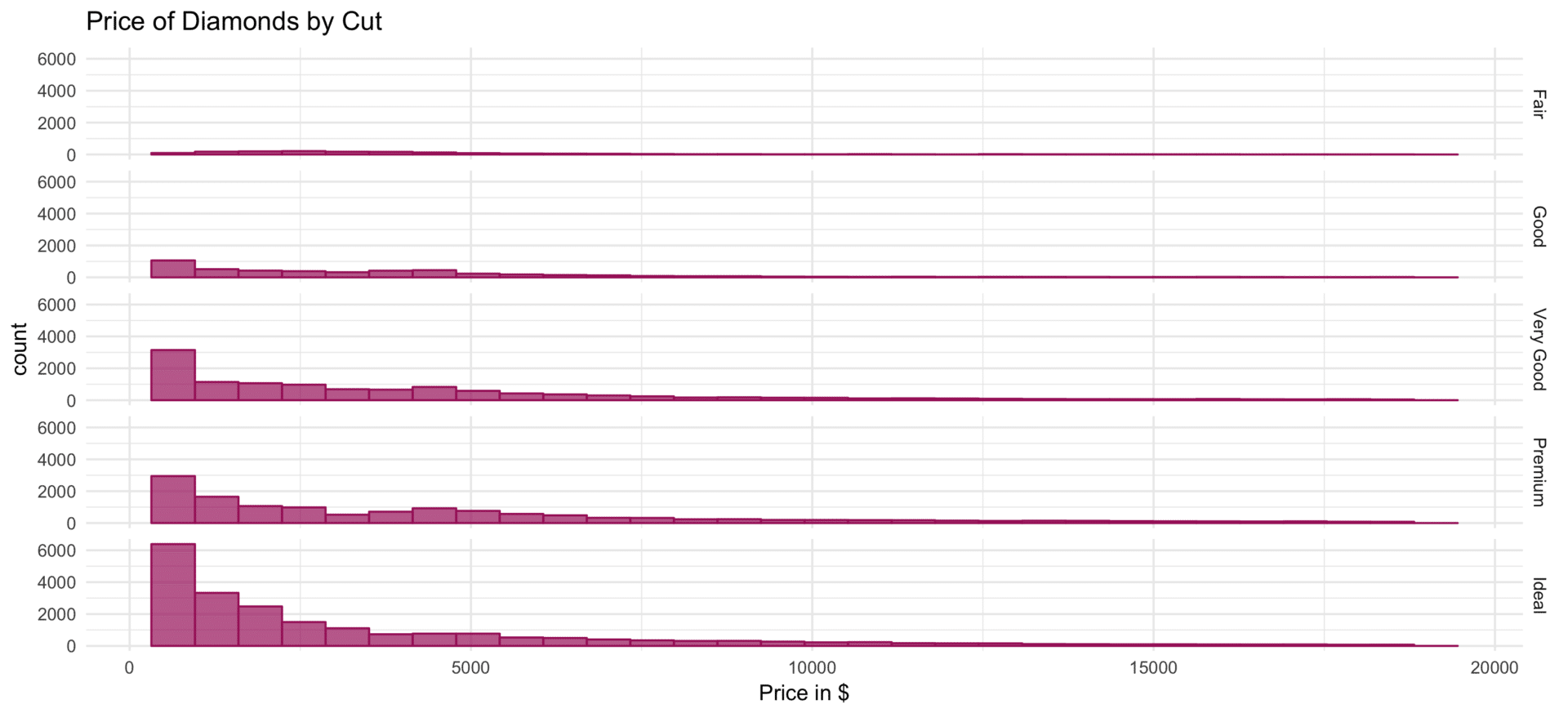
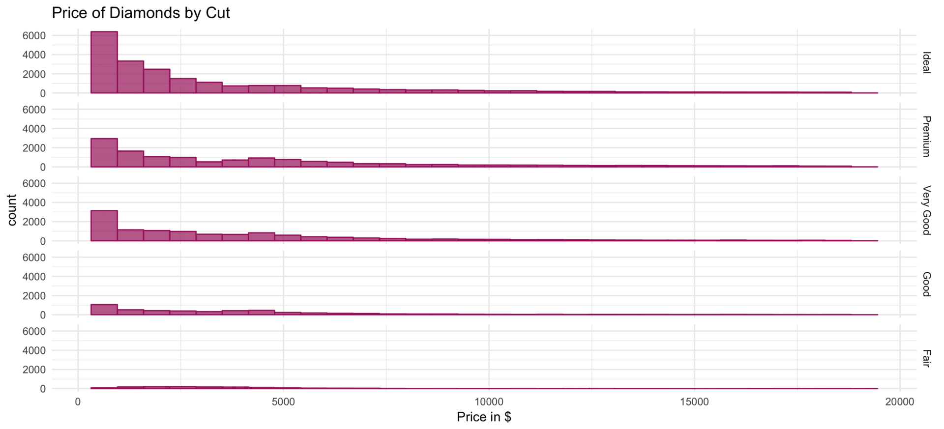
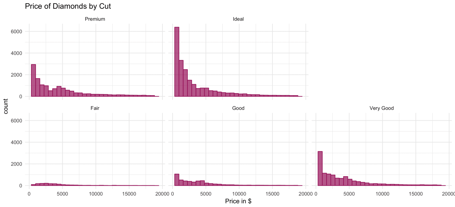
Finally, the argument as.table defines the layout of the multiples. For as.table = TRUE the panels pertaining to the highest values or highest-ranked categories of the categorizing features are positioned at the bottom right (as in a table), for as.table = FALSE the facets with the highest-ranked categories are positioned at the top-right (as in a plot).
# facet_grid: as.table
plot_base +
  facet_grid(facets = cut ~ .,
             as.table = TRUE) +
  ggtitle("Price of Diamonds by Cut")
ggsave("facet-grid-astable.png", width = 11, height = 5)
# facet_grid: not as.table
plot_base +
  facet_grid(facets = cut ~ .,
             as.table = FALSE) +
  ggtitle("Price of Diamonds by Cut")
ggsave("facet-grid-nottable.png", width = 11, height = 5)
# facet_wrap: as.table
plot_base +
  facet_wrap(facets = ~ cut,
             as.table = TRUE) +
  ggtitle("Price of Diamonds by Cut")
ggsave("facet-wrap-astable.png", width = 11, height = 5)

# facet_wrap: not as.table
plot_base +
  facet_wrap(facets = ~ cut,
             as.table = FALSE) +
  ggtitle("Price of Diamonds by Cut")
ggsave("facet-wrap-nottable.png", width = 11, height = 5)
Manipulating the scales of panels
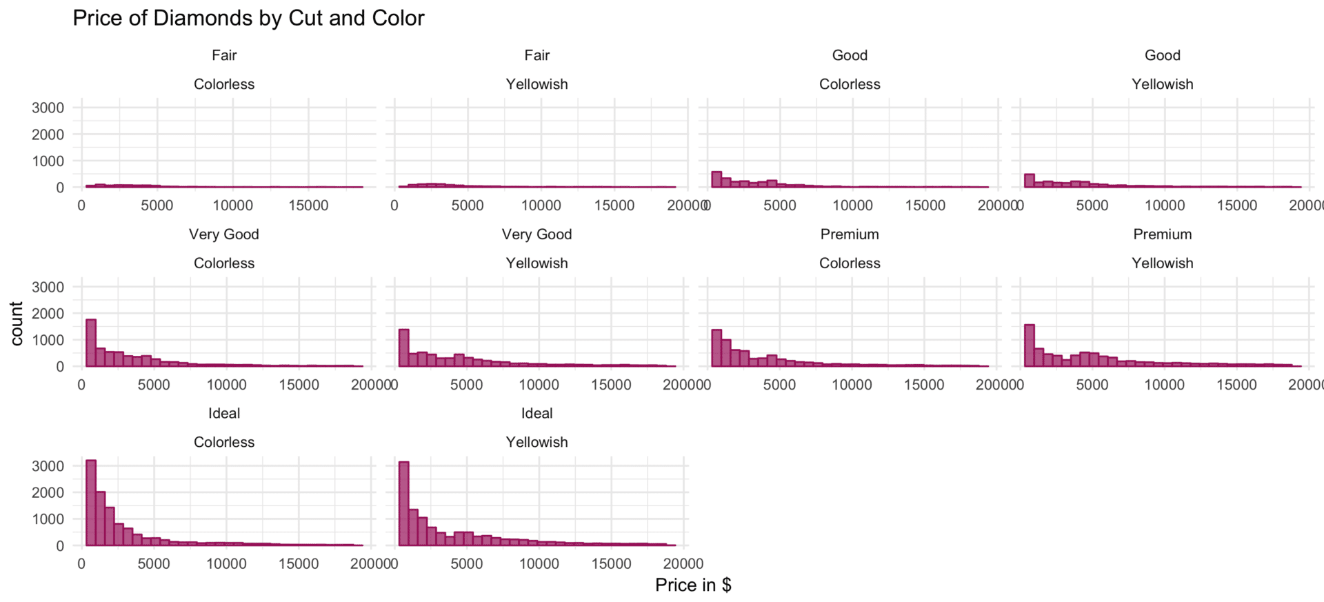
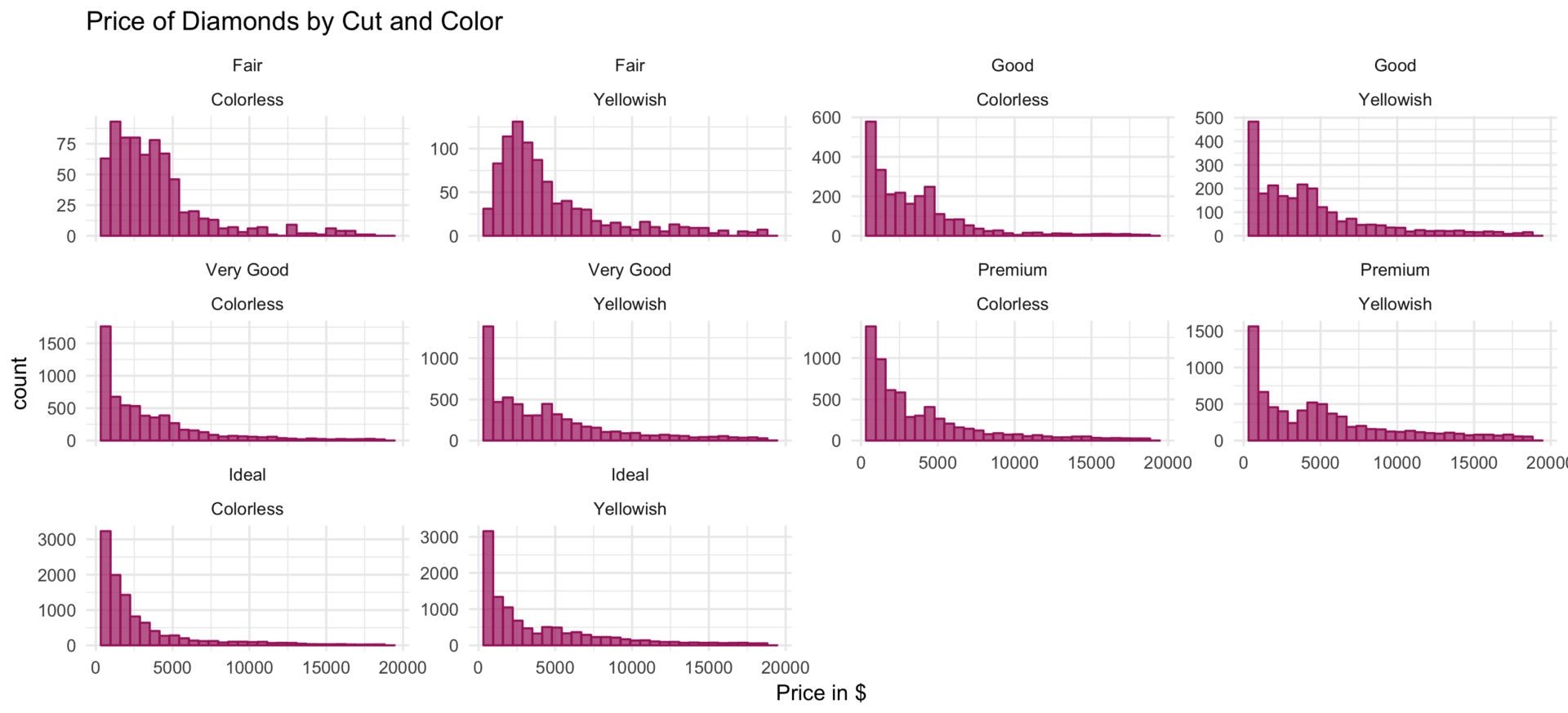
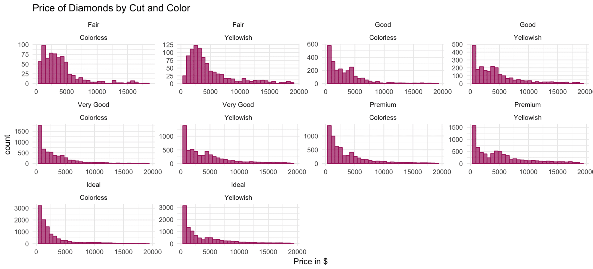
Apart from the definition of the contrasted subsets, the probably most important characteristic of facetted plots are the scales of the multiples. By default, the scales of all panels are identical. But depending on the data at hand and the comparison to be made, it might be more insightful to allow some or all scales to vary for the panels, thereby accentuating (smaller) particularities of the considered subsets.
The scales argument of facet_grid and facet_wrap, in combination with the options free, free_x or free_y allows respectively all, the x or the y scales to vary between panels. However, within facet_grid all plots within the columns or rows must have the same y scale respectively x scale, since they share the corresponding axes.
# facet_wrap: free x scale
plot_base +
  facet_wrap(facets = ~ cut + color,
             scales =  "free_x") +
  ggtitle("Price of Diamonds by Cut and Color")
ggsave("facet-wrap-free-x.png", width = 11, height = 5)
# facet_wrap: free x scale
plot_base +
  facet_wrap(facets = ~ cut + color,
             scales =  "free_y") +
  ggtitle("Price of Diamonds by Cut and Color")
ggsave("facet-wrap-free-y.png", width = 11, height = 5)
# facet_wrap: free x and y scale
plot_base +
  facet_wrap(facets = ~ cut + color,
             scales =  "free") +
  ggtitle("Price of Diamonds by Cut and Color")
ggsave("facet-wrap-free.png", width = 11, height = 5)
# facet_grid: free scales
plot_base +
  facet_grid(facets = color ~ cut,
             margins = TRUE,
             scales = "free") +
  ggtitle("Price of Diamonds by Cut and Color") +
  scale_x_continuous(breaks = c(5000, 15000)) # less x axis breaks
ggsave("facet-grid-scale-free.png", width = 11, height = 5)
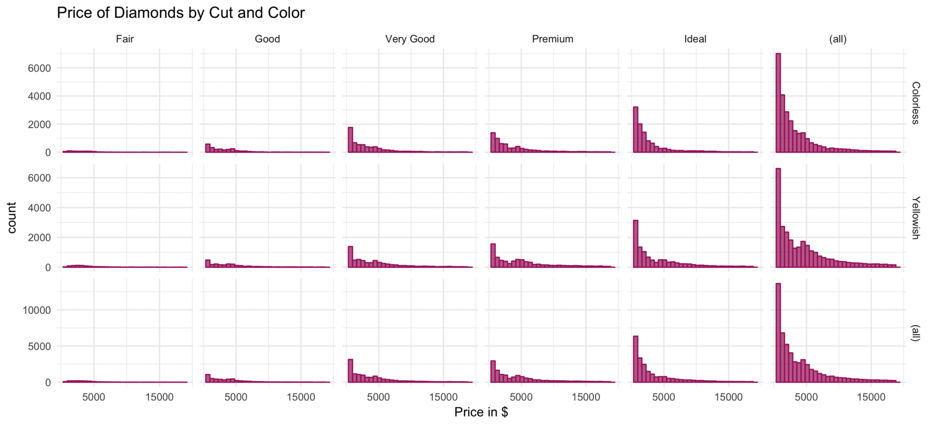
While the functionality of the scales argument is constrained, facet_grid offers an additional argument: space. When set to free, the width or height of each column or row varies in proportion to the range of scale of the plot in the respective position.
# facet_grid: free space and free scale
plot_base +
  facet_grid(facets = color ~ cut,
             margins = TRUE,
             scales = "free",
             space = "free") +
  ggtitle("Price of Diamonds by Cut and Color") +
  scale_x_continuous(breaks = c(5000, 15000)) # less x axis breaks
ggsave("facet-grid-scale-space-free.png", width = 11, height = 5)
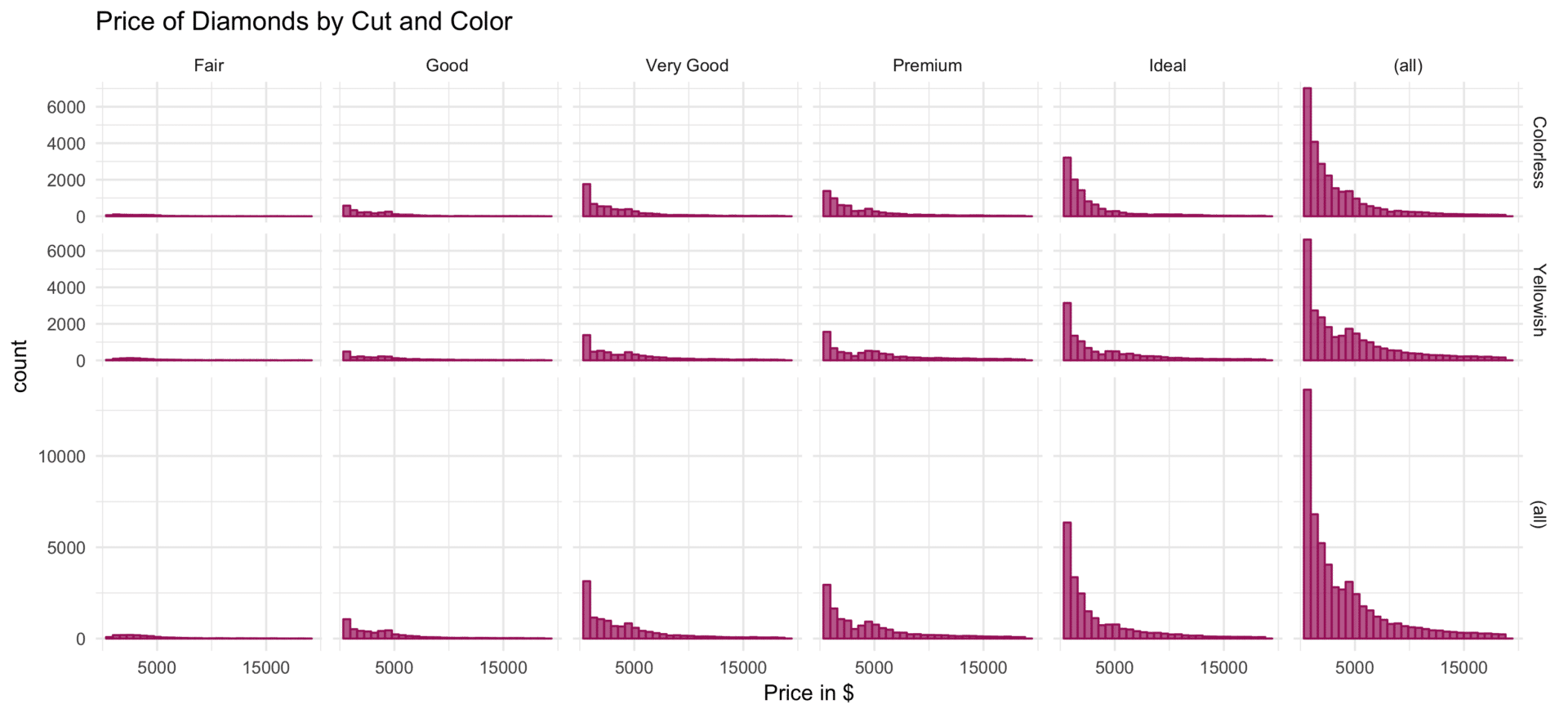
Faceting can be a powerful tool to facilitate the comparison of patterns within subsets of one’s data. Especially since ggplot2 makes facetting so convenient, one should always keep this option in mind.
References
- Wilkinson, L. (2011). ggplot2: Elegant Graphics for Data Analysis by WICKHAM, H.
