Data-Science-Anwendungen bieten Einblicke in große und komplexe Datensätze, die oft leistungsstarke Modelle enthalten, die sorgfältig auf die Bedürfnisse der Kund:innen abgestimmt sind. Die gewonnenen Erkenntnisse sind jedoch nur dann nützlich, wenn sie den Endnutzer:innen auf zugängliche und verständliche Weise präsentiert werden. An dieser Stelle kommt die Entwicklung einer Webanwendung mit einem gut gestalteten Frontend ins Spiel: Sie hilft bei der Visualisierung von anpassbaren Erkenntnissen und bietet eine leistungsstarke Schnittstelle, die Benutzer nutzen können, um fundierte Entscheidungen zu treffen.
In diesem Artikel werden wir erörtern, warum ein Frontend für Data-Science-Anwendungen sinnvoll ist und welche Schritte nötig sind, um ein funktionales Frontend zu bauen. Außerdem geben wir einen kurzen Überblick über beliebte Frontend- und Backend-Frameworks und wann diese eingesetzt werden sollten.
Drei Gründe, warum ein Frontend für Data Science nützlich ist
In den letzten Jahren hat der Bereich Data Science eine rasante Zunahme des Umfangs und der Komplexität der verfügbaren Daten erlebt. Data Scientists sind zwar hervorragend darin, aus Rohdaten aussagekräftige Erkenntnisse zu gewinnen, doch die effektive Vermittlung dieser Ergebnisse an die Beteiligten bleibt eine besondere Herausforderung. An dieser Stelle kommt ein Frontend ins Spiel. Ein Frontend bezeichnet im Zusammenhang mit Data Science die grafische Oberfläche, die es den Benutzer:innen ermöglicht, mit datengestützten Erkenntnissen zu interagieren und diese zu visualisieren. Wir werden drei Hauptgründe untersuchen, warum die Integration eines Frontends in den Data-Science-Workflow für eine erfolgreiche Analyse und Kommunikation unerlässlich ist.
Dateneinblicke visualisieren
Ein Frontend hilft dabei, die aus Data-Science-Anwendungen gewonnenen Erkenntnisse auf zugängliche und verständliche Weise zu präsentieren. Durch die Visualisierung von Datenwissen mit Diagrammen, Grafiken und anderen visuellen Hilfsmitteln können Benutzer:innen Muster und Trends in den Daten besser verstehen.
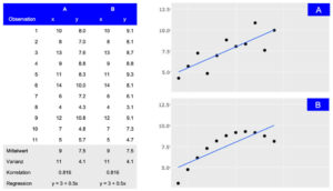
Darstellung von zwei Datensätzen (A und B), die trotz unterschiedlicher Verteilung die gleichen zusammenfassenden Statistiken aufweisen. Während die tabellarische Ansicht detaillierte Informationen liefert, macht die visuelle Darstellung die allgemeine Verbindung zwischen den Beobachtungen leicht zugänglich.
Benutzererlebnisse individuell gestalten
Dashboards und Berichte können in hohem Maße an die spezifischen Bedürfnisse verschiedener Benutzergruppen angepasst werden. Ein gut gestaltetes Frontend ermöglicht es den Nutzer:innen, mit den Daten auf eine Weise zu interagieren, die ihren Anforderungen am ehesten entspricht, so dass sie schneller und effektiver Erkenntnisse gewinnen können.
Fundierte Entscheidungsfindung ermöglichen
Durch die Darstellung der Ergebnisse von Machine-Learning-Modellen und der Ergebnisse erklärungsbedürftiger KI-Methoden über ein leicht verständliches Frontend erhalten die Nutzer:innen eine klare und verständliche Darstellung der Datenerkenntnisse, was fundierte Entscheidungen erleichtert. Dies ist besonders wichtig in Branchen wie dem Finanzhandel oder Smart Cities, wo Echtzeit-Einsichten zu Optimierungen und Wettbewerbsvorteilen führen können.
Vier Phasen von der Idee bis zum ersten Prototyp
Wenn es um Data Science Modelle und Ergebnisse geht, ist das Frontend der Teil der Anwendung, mit dem die Benutzer:innen interagieren. Es sollte daher klar sein, dass die Entwicklung eines nützlichen und produktiven Frontends Zeit und Mühe erfordert. Vor der eigentlichen Entwicklung ist es entscheidend, den Zweck und die Ziele der Anwendung zu definieren. Um diese Anforderungen zu ermitteln und zu priorisieren, sind mehrere Iterationen von Brainstorming- und Feedback-Sitzungen erforderlich. Während dieser Sitzungen wird das Frontend die Phasen von einer einfachen Skizze über ein Wireframe und ein Mockup bis hin zum ersten Prototyp durchlaufen.
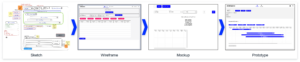
Skizze
In der ersten Phase wird eine grobe Skizze des Frontends erstellt. Dazu gehört die Identifizierung der verschiedenen Komponenten und wie sie aussehen könnten. Um eine Skizze zu erstellen, ist es hilfreich, eine Planungssitzung abzuhalten, in der die funktionalen Anforderungen und visuellen Ideen geklärt und ausgetauscht werden. Während dieser Sitzung wird eine erste Skizze mit einfachen Hilfsmitteln wie einem Online-Whiteboard (z. B. Miro) erstellt, aber auch Stift und Papier können ausreichen.
Wireframe
Wenn die Skizze fertig ist, müssen die einzelnen Teile der Anwendung miteinander verbunden werden, um ihre Wechselwirkungen und ihr Zusammenspiel zu verstehen. Dies ist eine wichtige Phase, um mögliche Probleme frühzeitig zu erkennen, bevor der Entwicklungsprozess beginnt. Wireframes zeigen die Nutzung aus der Sicht der Benutzer:innen und berücksichtigen die Anforderungen der Anwendung. Sie können auch auf einem Miro-Board oder mit Tools wie Figma erstellt werden.
Mockup
Nach den Skizzen- und Wireframe-Phasen besteht der nächste Schritt darin, ein Mockup des Frontends zu erstellen. Dabei geht es darum, ein visuell ansprechendes Design zu erstellen, das einfach zu bedienen und zu verstehen ist. Mit Tools wie Figma können Mockups schnell erstellt werden. Sie bieten auch eine interaktive Demo, die die Interaktion innerhalb des Frontends zeigt. In dieser Phase ist es wichtig, sicherzustellen, dass das Design mit der Marke und den Stilrichtlinien des Unternehmens übereinstimmt, denn der erste Eindruck bleibt haften.
Prototype
Sobald das Mockup fertig ist, ist es an der Zeit, einen funktionierenden Prototyp des Frontends zu erstellen und ihn mit der Backend-Infrastruktur zu verbinden. Um später die Skalierbarkeit zu gewährleisten, müssen das verwendete Framework und die gegebene Infrastruktur bewertet werden. Diese Entscheidung hat Auswirkungen auf die in dieser Phase verwendeten Tools und wird in den folgenden Abschnitten erörtert.
Es gibt viele Optionen für die Frontend-Entwicklung
Die meisten Data Scientisten sind mit R oder Python vertraut. Daher sind die ersten Lösungen für die Entwicklung von Frontend-Anwendungen wie Dashboards oft R Shiny, Dash oder streamlit. Diese Tools haben den Vorteil, dass Datenaufbereitung und Modellberechnungsschritte im selben Framework wie das Dashboard implementiert werden können. Die Visualisierungen sind eng mit den verwendeten Daten und Modellen verknüpft und Änderungen können oft vom selben Entwickler integriert werden. Für manche Projekte mag das ausreichen, aber sobald eine gewisse Skalierbarkeit erreicht ist, ist es von Vorteil, Backend-Modellberechnungen und Frontend-Benutzerinteraktionen zu trennen.
Es ist zwar möglich, diese Art der Trennung in R- oder Python-Frameworks zu implementieren, aber unter der Haube übersetzen diese Bibliotheken ihre Ausgabe in Dateien, die der Browser verarbeiten kann, wie HTML, CSS oder JavaScript. Durch die direkte Verwendung von JavaScript mit den entsprechenden Bibliotheken gewinnen die Entwickler mehr Flexibilität und Anpassungsfähigkeit. Einige gute Beispiele, die eine breite Palette von Visualisierungen bieten, sind D3.js, Sigma.js oder Plotly.js, mit denen reichhaltigere Benutzeroberflächen mit modernen und visuell ansprechenden Designs erstellt werden können.
Dennoch ist das Angebot an JavaScript-basierten Frameworks nach wie vor groß und wächst weiter. Die am häufigsten verwendeten Frameworks sind React, Angular, Vue und Svelte. Vergleicht man sie in Bezug auf Leistung, Community und Lernkurve, so zeigen sich einige Unterschiede, die letztlich von den spezifischen Anwendungsfällen und Präferenzen abhängen (weitere Details finden Sie hier oder hier).
Als „die Programmiersprache des Webs“ gibt es JavaScript schon seit langem. Das vielfältige und vielseitige Ökosystem von JavaScript mit den oben genannten Vorteilen bestätigt dies. Dabei spielen nicht nur die direkt verwendeten Bibliotheken eine Rolle, sondern auch die breite und leistungsfähige Palette an Entwickler-Tools, die das Leben der Entwickler erleichtern.
Überlegungen zur Backend-Architektur
Neben der Ideenfindung müssen auch die Fragen nach dem Entwicklungsrahmen und der Infrastruktur beantwortet werden. Die Kombination der Visualisierungen (Frontend) mit der Datenlogik (Backend) in einer Anwendung hat Vor- und Nachteile.
Ein Ansatz besteht darin, Technologien wie R Shiny oder Python Dash zu verwenden, bei denen sowohl das Frontend als auch das Backend gemeinsam in derselben Anwendung entwickelt werden. Dies hat den Vorteil, dass es einfacher ist, Datenanalyse und -visualisierung in eine Webanwendung zu integrieren. Es hilft den Benutzern, direkt über einen Webbrowser mit Daten zu interagieren und Visualisierungen in Echtzeit anzuzeigen. Vor allem R Shiny bietet eine breite Palette von Paketen für Data Science und Visualisierung, die sich leicht in eine Webanwendung integrieren lassen, was es zu einer beliebten Wahl für Entwickler macht, die im Bereich Data Science arbeiten.
Andererseits bietet die Trennung von Frontend und Backend durch unterschiedliche Frameworks wie Node.js und Python mehr Flexibilität und Kontrolle über den Anwendungsentwicklungsprozess. Frontend-Frameworks wie Vue und React bieten eine breite Palette von Funktionen und Bibliotheken für die Erstellung intuitiver Benutzeroberflächen und Interaktionen, während Backend-Frameworks wie Express.js, Flask und Django robuste Tools für die Erstellung von stabilem und skalierbarem serverseitigem Code bieten. Dieser Ansatz ermöglicht es Entwicklern, die besten Tools für jeden Aspekt der Anwendung auszuwählen, was zu einer besseren Leistung, einfacheren Wartung und mehr Anpassungsmöglichkeiten führen kann. Es kann jedoch auch zu einer höheren Komplexität des Entwicklungsprozesses führen und erfordert mehr Koordination zwischen Frontend- und Backend-Entwicklern.
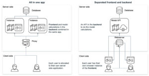
Das Hosten eines JavaScript-basierten Frontends bietet mehrere Vorteile gegenüber dem Hosten einer R Shiny- oder Python Dash-Anwendung. JavaScript-Frameworks wie React, Angular oder Vue.js bieten leistungsstarkes Rendering und Skalierbarkeit, was komplexe UI-Komponenten und groß angelegte Anwendungen ermöglicht. Diese Frameworks bieten auch mehr Flexibilität und Anpassungsoptionen für die Erstellung benutzerdefinierter UI-Elemente und die Implementierung komplexer Benutzerinteraktionen. Darüber hinaus sind JavaScript-basierte Frontends plattformübergreifend kompatibel und laufen auf Webbrowsern, Desktop-Anwendungen und mobilen Apps, was sie vielseitiger macht. Und schließlich ist JavaScript die Sprache des Webs, was eine einfachere Integration in bestehende Technologie-Stacks ermöglicht. Letztendlich hängt die Wahl der Technologie vom spezifischen Anwendungsfall, der Erfahrung des Entwicklungsteams und den Anforderungen der Anwendung ab.
Fazit
Der Aufbau eines Frontends für eine Data-Science-Anwendung ist entscheidend für die effektive Vermittlung von Erkenntnissen an die Endnutzer. Es hilft dabei, die Daten in einer leicht verdaulichen Art und Weise zu präsentieren und ermöglicht es den Benutzern, fundierte Entscheidungen zu treffen. Um sicherzustellen, dass die Bedürfnisse und Anforderungen richtig und effizient genutzt werden, muss das richtige Framework und die richtige Infrastruktur evaluiert werden. Wir schlagen vor, dass Lösungen in R oder Python ein guter Ausgangspunkt sind, aber Anwendungen in JavaScript könnten auf lange Sicht besser skalieren.
Wenn Sie ein Frontend für Ihre Data-Science-Anwendung entwickeln möchten, wenden Sie sich unverbindlich an unser Expertenteam, das Sie durch den Prozess führt und Ihnen die nötige Unterstützung bietet, um Ihre Visionen zu verwirklichen.
Read next …


… and explore new


Did you know, that you can transform plain old static ggplot graphs to animated ones? Well, you can with the help of the package gganimate by RStudio’s Thomas Lin Pedersen and David Robinson and the results are amazing! My STATWORX colleagues and I are very impressed how effortless all kinds of geoms are transformed to suuuper smooth animations. That’s why in this post I will provide a short overview of some of the wonderful functionalities of gganimate, I hope you’ll enjoy them as much as we do!
Since Valentine’s Day is just around the corner, we’re going to explore the Speed Dating Experiment dataset compiled by Columbia Business School professors Ray Fisman and Sheena Iyengar. Hopefully, we’ll learn about gganimate as well as how to find our Valentine. If you like, you can download the data from Kaggle.
Defining the basic animation: transition_*
How are static plots put into motion? Essentially, gganimate creates data subsets, which are plotted individually and constitute the substantial frames, which, when played consecutively, create the basic animation. The results of gganimate are so seamless because gganimate takes care of the so-called tweening for us by calculating data points for transition frames displayed in-between frames with actual input data.
The transition_* functions define how the data subsets are derived and thus define the general character of any animation. In this blogpost we’re going to explore three types of transitions: transition_states(), transition_reveal() and transition_filter(). But let’s start at the beginning.
We’ll start with transition_states(). Here the data is split into subsets according to the categories of the variable provided to the states argument. If several rows of a dataset pertain to the same unit of observation and should be identifiable as such, a grouping variable defining the observation units needs to be supplied. Alternatively, an identifier can be mapped to any other aesthetic.
Please note, to ensure the readability of this post, all text concerning the interpretation of the speed dating data is written in italics. If you’re not interested in that part you simply can skip those paragraphs. For the data prep, I’d like to refer you to my GitHub.
First, we’re going to explore what the participants of the Speed Dating Experiment look for in a partner. Participants were asked to rate the importance of attributes in a potential date by allocating a budget of 100 points to several characteristics, with higher values denoting a higher importance. The participants were asked to rate the attributes according to their own views. Further, the participants were asked to rate the same attributes according to the presumed wishes of their same-sex peers, meaning they allocated the points in the way they supposed their average same-sex peer would do.
We’re going to plot all of these ratings (x-axis) for all attributes (y-axis). Since we want to compare the individual wishes to the individually presumed wishes of peers, we’re going to transition between both sets of ratings. Color always indicates the personal wishes of a participant. A given bubble indicates the rating of one specific participant for a given attribute, switching between one’s own wishes and the wishes assumed for peers.
## Static Plot
# ...characteristic vs. (presumed) rating...
# ...color&size mapped to own rating, grouped by ID
plot1 <- ggplot(df_what_look_for,
       aes(x = value,
           y = variable,
           color = own_rating, # bubbels are always colord according to own whishes
           size = own_rating,
           group = iid)) + # identifier of observations across states
  geom_jitter(alpha = 0.5, # to reduce overplotting: jitttering & alpha
              width = 5) +
  scale_color_viridis(option = "plasma", # use virdis' plasma scale
                      begin = 0.2, # limit range of used hues
                      name = "Own Rating") +
  scale_size(guide = FALSE) + # no legend for size
  labs(y = "", # no axis label
       x = "Allocation of 100 Points",  # x-axis label
       title = "Importance of Characteristics for Potential Partner") +
  theme_minimal() +  # apply minimal theme
  theme(panel.grid = element_blank(),  # remove all lines of plot raster
        text = element_text(size = 16)) # increase font size

## Animated Plot
plot1 +
transition_states(states = rating) # animate contrast subsets acc. to variable rating 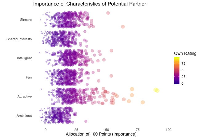
First off, if you’re a little confused which state is which, please be patient, we’ll explore dynamic labels in the section about ‚frame variables‘.
It’s apparent that different people look for different things in a partner. Yet attractiveness is often prioritized over other qualities. But the importance of attractiveness varies most strongly of all attributes between individuals. Interestingly, people are quite aware that their peer’s ratings might differ from their own views. Further, especially the collective presumptions (= the mean values) about others are not completely off, but of higher variance than the actual ratings.
So there is hope for all of us that somewhere out there somebody is looking for someone just as ambitious or just as intelligent as ourselves. However, it’s not always the inner values that count.
gganimate allows us to tailor the details of the animation according to our wishes. With the argument transition_length we can define the relative length of the transition from one to the other real subsets of data takes and with state_length how long, relatively speaking, each subset of original data is displayed. Only if the wrap argument is set to TRUE, the last frame will get morphed back into the first frame of the animation, creating an endless and seamless loop. Of course, the arguments of different transition functions may vary.
## Animated Plot
# ...replace default arguments
plot1 +
  transition_states(states = rating,
                    transition_length = 3, # 3/4 of total time for transitions
                    state_length = 1, # 1/4 of time to display actual data
                    wrap = FALSE) # no endless loop
Styling transitions: ease_aes
As mentioned before, gganimate takes care of tweening and calculates additional data points to create smooth transitions between successively displayed points of actual input data. With ease_aes we can control which so-called easing function is used to ‚morph‘ original data points into each other. The default argument is used to declare the easing function for all aesthetics in a plot. Alternatively, easing functions can be assigned to individual aesthetics by name. Amongst others quadric, cubic , sine and exponential easing functions are available, with the linear easing function being the default. These functions can be customized further by adding a modifier-suffix: with -in the function is applied as-is, with -out the function is reversely applied with -in-out the function is applied as-is in the first half of the transition and reversed in the second half.
Here I played around with an easing function that models the bouncing of a ball.
## Animated Plot
# ...add special easing function
plot1 +
  transition_states(states = rating) +
  ease_aes("bounce-in") # bouncy easing function, as-is
Dynamic labelling: {frame variables}
To ensure that we, mesmerized by our animations, do not lose the overview gganimate provides so-called frame variables that provide metadata about the animation as a whole or the previous/current/next frame. The frame variables – when wrapped in curly brackets – are available for string literal interpretation within all plot labels. For example, we can label each frame with the value of the states variable that defines the currently (or soon to be) displayed subset of actual data:
## Animated Plot
# ...add dynamic label: subtitle with current/next value of states variable
plot1 +
  labs(subtitle = "{closest_state}") + # add frame variable as subtitle
transition_states(states = rating) 
The set of available variables depends on the transition function. To get a list of frame variables available for any animation (per default the last one) the frame_vars() function can be called, to get both the names and values of the available variables.
Indicating previous data: shadow_*
To accentuate the interconnection of different frames, we can apply one of gganimates ’shadows‘. Per default shadow_null() i.e. no shadow is added to animations. In general, shadows display data points of past frames in different ways: shadow_trail() creates a trail of evenly spaced data points, while shadow_mark() displays all raw data points.
We’ll use shadow_wake() to create a little ‚wake‘ of past data points which are gradually shrinking and fading away. The argument wake_length allows us to set the length of the wake, relative to the total number of frames. Since the wakes overlap, the transparency of geoms might need adjustment. Obviously, for plots with lots of data points shadows can impede the intelligibility.
plot1B + # same as plot1, but with alpha = 0.1 in geom_jitter
  labs(subtitle = "{closest_state}") +
  transition_states(states = rating) +
  shadow_wake(wake_length = 0.5) # adding shadow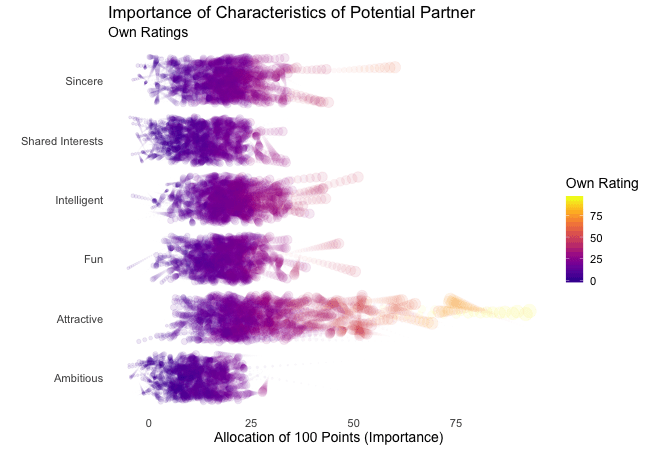
The benefits of transition_*
While I simply love the visuals of animated plots, I think they’re also offering actual improvement. I feel transition_states compared to facetting has the advantage of making it easier to track individual observations through transitions. Further, no matter how many subplots we want to explore, we do not need lots of space and clutter our document with thousands of plots nor do we have to put up with tiny plots.
Similarly, e.g. transition_reveal holds additional value for time series by not only mapping a time variable on one of the axes but also to actual time: the transition length between the individual frames displays of actual input data corresponds to the actual relative time differences of the mapped events. To illustrate this, let’s take a quick look at the ’success‘ of all the speed dates across the different speed dating events:
## Static Plot
# ... date of event vs. interest in second date for women, men or couples
plot2 <- ggplot(data = df_match,
                aes(x = date, # date of speed dating event
                    y = count, # interest in 2nd date
                    color = info, # which group: women/men/reciprocal
                    group = info)) +
  geom_point(aes(group = seq_along(date)), # needed, otherwise transition dosen't work
             size = 4, # size of points
             alpha = 0.7) + # slightly transparent
  geom_line(aes(lty = info), # line type according to group
            alpha = 0.6) + # slightly transparent
  labs(y = "Interest After Speed Date",
       x = "Date of Event",
       title = "Overall Interest in Second Date") +
  scale_linetype_manual(values = c("Men" = "solid", # assign line types to groups
                                   "Women" = "solid",
                                   "Reciprocal" = "dashed"),
                        guide = FALSE) + # no legend for linetypes
  scale_y_continuous(labels = scales::percent_format(accuracy = 1)) + # y-axis in %
  scale_color_manual(values = c("Men" = "#2A00B6", # assign colors to groups
                                "Women" = "#9B0E84",
                                "Reciprocal" = "#E94657"),
                     name = "") +
  theme_minimal() + # apply minimal theme
  theme(panel.grid = element_blank(), # remove all lines of plot raster
        text = element_text(size = 16)) # increase font size

## Animated Plot
plot2 +
  transition_reveal(along = date)
Displayed are the percentages of women and men who were interested in a second date after each of their speed dates as well as the percentage of couples in which both partners wanted to see each other again.
Most of the time, women were more interested in second dates than men. Further, the attraction between dating partners often didn’t go both ways: the instances in which both partners of a couple wanted a second date always were far more infrequent than the general interest of either men and women. While it’s hard to identify the most romantic time of the year, according to the data there seemed to be a slack in romance in early autumn. Maybe everybody still was heartbroken over their summer fling? Fortunately, Valentine’s Day is in February.
Another very handy option is transition_filter(), it’s a great way to present selected key insights of your data exploration. Here the animation browses through data subsets defined by a series of filter conditions. It’s up to you which data subsets you want to stage. The data is filtered according to logical statements defined in transition_filter(). All rows for which a statement holds true are included in the respective subset. We can assign names to the logical expressions, which can be accessed as frame variables. If the keep argument is set to TRUE, the data of previous frames is permanently displayed in later frames.
I want to explore, whether one’s own characteristics relate to the attributes one looks for in a partner. Do opposites attract? Or do birds of a feather (want to) flock together?
Displayed below are the importances the speed dating participants assigned to different attributes of a potential partner. Contrasted are subsets of participants, who were rated especially funny, attractive, sincere, intelligent or ambitious by their speed dating partners. The rating scale went from 1 = low to 10 = high, thus I assume value of >7 to be rather outstanding.
## Static Plot (without geom)
# ...importance ratings for different attributes
plot3 <- ggplot(data = df_ratings,
                 aes(x = variable, # different attributes
                     y = own_rating, # importance regarding potential partner
                     size = own_rating,
                     color = variable, # different attributes
                     fill = variable)) +
  geom_jitter(alpha = 0.3) +
  labs(x = "Attributes of Potential Partner", # x-axis label
       y = "Allocation of 100 Points (Importance)",  # y-axis label
       title = "Importance of Characteristics of Potential Partner", # title
       subtitle = "Subset of {closest_filter} Participants") + # dynamic subtitle
  scale_color_viridis_d(option = "plasma", # use viridis scale for color
                        begin = 0.05, # limit range of used hues
                        end = 0.97,
                        guide = FALSE) + # don't show legend
  scale_fill_viridis_d(option = "plasma", # use viridis scale for filling
                       begin = 0.05, # limit range of used hues
                       end = 0.97,
                       guide = FALSE) + # don't show legend
  scale_size_continuous(guide = FALSE) + # don't show legend
  theme_minimal() + # apply minimal theme
  theme(panel.grid = element_blank(),  # remove all lines of plot raster
        text = element_text(size = 16)) # increase font size

## Animated Plot
# ...show ratings for different subsets of participants
plot3 +
  geom_jitter(alpha = 0.3) +
  transition_filter("More Attractive" = Attractive > 7, # adding named filter expressions
                    "Less Attractive" = Attractive <= 7,
                    "More Intelligent" = Intelligent > 7,
                    "Less Intelligent" = Intelligent <= 7,
                    "More Fun" = Fun > 7,
                    "Less Fun" = Fun <= 5)
Of course, the number of extraordinarily attractive, intelligent or funny participants is relatively low. Surprisingly, there seem to be little differences between what the average low vs. high scoring participants look for in a partner. Rather the lower scoring group includes more people with outlying expectations regarding certain characteristics. Individual tastes seem to vary more or less independently from individual characteristics.
Styling the (dis)appearance of data: enter_* / exit_*
Especially if displayed subsets of data do not or only partially overlap, it can be favorable to underscore this visually. A good way to do this are the enter_*() and exit_*() functions, which enable us to style the entry and exit of data points, which do not persist between frames.
There are many combinable options: data points can simply (dis)appear (the default), fade (enter_fade()/exit_fade()), grow or shrink (enter_grow()/exit_shrink()), gradually change their color (enter_recolor()/exit_recolor()), fly (enter_fly()/exit_fly()) or drift (enter_drift()/exit_drift()) in and out.
We can use these stylistic devices to emphasize changes in the databases of different frames. I used exit_fade() to let further not included data points gradually fade away while flying them out of the plot area on a vertical route (y_loc = 100), data points re-entering the sample fly in vertically from the bottom of the plot (y_loc = 0):
## Animated Plot
# ...show ratings for different subsets of participants
plot3 +
  geom_jitter(alpha = 0.3) +
  transition_filter("More Attractive" = Attractive > 7, # adding named filter expressions
                    "Less Attractive" = Attractive <= 7,
                    "More Intelligent" = Intelligent > 7,
                    "Less Intelligent" = Intelligent <= 7,
                    "More Fun" = Fun > 7,
                    "Less Fun" = Fun <= 5) +
  enter_fly(y_loc = 0) + # entering data: fly in vertically from bottom
  exit_fly(y_loc = 100) + # exiting data: fly out vertically to top...
  exit_fade() # ...while color is fading
Finetuning and saving: animate() & anim_save()
Gladly, gganimate makes it very easy to finalize and save our animations. We can pass our finished gganimate object to animate() to, amongst other things, define the number of frames to be rendered (nframes) and/or the rate of frames per second (fps) and/or the number of seconds the animation should last (duration). We also have the option to define the device in which the individual frames are rendered (the default is device = “png”, but all popular devices are available). Further, we can define arguments that are passed on to the device, like e.g. width or height. Note, that simply printing an gganimateobject is equivalent to passing it to animate() with default arguments. If we plan to save our animation the argument renderer, is of importance: the function anim_save() lets us effortlessly save any gganimate object, but only so if it was rendered using one of the functions magick_renderer() or the default gifski_renderer().
The function anim_save()works quite straightforward. We can define filename and path (defaults to the current working directory) as well as the animation object (defaults to the most recently created animation).
# create a gganimate object
gg_animation <- plot3 +
  transition_filter("More Attractive" = Attractive > 7,
                    "Less Attractive" = Attractive <= 7)

# adjust the animation settings
animate(gg_animation,
        width = 900, # 900px wide
        height = 600, # 600px high
        nframes = 200, # 200 frames
        fps = 10) # 10 frames per second

# save the last created animation to the current directory
anim_save("my_animated_plot.gif")
Conclusion (and a Happy Valentine’s Day)
I hope this blog post gave you an idea, how to use gganimate to upgrade your own ggplots to beautiful and informative animations. I only scratched the surface of gganimates functionalities, so please do not mistake this post as an exhaustive description of the presented functions or the package. There is much out there for you to explore, so don’t wait any longer and get started with gganimate!
But even more important: don’t wait on love. The speed dating data shows that most likely there’s someone out there looking for someone just like you. So from everyone here at STATWORX: Happy Valentine’s Day!

## 8 bit heart animation
animation2 <- plot(data = df_eight_bit_heart %>% # includes color and x/y position of pixels
         dplyr::mutate(id = row_number()), # create row number as ID
                aes(x = x,
                    y = y,
                    color = color,
                    group = id)) +
  geom_point(size = 18, # depends on height & width of animation
             shape = 15) + # square
  scale_color_manual(values = c("black" = "black", # map values of color to actual colors
                                "red" = "firebrick2",
                                "dark red" = "firebrick",
                                "white" = "white"),
                     guide = FALSE) + # do not include legend
  theme_void() + # remove everything but geom from plot
  transition_states(-y, # reveal from high to low y values
                    state_length = 0) +
  shadow_mark() + # keep all past data points
  enter_grow() + # new data grows
  enter_fade() # new data starts without color

animate(animation2,
        width = 250, # depends on size defined in geom_point
        height = 250, # depends on size defined in geom_point
        end_pause = 15) # pause at end of animation
Nearly one year ago, I analyzed how we use emojis in our Slack messages. Since then, STATWORX grew, and we are a lot more people now! So, I just wanted to check if something changed.
Last time, I did not show our custom emojis, since they are, of course, not available in the fonts I used. This time, I will incorporate them with geom_image(). It is part of the ggimage package from Guangchuang Yu, which you can find here on his Github. With geom_image() you can include images like .png files to your ggplot.
What changed since last year?
Let’s first have a look at the amount of emojis we are using. In the plot below, you can see that since my last analysis in October 2018 (red line) the amount of emojis is rising. Not as much as I thought it would, but compared to the previous period, we now have more days with a usage of over 100 emojis per day!
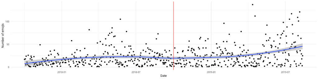
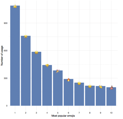
Like last time, our top emoji is ????, followed by ???? and ????. But sneaking in at number ten is one of our custom emojis: party_hat_parrot!
How to include custom images?
In my previous blogpost, I hid all our custom emojis behind❓since they were not part of the font. It did not occur to me to use their images, even though the package is from the same creator! So, to make up for my ignorance, I grabbed the top 30 custom emojis and downloaded their images from our Slack servers, saved them as .png and made sure they are all roughly the same size.
To use geom_image() I just added the path of the images to my data (the … are just an abbreviation for the complete path).
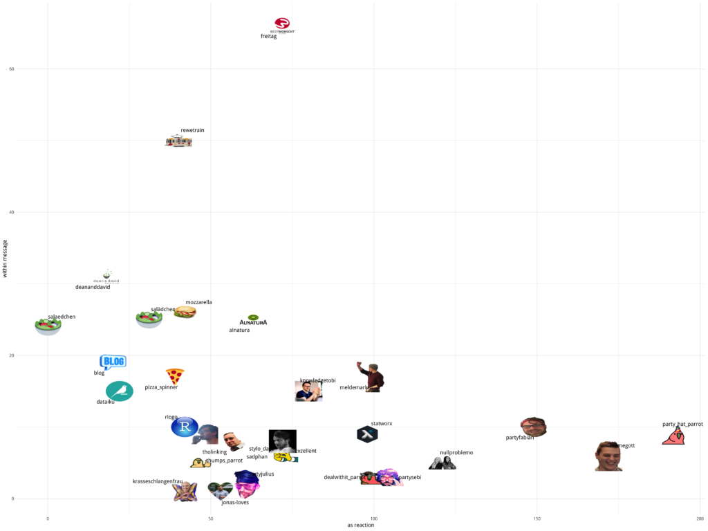
                NAME COUNT REACTION IMAGE
1:          alnatura    25       63 .../custom/alnatura.png
2:              blog    19       20 .../custom/blog.png
3:           dataiku    15       22 .../custom/dataiku.png
4: dealwithit_parrot     3      100 .../custom/dealwithit_parrot.png
5:      deananddavid    31       18 .../custom/deananddavid.png
This would have been enough to just add the images now, but since I wanted the NAME attribute as a label, I included geom_text_repel from the ggrepel library. This makes handling of non-overlapping labels much simpler!
ggplot(custom_dt, aes( x = REACTION, y = COUNT, label = NAME)) +
  geom_image(aes(image = IMAGE), size = 0.04) +
  geom_text_repel(point.padding = 0.9, segment.alpha = 0) +
  xlab("as reaction") +
  ylab("within message") +
  theme_minimal()
Usually, if a label is „too far“ away from the marker, geom_text_repel includes a line to indicate where the labels belong. Since these lines would overlap the images, I used segment.alpha = 0 to make them invisible. With point.padding = 0.9 I gave the labels a bit more space, so it looks nicer. Depending on the size of the plot, this needs to be adjusted. In the plot, one can see our usage of emojis within a message (y-axis) and as a reaction (x-axis).
To combine the emoji font and custom emojis, I used the following data and code — really… why did I not do this last time? ???? Since the UNICODE is NA when I want to use the IMAGE, there is no „double plotting“.
                     EMOJI REACTION COUNT  SUM PLACE    UNICODE   IMAGE
 1:                    :+1:     1090     0 1090     1 U0001f44d
 2:                   :joy:      609   152  761     2 U0001f602
 3:                 :smile:       91   496  587     3 U0001f604
 4:                    :-1:      434     9  443     4 U0001f44e
 5:                  :tada:      346    38  384     5 U0001f389
 6:                  :fire:      274    17  291     6 U0001f525
 7: :slightly_smiling_face:        1   250  251     7 U0001f642
 8:                  :wink:       27   191  218     8 U0001f609
 9:                  :clap:      201    13  214     9 U0001f44f
10:      :party_hat_parrot:      192     9  201    10       <NA>  .../custom/party_hat_parrot.png
quartz()
ggplot(plotdata2, aes(x = PLACE, y = SUM, label = UNICODE)) +
  geom_bar(stat = "identity", fill = "steelblue") +
  geom_text(family="EmojiOne") +
  xlab("Most popular emojis") +
  ylab("Number of usage") +
  scale_fill_brewer(palette = "Paired") +
  geom_image(aes(image = IMAGE), size = 0.04) +
  theme_minimal()
ps = grid.export(paste0(main_path, "plots/top-10-used-emojis.svg"), addClass=T)
dev.off()
The meaning behind emojis
Now we know what our top emojis are. But what is the rest of the world doing? Thanks to Emojimore for providing me with this overview! On their site, you can find meanings for a lot more emojis.
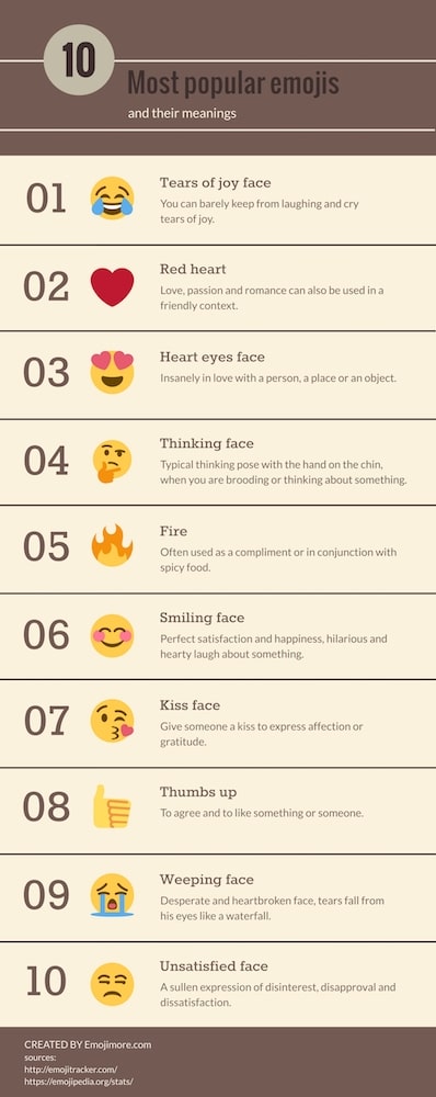
Behind each of our custom emojis is a story as well. For example, all the food emojis are helping us every day to decide where to eat and provide information on what everyone is planning for lunch! And if you do not agree with the decision, just react with sadphan to let the others know about your feelings. If you want to know the whole stories behind all custom emojis or even help create new ones, then maybe you should join our team — check out our available job offers here!
Netzwerke sind überall. Wir haben soziale Netzwerke wie Facebook, kompetitive Produktnetzwerke oder verschiedene Netzwerke innerhalb einer Organisation. Auch für STATWORX ist es eine häufige Aufgabe, verborgene Strukturen und Cluster in einem Netzwerk aufzudecken und sie für unsere Kunden zu visualisieren. In der Vergangenheit haben wir dazu das Tool Gephi verwendet, um unsere Ergebnisse der Netzwerkanalyse zu visualisieren. Beeindruckt von dieser schönen und interaktiven Visualisierung war unsere Idee, einen Weg zu finden, Visualisierungen in der gleichen Qualität direkt in R zu erstellen und sie unseren Kunden in einer R Shiny App zu präsentieren.
Unsere erste Überlegung war, Netzwerke mit igraph zu visualisieren, einem Paket, das eine Sammlung von Netzwerkanalysetools enthält, wobei der Schwerpunkt auf Effizienz, Portabilität und Benutzerfreundlichkeit liegt. Wir haben es in der Vergangenheit schon in unserem Paket helfRlein für die Funktion getnetwork verwendet. Das Paket igraph kann zwar ansprechende Netzwerkvisualisierungen erstellen, aber leider sind diese jedoch ausschließlich statisch. Um hingegen interaktive Netzwerkvisualisierungen zu erstellen, stehen uns mehrere Pakete in R zur Verfügung, die alle auf Javascript-Bibliotheken basieren.
Unser Favorit für diese Visualisierungsaufgabe ist das Paket visNetwork, das die Javascript-Bibliothek vis.js verwendet und auf htmlwidgets basiert. Es ist mit Shiny, R Markdown-Dokumenten und dem RStudio-Viewer kompatibel. visNetwork bietet viele Anpassungsmöglichkeiten, um ein Netzwerk zu individualisieren, einen schönen Output und eine gute Performance, was sehr wichtig ist, wenn wir den Output in Shiny verwenden möchten. Außerdem ist eine hervorragende Dokumentation hier zu finden.
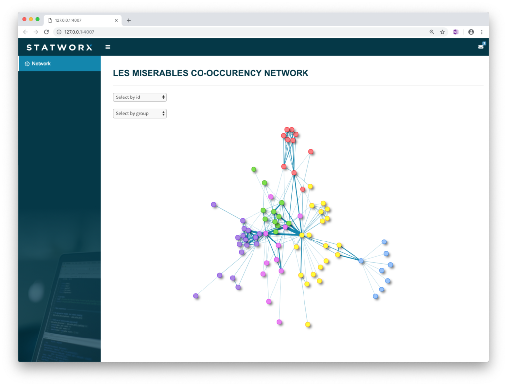
Gehen wir nun also die Schritte durch, die von der Datenbasis bis hin zur perfekten Visualisierung in R Shiny gemacht werden müssen. Dazu verwenden wir im Folgenden das Netzwerk der Les Misérables Charaktere als Beispiel. Dieses ungerichtete Netzwerk enthält Informationen dazu, welche Figuren in Victor Hugos Roman „Les Misérables“ gemeinsam auftreten. Ein Knoten (engl. Node) steht für eine Figur, und ein Kante (engl. Edge) zwischen zwei Knoten zeigt an, dass diese beiden Figuren im selben Kapitel des Buches auftreten. Das Gewicht jeder Verbindung gibt an, wie oft ein solches gemeinsames Auftreten vorkommt.
Datenaufbereitung
Als erstes müssen wir das Paket mit install.packages("visNetwork") installieren und den Datensatz lesmis laden. Der Datensatz ist im Paket geomnet enthalten.
Um das Netzwerk zwischen den Charakteren von Les Misérables zu visualisieren, benötigt das Paket visNetwork zwei Datensätze. Einen für die Knoten und einen für die Kanten des Netzwerks. Glücklicherweise liefern unsere geladenen Daten beides und wir müssen sie nur noch in das richtige Format bringen.
rm(list = ls())

# Libraries ---------------------------------------------------------------
library(visNetwork)
library(geomnet)
library(igraph)


# Data Preparation --------------------------------------------------------

#Load dataset
data(lesmis)

#Nodes
nodes <- as.data.frame(lesmis[2])
colnames(nodes) <- c("id", "label")

#id has to be the same like from and to columns in edges
nodes$id <- nodes$label

#Edges
edges <- as.data.frame(lesmis[1])
colnames(edges) <- c("from", "to", "width")
Die folgende Funktion benötigt spezifische Namen für die Spalten, um die richtige Spalte zu erkennen. Zu diesem Zweck müssen die Kanten ein Data Frame mit mindestens einer Spalte sein, die angibt, in welchem Knoten eine Kante beginnt (from) und wo sie endet (to). Für die Knoten benötigen wir mindestens eine eindeutige ID (id), die mit den Argumenten from und to übereinstimmen muss.
Knoten:
label: Eine Spalte, die definiert, wie ein Knoten beschriftet istvalue: Definiert die Größe eines Knotens innerhalb des Netzwerksgroup: Weist einen Knoten einer Gruppe zu; dies kann das Ergebnis einer Clusteranalyse oder einer Community Detection seinshape: Legt fest, wie ein Knoten dargestellt wird. Zum Beispiel als Kreis, Quadrat oder Dreieckcolor: Legt die Farbe eines Knotens festtitle: Legt den Tooltip fest, der erscheint, wenn du den Mauszeiger über einen Knoten bewegst (dies kann HTML oder ein Zeichen sein)shadow: Legt fest, ob ein Knoten einen Schatten hat oder nicht (TRUE/FALSE)
Kanten:
label,title,shadowlength,width: Definiert die Länge/Breite einer Kante innerhalb des Netzwerksarrows: Legt fest, wo ein möglicher Pfeil an der Kante gesetzt werden solldashes: Legt fest, ob die Kanten gestrichelt sein sollen oder nicht (TRUE/FALSE)smooth: Darstellung als Kurve (TRUE/FALSE)
Dies sind die wichtigsten Einstellungen. Sie können für jeden einzelnen Knoten oder jede einzelne Kante individuell angepasst werden. Um einige Konfigurationen für alle Knoten oder Kanten einheitlich einzustellen, wie z.B. die gleiche Form oder Pfeile, können wir später bei der Spezifizierung des Outputs visNodes und visEdges nutzen. Wir werden diese Möglichkeit später noch genauer betrachten.
Zusätzlich wollen wir Gruppen innerhalb des Netzwerks identifizieren und darstellen. Wir werden dazu die Gruppen hervorheben, indem wir den Kanten des Netzwerks Farben hinzufügen. Dafür clustern wir die Daten zuerst mit der Community Detection Methode Louvain und erhalten die neue Spalte group:
#Create graph for Louvain
graph <- graph_from_data_frame(edges, directed = FALSE)

#Louvain Comunity Detection
cluster <- cluster_louvain(graph)

cluster_df <- data.frame(as.list(membership(cluster)))
cluster_df <- as.data.frame(t(cluster_df))
cluster_df$label <- rownames(cluster_df)

#Create group column
nodes <- left_join(nodes, cluster_df, by = "label")
colnames(nodes)[3] <- "group"
Output Optionen
Um einen Eindruck davon zu geben, welche Möglichkeiten wir haben, wenn es um die Design- und Funktionsoptionen bei der Erstellung unseres Output geht, sehen wir uns zwei Darstellungen des Les Misérables-Netzwerks genauer an.
Wir beginnen mit der einfachsten Möglichkeit und geben nur die Knoten und Kanten als Data Frames an die Funktion weiter:
visNetwork(nodes, edges)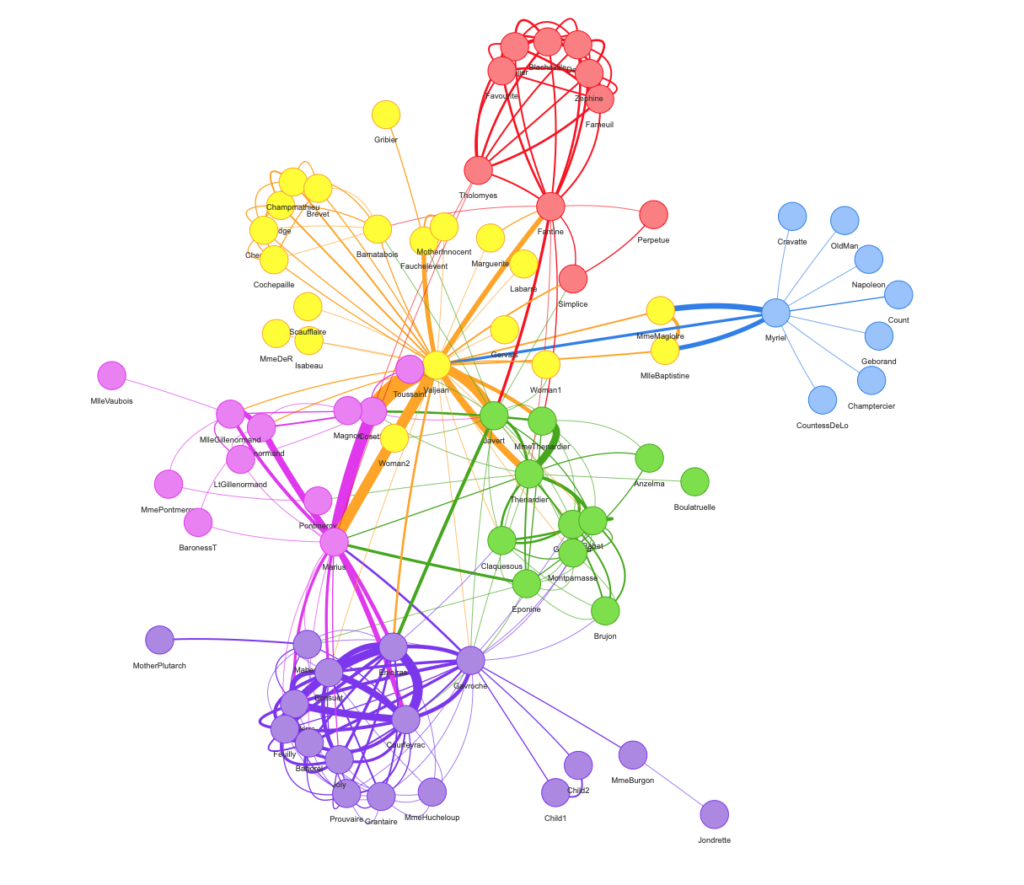
Mit dem Pipe-Operator können wir unser Netzwerk mit einigen anderen Funktionen wie visNodes, visEdges, visOptions, visLayout oder visIgraphLayout anpassen:
visNetwork(nodes, edges, width = "100%") %>%
  visIgraphLayout() %>%
  visNodes(
    shape = "dot",
    color = list(
      background = "#0085AF",
      border = "#013848",
      highlight = "#FF8000"
    ),
    shadow = list(enabled = TRUE, size = 10)
  ) %>%
  visEdges(
    shadow = FALSE,
    color = list(color = "#0085AF", highlight = "#C62F4B")
  ) %>%
  visOptions(highlightNearest = list(enabled = T, degree = 1, hover = T),
             selectedBy = "group") %>%
  visLayout(randomSeed = 11)
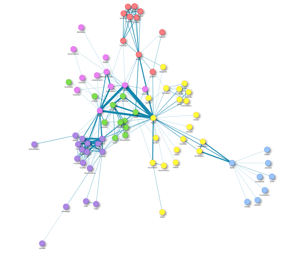
visNodes und visEdges beschreiben das allgemeine Aussehen der Knoten und Kanten im Netzwerk. Wir können zum Beispiel die Form aller Knoten festlegen oder die Farben aller Kanten definieren.
Wenn es um die Veröffentlichung in R geht, kann das Rendern des Netzwerks viel Zeit in Anspruch nehmen. Um dieses Problem zu lösen, verwenden wir die Funktion visIgraph. Sie verkürzt die Darstellungszeit, indem sie die Koordinaten im voraus berechnet und alle verfügbaren igraph-Layouts bereitstellt.
Mit visOptions können wir einstellen, wie das Netzwerk reagiert, wenn wir mit ihm interagieren. Zum Beispiel, was passiert, wenn wir auf einen Knoten klicken.
Mit visLayout können wir das Aussehen des Netzwerks festlegen. Soll es ein hierarchisches sein oder wollen wir das Layout mit einem speziellen Algorithmus verbessern? Außerdem können wir einen Seed (randomSeed) angeben, damit das Netzwerk immer identisch aussieht, wenn wir es laden.
Dies sind nur einige Beispielfunktionen, mit denen wir unser Netzwerk anpassen können. Das Paket bietet noch viel mehr Möglichkeiten zur individuellen Anpassung. Weitere Details sind in der Dokumentation zu finden.
Shiny Integration
Um die interaktiven Ergebnisse unseren Kunden zu präsentieren, wollen wir sie in eine Shiny-App integrieren. Deshalb bereiten wir die Daten „offline“ auf, speichern die Knoten- und Kanten-Dateien und erstellen den Output innerhalb der Shiny-App „online“. Hier ist ein einfaches Beispiel für das Schema, das für Shiny verwendet werden kann:
global.R:
library(shiny)
library(visNetwork)
server.R:
shinyServer(function(input, output) {
  output$network <- renderVisNetwork({
    load("nodes.RData")
    load("edges.RData")

    visNetwork(nodes, edges) %>%
      visIgraphLayout()
  })
})
ui.R:
shinyUI(
  fluidPage(
    visNetworkOutput("network")
  )
)
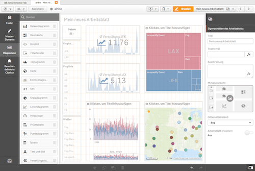
Der Screenshot unserer Shiny-App veranschaulicht ein mögliches Ergebnis:
Fazit
Neben anderen verfügbaren Paketen zur interaktiven Visualisierung von Netzwerken in R, ist visNetwork unser absoluter Favorit. Es ist ein leistungsstarkes Paket, um interaktive Netzwerke direkt in R zu erstellen und in Shiny zu veröffentlichen. Wir können unsere Netzwerke direkt in unsere Shiny-Anwendung integrieren und sie mit einer stabilen Performance ausführen, wenn wir die Funktion visIgraphLayout verwenden. So benötigen wir keine externe Software wie Gephi mehr.
Habe ich dein Interesse geweckt, deine eigenen Netzwerke zu visualisieren? Dann kannst du gerne meinen Code verwenden oder mich kontaktieren und die Github-Seite des verwendeten Pakets hier besuchen.
Quellen
Knuth, D. E. (1993) „Les miserables: coappearance network of characters in the novel les miserables“, The Stanford GraphBase: A Platform for Combinatorial Computing, Addison-Wesley, Reading, MA
Die Datenexploration ist ein wichtiger Schritt in jedem Data Science-Projekt hier bei STATWORX. Um alle relevanten Erkenntnisse zu gewinnen, ziehen wir interaktive Diagramme statischen Diagrammen vor, da wir so die Möglichkeit haben, tiefer in die Daten einzudringen. Das hilft uns, alle Informationen sichtbar zu machen.
In diesem Blogbeitrag zeigen wir dir, wie du die Interaktivität von Plotly Histograms in Python verbessern kannst, wie du in der Grafik unten sehen kannst. Du findest den Code in unserem GitHub Repo.
TL;DR: Kurze Zusammenfassung
- Wir zeigen dir das Standard Histogram von Plotly und sein unerwartetes Verhalten.
- Wir verbessern das interaktive Histogram, damit es unserer menschlichen Intuition entspricht, und zeigen dir den Code.
- Wir erklären den Code Zeile für Zeile und geben dir mehr Informationen über die Implementierung.
Das Problem des Standard Histograms von Plotly
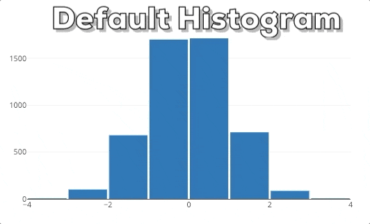
Diese Grafik zeigt dir das Verhalten eines Plotly Histograms, wenn du in eine bestimmte Region hinein zoomst. Du kannst sehen, dass die Balken einfach größer/breiter werden. Das ist nicht das, was wir erwarten! Wenn wir in ein Diagramm reinzoomen, wollen wir tiefer graben und feinere Informationen für einen bestimmten Bereich sehen. Deshalb erwarten wir, dass das Histogram detailliertere Informationen anzeigt. In diesem speziellen Fall erwarten wir, dass das Histogram Bins für die ausgewählte Region anzeigt. Daher muss das Histogram neu gebinnt werden.
Verbesserung des interaktiven Histograms
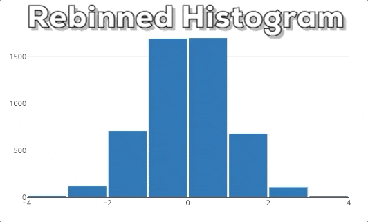
In dieser Grafik kannst du unser erwartetes Endergebnis sehen. Wenn man einen neuen x-Bereich auswählt, soll das Histogram auf der Grundlage des neuen x-Bereichs neu berechnet werden.
Um dieses Verhalten zu implementieren, müssen wir die Grafik ändern, wenn sich der ausgewählte x-Bereich ändert. Dies ist eine neue Funktion von plotly.py 3.0.0, die der großartige Jon Mease der Community zur Verfügung gestellt hat. Du kannst mehr über die neuen Funktionen von Plotly.py 3.0.0 in dieser Ankündigung lesen.
Hinweis: Die Implementierung funktioniert nur innerhalb eines Jupyter-Notebooks oder JupyterLabs, da sie einen aktiven Python-Kernel für den Callback benötigt. Sie funktioniert nicht in einem eigenständigen Python-Skript und auch nicht in einer eigenständigen HTML-Datei. Die Idee für die Umsetzung ist die folgende: Wir erstellen eine interaktive Abbildung und jedes Mal, wenn sich die X-Achse ändert, aktualisieren wir die zugrunde liegenden Daten des Histograms. Whoops, warum haben wir das Binning nicht geändert? Plotly Histograms übernehmen automatisch das Binning für die zugrunde liegenden Daten. Wir können also das Histogram die Arbeit machen lassen und nur die zugrunde liegenden Daten ändern. Das ist zwar ein wenig kontraintuitiv, spart aber eine Menge Arbeit.
Einblick in den vollständigen Code
Hier kommt also endlich der relevante Code ohne unnötige Importe usw. Wenn du den vollständigen Code sehen willst, schau bitte in diese GitHub-Datei.
x_values = np.random.randn(5000)
figure = go.FigureWidget(data=[go.Histogram(x=x_values,
                                            nbinsx=10)],
                         layout=go.Layout(xaxis={'range': [-4, 4]},
                                          bargap=0.05))
histogram = figure.data[0]

def adjust_histogram_data(xaxis, xrange):
    x_values_subset = x_values[np.logical_and(xrange[0] <= x_values,
                                              x_values <= xrange[1])]
    histogram.x = x_values_subset
figure.layout.xaxis.on_change(adjust_histogram_data, 'range')
Detaillierte Erklärungen für jede Codezeile
Im Folgenden geben wir einige detaillierte Einblicke und Erklärungen zu jeder Codezeile.
1) Initialisierung der x_values
x_values = np.random.randn(5000)
Wir erhalten 5000 neue zufällige x_values, die nach einer Normalverteilung ausgegeben werden. Die Werte werden von der großartigen Numpy-Bibliothek erstellt, die mit np abgekürzt wird.
2) Erstellen der figure
figure = go.FigureWidget(data=[go.Histogram(x=x_values,
                                            nbinsx=10)],
                         layout=go.Layout(xaxis={'range': [-4, 4]},
                                          bargap=0.05))
Wir erzeugen eine neue FigureWidget-Instanz. Das FigureWidget-Objekt ist das neue „magische Objekt“, das von Jon Mease eingeführt wurde. Du kannst es in Jupyter Notebook oder JupyterLab wie eine normale Plotly figure anzeigen, aber es gibt einige Vorteile.Du kannst das FigureWidget auf verschiedene Arten in Python manipulieren und du kannst auch auf einige Ereignisse hören und weiteren Python-Code ausführen, was dir eine Menge Möglichkeiten gibt. Diese Flexibilität ist der große Vorteil, den sich Jon Mease ausgedacht hat. Das FigureWidget erhält die Attribute data und layout.
Als data geben wir eine Liste aller traces (sprich: Visualisierungen) an, die wir anzeigen wollen. In unserem Fall wollen wir nur ein einziges Histogram anzeigen. Die x-Werte für das Histogramm sind unsere x_values. Außerdem setzen wir die maximale Anzahl der Bins mit nbinsx auf 10. Plotly verwendet dies als Richtlinie, erzwingt aber nicht, dass der Plot genau nbinsx Bins enthält. Als layout geben wir ein neues Layout-Objekt an und setzen den Bereich der x-Achse (xaxis) auf [-4, 4]. Mit dem Argument bargap können wir das Layout dazu bringen eine Lücke zwischen den einzelnen Balken anzuzeigen. So können wir besser erkennen, wo ein Balken aufhört und der nächste beginnt. In unserem Fall wird dieser Wert auf 0.05 gesetzt.
3) Speichern einer Referenz zum Histogram
histogram = figure.data[0]
Wir erhalten den Verweis auf das Histogram, weil wir das Histogram im letzten Schritt-Updating-the-histogram-data) manipulieren wollen. Wir erhalten nicht die eigentlichen Daten, sondern einen Verweis auf das trace-Objekt von Plotly. Diese Plotly-Syntax ist vielleicht etwas irreführend, aber sie stimmt mit der Definition der Abbildung überein, in der wir auch die „traces“ als „data“ angegeben haben.
4) Überblick zum Callback
def adjust_histogram_data(xaxis, xrange):
    x_values_subset = x_values[np.logical_and(xrange[0] <= x_values,
                                              x_values <= xrange[1])]
    hist.x = x_values_subset
figure.layout.xaxis.on_change(adjust_histogram_data, 'range')
In diesem Abschnitt legen wir zunächst fest, was wir tun wollen, wenn sich die x-Achse ändert. Danach registrieren wir die Callback-Funktion adjust_histogram_data. Wir werden das weiter aufschlüsseln, aber wir beginnen mit der letzten Zeile, weil Python diese Zeile zur Laufzeit zuerst ausführt. Deshalb ist es sinnvoller, den Code in dieser umgekehrten Reihenfolge zu lesen. Noch ein bisschen mehr Hintergrundwissen zum Callback: Der Code in der Callback-Methode adjust_histogram_data wird aufgerufen, wenn das Ereignis xaxis.on_change tatsächlich eintritt, weil Benutzende mit dem Diagramm interagiert haben. Aber zuerst muss Python die Callback-Methode adjust_histogram_data registrieren. Viel später, wenn das Callback-Ereignis xaxis.on_change eintritt, wird Python die Callback-Methode adjust_histogram_data und ihren Inhalt ausführen. Lies dir diesen Abschnitt 3-4 Mal durch, bis du ihn vollständig verstanden hast.
4a) Registrierung des Callbacks
figure.layout.xaxis.on_change(adjust_histogram_data, 'range')
In dieser Zeile teilen wir dem Figure-Objekt mit, dass es die Callback-Funktion adjust_histogram_data immer dann aufrufen soll, wenn sich die X-Achse ändert. Bitte beachte, dass wir nur den Namen der Funktion adjust_histogram_data ohne die runden Klammern () angeben. Das liegt daran, dass wir nur den Verweis auf die Funktion übergeben müssen und die Funktion nicht aufrufen wollen. Das ist ein häufiger Fehler und sorgt oftmals für Verwirrung. Außerdem geben wir an, dass wir nur an dem Attribut range interessiert sind. Daher wird das figure-Objekt nur diese Information an die Callback-Funktion senden.
Aber wie sieht die Callback-Funktion aus und was ist ihre Aufgabe? Diese Fragen werden in den nächsten Schritten erklärt:
4b) Definieren der Callback-Signatur
def adjust_histogram_data(xaxis, xrange):
Hier beginnen wir, unsere Callback-Funktion zu definieren. Das erste Argument, das an die Funktion übergeben wird, ist das Objekt xaxis, das den Callback ausgelöst hat. Das ist eine Konvention von Plotly und wir müssen diesen Platzhalter nur hier einfügen, obwohl wir ihn nicht benutzen. Das zweite Argument ist der xrange, der die untere und obere Grenze der neuen xrange-Konfiguration enthält. Du fragst dich vielleicht: „Woher kommen die Argumente xaxis und xrange?“ Diese Argumente werden automatisch von figure bereitgestellt, wenn der Callback aufgerufen wird. Wenn du Callbacks zum ersten Mal verwendest, mag dir das wie unergründliche Magie vorkommen. Aber du wirst dich daran gewöhnen…
4c) Aktualisieren der x_values
x_values_subset = x_values[np.logical_and(xrange[0] <= x_values,
                                          x_values <= xrange[1])]
In dieser Zeile definieren wir unsere neuen x_values, die in den meisten Fällen eine Teilmenge der ursprünglichen x_values sind. Wenn die untere und die obere Grenze jedoch sehr weit voneinander entfernt sind, kann es passieren, dass wir alle ursprünglichen x_values auswählen. Die Teilmenge ist also nicht immer eine strenge Teilmenge. Die untere Grenze der xrange wird durch xrange[0] und die obere Grenze durch xrange[1] definiert. Um die Teilmenge der x_values auszuwählen, die innerhalb der unteren und oberen Grenze des Bereichs liegt, verwenden wir die Funktion logical_and von Numpy. Es gibt mehrere Möglichkeiten, wie wir in Python Teilmengen von Daten auswählen können. Zum Beispiel kannst du das auch über Pandas-Selektoren tun, wenn du Pandas Dataframes/Series verwendest.
4d) Aktualisieren der Histogram-Daten
histogram.x = x_values_subset
In dieser Zeile aktualisieren wir die zugrundeliegenden Daten des Histograms und setzen sie auf das neue x_values_subset. Diese Zeile löst die Aktualisierung des Histograms und das automatische Rebinning aus. Das histogram ist der Verweis, den wir in Schritt 3 des Codes erstellt haben, weil wir ihn hier brauchen.
Fazit
In diesem Blogbeitrag haben wir dir gezeigt, wie du das Standard-Histogram von Plotly durch interaktives Binning verbessern kannst. Wir haben dir den Code gegeben und jede Zeile der Implementierung erklärt. Wir hoffen, dass du uns folgen konntest und ein gutes Verständnis für die neuen Möglichkeiten von plotly.py 3.0.0 gewonnen hast.
Vielleicht hast du manchmal das Gefühl, dass du den Code, den du im Internet oder auf Stackoverflow findest, nicht gut verstehst. Wenn du intuitive Erklärungen für Themen aus Data Science-Welt suchst, solltest du dir einige unserer offenen Kurse ansehen, die von unseren Data Science-Expert:innen hier bei STATWORX unterrichtet werden.
Quellen
- Offizielles plotly.py GitHub-Repository https://github.com/plotly/plotly.py
- Offizielle Übersicht über alle neuen Funktionen von plotly.py 3.0.0 https://medium.com/@plotlygraphs/introducing-plotly-py-3-0-0-7bb1333f69c6
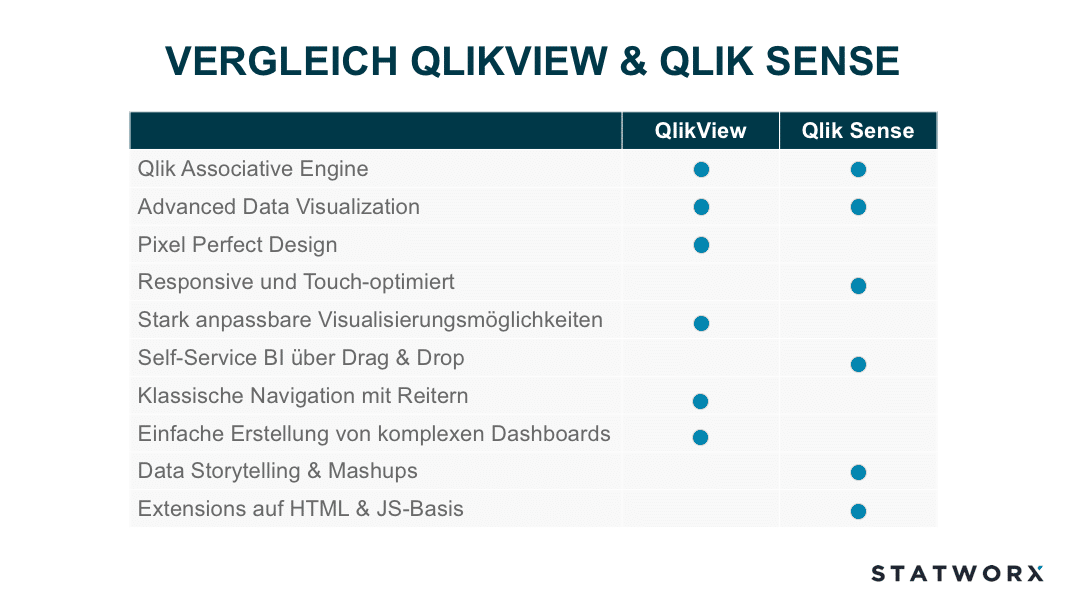
Daten-Visualisierung und -Verständnis sind wichtige Faktoren bei der Durchführung eines Data Science Projekts. Eine visuelle Exploration der Daten unterstützt den Data Scientist beim Verständnis der Daten und liefert häufig wichtige Hinweise über Datenqualität und deren Besonderheiten. Bei STATWORX wenden wir im Bereich Datenvisualsierung eine Vielzahl von unterschiedlichen Tools und Technologien an, wie z.B. Tableau, Qlik, R Shiny oder D3. Seit 2014 hat QlikTech zwei Produkte im Angebot: QlikView und Qlik Sense. Für viele unserer Kunden ist die Entscheidung, ob sie QlikView oder QlikSense einsetzen sollen nicht einfach zu treffen. Was sind die Vor- und Nachteile der beiden Produkte? In diesem Blogbeitrag erläutern wir die Unterschiede zwischen den beiden Tools.

Geschichte und Aufbau von Qlik
Die Erfolgsgeschichte der Firma QlikTech begann in den 90er Jahren mit dem Produkt QlikView, das im Jahre 2014 durch QlikSense offiziell abgelöst werden sollte. Aktuell sind noch beide Produkte am Markt, QlikTech fokussiert sich jedoch stark auf die Weiterentwicklung von QlikSense. Zwischen den Veröffentlichungsterminen der beiden Produkte stieg die Anzahl der Mitarbeiter von QlikTech von 35 auf über 2000. Beiden Produkten liegt dieselbe Kerntechnologie zu Grunde; die Qlik Associative Engine. Diese ermöglicht eine einfache Verknüpfung von unterschiedlichen Datensätzen, die alle In-Memory (im Arbeitsspeicher des Rechners) gehalten werden. Dies ermöglicht einen extrem schnellen Datenzugriff, da der Arbeitsspeicher gegenüber normalen Datenträgern eine erheblich schnellere Lese- und Schreibgeschwindigkeit aufweist. Weiterhin kann die Qlik Associative Engine viele Nutzer und große Datenmengen managen was einer der Hauptgründe ist, warum sich Qlik erfolgreich gegen seine Mitbewerber durchsetzen konnte.
QlikView
QlikView orientiert sich grundsätzlich am Thema „Guided Analytics“. Hierbei wird dem Endanwender eine App von einem QlikView-Entwickler bereitgestellt, die die notwendigen Überlegungen und Implementierungen rund um das Datenmodell, den inhaltlichen und optischen Aufbau der App sowie die unterschiedlichen Visualisierunge enthält. Der Anwender wiederum hat die komplette Freiheit die Daten durch Filtern, Auswählen, Drill-Down und Cycle Groups zu erkunden, um neue Erkentnisse zu gewinnen und Antworten auf seine Business-Fragen zu finden. Hierbei steht allerdings das Erstellen von eigenen Visualisierungen für den Endanwender nicht im Fokus.
Die Entwicklung von QlikView Applikationen erfordert Erfahrung und Expertise, da die Dashboarderstellung nicht über Drag und Drop möglich ist. Der Endanwender erhält hingegen eine fertige und einsatzbereite Applikation und kann somit umgehend mit seinen BI Analysen starten.
Die fertigen Datenmodelle und die daraus resultierende QVDs können ebenfalls von Qlik Sense geöffnet werden, dies ist allerdings andersherum nicht möglich.
Weitere wichtige Eckpunkte zu QlikView sind:
- eine Vielzahl an unterschiedlichen Datenverbindungsmöglichkeiten vorhanden
- keine Cloud-Lösung erhältlich, QlikView läuft lokal oder auf einem On-Premise Server
- benutzerfreundliche Entwicklungsoberfläche
- baut auf C++ und C# auf
- PDF Reporting durch NPrinting möglich
- Pixel genaues Erstellen von Applikationen
- 2000er Retro-Charme
- schnelle Entwicklungsprozesse und einfache Anpassungsmöglichkeiten
Qlik Sense
Qlik Sense wurde mit dem Fokus auf Self-Service BI entwickelt und ist Qliks Antwort auf den größten Mitbewerber Tableau. Hierbei wird der Anwender der Applikation weniger gerichtet geleitet sondern ihm die Möglichkeit gegeben seine eigenen Daten zu integrieren, um Apps selbständig zu kreieren. Einer der Vorteile von Self-Service BI ist, dass der Anwender eigenständig neue Visualisierungen erstellen kann, die sich konkret an seinen Fragestellungen orientieren. Allerdings erfordert dies engagierte und neugierige Anwender, die Lust haben ihre Daten zu erkunden. Tools wie QlikSense vereinfachen den Prozess bei der Erstellung von Visualisierungen erheblich, sodass auch unerfahrene Anwender innerhalb kürzester Zeit sinnvolle Darstellungen aus ihren Daten generieren können.
Die Erstellung von Visualisierungen und Layout erfolgt einfach über Drag & Drop. Kennzahlen und Dimensionen können ebenfalls in die Visualisierung gezogen werden. Im Gegensatz zu QlikView stehen nativ moderne Datenvisualisierungsmöglichkeiten zu Verfügung wie beispielsweiße Karten für Geoanalysen.
Jedoch spielen Qlik Experten weiterhin eine wichtige Rolle, da falls es sich nicht um Ad-hoc Analysen handelt eine Anbindung an die bestehende Dateninfrastruktur notwendig ist. Folglich ist es bei großen Datenmengen ebenfalls wichtig, dass das Datenmodell effizient und performant ausgestalltet sind. Um unterschiedliche Berechnung von KPIs zu vermeiden und die Kommunikation von widersprüchlichen Ergebnissen zwischen Abteilungen zu verhindern ist die Bereitstellung von Masterkennzahlen und Dimensionen entscheident. Zusätzlich vermeidet dies die ineffiziente Berechnung von Kennziffern, was bei großen Datenmengen an Bedeutung gewinnt bezüglich Ladezeit. Oft sind komplexere Analysen notwendig, welche nicht durch Drag & Drop möglich sind, sondern Erfahrung und Expertise in weitergehende Funktionen wie Set Analysen erfordert. Nur dadurch kann das volle Potential von Qlik Sense ausgeschöpft werden.
Im Vergleich zu QlikView ist Qlik Sense benutzerfreundlicher gestaltet worden, allerdings schränkt dies die Individualisierungsmöglichkeiten ein, was für erfahrene QlikView-Benutzer beim Umstieg frustrierend sein kann.
Weiterhin gibt es aus der Anwendung von QlikSense heraus noch folgende wichtige Punkte:
- Vielzahl von möglichen Datenverbindungen und Integration eines Data Marketplace
- Cloud Option vorhanden
- vereinfachtes Lizenzmodell
- kostenfreie Desktop-Version
- PDF Reporting durch NPrinting
- verwendet HTML und JavaScript als Grundlage
- anwenderfreundliche, offene API
- Vielzahl an kostenlosen und kostenpflichtigen Extensions, allerdings ist hierbei nicht immer eine Kompatibilität mit der nächsten Qlik Sense Version gewährleistet
- responsive, dadurch geeignet für mobile Devices und touch-freundliche Bedienung
Fazit
Schaut man sich die letzten Updates von QlikView und Qlik Sense an, erkennt man deutlich, dass der Fokus von QlikTech auf Qlik Sense liegt. QlikView soll weiterhin mit Updates versorgt werden, allerdings wird es vorrausichtlich keine neuen Features geben, diese bleiben Qlik Sense vorbehalten. Lange Zeit war der grundlegende Funktionsumfang gleich und die größten Unterschiede gab es hinsichtlich Bedienung und Visualisierungsmöglichkeiten. Allerdings gibt es beispielsweise die neuen In… Funktionen, die Year-to-date Berechnungen vereinfachen, nur in Qlik Sense.
Die Entwicklung von komplexeren Dashboards gestaltet sich unter Qlik Sense im Vergleich zu QlikView als schwieriger. Hier spielt QlikView eindeutig seine Stärke aus. Allerdings erweitern sich die Möglichkeiten diesbezüglich für Qlik Sense mit jedem Update. In den neusten Versionen wurden Optionen integriert um die Grid-Size anzupassen, die Seitenlänge zu erweitern und Scrollen zu ermöglichen oder ein Dashboard mit CI-konformen Farben zu gestalten mittels Custom-Themes. Außerdem bietet Qlik Sense für komplexe Dashboards die Möglichkeit Mashups zu erstellen. Hierbei handelt es sich um Webseiten oder Applikationen in die Qlik Sense Objekte integriert werden. Die Lücke zu QlikView hinsichtlich der Erstellung von Dashboards verkleinert sich somit stetig.
Beide Lösungen werden noch für längere Zeit ihre Daseinsberechtigung haben. Daher wird es für manche Unternehmen weiterhin Sinn machen QlikView und Qlik Sense parallel zu Betreiben und sich anwendungsbezogen für ein Produkt zu entscheiden.
Nachdem wir in dem vorherigen Artikel eine Einführung in Pandas gegeben haben und somit nun Daten auswählen sowie manipulieren können, soll sich in diesem Artikel alles um die Visualisierung von Daten drehen. Bekanntlicherweise lassen sich mit der passenden Grafik Daten häufig noch besser verstehen und ermöglichen eine andere Art der Interpretation, unabhängig von Mittelwerten und anderen Kennzahlen.
Welche Bibliothek zu Datenvisualisierung in Python?
In dem Bibliotheksdschungel von Python wimmelt es nur so von Bibliotheken, die sich zur Visualisierung eignen. Die Bandbreite reicht von einem einfachen Streudiagramm über die Darstellung der Struktur eines neuronalen Netzes bis zu 3D-Visualisierungen. Die älteste und ausgereifteste Datenvisualisierungs Bibliothek im Python Ökosystem ist Matplotlib. Mit dem Start der Entwicklung im Jahr 2003 hat sie sich kontinuierlich weiterentwickelt und bildet auch die Basis für die Bibliothek seaborn. Sie bietet eine große Fülle an Einstellungs- bzw. Customizing Möglichkeiten und orientiert sich dabei an MATLAB. Der Namenszusammenhang ist offensichtlich ;-).
Start mit Matplotlib
Grafiken mit Matplotlib zu erstellen kann auf zwei Arten erfolgen:
- via
pyplot - Objekt-orientierter Ansatz
An dieser Stelle sei angemerkt, dass es sich bei pyplot um eine Teilbibliothek von matplotlib handelt. Der erste Ansatz ist der meist verbereitete, da dieser einen einfachen Einstieg in Matplotlib ermöglicht. Hingegen bietet sich der zweite für wirklich sehr detailreiche Grafiken an, die viele Anpassungen erfordern, an. In diesem Blog-Beitrag werden die Grafiken ausschließlich mit pyplot erstellen. Die Erstellung orientiert sich dabei an folgender Vorgehensweise:
- Erstellung eines
figure-Objekts inkl.axes-Objekten - Bearbeiten der
axes-Objekte - Ausgabe des Objekts
Folglich bearbeiten wir in Python somit ein Objekt direkt, anstatt wie bei der „Gramma of Graphics“ Schicht für Schicht auf eine Grafik zu legen.
Initialisierung einer Grafik
Der Import von matplotlib typerweise wie folgt:
# Import Matplotlib
import matplotlib.pyplot as plt
Nun gilt es ein figure-Objekt anzulegen. An dieser Stelle sollte man sich zudem überlegen, wie viele Darstellungen man in seinem Objekt integrieren möchte, dies erleichtert den späteren Arbeitsfluss. Im folgenden Codebeispiel wird eine figure mit einer Spalte sowie einer Zeile erstellt.
# Initilaisierung einer Figure
fig, ax = plt.subplots(nrows = 1, ncols = 1)
# Ausgabe der Figure
fig
Die Methode figure liefert zwei Argumente zurück, es handelt sich dabei um die eigentlich figure sowie um ein Axes-Objekt. Dies hängt mit dem objektorientierten Ansatz von Matplotlib zusammen. Umfasst eine figure mehrere Teildarstellungen wie z.B. Histogramme von unterschiedlichen Daten, so kann man die Teildarstellungen einzeln über das Axes-Objekt bearbeiten und das figure-Objekt fasst alle Teildarstellungen zusammen. Die figure umfasst somit die graphische Darstellung und das Axes-Objekt die einzelnen Teildarstellungen. Lässt man sich die erstellte Variable fig ausgeben, so erhält man folgende Darstellung:
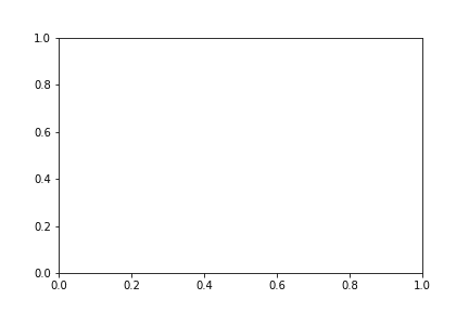
Unsere Grafik enthält also bis jetzt nur ein Koordinatensystem. Um den objektorientieren Ansatz noch einmal zu verdeutlichen erstellen wir eine figure mit insgesamt zwei Zeilen und Splaten.
# Erstellen einer Figure mit 4 separaten Grafiken
fig, ax = plt.subplots(nrows = 2, ncols = 2)
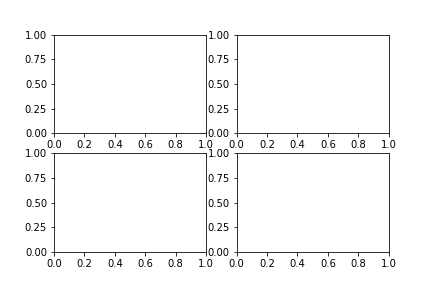
Mittels Indexselektion kann man nun die einzelnen Teildarstellungen aus dem Grid auswählen. Somit sollte der objektorientierte Ansatz klar und deutlich geworden sein.
# Auswahl der einzelnen Teildarstellungen
ax[0,0]
ax[0,1]
ax[1,0]
ax[1,1]
Bei der Initialisierung einer Grafik sind natürlich Anpassungen im Hinblick auf die Größe der Grafik denkbar, dies lässt sich wie folgt umsetzen:
# Festlegung der figure Größe
fig, ax = plt.subplots(nrows = 2, ncols = 2, figsize = (10, 12))
Die Grafikgröße wird als Tuple (Breite, Höhe) in Inches angegeben.
Darstellung von Daten
Nachdem wir dargestellt haben wie man eine Grafik in Matplotlib initialisieren kann, soll es nun darum gehen, diese mit Daten zu befüllen. Für den Einstieg nehmen wir die erste figure aus dem Blog-Beitrag. Zur Darstellung von Daten greifen wir auf das Axes-Objekt zu und wählen zu Beginn die Funktion plot. Eine Vielzahl von weiteren Funktionen kann unter diesem Link gefunden werden.
# Erstellen der Grafik
fig, ax = plt.subplots(nrows = 1, ncols = 1)
# Erstellen von Beispieldaten
sample_data = np.random.randint(low = 0, high = 10, size = 10)
# Darstellung der Beispieldaten
ax.plot(sample_data)
# Ausgabe der Figure
fig
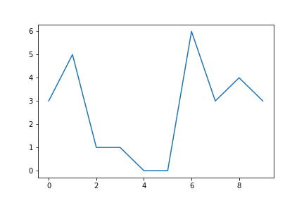
An dieser Stelle sei kurz angemerkt, dass Matplotlib im Hintergrund zwei Vorgänge durchgeführt hat:
- Die Skala wurde automatisch an die Daten angepasst.
- Die Darstellung der Daten erfolgte über den Index, d. h. der eigentliche Wert ist auf der y-Achse.
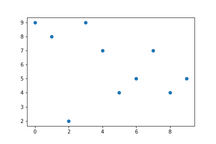
Ist man der Auffassung, dass z.B. ein Streudiagramm besser geeignet wäre, so lässt sich die Grafik einfach ändern. Anstelle von plot schreibt man scatter. Der Codes zeigt, dass in diesem Fall nicht die Daten automatisch über den Index dargestellt wurden, sondern explizit x und y als Argumente übergeben müssen.
# Erstellen der Grafik
fig, ax = plt.subplots(nrows = 1, ncols = 1)
# Erstellen von Beispieldaten
sample_data = np.random.randint(low = 0, high = 10, size = 10)
# Darstellung der Beispieldaten
ax.scatter(x = range(0, len(sample_data)), y=sample_data)
# Ausgabe der Figure
fig
Alle typischen Datenvisualisierungen lassen sich so mit Matplotlib umsetzen.
Beschriftungen und Speichern von Grafiken
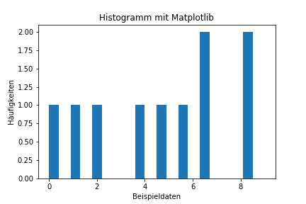
Die Darstellung der Daten ist die eine Sache, mit einer passenden Überschrift werden sie dann doch verständlicher.
Als Beispiel wollen wir ein Histogramm mit den Beispieldaten beschriften. Mithilfe der Funktionen set_ kann die Beschriftung einfach vorgenommen werden.
fig, ax = plt.subplots(nrows=1, ncols=1)
sample_data = np.random.randint(low = 0, high = 10, size = 10)
ax.hist(sample_data,width = 0.4)
# Hinzufügen der Beschriftungen
ax.set_xlabel('Beispieldaten')
ax.set_ylabel('Häufigkeiten')
ax.set_title('Histogramm mit Matplotlib')
# Ausgabe der Figure
fig
Wir erhalten folgende Grafik:
Möchte man gerne seine Grafik speichern, so kann man über die Funktion fig.savefig('Pfad der Grafik') dies vornehmen.
Resümee und Ausblick
Dieser Blog Beitrag sollte einen ersten Einstieg in die Python Visualisierungsbibliothek Matplotlib geben und grundlegende Konzepte vermitteln. Die Anpassbarkeit der Grafiken geht weit über die Funktionen, die wir vorgestellt haben, hinaus:
- Anpassung der Farben, Farbverläufe,…
- individuelle Axenbeschriftung/-skalierung
- Annotieren von Grafiken mit Text Boxen
- Änderung der Schriftart
- …
Allgemein ist zu berücksichtigen, die passenden Daten für die Grafiken auszuwählen, wie man das mit Pandas umsetzen kann, lässt sich hier nachlesen. Im nächsten Beitrag in dieser Serie wird es dann um Scikit-Learn gehen, der Einsteiger Machine Learning Bibliothek in Python.
In the last post of this series, we dealt with axis systems. In this post, we are also dealing with axes but this time we are taking a look at the position scales of dates, time, and datetimes. Since we at STATWORX are often forecasting – and thus plotting – time series, this is an important issue for us. The choice of axis ticks and labels can make the message conveyed by a plot clearer. Oftentimes, some points in time are – e.g. due to their business implications – more important than others and should be easily identified. Unequivocal, yet parsimonious labeling is key to the readability of any plot. Luckily, ggplot2 enables us to do so for dates and times with almost any effort at all.
We are using ggplot’s economics data set. Our base Plot looks like this:
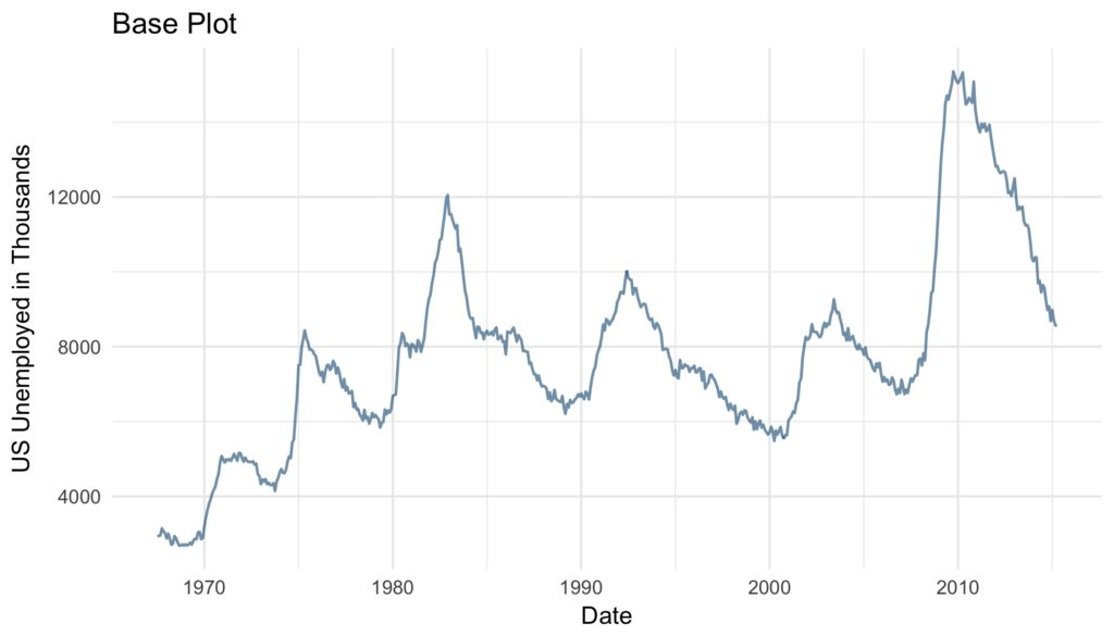
base_plot <- ggplot(data = economics) +
  geom_line(aes(x = date, y = unemploy),
            color = "#09557f",
            alpha = 0.6,
            size = 0.6) +
  labs(x = "Date",
       y = "US Unemployed in Thousands",
       title = "Base Plot") +
  theme_minimal()
Scale Types
As of now, ggplot2 supports three date and time classes: POSIXct, Date and hms. Depending on the class at hand, axis ticks and labels can be controlled by using scale_*_datetime, scale_*_date or scale_*_time, respectively. Depending on whether one wants to modify the x or the y axis scale_x_* or scale_y_* are to be employed. For sake of simplicity, in the examples only scale_x_date is employed, but all discussed arguments work just the same for all mentioned scales.
Minor Modifications
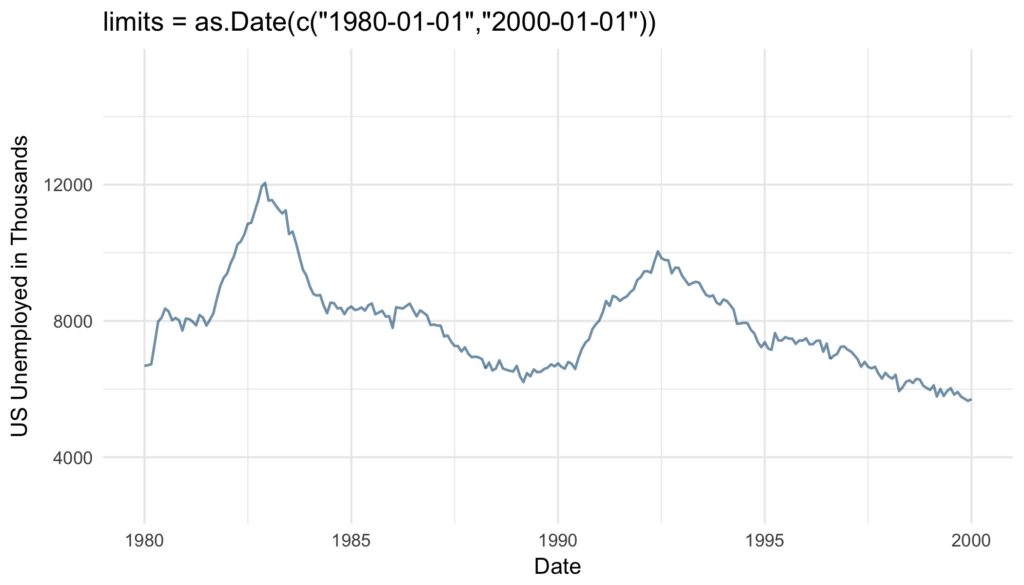
Let’s start easy. With the argument limits the range of the displayed dates or time can be set. Two values of the correct date or time class have to be supplied.
base_plot +
scale_x_date(limits = as.Date(c("1980-01-01","2000-01-01"))) +
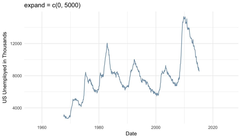
ggtitle("limits = as.Date(c("1980-01-01","2000-01-01"))")The expand argument ensures that there is some distance between the displayed data and the axes. The multiplicative constant is multiplied with the range of the displayed data, the additive is multiplied with one unit of the depicted data. The sum of the two resulting distances is added to the axis limits as padding. The resulting empty space is added at the left and right end of the x-axis or the top and bottom of the y-axis.
base_plot +
scale_x_date(expand = c(0, 5000)) + #5000/365 = 13.69863 years
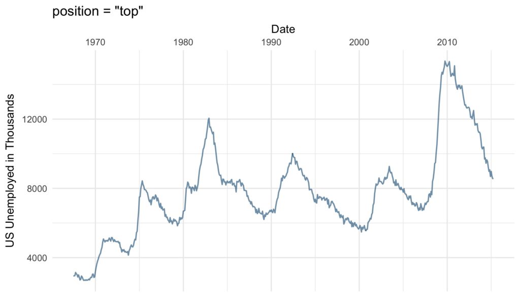
ggtitle("expand = c(0, 5000)")position argument defines where the labels are displayed: Either “left” or “right” from the y-axis or on the “top” or on the “bottom” of the x-axis.
base_plot +
   scale_x_date(position = "top") +
   ggtitle("position = "top"")
Axis Ticks and Grid Lines
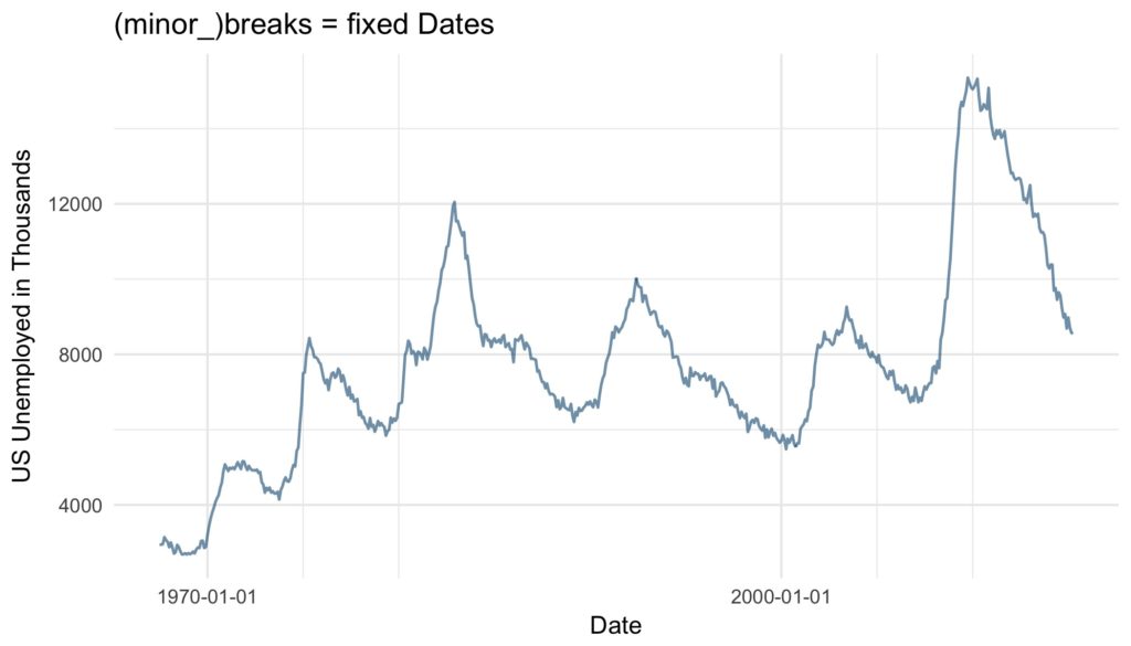
More essential than the cosmetic modifications discussed so far are the axis ticks. There are several ways to define the axis ticks of dates and times. There are the labelled major breaks and further the minor breaks, which are not labeled but marked by grid lines. These can be customized with the arguments breaks and minor_breaks, respectively. The breaks as the well as minor_breaks can be defined by a numeric vector of exact positions or a function with the axis limits as inputs and breaks as outputs. Alternatively, the arguments can be set to NULL to display (minor) breaks at all. These options are especially handy if irregular intervals between breaks are desired.
 base_plot +
  scale_x_date(breaks = as.Date(c("1970-01-01", "2000-01-01")),
               minor_breaks = as.Date(c("1975-01-01", "1980-01-01",
                                        "2005-01-01", "2010-01-01"))) +
   ggtitle("(minor_)breaks = fixed Dates")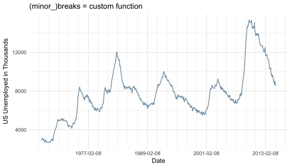
base_plot +
   scale_x_date(breaks = function(x) seq.Date(from = min(x),
   											  to = max(x),
   											  by = "12 years"),
                minor_breaks = function(x) seq.Date(from = min(x),
                									to = max(x),
                									by = "2 years")) +
   ggtitle("(minor_)breaks = custom function")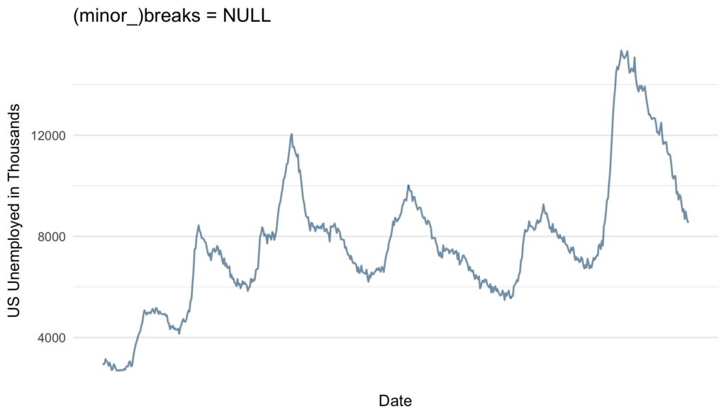
base_plot +
	scale_x_date(breaks = NULL,
              minor_breaks = NULL) +
  ggtitle("(minor_)breaks = NULL")
Another and very convenient way to define regular breaks are the date_breaks and the date_minor_breaks argument. As input both arguments take a character vector combining a string specifying the time unit (either “sec“, „min“, „hour“, „day“, „week“, „month“ or „year“) and an integer specifying number of said units specifying the break intervals.
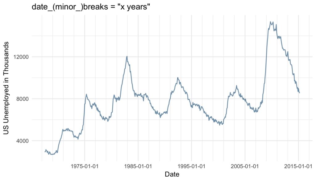
base_plot +
  scale_x_date(date_breaks = "10 years",
               date_minor_breaks = "2 years") +
  ggtitle("date_(minor_)breaks = "x years"")
If both are given, date(_minor)_breaks overrules (minor_)breaks.
Axis Labels
Similar to the axis ticks, the format of the displayed labels can either be defined via the labels or the date_labels argument. The labels argument can either be set to NULL if no labels should be displayed, with the breaks as inputs and the labels as outputs. Alternatively, a character vector with labels for all the breaks can be supplied to the argument. This can be very useful, since like this virtually any character vector can be used to label the breaks. The number of labels must be the same as the number of breaks. If the breaks are defined by a function, date_breaks or by default the labels must be defined by a function as well.
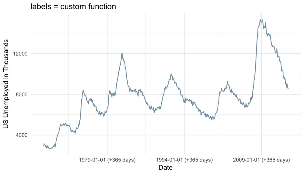
base_plot +
  scale_x_date(date_breaks = "15 years",
               labels = function(x) paste((x-365), "(+365 days)")) +
ggtitle("labels = custom function") 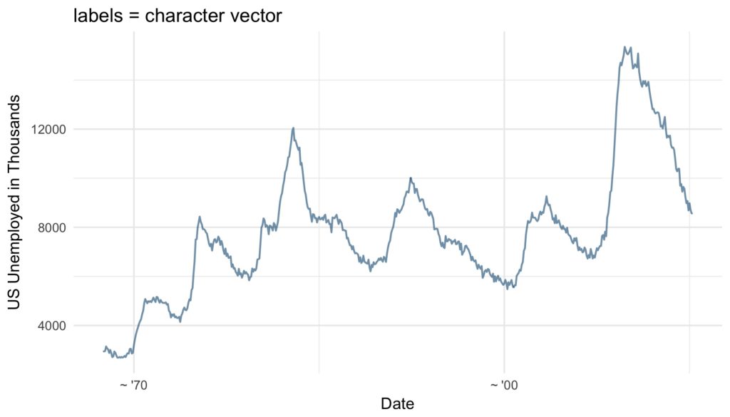
base_plot +
  scale_x_date(breaks = as.Date(c("1970-01-01", "2000-01-01")),
               labels = c("~ '70", "~ '00")) +
  ggtitle("labels = character vector")
Furthermore and very conveniently, the format of the labels can be controlled via the argument date_labels set to a string of formatting codes, defining order, format and elements to be displayed:
| Code | Meaning |
|---|---|
| %S | second (00-59) |
| %M | minute (00-59) |
| %l | hour, in 12-hour clock (1-12) |
| %I | hour, in 12-hour clock (01-12) |
| %H | hour, in 24-hour clock (01-24) |
| %a | day of the week, abbreviated (Mon-Sun) |
| %A | day of the week, full (Monday-Sunday) |
| %e | day of the month (1-31) |
| %d | day of the month (01-31) |
| %m | month, numeric (01-12) |
| %b | month, abbreviated (Jan-Dec) |
| %B | month, full (January-December) |
| %y | year, without century (00-99) |
| %Y | year, with century (0000-9999) |
Source: Wickham 2009 p. 99
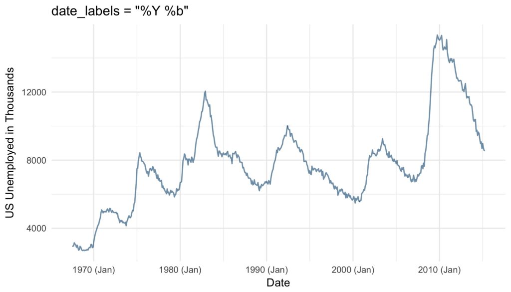
base_plot +
  scale_x_date(date_labels = "%Y (%b)") +
  ggtitle("date_labels = "%Y (%b)"")
The choice of axis ticks and labels might seem trivial. However, one should not underestimate the amount of confusion that can be caused by too many, too less or poorly positioned axis ticks and labels. Further, economical yet clear labeling of axis ticks can increase the readability and visual appeal of any time series plot immensely. Since it is so easy to tweak the date and time axes in ggplot2 there is simply no excuse not to do so.
References
- Wickham, H. (2009). ggplot2: elegant graphics for data analysis. Springer.
Ein wesentliches Problem von größeren und heterogenen Daten ist häufig ihre Interpretation. Als Data Scientist stellt man sich auch deshalb unter anderem folgende Fragen:
- Wie sind die Daten strukturiert?
- Was sind besondere Merkmale?
- Wie lassen sich die Daten graphisch aufbereiten?
Selbstverständlich lässt sich diese Liste noch um beliebige Fragestellungen erweitern. Als Hilfestellung zur Lösung der letzten Frage soll folgender Blog Artikel dienen. Anhand eines einfachen Datensatzes möchten wir euch zeigen, wie man mit einem überschaubaren Aufwand ein Dashboard mit der Python-Bibliothek Bokeh aufbauen kann. Dieses lässt sich dann nicht nur zur einfachen Visualisierung von Daten verwenden, sondern natürlich auch für einen Live Betrieb auf einer Website oder Ähnlichem.
Welche Voraussetzungen solltet ihr mitbringen?
Zur Umsetzung dieses kleinen Projektes solltet ihr eine aktuelle Version von Python 3 auf Eurem PC installiert haben. Falls nicht, ist es am einfachsten, Anaconda zu installieren – hiermit seid ihr bestens für dieses Projekt ausgestattet. Durch das Setup werden nicht nur Python, sondern auch viele weitere Bibliotheken wie Bokeh installiert. Zudem bietet es sich an, dass ihr bereits ein wenig Erfahrung in der grundsätzlichen Funktionsweise von Python sammeln konntet und vor der Benutzung der Kommandozeile/Terminal nicht zurückschreckt. Für die Erstellung des Dashboards solltet ihr zudem über einen passenden Texteditor/IDE wie z.B. Atom, PyCharm oder Jupyter verfügen. Ein Jupyter Notebook könnt ihr – sofern ihr Anaconda installiert habt – sehr einfach starten und müsst keine zusätzlichen Installationen vornehmen. Die Vorteile von Jupyter zeigt unser Data Scientist Marvin in einem Blogbeitrag.
Bokeh – Eine kurze Einführung in die Namensherkunft
Die ursprüngliche Bedeutung von Bokeh kommt aus der Fotografie und leitet sich von dem japanischen Wort boke ab. Es bedeutet so viel wie Unschärfe. Die Namenskomposition mit dem Wort boke und dem Buchstaben h ist auf Mike Johnston zurückzuführen, sie sollte die englische Aussprache vereinfachen.
Nun jedoch zurück zur eigentlichen Anwendung von Bokeh. Die Bibliothek ermöglicht es relativ einfach interaktive Grafiken in Anlehnung an D3.js zu erstellen, in denen z.B. per Mausklick Ausschnitte größer dargestellt und diese dann gespeichert werden können. Für Anwendung der Datenexploration ist diese Funktion eine gute Möglichkeit, sein Datenverständnis zu verbessern.
Unser Datensatz
Für das Dashboard wollen wir nicht fiktive Zahlen generieren und uns diese anzeigen lassen, sondern einen möglichst realen Datensatz verwenden. Hierzu begeben wir uns in die Gastronomie. Ein Kellner hat sich die Mühe gemacht, sein nach seinem Feierabend erhaltenes Trinkgeld und einige weitere Daten zu seinen Kunden zu notieren. Der Datensatz ist in der Grafikbibliothek Seaborn enthalten und lässt sich so einfach herunterladen.
import seaborn as sns
tips = sns.load_datset('tips')
Betrachten wir die ersten Zeilen des Datensatzes, so zeigt sich, dass der Kellner eine überschaubare Anzahl von verschiedenen Variablen erfasst hat. Ein Vorteil der Daten ist ihre unterschiedliche Struktur, so sind Variablen mit unterschiedlichen Skalen enthalten, welche wir für verschiedene Visualisierung in unserem Dashboard nutzen können.
| total_bill | tip | sex | smoker | day | time | size |
|---|---|---|---|---|---|---|
| 16.99 | 1.01 | Female | No | Sun | Dinner | 2 |
| 10.34 | 1.66 | Male | No | Sun | Dinner | 3 |
| 21.01 | 3.5 | Male | No | Sun | Dinner | 3 |
| 23.68 | 3.31 | Male | No | Sun | Dinner | 2 |
| 24.59 | 3.61 | Female | No | Sun | Dinner | 4 |
Möglichkeiten eines Bokeh Dashboards
Nachdem wir nun einen ersten Überblick über unsere Daten gewonnen haben, gilt es das Dashboard mit Bokeh aufzubauen. Grundsätzlich gibt es hierbei zwei Möglichkeiten:
- Erstellung eines HTML Dokuments inkl. aller Abbildungen
- Starten eines Bokeh Servers
Die erste Möglichkeit bietet den Vorteil, dass ein Dashboard sehr einfach in Form eines HTML Dokuments gespeichert werden kann, allerdings sind interaktive Gestaltungsmöglichkeiten nur beschränkt umsetzbar, sodass wir in diesem Blog Beitrag die zweite Möglichkeit genauer vorstellen. Das Starten des Bokeh Servers läuft folgendermaßen ab:
- Terminal/Bash-Konsole öffnen
- mit cd in das Verzeichnis des Python-Skriptes wechseln
- Dashboard mit
bokeh serve --show name-des-skriptes.pystarten
Der Befehl --show ist nicht zwingend für das Dashboard erforderlich, bringt aber den Vorteil mit sich, dass das Dashboard direkt im Browser angzeigt wird.
Erstellung des Bokeh Dashboards
Kommen wir nun dazu, wie man das Dashboard aufbauen kann. Neben den verschiedenen Visualisierungen kann das Dashboard mit den Widgets wie ein Baukasten modular aufgebaut werden. Auf der Website von bokeh finden sich eine Vielzahl von unterschiedlichen Widgets, womit sich die Funktionen beliebig erweitern lassen. Ziel von unserem Dashboard sollen es sein, dass es folgende Eigenschaften erfüllt:
- Zwei unterschiedliche Visualisierungen
- Interaktionselemente zur Auswahl von Daten für unsere Darstellungen
Als Visualisierungen wollen wir zum einen ein Histogramm/Säulendiagramm und zum anderen einen Scatter-Plot in unser Dashboard aufnehmen. Hierzu importieren wir die Klasse figure mit dieser können wir beide Visualisierung umsetzen. Hierzu drei Anmerkungen:
- Für Bokeh Grafiken ist es entscheidend, um welche Art von Skala es sich bei den Daten handelt. Wir haben in unserem Fall sowohl Daten mit einer Nominalskala, als auch Daten mit einer Verhältnisskala. Wir erstellen daher ein Histogramm sowie ein Säulendiagramm für die unterschiedlichen Fälle.
- Bevor wir ein Histogramm mit Bokeh darstellen können, müssen wir zunächst noch die Klassengrößen und die jeweilige Anzahl der Beobachtungen in den Klassen festlegen, da dies nicht direkt in Bokeh erfolgen kann, setzen wir diesen Schritt mit numpy und der Funktion
np.histogram()um. - Zudem überführen wir unsere Daten in ein Dictionary, damit wir dieses später leicht ändern und das Dashboard interaktiv gestalten können.
Der folgende Python-Code zeigt, wie man das in Verbindung mit dem Bokeh Server und unserem Datensatz umsetzen kann.
import numpy as np
from seaborn import load_dataset
from bokeh.io import curdoc
from bokeh.layouts import row
from bokeh.models import ColumnDataSource
from bokeh.plotting import figure

# Festlegen des Dashboard Titles
curdoc().title = "Histogramm/Säulendiagramm"

# Datenset laden
tips = load_dataset("tips")

# VISUALISIERUNGEN
# Histogramm mit Numpy erstellen
top_hist, x_hist = np.histogram(tips.total_bill)

# Daten in Dict überführen
source_hist = ColumnDataSource(data=dict(x=x_hist[:-1], top=top_hist))

# Allgemeinen Plot erstellen
hist = figure(plot_height=400, plot_width=400,
              title="Histogramm",
              x_axis_label='total_bill',
              y_axis_label='Absolute Häufigkeit')

# Darstellung des Säulendiagramms
hist.vbar(x='x', top='top', width=0.5, source=source_hist)

# Kategoriale Variablen
kat_data = tips.smoker.value_counts()
x_kat = list(kat_data.index)
top_kat = kat_data.values

# Daten in Dict überführen
source_kat = ColumnDataSource(data=dict(x=x_kat, top=top_kat))

# Allgemeinen Plot erstellen
bar = figure(x_range= x_kat, plot_height=400, plot_width=400,
             title="Säulendiagramm",
             x_axis_label='smoker',
             y_axis_label='Absolute Häufigkeit')

# Darstellung des Säulendiagramm
bar.vbar(x='x', top='top', width=0.1, source=source_kat)

# Hinzufügen der beiden Visualisierungen in das Hauptdokument
curdoc().add_root(row(hist, bar))
Als nächstes fügen wir unseren Scatter-Plot zu unserem Dashboard hinzu, hierfür erstellen wir auch wieder eine figure mit einem zugehörigen Daten-Dictionary. Dieses können wir dann zu unserem Dashboard einfach hinzufügen.
# Hinzufügen des Scatter Plots
curdoc().add_root(row(hist, bar, scatter))
Der Übersicht halber stellen wir nicht mehr den gesamten Programmcode hier dar, sondern nur noch die wesentlichen Auszüge. Den gesamten Quellcode findet ihr in unserem unserem Git Repositroy. Für dieses Beispiel heißt die zugehörige Datei bokeh-hist-bar-scatter.py. Unser Dashboard sieht inzwischen folgendermaßen aus:
Bis jetzt hat unser Dashboard die erste Anforderung erfüllt, was jetzt noch fehlt, sind die Interaktionselemente auf Englisch: Widgets. Die Funktion der Widgets soll sein, die verschiedenen Variablen für die beiden Plots auszuwählen. Da unser Scatterplot sowohl eine x-, als auch eine y-Achse hat, verwenden wir zwei Select Widgets, um für beide Achsen Daten auszuwählen und beschränken uns auf die Variablen mit Verhältnisskala, also numerischer Natur.

Wie verleiht man dem Dashboard nun die notwendige Interaktion?
Ein wesentliches Manko unseres Dashboards bis jetzt ist es, dass es nur einen Datensatz darstellt, jedoch keine Aktualisierung vornimmt, wenn wir z.B. in den Widgets andere Variablen ausgewählt haben. Das lösen wir nun über die Funktion update_data und eine for-Schleife. Mit der Funktion verändern wir die Daten in unserem Histogramm/Säulendiagramm sowie den Scatter-Plot. Die aktuell gewählten Variablen in unseren Widgets erhalten wir, in dem wir auf das Attribut value zugreifen. Anschließend können wir das dict für unsere Daten aktualisieren. Für die Histogramme ist es entscheidend, ob eine kategoriale Variable vorliegt. Diese Fallunterscheidung decken wir mit der if-Bedinung ab, je nach Variable wird daher entweder das obere oder untere Diagramm aktualisiert. Mit der for-Schleife wird nun sobald eine Veränderung in einem unserer Widgets eintritt, die Funktion update_data ausgeführt.
def update_data(attrname, old, new):
    """Update der Daten sowie der Beschriftungen"""
    # Scatter Diagramm
    scatter.xaxis.axis_label = select_x.value
    scatter.yaxis.axis_label = select_y.value
    x = select_x.value
    y = select_y.value
    source_scatter.data = dict(x=tips[x], y= tips[y])
    # Säulendiagramm
    data_cat = tips[select_cat.value]
    summary = data_cat.value_counts()
    bar.x_range.factors = list(summary.index)
    source_kat.data = dict(x=list(summary.index), top=summary.values)
    bar.xaxis.axis_label = select_cat.value
    # Historamm
    data_hist = tips[select_hist.value]
    top_hist_new, x_hist_new = np.histogram(data_hist)
    source_hist.data = dict(x= x_hist_new[:-1], top=top_hist_new)
    hist.xaxis.axis_label = select_hist.value

for w in [select_hist, select_cat, select_x, select_y]:
    w.on_change('value', update_data)
Damit ist unser Dashboard nun fertig und hat die Zielsetzung erfüllt. Den Code für das fertige Dashboard findet ihr in der Datei bokeh-dashboard-final.py unter folgendem Link und so sieht es in Aktion aus:
Fazit
Zum Abschluss möchten wir noch ein kurzes Fazit zu unserem Dashboard ziehen. Es hat sich gezeigt, dass folgende Schritte für ein interaktives Bokeh-Dashboard notwendig sind:
- Vorbereitung der Daten und Erstellung von Dictionaries
- Festlegung der Visualisierung und zugehörigen Skalen
- Hinzufügen der passenden Widgets
- Definition einer oder mehrer Funkitonen zur Aktualisierung der Diagramme
Sobald dieses Grundgerüst steht, kann man sein Bokeh-Dashborad beliebig um Widgets und Darstellungen erweitern. Im Hinterkopf sollte man stets die objekteorientierte Arbeitsweise behalten und sich über die verschiedenen Klassen sowie Attribute der Objekte bewusst sein. Durch die Umsetzung in Python ist das Verarbeiten von Daten z.B. mit der Bibliothek pandas einfach möglich. Mit Bokeh spart ihr euch zudem den Aufwand, selber das Layout in HTML-Code festzulegen und auch die Interaktionen in JavaScript zu schreiben. Viel Spaß beim Erstellen eigener Dashboards!
Referenzen: