In the last post of this series, we dealt with axis systems. In this post, we are also dealing with axes but this time we are taking a look at the position scales of dates, time, and datetimes. Since we at STATWORX are often forecasting – and thus plotting – time series, this is an important issue for us. The choice of axis ticks and labels can make the message conveyed by a plot clearer. Oftentimes, some points in time are – e.g. due to their business implications – more important than others and should be easily identified. Unequivocal, yet parsimonious labeling is key to the readability of any plot. Luckily, ggplot2 enables us to do so for dates and times with almost any effort at all.
We are using ggplot’s economics data set. Our base Plot looks like this:
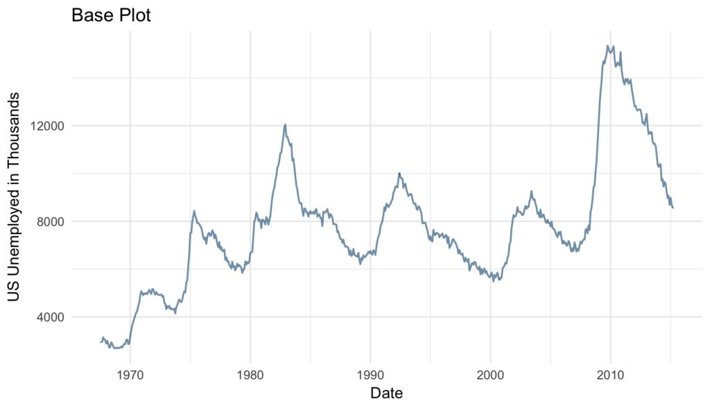
base_plot <- ggplot(data = economics) +
  geom_line(aes(x = date, y = unemploy),
            color = "#09557f",
            alpha = 0.6,
            size = 0.6) +
  labs(x = "Date",
       y = "US Unemployed in Thousands",
       title = "Base Plot") +
  theme_minimal()
Scale Types
As of now, ggplot2 supports three date and time classes: POSIXct, Date and hms. Depending on the class at hand, axis ticks and labels can be controlled by using scale_*_datetime, scale_*_date or scale_*_time, respectively. Depending on whether one wants to modify the x or the y axis scale_x_* or scale_y_* are to be employed. For sake of simplicity, in the examples only scale_x_date is employed, but all discussed arguments work just the same for all mentioned scales.
Minor Modifications
Let’s start easy. With the argument limits the range of the displayed dates or time can be set. Two values of the correct date or time class have to be supplied.
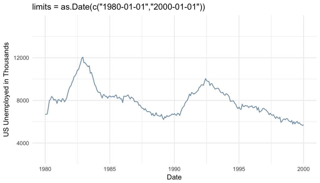
 base_plot +
   scale_x_date(limits = as.Date(c("1980-01-01","2000-01-01"))) +
   ggtitle("limits = as.Date(c("1980-01-01","2000-01-01"))")
The expand argument ensures that there is some distance between the displayed data and the axes. The multiplicative constant is multiplied with the range of the displayed data, the additive is multiplied with one unit of the depicted data. The sum of the two resulting distances is added to the axis limits as padding. The resulting empty space is added at the left and right end of the x-axis or the top and bottom of the y-axis.
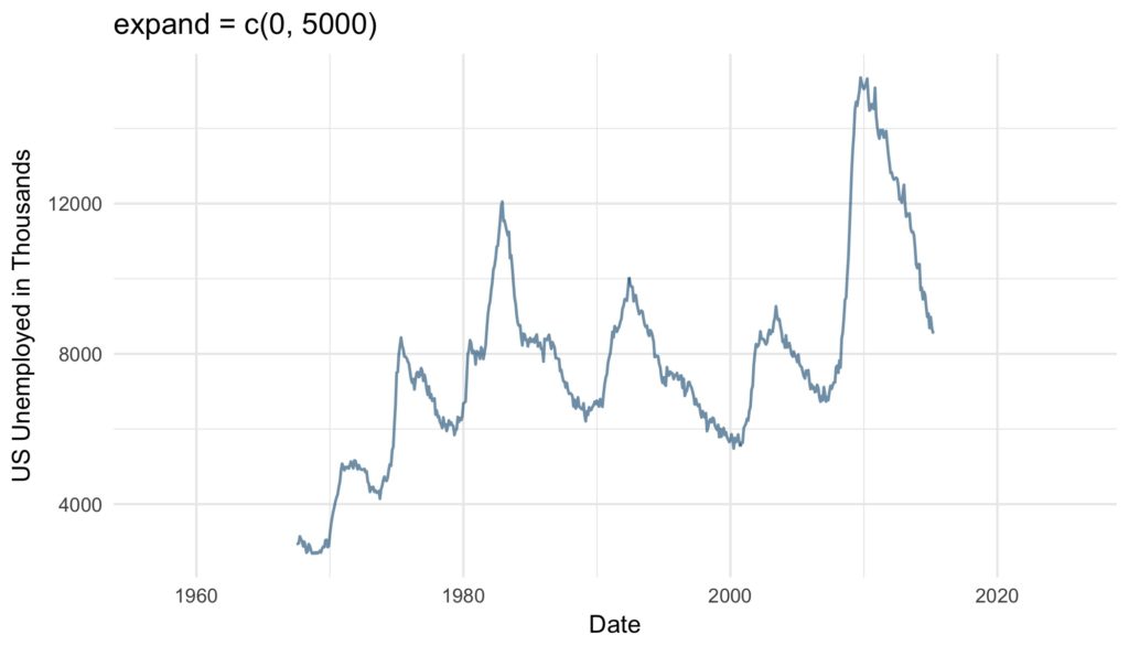
 base_plot +
 scale_x_date(expand = c(0, 5000)) +   #5000/365 = 13.69863 years
   ggtitle("expand = c(0, 5000)")
position argument defines where the labels are displayed: Either “left” or “right” from the y-axis or on the “top” or on the “bottom” of the x-axis.
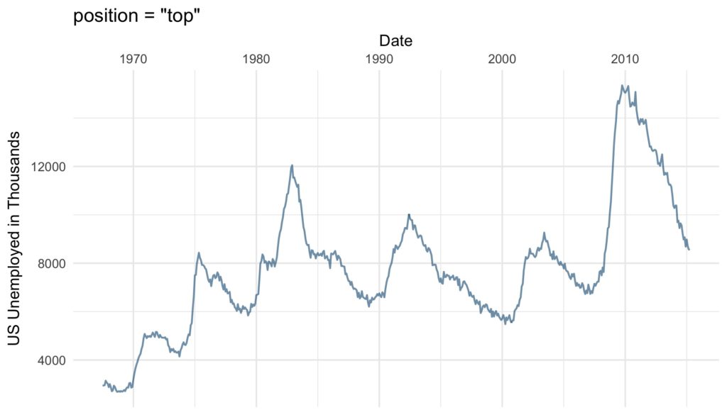
base_plot +
   scale_x_date(position = "top") +
   ggtitle("position = "top"")
Axis Ticks and Grid Lines
More essential than the cosmetic modifications discussed so far are the axis ticks. There are several ways to define the axis ticks of dates and times. There are the labelled major breaks and further the minor breaks, which are not labeled but marked by grid lines. These can be customized with the arguments breaks and minor_breaks, respectively. The breaks as the well as minor_breaks can be defined by a numeric vector of exact positions or a function with the axis limits as inputs and breaks as outputs. Alternatively, the arguments can be set to NULL to display (minor) breaks at all. These options are especially handy if irregular intervals between breaks are desired.
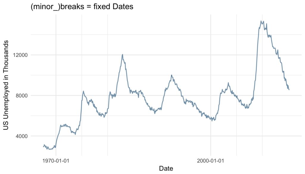
 base_plot +
  scale_x_date(breaks = as.Date(c("1970-01-01", "2000-01-01")),
               minor_breaks = as.Date(c("1975-01-01", "1980-01-01",
                                        "2005-01-01", "2010-01-01"))) +
   ggtitle("(minor_)breaks = fixed Dates")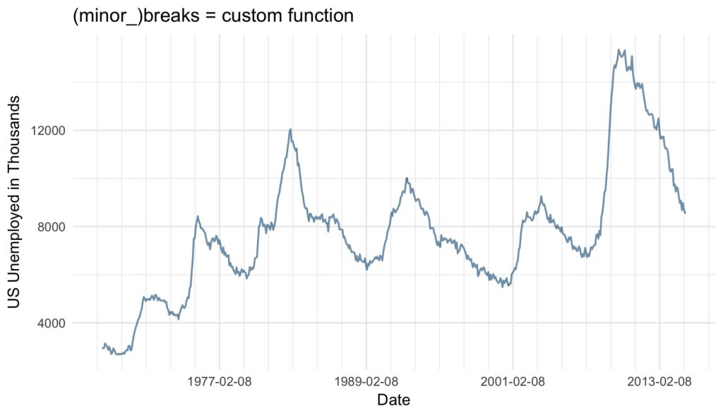
base_plot +
   scale_x_date(breaks = function(x) seq.Date(from = min(x),
   											  to = max(x),
   											  by = "12 years"),
                minor_breaks = function(x) seq.Date(from = min(x),
                									to = max(x),
                									by = "2 years")) +
   ggtitle("(minor_)breaks = custom function")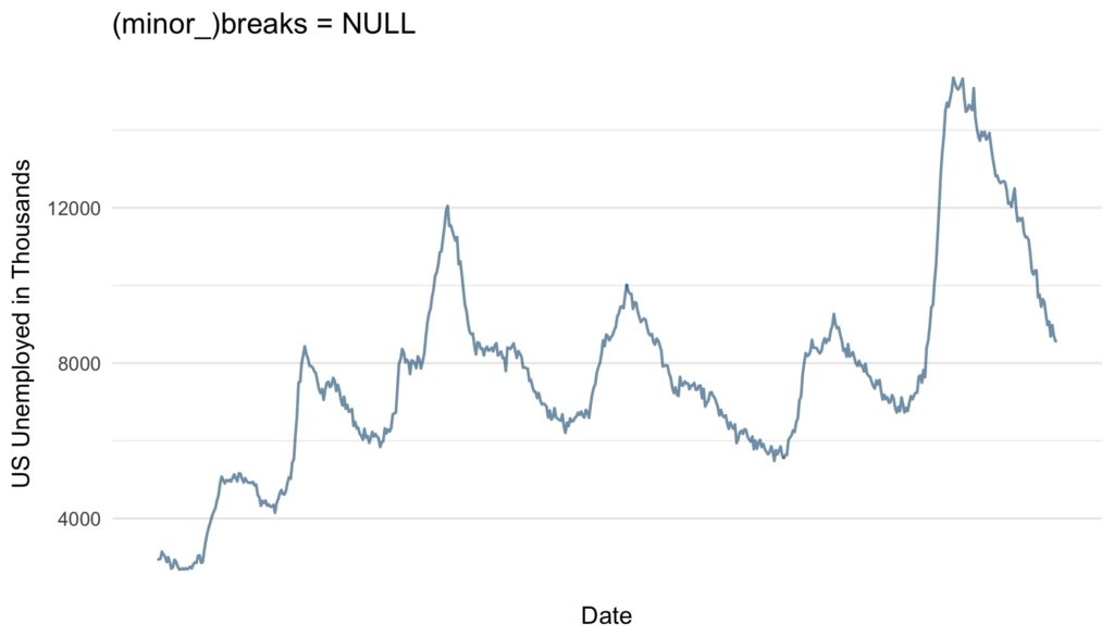
base_plot +
	scale_x_date(breaks = NULL,
              minor_breaks = NULL) +
  ggtitle("(minor_)breaks = NULL")
Another and very convenient way to define regular breaks are the date_breaks and the date_minor_breaks argument. As input both arguments take a character vector combining a string specifying the time unit (either “sec”, “min”, “hour”, “day”, “week”, “month” or “year”) and an integer specifying number of said units specifying the break intervals.
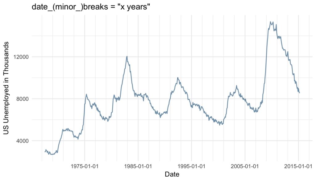
base_plot +
  scale_x_date(date_breaks = "10 years",
               date_minor_breaks = "2 years") +
  ggtitle("date_(minor_)breaks = "x years"")
If both are given, date(_minor)_breaks overrules (minor_)breaks.
Axis Labels
Similar to the axis ticks, the format of the displayed labels can either be defined via the labels or the date_labels argument. The labels argument can either be set to NULL if no labels should be displayed, with the breaks as inputs and the labels as outputs. Alternatively, a character vector with labels for all the breaks can be supplied to the argument. This can be very useful, since like this virtually any character vector can be used to label the breaks. The number of labels must be the same as the number of breaks. If the breaks are defined by a function, date_breaks or by default the labels must be defined by a function as well.
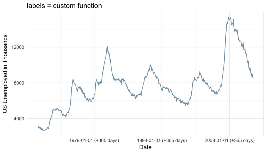
base_plot +
  scale_x_date(date_breaks = "15 years",
               labels = function(x) paste((x-365), "(+365 days)")) +
ggtitle("labels = custom function") 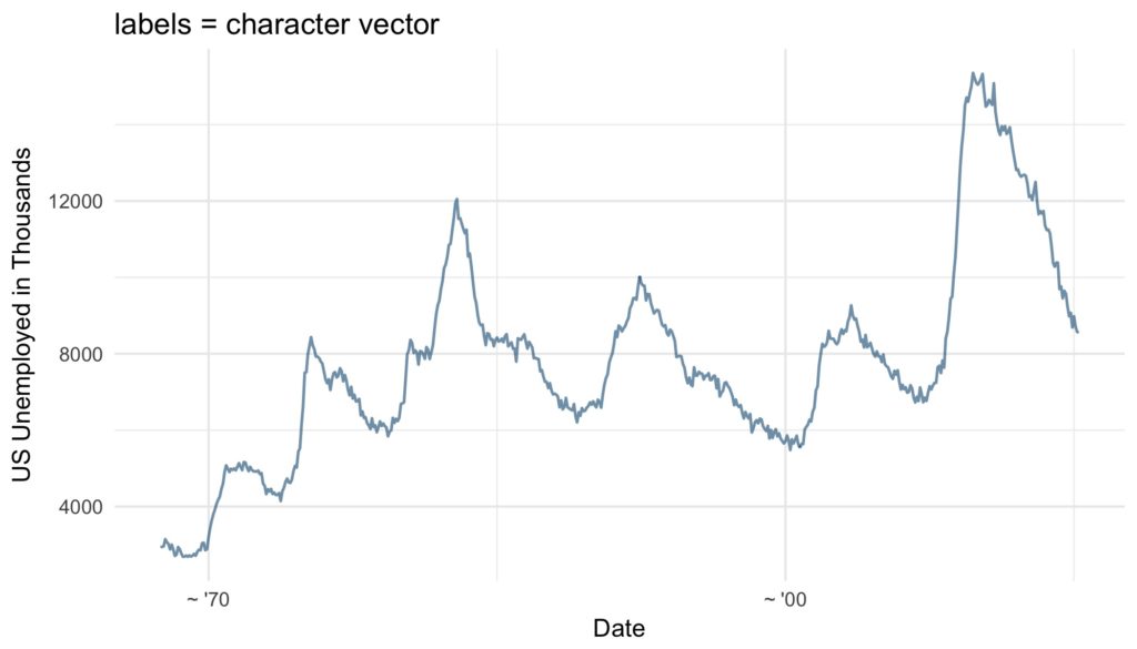
base_plot +
  scale_x_date(breaks = as.Date(c("1970-01-01", "2000-01-01")),
               labels = c("~ '70", "~ '00")) +
  ggtitle("labels = character vector")
Furthermore and very conveniently, the format of the labels can be controlled via the argument date_labels set to a string of formatting codes, defining order, format and elements to be displayed:
| Code | Meaning |
|---|---|
| %S | second (00-59) |
| %M | minute (00-59) |
| %l | hour, in 12-hour clock (1-12) |
| %I | hour, in 12-hour clock (01-12) |
| %H | hour, in 24-hour clock (01-24) |
| %a | day of the week, abbreviated (Mon-Sun) |
| %A | day of the week, full (Monday-Sunday) |
| %e | day of the month (1-31) |
| %d | day of the month (01-31) |
| %m | month, numeric (01-12) |
| %b | month, abbreviated (Jan-Dec) |
| %B | month, full (January-December) |
| %y | year, without century (00-99) |
| %Y | year, with century (0000-9999) |
Source: Wickham 2009 p. 99
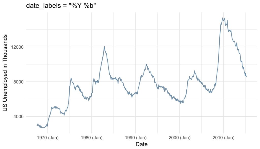
base_plot +
  scale_x_date(date_labels = "%Y (%b)") +
  ggtitle("date_labels = "%Y (%b)"")
The choice of axis ticks and labels might seem trivial. However, one should not underestimate the amount of confusion that can be caused by too many, too less or poorly positioned axis ticks and labels. Further, economical yet clear labeling of axis ticks can increase the readability and visual appeal of any time series plot immensely. Since it is so easy to tweak the date and time axes in ggplot2 there is simply no excuse not to do so.
References
- Wickham, H. (2009). ggplot2: elegant graphics for data analysis. Springer.